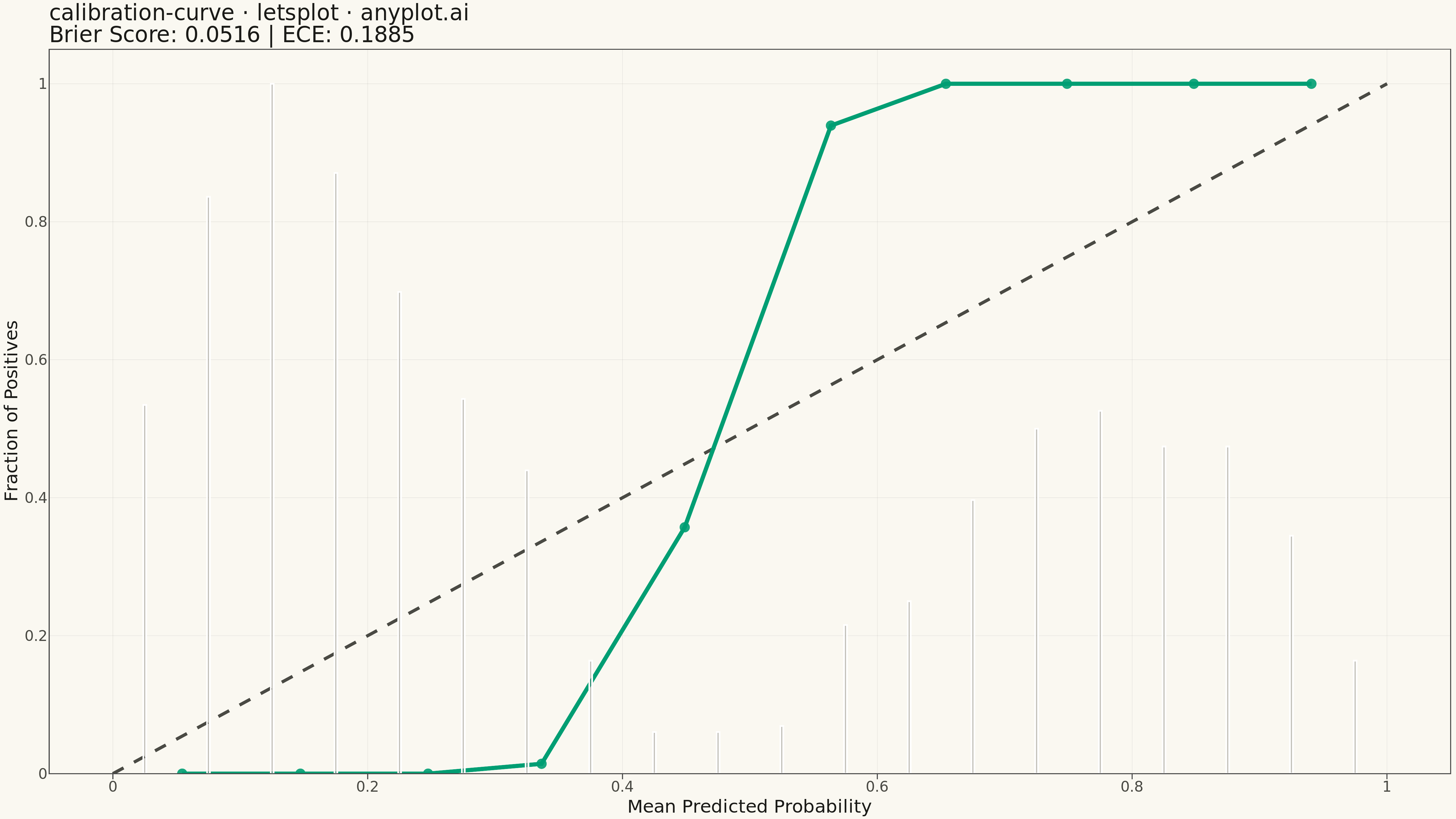
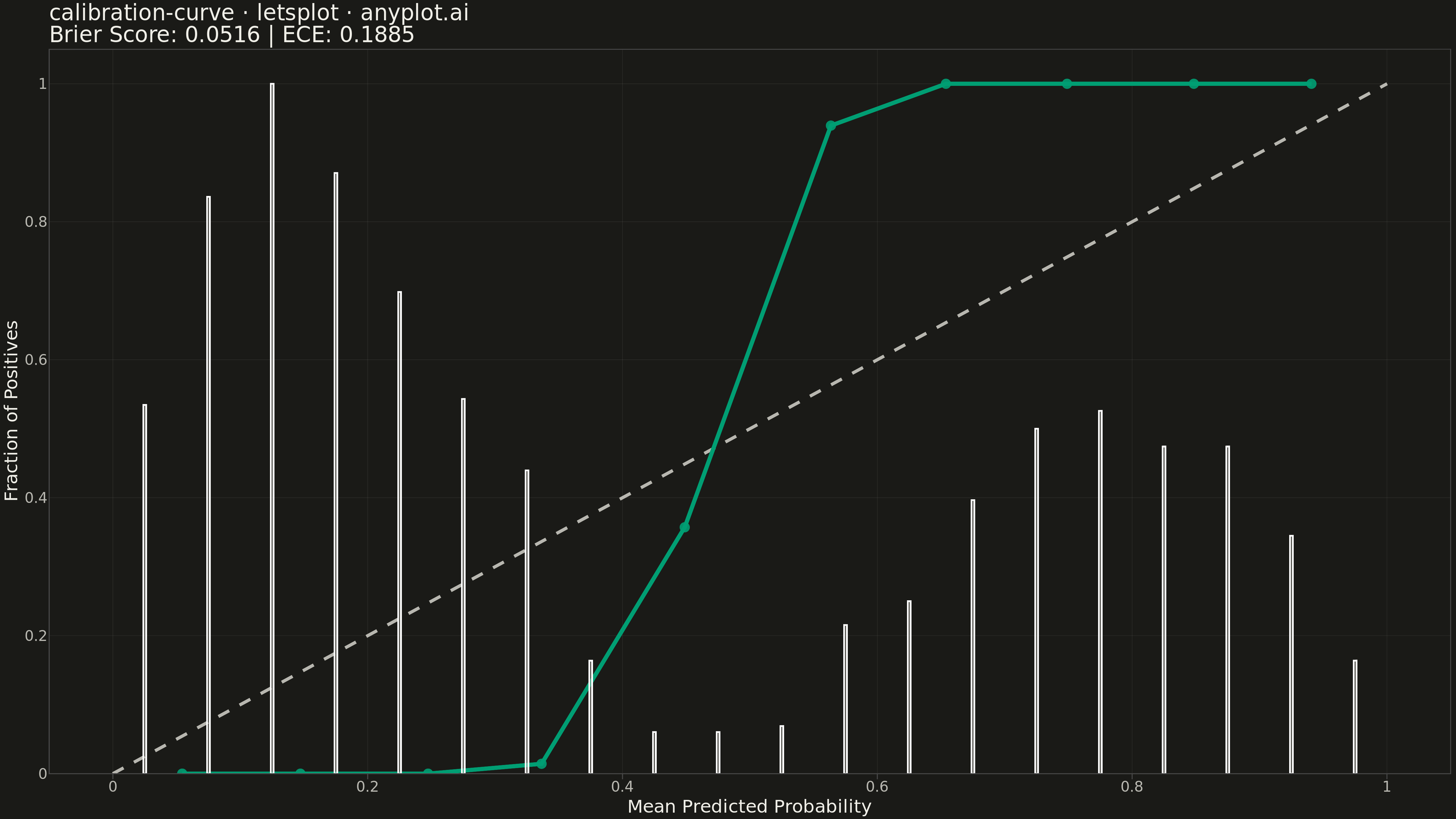
A calibration curve (reliability diagram) visualizes how well the predicted probabilities of a binary classifier match actual outcomes. By plotting the fraction of positives against mean predicted probability in binned intervals, it reveals whether a model is well-calibrated, overconfident, or underconfident. A perfectly calibrated model follows the diagonal line where predicted probability equals observed frequency.
""" anyplot.ai
calibration-curve: Calibration Curve
Library: letsplot 4.9.0 | Python 3.13.13
Quality: 91/100 | Updated: 2026-05-10
"""

import os

import numpy as np
import pandas as pd
from lets_plot import *
from lets_plot.export import ggsave


LetsPlot.setup_html()

# Theme tokens
THEME = os.getenv("ANYPLOT_THEME", "light")
PAGE_BG = "#FAF8F1" if THEME == "light" else "#1A1A17"
ELEVATED_BG = "#FFFDF6" if THEME == "light" else "#242420"
INK = "#1A1A17" if THEME == "light" else "#F0EFE8"
INK_SOFT = "#4A4A44" if THEME == "light" else "#B8B7B0"
INK_MUTED = "#6B6A63" if THEME == "light" else "#A8A79F"
RULE = "rgba(26,26,23,0.10)" if THEME == "light" else "rgba(240,239,232,0.10)"

BRAND = "#009E73"  # Okabe-Ito position 1 — first series
SECONDARY = "#C475FD"  # Okabe-Ito position 2 — reference line

# Data - Generate realistic binary classification predictions
np.random.seed(42)
n_samples = 1000

# Create true labels with imbalanced classes (60/40 split)
y_true = np.concatenate([np.zeros(600), np.ones(400)])

# Generate predicted probabilities with realistic calibration issues
# Model tends to be slightly overconfident (probabilities pushed toward extremes)
y_prob = np.zeros(n_samples)

# For true negatives: mostly low probabilities with some mid-range
y_prob[:600] = np.clip(np.random.beta(2, 5, 600) * 0.6 + np.random.normal(0, 0.05, 600), 0, 1)
# For true positives: mostly high probabilities but with spread
y_prob[600:] = np.clip(np.random.beta(5, 2, 400) * 0.6 + 0.35 + np.random.normal(0, 0.08, 400), 0, 1)

# Shuffle the data
shuffle_idx = np.random.permutation(n_samples)
y_true = y_true[shuffle_idx]
y_prob = y_prob[shuffle_idx]

# Calculate calibration curve with 10 bins
n_bins = 10
bin_edges = np.linspace(0, 1, n_bins + 1)
bin_centers = (bin_edges[:-1] + bin_edges[1:]) / 2

mean_predicted = []
fraction_positive = []
bin_counts = []

for i in range(n_bins):
    mask = (y_prob >= bin_edges[i]) & (y_prob < bin_edges[i + 1])
    if i == n_bins - 1:  # Include right edge for last bin
        mask = (y_prob >= bin_edges[i]) & (y_prob <= bin_edges[i + 1])

    if mask.sum() > 0:
        mean_predicted.append(y_prob[mask].mean())
        fraction_positive.append(y_true[mask].mean())
        bin_counts.append(mask.sum())
    else:
        mean_predicted.append(bin_centers[i])
        fraction_positive.append(np.nan)
        bin_counts.append(0)

# Calculate Brier Score
brier_score = np.mean((y_prob - y_true) ** 2)

# Calculate Expected Calibration Error (ECE)
ece = 0
total_samples = sum(bin_counts)
for i in range(n_bins):
    if bin_counts[i] > 0:
        ece += (bin_counts[i] / total_samples) * abs(fraction_positive[i] - mean_predicted[i])

# Create dataframe for calibration curve
df_calibration = pd.DataFrame(
    {"mean_predicted": mean_predicted, "fraction_positive": fraction_positive, "bin_count": bin_counts}
)
df_calibration = df_calibration.dropna()
df_calibration["tooltip"] = df_calibration.apply(
    lambda row: (
        f"Predicted: {row['mean_predicted']:.3f}\nObserved: {row['fraction_positive']:.3f}\nBin size: {int(row['bin_count'])}"
    ),
    axis=1,
)

# Create dataframe for diagonal (perfect calibration)
df_diagonal = pd.DataFrame({"x": [0, 1], "y": [0, 1]})

# Create dataframe for histogram of predictions
hist_bins = 20
hist_counts, hist_edges = np.histogram(y_prob, bins=hist_bins, range=(0, 1))
hist_centers = (hist_edges[:-1] + hist_edges[1:]) / 2
df_histogram = pd.DataFrame({"prob_center": hist_centers, "count": hist_counts / hist_counts.max()})

# Plot
plot = (
    ggplot()
    # Perfect calibration diagonal line
    + geom_line(aes(x="x", y="y"), data=df_diagonal, color=INK_SOFT, size=1.5, linetype="dashed")
    # Calibration curve
    + geom_line(aes(x="mean_predicted", y="fraction_positive"), data=df_calibration, color=BRAND, size=2)
    + geom_point(
        aes(x="mean_predicted", y="fraction_positive", tooltip="tooltip"),
        data=df_calibration,
        color=BRAND,
        size=5,
        alpha=0.9,
    )
    # Histogram bars at bottom showing prediction distribution
    + geom_bar(
        aes(x="prob_center", y="count"), data=df_histogram, stat="identity", fill=INK_MUTED, alpha=0.4, width=0.045
    )
    # Labels and styling
    + labs(
        x="Mean Predicted Probability",
        y="Fraction of Positives",
        title=f"calibration-curve · letsplot · anyplot.ai\nBrier Score: {brier_score:.4f} | ECE: {ece:.4f}",
    )
    + scale_x_continuous(limits=[0, 1], breaks=[0, 0.2, 0.4, 0.6, 0.8, 1.0])
    + scale_y_continuous(limits=[0, 1], breaks=[0, 0.2, 0.4, 0.6, 0.8, 1.0])
    + theme(
        plot_background=element_rect(fill=PAGE_BG, color=PAGE_BG),
        panel_background=element_rect(fill=PAGE_BG),
        panel_grid_major=element_line(color=RULE, size=0.4),
        panel_grid_minor=element_blank(),
        axis_title=element_text(size=20, color=INK),
        axis_text=element_text(size=16, color=INK_SOFT),
        axis_line=element_line(color=INK_SOFT, size=0.6),
        plot_title=element_text(size=24, color=INK),
        axis_ticks_length_x=6,
        axis_ticks_length_y=6,
    )
    + ggsize(1600, 900)
)

# Save outputs
ggsave(plot, f"plot-{THEME}.png", path=".", scale=3)
ggsave(plot, f"plot-{THEME}.html", path=".")
Runnable source as JSON, for any HTTP client: https://api.anyplot.ai/specs/calibration-curve/letsplot/code. Any spec id and library id listed in llms-full.txt fit the same URL shape; every URL below is complete and callable.
{
  "spec_id": "calibration-curve",
  "language": "python",
  "library": "letsplot",
  "page": "https://anyplot.ai/calibration-curve/python/letsplot",
  "hub": "https://anyplot.ai/calibration-curve",
  "code_json": "https://api.anyplot.ai/specs/calibration-curve/letsplot/code",
  "spec_json": "https://api.anyplot.ai/specs/calibration-curve",
  "render_light_png": "https://storage.googleapis.com/anyplot-images/plots/calibration-curve/python/letsplot/plot-light.png",
  "render_dark_png": "https://storage.googleapis.com/anyplot-images/plots/calibration-curve/python/letsplot/plot-dark.png",
  "interactive_light_html": "https://storage.googleapis.com/anyplot-images/plots/calibration-curve/python/letsplot/plot-light.html",
  "interactive_dark_html": "https://storage.googleapis.com/anyplot-images/plots/calibration-curve/python/letsplot/plot-dark.html",
  "quality_score": 91.0,
  "license": "MIT",
  "guide": "https://anyplot.ai/llms.txt"
}
Part of Calibration Curve on anyplot.ai.