The same plot in 14 other libraries — Python: Altair, Bokeh, lets-plot, Matplotlib, Plotly, plotnine, Pygal, Seaborn; Julia: Makie.jl; JavaScript: Chart.js, D3.js, Apache ECharts, Highcharts, MUI X Charts. Compare all 15 side by side: Calibration Curve in Python, R, Julia and JavaScript.
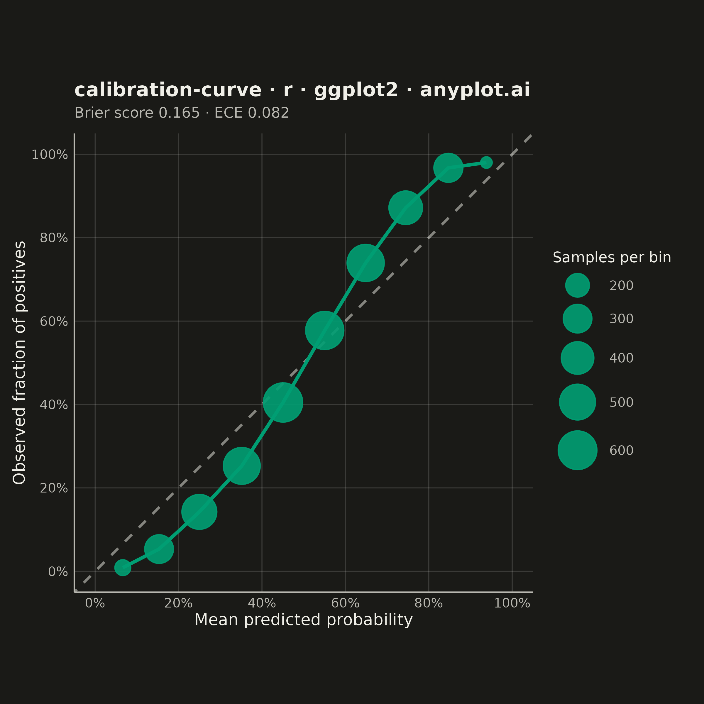
A calibration curve (reliability diagram) visualizes how well the predicted probabilities of a binary classifier match actual outcomes. By plotting the fraction of positives against mean predicted probability in binned intervals, it reveals whether a model is well-calibrated, overconfident, or underconfident. A perfectly calibrated model follows the diagonal line where predicted probability equals observed frequency.
#' anyplot.ai
#' calibration-curve: Calibration Curve
#' Library: ggplot2 3.5.1 | R 4.4.1
#' Quality: 93/100 | Created: 2026-09-02

library(ggplot2)
library(dplyr)
library(ragg)

set.seed(42)

# --- Theme tokens -------------------------------------------------------
THEME       <- Sys.getenv("ANYPLOT_THEME", "light")
PAGE_BG     <- if (THEME == "light") "#FAF8F1" else "#1A1A17"
INK         <- if (THEME == "light") "#1A1A17" else "#F0EFE8"
INK_SOFT    <- if (THEME == "light") "#4A4A44" else "#B8B7B0"
IMPRINT_PALETTE <- c("#009E73", "#C475FD", "#4467A3", "#BD8233",
                     "#AE3030", "#2ABCCD", "#954477", "#99B314")
BRAND       <- IMPRINT_PALETTE[1]
ANYPLOT_NEUTRAL <- INK  # theme-adaptive anchor for the reference (baseline) line
GRID_COLOR  <- scales::alpha(INK, 0.15)  # faint grid, distinct from the INK/INK_SOFT text tokens

# --- Data -----------------------------------------------------------------
# A diagnostic screening model that is systematically underconfident: bagged
# ensembles (e.g. random forests) average many trees, which pulls predicted
# probabilities toward the middle relative to the true underlying risk, so
# observed outcomes end up more extreme than predicted at both ends.
n_samples <- 4000
y_prob <- rbeta(n_samples, 2, 2)
true_logit <- 1.8 * log(y_prob / (1 - y_prob))
true_risk <- 1 / (1 + exp(-true_logit))
y_true <- rbinom(n_samples, 1, true_risk)

df <- tibble::tibble(y_prob = y_prob, y_true = y_true)

# --- Calibration binning ----------------------------------------------------
bin_edges <- seq(0, 1, by = 0.1)
df <- df %>%
  mutate(bin = cut(y_prob, breaks = bin_edges, include.lowest = TRUE))

calib <- df %>%
  group_by(bin) %>%
  summarise(mean_pred = mean(y_prob), frac_pos = mean(y_true), n = n(), .groups = "drop")

brier_score <- mean((df$y_prob - df$y_true)^2)
ece <- sum(calib$n / nrow(df) * abs(calib$frac_pos - calib$mean_pred))

# --- Title (scale fontsize to length, see plot-generator.md) ---------------
# The 67-char baseline in plot-generator.md assumes the 8in-wide landscape
# canvas; this plot uses the 6in-wide square canvas, so the safe character
# budget shrinks proportionally (67 * 6/8) before the fontsize formula applies.
plot_title <- "calibration-curve · r · ggplot2 · anyplot.ai"
plot_subtitle <- sprintf("Brier score %.3f · ECE %.3f", brier_score, ece)
square_baseline_chars <- 67 * 6 / 8
title_fontsize <- round(12 * min(1, square_baseline_chars / nchar(plot_title)))
title_fontsize <- max(title_fontsize, 8)

# --- Plot -------------------------------------------------------------------
p <- ggplot(calib, aes(x = mean_pred, y = frac_pos)) +
  geom_abline(intercept = 0, slope = 1, linetype = "dashed",
              linewidth = 0.7, color = ANYPLOT_NEUTRAL, alpha = 0.5) +
  geom_line(color = BRAND, linewidth = 1.0) +
  geom_point(aes(size = n), color = BRAND, alpha = 0.9) +
  scale_x_continuous(limits = c(0, 1), breaks = seq(0, 1, 0.2), labels = scales::percent) +
  scale_y_continuous(limits = c(0, 1), breaks = seq(0, 1, 0.2), labels = scales::percent) +
  scale_size_continuous(range = c(3, 11), name = "Samples per bin") +
  labs(
    title = plot_title,
    subtitle = plot_subtitle,
    x = "Mean predicted probability",
    y = "Observed fraction of positives"
  ) +
  coord_fixed() +
  theme_minimal(base_size = 8) +
  theme(
    plot.background    = element_rect(fill = PAGE_BG, color = PAGE_BG),
    panel.background   = element_rect(fill = PAGE_BG, color = NA),
    panel.grid.major   = element_line(color = GRID_COLOR, linewidth = 0.3),
    panel.grid.minor   = element_blank(),
    panel.border       = element_blank(),
    axis.line          = element_line(color = INK_SOFT, linewidth = 0.4),
    axis.title         = element_text(color = INK, size = 10),
    axis.text          = element_text(color = INK_SOFT, size = 8),
    axis.ticks         = element_blank(),
    plot.title         = element_text(color = INK, size = title_fontsize, face = "bold"),
    plot.subtitle      = element_text(color = INK_SOFT, size = 9, margin = margin(b = 8)),
    legend.background  = element_rect(fill = PAGE_BG, color = NA),
    legend.text        = element_text(color = INK_SOFT, size = 8),
    legend.title       = element_text(color = INK, size = 9),
    legend.key.size    = unit(0.8, "lines"),
    legend.spacing.y   = unit(2, "pt"),
    legend.position    = "right",
    plot.margin        = margin(t = 12, r = 16, b = 8, l = 8)
  )

# --- Save -------------------------------------------------------------------
ggsave(
  filename = sprintf("plot-%s.png", THEME),
  plot     = p,
  device   = ragg::agg_png,
  width    = 6,
  height   = 6,
  units    = "in",
  dpi      = 400
)
Runnable source as JSON, for any HTTP client: https://api.anyplot.ai/specs/calibration-curve/ggplot2/code. Any spec id and library id listed in llms-full.txt fit the same URL shape; every URL below is complete and callable.
{
  "spec_id": "calibration-curve",
  "language": "r",
  "library": "ggplot2",
  "page": "https://anyplot.ai/calibration-curve/r/ggplot2",
  "hub": "https://anyplot.ai/calibration-curve",
  "code_json": "https://api.anyplot.ai/specs/calibration-curve/ggplot2/code",
  "spec_json": "https://api.anyplot.ai/specs/calibration-curve",
  "render_light_png": "https://storage.googleapis.com/anyplot-images/plots/calibration-curve/r/ggplot2/plot-light.png",
  "render_dark_png": "https://storage.googleapis.com/anyplot-images/plots/calibration-curve/r/ggplot2/plot-dark.png",
  "quality_score": 93.0,
  "license": "MIT",
  "guide": "https://anyplot.ai/llms.txt"
}
Part of Calibration Curve on anyplot.ai.