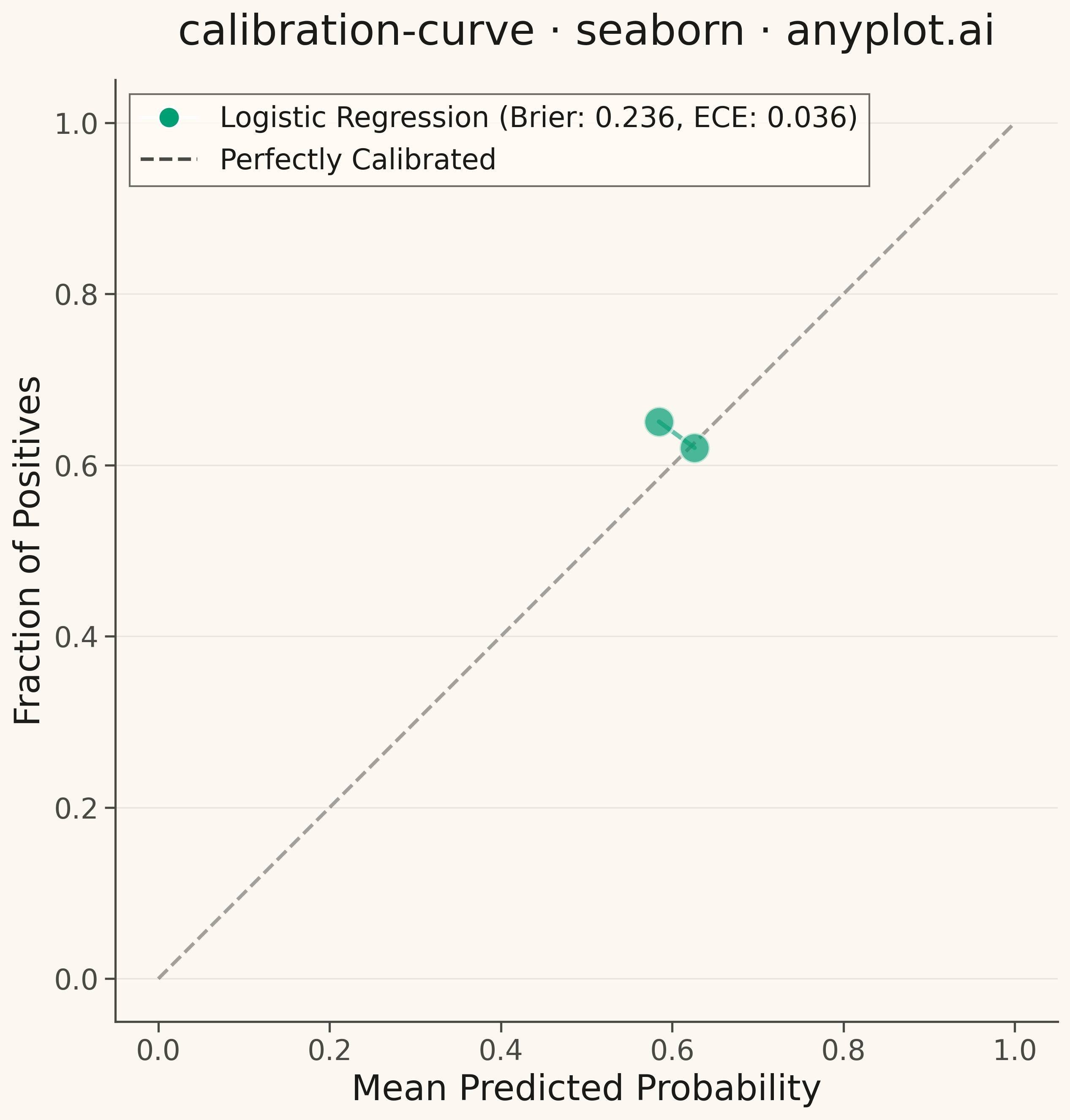
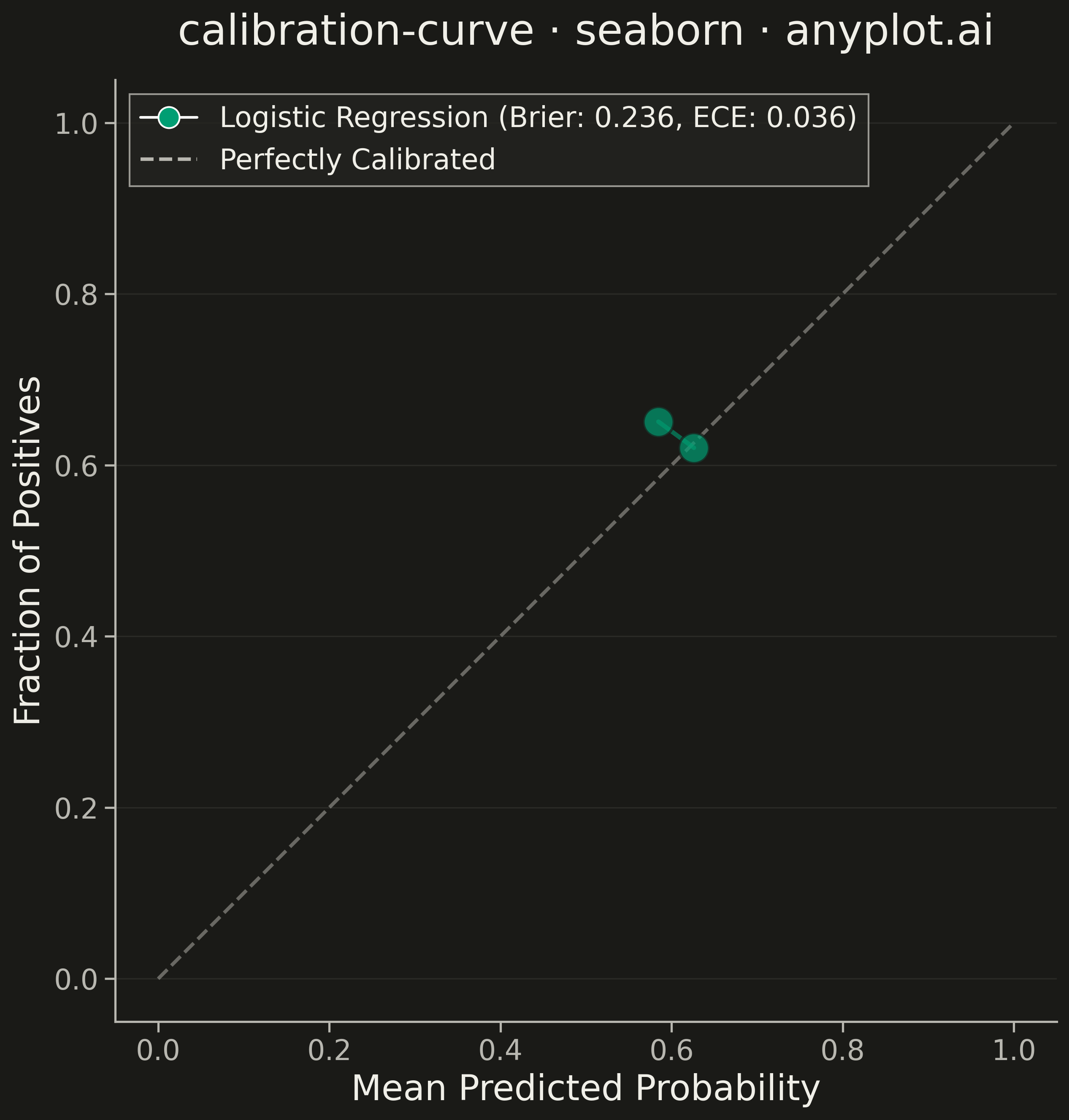
A calibration curve (reliability diagram) visualizes how well the predicted probabilities of a binary classifier match actual outcomes. By plotting the fraction of positives against mean predicted probability in binned intervals, it reveals whether a model is well-calibrated, overconfident, or underconfident. A perfectly calibrated model follows the diagonal line where predicted probability equals observed frequency.
""" anyplot.ai
calibration-curve: Calibration Curve
Library: seaborn 0.13.2 | Python 3.13.13
Quality: 87/100 | Updated: 2026-05-10
"""

import matplotlib.pyplot as plt
import numpy as np
import seaborn as sns


# Set seaborn style
sns.set_theme(style="whitegrid")

# Generate synthetic binary classification data
np.random.seed(42)
n_samples = 2000

# True labels - imbalanced for realism (35% positive class)
y_true = np.random.binomial(1, 0.35, n_samples)

# Simulate a well-calibrated classifier (predictions close to diagonal)
base_probs = y_true * 0.7 + (1 - y_true) * 0.3 + np.random.normal(0, 0.2, n_samples)
y_prob_calibrated = np.clip(base_probs, 0.01, 0.99)

# Simulate an overconfident classifier (S-shaped: below diagonal on left, above on right)
y_prob_overconfident = 1 / (1 + np.exp(-5 * (y_prob_calibrated - 0.5)))
y_prob_overconfident = np.clip(y_prob_overconfident, 0.01, 0.99)

# Simulate an underconfident classifier (inverted S: above diagonal on left, below on right)
y_prob_underconfident = 0.5 + (y_prob_calibrated - 0.5) * 0.35
y_prob_underconfident = np.clip(y_prob_underconfident, 0.01, 0.99)

# Compute calibration curves (bin predictions, compute fraction of positives)
n_bins = 10
bin_edges = np.linspace(0, 1, n_bins + 1)

# Well-calibrated model calibration curve
bin_indices_calib = np.digitize(y_prob_calibrated, bin_edges[1:-1])
prob_true_calib = [np.mean(y_true[bin_indices_calib == i]) for i in range(n_bins) if np.sum(bin_indices_calib == i) > 0]
prob_pred_calib = [
    np.mean(y_prob_calibrated[bin_indices_calib == i]) for i in range(n_bins) if np.sum(bin_indices_calib == i) > 0
]

# Overconfident model calibration curve
bin_indices_over = np.digitize(y_prob_overconfident, bin_edges[1:-1])
prob_true_over = [np.mean(y_true[bin_indices_over == i]) for i in range(n_bins) if np.sum(bin_indices_over == i) > 0]
prob_pred_over = [
    np.mean(y_prob_overconfident[bin_indices_over == i]) for i in range(n_bins) if np.sum(bin_indices_over == i) > 0
]

# Underconfident model calibration curve
bin_indices_under = np.digitize(y_prob_underconfident, bin_edges[1:-1])
prob_true_under = [np.mean(y_true[bin_indices_under == i]) for i in range(n_bins) if np.sum(bin_indices_under == i) > 0]
prob_pred_under = [
    np.mean(y_prob_underconfident[bin_indices_under == i]) for i in range(n_bins) if np.sum(bin_indices_under == i) > 0
]

# Calculate Brier scores (mean squared error of probability predictions)
brier_calib = np.mean((y_prob_calibrated - y_true) ** 2)
brier_over = np.mean((y_prob_overconfident - y_true) ** 2)
brier_under = np.mean((y_prob_underconfident - y_true) ** 2)

# Create figure with two subplots
fig, (ax1, ax2) = plt.subplots(1, 2, figsize=(16, 9), gridspec_kw={"width_ratios": [2, 1]})

# Colors: Python Blue, Python Yellow, and a third colorblind-safe color
colors = ["#306998", "#FFD43B", "#8B4513"]

# Plot calibration curves using seaborn lineplot
sns.lineplot(
    x=prob_pred_calib,
    y=prob_true_calib,
    ax=ax1,
    marker="o",
    markersize=14,
    linewidth=3,
    color=colors[0],
    label=f"Well-Calibrated (Brier: {brier_calib:.3f})",
)
sns.lineplot(
    x=prob_pred_over,
    y=prob_true_over,
    ax=ax1,
    marker="s",
    markersize=12,
    linewidth=3,
    color=colors[1],
    label=f"Overconfident (Brier: {brier_over:.3f})",
)
sns.lineplot(
    x=prob_pred_under,
    y=prob_true_under,
    ax=ax1,
    marker="^",
    markersize=12,
    linewidth=3,
    color=colors[2],
    label=f"Underconfident (Brier: {brier_under:.3f})",
)

# Diagonal reference line for perfect calibration
ax1.plot([0, 1], [0, 1], "k--", linewidth=2, alpha=0.7, label="Perfectly Calibrated")

# Styling for calibration plot
ax1.set_xlabel("Mean Predicted Probability", fontsize=20)
ax1.set_ylabel("Fraction of Positives", fontsize=20)
ax1.set_title("calibration-curve · seaborn · pyplots.ai", fontsize=24, pad=15)
ax1.tick_params(axis="both", labelsize=16)
ax1.set_xlim(-0.02, 1.02)
ax1.set_ylim(-0.02, 1.02)
ax1.legend(fontsize=14, loc="lower right")
ax1.grid(True, alpha=0.3, linestyle="--")
ax1.set_aspect("equal")

# Histogram of predicted probabilities using seaborn
sns.histplot(
    y_prob_calibrated,
    ax=ax2,
    bins=20,
    color=colors[0],
    alpha=0.5,
    label="Well-Calibrated",
    edgecolor="white",
    linewidth=0.5,
)
sns.histplot(
    y_prob_overconfident,
    ax=ax2,
    bins=20,
    color=colors[1],
    alpha=0.5,
    label="Overconfident",
    edgecolor="white",
    linewidth=0.5,
)
sns.histplot(
    y_prob_underconfident,
    ax=ax2,
    bins=20,
    color=colors[2],
    alpha=0.5,
    label="Underconfident",
    edgecolor="white",
    linewidth=0.5,
)

# Styling for histogram
ax2.set_xlabel("Predicted Probability", fontsize=20)
ax2.set_ylabel("Count", fontsize=20)
ax2.set_title("Prediction Distribution", fontsize=22, pad=15)
ax2.tick_params(axis="both", labelsize=16)
ax2.legend(fontsize=12, loc="upper right")
ax2.grid(True, alpha=0.3, linestyle="--")

plt.tight_layout()
plt.savefig("plot.png", dpi=300, bbox_inches="tight")
Runnable source as JSON, for any HTTP client: https://api.anyplot.ai/specs/calibration-curve/seaborn/code. Any spec id and library id listed in llms-full.txt fit the same URL shape; every URL below is complete and callable.
{
  "spec_id": "calibration-curve",
  "language": "python",
  "library": "seaborn",
  "page": "https://anyplot.ai/calibration-curve/python/seaborn",
  "hub": "https://anyplot.ai/calibration-curve",
  "code_json": "https://api.anyplot.ai/specs/calibration-curve/seaborn/code",
  "spec_json": "https://api.anyplot.ai/specs/calibration-curve",
  "render_light_png": "https://storage.googleapis.com/anyplot-images/plots/calibration-curve/python/seaborn/plot-light.png",
  "render_dark_png": "https://storage.googleapis.com/anyplot-images/plots/calibration-curve/python/seaborn/plot-dark.png",
  "quality_score": 87.0,
  "license": "MIT",
  "guide": "https://anyplot.ai/llms.txt"
}
Part of Calibration Curve on anyplot.ai.