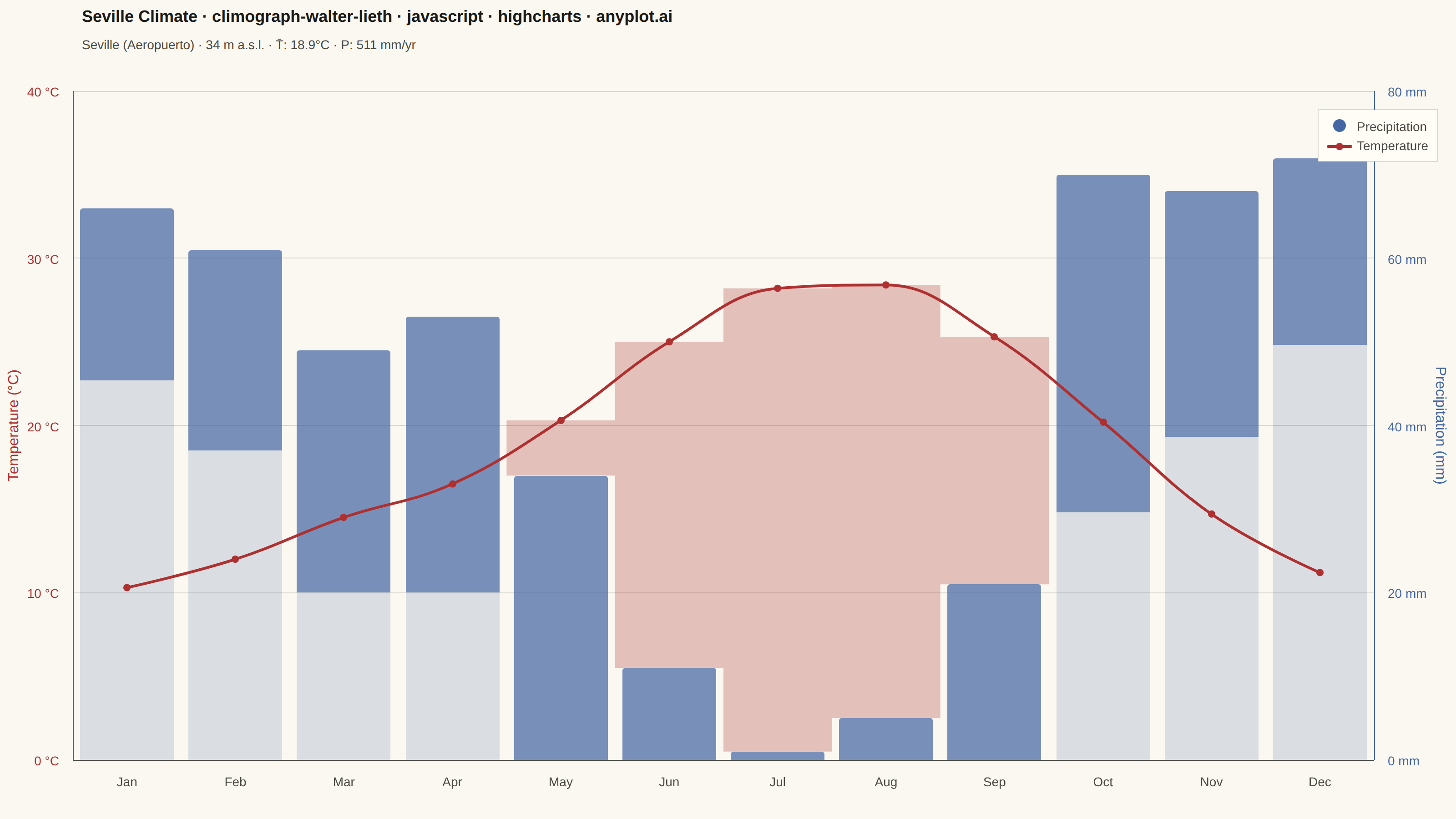
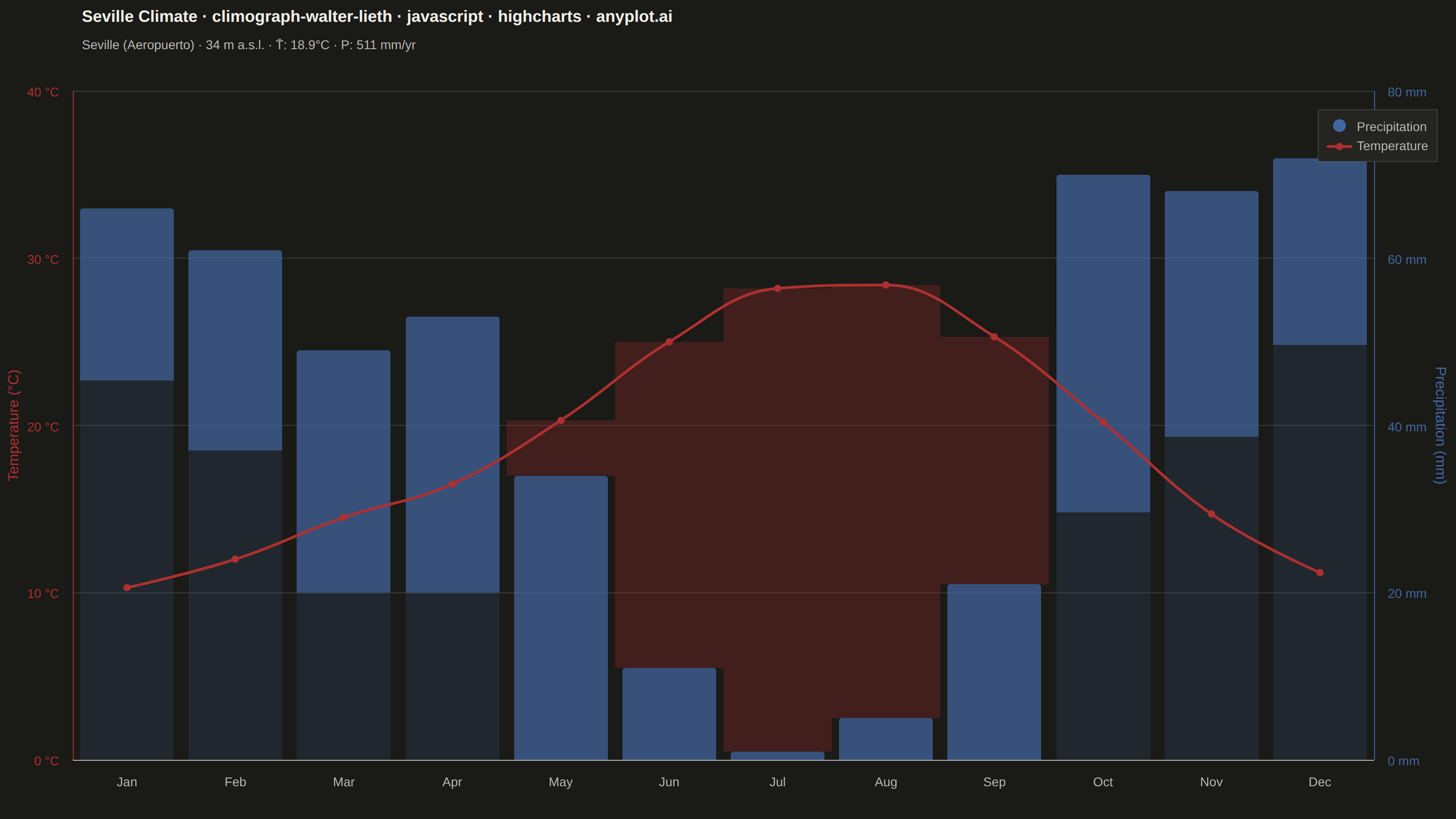
A Walter-Lieth climate diagram (climograph) is the canonical visualization of a location's annual climate, plotting monthly mean temperature and monthly precipitation over the twelve months on a single panel. It uses the classic 1:2 axis-scaling convention where 10 °C on the temperature axis aligns with 20 mm on the precipitation axis, so the relationship between the two curves directly reveals water availability: where precipitation exceeds the temperature curve the period is humid (filled blue/hatched), and where the temperature curve rises above precipitation the period is arid (filled red/dotted). A header carries station metadata and annual means, while frost indicators along the baseline mark cold months.
// anyplot.ai
// climograph-walter-lieth: Walter-Lieth Climate Diagram
// Library: highcharts 12.6.0 | JavaScript 22.22.3
// Quality: 85/100 | Created: 2026-06-15

//# anyplot-orientation: landscape

const t = window.ANYPLOT_TOKENS;

// --- Data: Seville climate normals (1991–2020) --------------------------------
// Classic Mediterranean station with pronounced summer arid period
const months = ["Jan", "Feb", "Mar", "Apr", "May", "Jun",
                "Jul", "Aug", "Sep", "Oct", "Nov", "Dec"];

const temperature   = [10.3, 12.0, 14.5, 16.5, 20.3, 25.0, 28.2, 28.4, 25.3, 20.2, 14.7, 11.2];
const precipitation = [66,   61,   49,   53,   34,   11,    1,    5,   21,   70,   68,   72];

const stationName       = "Seville (Aeropuerto)";
const elevation         = 34;
const annualMeanTemp    = 18.9;
const annualPrecipTotal = 511;

// Walter-Lieth scaling: 10 °C ≡ 20 mm → right-axis max = 2 × left-axis max
// Humid:  P > T×2  →  lighter-blue top stacked segment (humid excess above T×2 line)
// Arid:   T×2 > P  →  red SVG fill between temperature line and precipitation bar top

// Semantic colors follow universal meteorological convention for Walter-Lieth diagrams
const PRECIP_COLOR = t.palette[2];  // "#4467A3" — Imprint blue (precipitation)
const TEMP_COLOR   = t.palette[4];  // "#AE3030" — Imprint matte-red (temperature)

const titleText = "Seville Climate · climograph-walter-lieth · javascript · highcharts · anyplot.ai";
const titleFs   = Math.max(14, Math.round(22 * 67 / titleText.length));

// Split precipitation into stacked columns that expose the humid/arid boundary.
// Bottom segment: the portion up to the T×2 threshold (present in all months).
// Top segment: the "humid excess" above T×2 (non-zero only in humid months).
const precipBase  = temperature.map((temp, i) => Math.min(precipitation[i], temp * 2));
const precipHumid = precipitation.map((p, i)  => Math.max(0, p - temperature[i] * 2));

// Draw arid SVG fills (red, between temperature line and small bars in summer)
// and frost-period indicators at the 0 °C baseline.
// Arid fills render in the empty space above the summer bars — no z-index issues.
function drawOverlays(chart) {
  if (chart.wlOverlayGroup) chart.wlOverlayGroup.destroy();
  chart.wlOverlayGroup = chart.renderer.g().attr({ zIndex: 2 }).add();

  const xAxis      = chart.xAxis[0];
  const tempAxis   = chart.yAxis[0];   // left: 0–40 °C
  const precipAxis = chart.yAxis[1];   // right: 0–80 mm

  // Pixel step between adjacent category centers (equals the category cell width)
  const step = xAxis.toPixels(1, false) - xAxis.toPixels(0, false);

  // Arid fills: red rectangle from precipitation bar top up to temperature line.
  // Both axes share proportional range (0–40 °C ↔ 0–80 mm), so pixel Y is comparable.
  for (let i = 0; i < 12; i++) {
    if (precipitation[i] >= temperature[i] * 2) continue;  // skip humid months
    const cx  = xAxis.toPixels(i, false);
    const tY  = tempAxis.toPixels(temperature[i], false);   // temperature line (higher on screen)
    const pY  = precipAxis.toPixels(precipitation[i], false); // bar top (lower on screen)
    chart.renderer
      .path(['M', cx - step / 2, tY, 'L', cx + step / 2, tY,
             'L', cx + step / 2, pY, 'L', cx - step / 2, pY, 'Z'])
      .attr({ fill: TEMP_COLOR, 'fill-opacity': 0.28 })
      .add(chart.wlOverlayGroup);
  }

  // Frost-period indicators: solid colored band at the 0 °C baseline for months
  // with mean temperature below 0 °C. Seville has none; structure required by spec.
  const baseY = tempAxis.toPixels(0, false);
  for (let i = 0; i < 12; i++) {
    if (temperature[i] >= 0) continue;
    const cx = xAxis.toPixels(i, false);
    chart.renderer
      .rect(cx - step / 2, baseY, step, 12)
      .attr({ fill: PRECIP_COLOR, 'fill-opacity': 0.65 })
      .add(chart.wlOverlayGroup);
  }
}

// --- Chart -------------------------------------------------------------------
Highcharts.chart("container", {
  chart: {
    backgroundColor: "transparent",
    animation: false,
    style: { fontFamily: "inherit" },
    marginTop: 100,
    marginBottom: 65,
    marginLeft: 80,
    marginRight: 90,
    plotBorderWidth: 0,
    events: {
      render: function () { drawOverlays(this); },
    },
  },
  credits: { enabled: false },

  title: {
    text: titleText,
    align: "left",
    x: 80,
    style: { color: t.ink, fontSize: `${titleFs}px`, fontWeight: "600" },
  },

  subtitle: {
    text: `${stationName}  ·  ${elevation} m a.s.l.  ·  T̄: ${annualMeanTemp}°C  ·  P: ${annualPrecipTotal} mm/yr`,
    align: "left",
    x: 80,
    y: 44,
    style: { color: t.inkSoft, fontSize: "14px" },
  },

  xAxis: {
    categories: months,
    lineColor: t.inkSoft,
    tickColor: t.inkSoft,
    labels: { style: { color: t.inkSoft, fontSize: "14px" } },
    crosshair: false,
  },

  yAxis: [
    // Left: Temperature (°C)
    {
      id: "temp",
      title: {
        text: "Temperature (°C)",
        style: { color: TEMP_COLOR, fontSize: "16px" },
      },
      labels: {
        format: "{value} °C",
        style: { color: TEMP_COLOR, fontSize: "14px" },
      },
      tickPositions: [0, 10, 20, 30, 40],
      min: 0,
      max: 40,
      lineColor: TEMP_COLOR,
      lineWidth: 1,
      gridLineColor: t.grid,
      gridLineWidth: 1,
    },
    // Right: Precipitation (mm) — 2:1 scale relative to temperature axis
    {
      id: "precip",
      title: {
        text: "Precipitation (mm)",
        style: { color: PRECIP_COLOR, fontSize: "16px" },
      },
      labels: {
        format: "{value} mm",
        style: { color: PRECIP_COLOR, fontSize: "14px" },
      },
      tickPositions: [0, 20, 40, 60, 80],
      min: 0,
      max: 80,
      opposite: true,
      lineColor: PRECIP_COLOR,
      lineWidth: 1,
      gridLineWidth: 0,
    },
  ],

  legend: {
    enabled: true,
    align: "right",
    verticalAlign: "top",
    layout: "vertical",
    x: -10,
    y: 110,
    itemStyle: { color: t.inkSoft, fontSize: "14px" },
    itemHoverStyle: { color: t.ink },
    symbolWidth: 28,
    backgroundColor: t.elevatedBg,
    borderColor: t.grid,
    borderWidth: 1,
    padding: 10,
  },

  plotOptions: {
    series: { animation: false },
    column: {
      stacking: "normal",
      borderWidth: 0,
      groupPadding: 0.05,
      pointPadding: 0.02,
    },
    spline: {
      lineWidth: 3,
      marker: {
        enabled: true,
        radius: 4,
        symbol: "circle",
        lineWidth: 1.5,
        lineColor: "transparent",
      },
    },
  },

  series: [
    // Bottom segment: precipitation up to the T×2 threshold (always present)
    {
      type: "column",
      name: "Precipitation",
      data: precipBase,
      color: PRECIP_COLOR,
      opacity: 0.85,
      yAxis: 1,
      zIndex: 1,
    },
    // Top segment: humid excess above the T×2 line (non-zero only in humid months)
    // Shown at lower opacity so the two segments are visually distinct
    {
      type: "column",
      name: "Humid excess",
      data: precipHumid,
      color: PRECIP_COLOR,
      opacity: 0.42,
      yAxis: 1,
      zIndex: 1,
      showInLegend: false,
      linkedTo: ":previous",
    },
    {
      type: "spline",
      name: "Temperature",
      data: temperature,
      color: TEMP_COLOR,
      yAxis: 0,
      zIndex: 3,
      marker: { fillColor: TEMP_COLOR, lineColor: "transparent" },
    },
  ],
});
Runnable source as JSON, for any HTTP client: https://api.anyplot.ai/specs/climograph-walter-lieth/highcharts/code. Any spec id and library id listed in llms-full.txt fit the same URL shape; every URL below is complete and callable.
{
  "spec_id": "climograph-walter-lieth",
  "language": "javascript",
  "library": "highcharts",
  "page": "https://anyplot.ai/climograph-walter-lieth/javascript/highcharts",
  "hub": "https://anyplot.ai/climograph-walter-lieth",
  "code_json": "https://api.anyplot.ai/specs/climograph-walter-lieth/highcharts/code",
  "spec_json": "https://api.anyplot.ai/specs/climograph-walter-lieth",
  "render_light_png": "https://storage.googleapis.com/anyplot-images/plots/climograph-walter-lieth/javascript/highcharts/plot-light.png",
  "render_dark_png": "https://storage.googleapis.com/anyplot-images/plots/climograph-walter-lieth/javascript/highcharts/plot-dark.png",
  "interactive_light_html": "https://storage.googleapis.com/anyplot-images/plots/climograph-walter-lieth/javascript/highcharts/plot-light.html",
  "interactive_dark_html": "https://storage.googleapis.com/anyplot-images/plots/climograph-walter-lieth/javascript/highcharts/plot-dark.html",
  "quality_score": 85.0,
  "license": "MIT",
  "guide": "https://anyplot.ai/llms.txt"
}
Part of Walter-Lieth Climate Diagram on anyplot.ai.