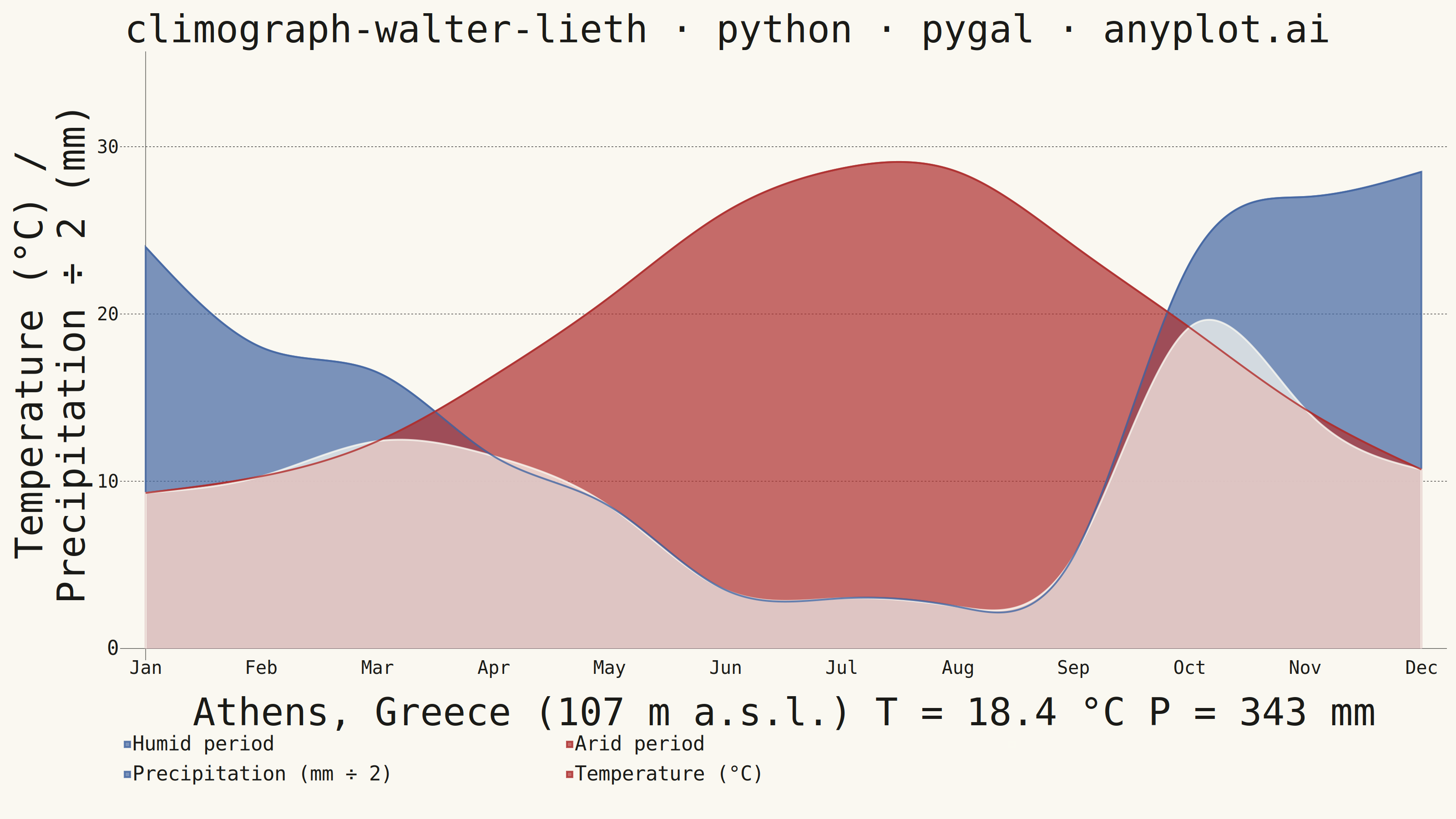
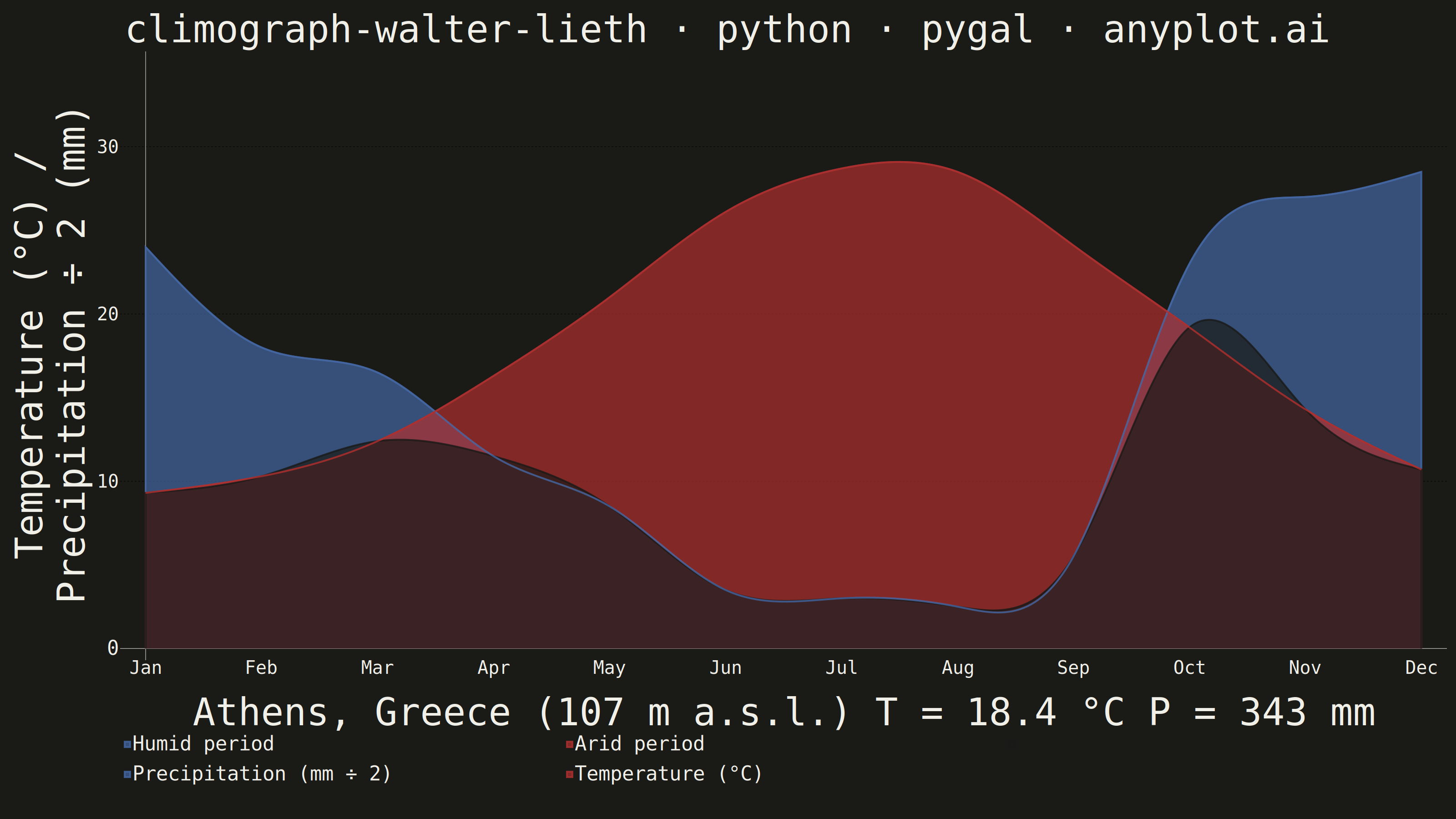
A Walter-Lieth climate diagram (climograph) is the canonical visualization of a location's annual climate, plotting monthly mean temperature and monthly precipitation over the twelve months on a single panel. It uses the classic 1:2 axis-scaling convention where 10 °C on the temperature axis aligns with 20 mm on the precipitation axis, so the relationship between the two curves directly reveals water availability: where precipitation exceeds the temperature curve the period is humid (filled blue/hatched), and where the temperature curve rises above precipitation the period is arid (filled red/dotted). A header carries station metadata and annual means, while frost indicators along the baseline mark cold months.
""" anyplot.ai
climograph-walter-lieth: Walter-Lieth Climate Diagram
Library: pygal 3.1.0 | Python 3.13.13
Quality: 85/100 | Created: 2026-06-15
"""

import os
import sys


# Prevent the local pygal.py from shadowing the installed pygal package
_script_dir = os.path.dirname(os.path.abspath(__file__))
if _script_dir in sys.path:
    sys.path.remove(_script_dir)

import pygal
from pygal.style import Style


# Theme tokens
THEME = os.getenv("ANYPLOT_THEME", "light")
PAGE_BG = "#FAF8F1" if THEME == "light" else "#1A1A17"
INK = "#1A1A17" if THEME == "light" else "#F0EFE8"
INK_MUTED = "#6B6A63" if THEME == "light" else "#A8A79F"

# Semantic color exception: precipitation = blue (water), temperature = red (heat)
PRECIP_COLOR = "#4467A3"
TEMP_COLOR = "#AE3030"

# Station: Athens, Greece — Mediterranean Csa (1991-2020 normals)
station = "Athens, Greece"
elevation = 107
months = ["Jan", "Feb", "Mar", "Apr", "May", "Jun", "Jul", "Aug", "Sep", "Oct", "Nov", "Dec"]
temp_c = [9.3, 10.3, 12.4, 16.3, 21.0, 26.1, 28.7, 28.5, 24.1, 19.2, 14.3, 10.7]
precip_mm = [48, 36, 33, 23, 17, 7, 6, 5, 11, 46, 54, 57]

temp_annual = round(sum(temp_c) / 12, 1)
precip_annual = sum(precip_mm)

# Walter-Lieth: 10 °C = 20 mm → scale precipitation onto the temperature axis
precip_scaled = [p / 2 for p in precip_mm]

# Overlap base: the region below BOTH curves gets no fill (masked with background)
base = [min(p, t) for p, t in zip(precip_scaled, temp_c, strict=True)]

title_str = "climograph-walter-lieth · python · pygal · anyplot.ai"
station_meta = f"{station} ({elevation} m a.s.l.)   T = {temp_annual} °C   P = {precip_annual} mm"

title_fs = max(44, round(66 * 67 / len(title_str)))

# Colors tuple ordered by series add() sequence:
# 1. PRECIP_COLOR — humid fill (blue, bottom layer)
# 2. TEMP_COLOR   — arid fill  (red, covers blue where temp > precip)
# 3. PAGE_BG      — background mask (hides fill in overlap region 0→min)
# 4. PRECIP_COLOR — precipitation outline line
# 5. TEMP_COLOR   — temperature outline line
colors_tuple = (PRECIP_COLOR, TEMP_COLOR, PAGE_BG, PRECIP_COLOR, TEMP_COLOR)

custom_style = Style(
    background=PAGE_BG,
    plot_background=PAGE_BG,
    foreground=INK,
    foreground_strong=INK,
    foreground_subtle=INK_MUTED,
    colors=colors_tuple,
    title_font_size=title_fs,
    label_font_size=40,
    major_label_font_size=44,
    legend_font_size=44,
    value_font_size=0,
    stroke_width=4.0,
)

chart = pygal.Line(
    width=3200,
    height=1800,
    style=custom_style,
    title=title_str,
    x_title=station_meta,
    y_title="Temperature (°C)  /  Precipitation ÷ 2 (mm)",
    show_legend=True,
    legend_at_bottom=True,
    fill=False,
    show_x_guides=False,
    show_y_guides=True,
    interpolate="cubic",
    dots_size=0,
    range=(0, 35),
)

chart.x_labels = months
chart.y_labels = [0, 10, 20, 30]

# Differential fill — 3-layer stacking trick:
#   Layer 1 (blue, bottom): 0 → precip_scaled everywhere
#   Layer 2 (red, on top):  0 → temp_c everywhere (covers blue where temp > precip)
#   Layer 3 (bg mask, top): 0 → min(precip, temp) — erases fill in the shared base region
# Net result: blue between temp and precip/2 (humid), red between precip/2 and temp (arid)
chart.add("Humid period", precip_scaled, fill=True, stroke_style={"width": 0})
chart.add("Arid period", temp_c, fill=True, stroke_style={"width": 0})
chart.add(" ", base, fill=True, stroke_style={"width": 0})

# Outline lines rendered on top of fills
chart.add("Precipitation (mm ÷ 2)", precip_scaled, fill=False, stroke_style={"width": 4})
chart.add("Temperature (°C)", temp_c, fill=False, stroke_style={"width": 6})

chart.render_to_png(f"plot-{THEME}.png")
with open(f"plot-{THEME}.html", "wb") as f:
    f.write(chart.render())
Runnable source as JSON, for any HTTP client: https://api.anyplot.ai/specs/climograph-walter-lieth/pygal/code. Any spec id and library id listed in llms-full.txt fit the same URL shape; every URL below is complete and callable.
{
  "spec_id": "climograph-walter-lieth",
  "language": "python",
  "library": "pygal",
  "page": "https://anyplot.ai/climograph-walter-lieth/python/pygal",
  "hub": "https://anyplot.ai/climograph-walter-lieth",
  "code_json": "https://api.anyplot.ai/specs/climograph-walter-lieth/pygal/code",
  "spec_json": "https://api.anyplot.ai/specs/climograph-walter-lieth",
  "render_light_png": "https://storage.googleapis.com/anyplot-images/plots/climograph-walter-lieth/python/pygal/plot-light.png",
  "render_dark_png": "https://storage.googleapis.com/anyplot-images/plots/climograph-walter-lieth/python/pygal/plot-dark.png",
  "interactive_light_html": "https://storage.googleapis.com/anyplot-images/plots/climograph-walter-lieth/python/pygal/plot-light.html",
  "interactive_dark_html": "https://storage.googleapis.com/anyplot-images/plots/climograph-walter-lieth/python/pygal/plot-dark.html",
  "quality_score": 85.0,
  "license": "MIT",
  "guide": "https://anyplot.ai/llms.txt"
}
Part of Walter-Lieth Climate Diagram on anyplot.ai.