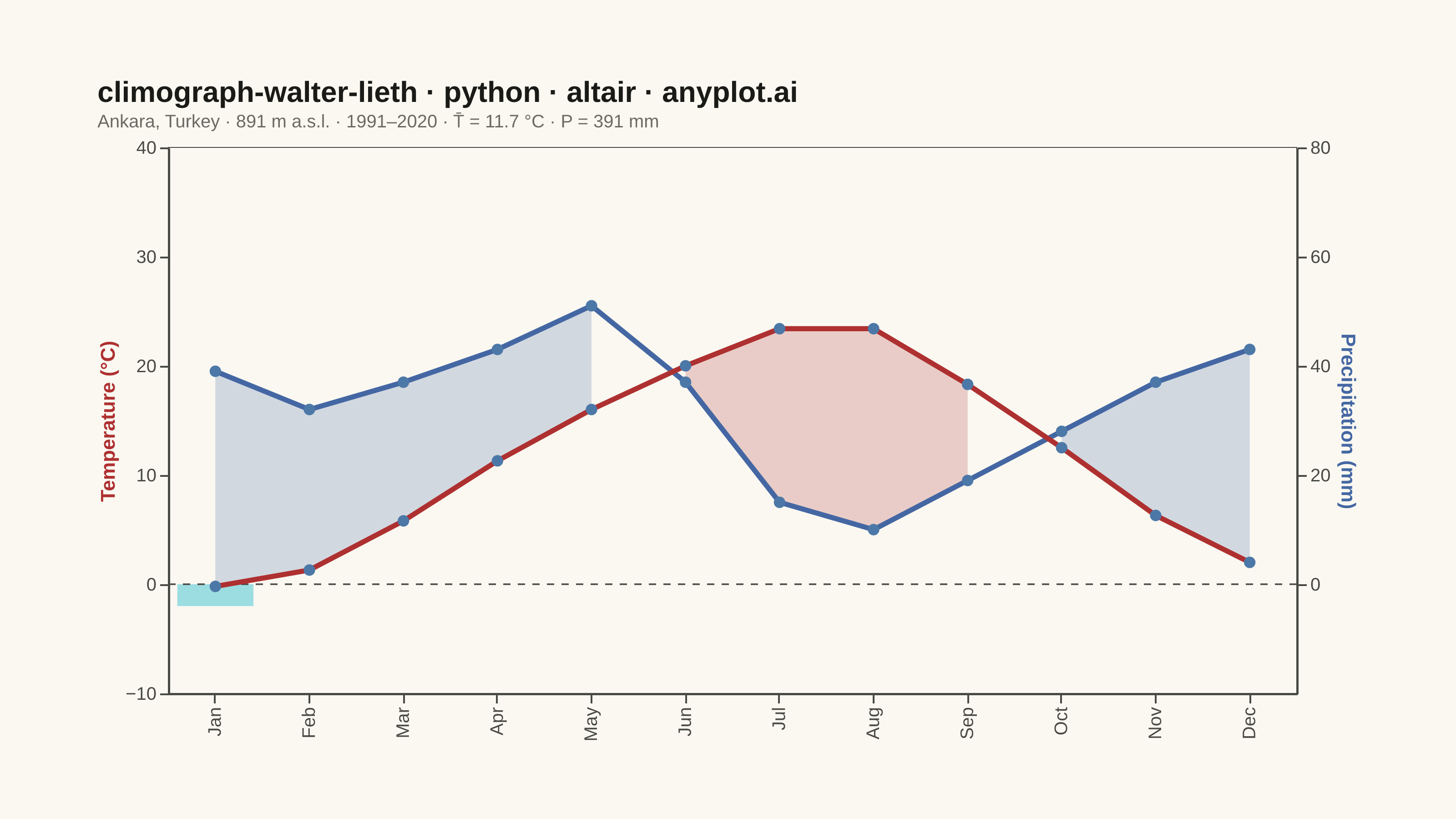
A Walter-Lieth climate diagram (climograph) is the canonical visualization of a location's annual climate, plotting monthly mean temperature and monthly precipitation over the twelve months on a single panel. It uses the classic 1:2 axis-scaling convention where 10 °C on the temperature axis aligns with 20 mm on the precipitation axis, so the relationship between the two curves directly reveals water availability: where precipitation exceeds the temperature curve the period is humid (filled blue/hatched), and where the temperature curve rises above precipitation the period is arid (filled red/dotted). A header carries station metadata and annual means, while frost indicators along the baseline mark cold months.
""" anyplot.ai
climograph-walter-lieth: Walter-Lieth Climate Diagram
Library: altair 6.2.1 | Python 3.13.13
Quality: 86/100 | Created: 2026-06-15
"""

import importlib
import os
import sys


# Drop script directory from sys.path so `altair` resolves to the package, not this file
sys.path[:] = [p for p in sys.path if os.path.abspath(p or ".") != os.path.dirname(os.path.abspath(__file__))]
alt = importlib.import_module("altair")
np = importlib.import_module("numpy")
pd = importlib.import_module("pandas")
Image = importlib.import_module("PIL.Image")

# Theme tokens — Imprint palette chrome
THEME = os.getenv("ANYPLOT_THEME", "light")

# Theme-conditional fill opacities — dark background needs higher opacity for visibility
ARID_OPACITY = 0.45 if THEME == "dark" else 0.22
HUMID_OPACITY = 0.40 if THEME == "dark" else 0.22
PAGE_BG = "#FAF8F1" if THEME == "light" else "#1A1A17"
ELEVATED_BG = "#FFFDF6" if THEME == "light" else "#242420"
INK = "#1A1A17" if THEME == "light" else "#F0EFE8"
INK_SOFT = "#4A4A44" if THEME == "light" else "#B8B7B0"
INK_MUTED = "#6B6A63" if THEME == "light" else "#A8A79F"

# Semantic colour assignments (Walter-Lieth convention)
# Imprint position 5 (matte red) — temperature/heat
TEMP_COLOR = "#AE3030"
# Imprint position 3 (blue) — precipitation/water
PRECIP_COLOR = "#4467A3"
# Imprint position 6 (cyan) — frost/ice
FROST_COLOR = "#2ABCCD"

# Station: Ankara, Turkey — climate normals 1991–2020
STATION = "Ankara, Turkey"
ELEVATION = 891
PERIOD = "1991–2020"
MONTHS = ["Jan", "Feb", "Mar", "Apr", "May", "Jun", "Jul", "Aug", "Sep", "Oct", "Nov", "Dec"]

temp_vals = np.array([-0.2, 1.3, 5.8, 11.3, 16.0, 20.0, 23.4, 23.4, 18.3, 12.5, 6.3, 2.0])
precip_vals = np.array([39, 32, 37, 43, 51, 37, 15, 10, 19, 28, 37, 43])

annual_temp = round(float(np.mean(temp_vals)), 1)
annual_precip = int(np.sum(precip_vals))

# Walter-Lieth: 10 °C ↔ 20 mm — divide precip by 2 for temp-scale comparison
precip_t = precip_vals / 2.0
PERHUMID_THRESH = 50.0  # °C-equiv of 100 mm

# Y-axis domains (1:2 ratio enforced between temp and precip axes)
TEMP_MIN, TEMP_MAX = -10, 40
PRECIP_MIN, PRECIP_MAX = -20, 80  # exactly 2× temp domain

# Build DataFrame
df = pd.DataFrame({"month": MONTHS, "temp": temp_vals, "precip": precip_vals.astype(float), "precip_t": precip_t})

# Fill zones in temperature-equivalent units
arid_mask = df["temp"] > df["precip_t"]
humid_mask = df["precip_t"] > df["temp"]
perhumid_mask = df["precip_t"] > PERHUMID_THRESH

df["arid_top"] = np.where(arid_mask, df["temp"], np.nan)
df["arid_bot"] = np.where(arid_mask, df["precip_t"], np.nan)
df["humid_top"] = np.where(humid_mask, np.minimum(df["precip_t"], PERHUMID_THRESH), np.nan)
df["humid_bot"] = np.where(humid_mask, df["temp"], np.nan)
df["phum_top"] = np.where(perhumid_mask, df["precip_t"], np.nan)
df["phum_bot"] = np.where(perhumid_mask, PERHUMID_THRESH, np.nan)
# Frost indicator with minimum visual height (2 °C) so near-zero months remain legible
FROST_MIN_H = 2.0
df["frost_top"] = np.where(df["temp"] < 0, 0.0, np.nan)
df["frost_bot"] = np.where(df["temp"] < 0, np.minimum(df["temp"], -FROST_MIN_H), np.nan)

# Scales
temp_scale = alt.Scale(domain=[TEMP_MIN, TEMP_MAX])
precip_scale = alt.Scale(domain=[PRECIP_MIN, PRECIP_MAX])

# Shared x encoding
x_enc = alt.X(
    "month:O",
    sort=MONTHS,
    axis=alt.Axis(title=None, labelFontSize=10, labelColor=INK_SOFT, domainColor=INK_SOFT, tickColor=INK_SOFT),
)

# Left Y-axis — defined by the temperature-line layer
left_axis = alt.Axis(
    title="Temperature (°C)",
    titleColor=TEMP_COLOR,
    orient="left",
    labelColor=INK_SOFT,
    domainColor=INK_SOFT,
    tickColor=INK_SOFT,
    gridColor=INK,
    gridOpacity=0.1,
    values=[-10, 0, 10, 20, 30, 40],
    labelFontSize=10,
    titleFontSize=11,
)

# Right Y-axis — defined by the invisible anchor layer
right_axis = alt.Axis(
    title="Precipitation (mm)",
    titleColor=PRECIP_COLOR,
    orient="right",
    labelColor=INK_SOFT,
    domainColor=INK_SOFT,
    tickColor=INK_SOFT,
    gridOpacity=0,
    values=[0, 20, 40, 60, 80],
    labelFontSize=10,
    titleFontSize=11,
)

base = alt.Chart(df)

# Frost indicator — cyan bars below 0 °C for frost months
frost_fill = base.mark_bar(color=FROST_COLOR, opacity=0.45, width={"band": 0.9}).encode(
    x=x_enc, y=alt.Y("frost_bot:Q", scale=temp_scale, axis=None), y2=alt.Y2("frost_top:Q")
)

# Arid fill — red area between temperature (top) and precip_t (bottom)
arid_fill = base.mark_area(color=TEMP_COLOR, opacity=ARID_OPACITY).encode(
    x=x_enc, y=alt.Y("arid_bot:Q", scale=temp_scale, axis=None), y2=alt.Y2("arid_top:Q")
)

# Humid fill — blue area between precip_t (top) and temperature (bottom), ≤ 100 mm
humid_fill = base.mark_area(color=PRECIP_COLOR, opacity=HUMID_OPACITY).encode(
    x=x_enc, y=alt.Y("humid_bot:Q", scale=temp_scale, axis=None), y2=alt.Y2("humid_top:Q")
)

# Perhumid fill — solid blue area above 100 mm threshold (compressed scale zone)
phum_fill = base.mark_area(color=PRECIP_COLOR, opacity=0.65).encode(
    x=x_enc, y=alt.Y("phum_bot:Q", scale=temp_scale, axis=None), y2=alt.Y2("phum_top:Q")
)

# 0 °C reference line
zero_rule = (
    alt.Chart(pd.DataFrame({"y": [0.0]}))
    .mark_rule(color=INK_SOFT, strokeWidth=0.9, strokeDash=[4, 4])
    .encode(y=alt.Y("y:Q", scale=temp_scale, axis=None))
)

# Precipitation curve drawn on temperature-equivalent scale
precip_line = base.mark_line(color=PRECIP_COLOR, strokeWidth=2.8, point=alt.OverlayMarkDef(size=40)).encode(
    x=x_enc,
    y=alt.Y("precip_t:Q", scale=temp_scale, axis=None),
    tooltip=[alt.Tooltip("month:O", title="Month"), alt.Tooltip("precip:Q", title="Precipitation (mm)", format=".0f")],
)

# Temperature curve — also anchors the left Y-axis definition
temp_line = base.mark_line(color=TEMP_COLOR, strokeWidth=2.8, point=alt.OverlayMarkDef(size=40)).encode(
    x=x_enc,
    y=alt.Y("temp:Q", scale=temp_scale, axis=left_axis),
    tooltip=[alt.Tooltip("month:O", title="Month"), alt.Tooltip("temp:Q", title="Temperature (°C)", format=".1f")],
)

# Invisible layer that anchors the right precipitation axis
right_layer = base.mark_point(opacity=0, size=0).encode(
    x=x_enc, y=alt.Y("precip:Q", scale=precip_scale, axis=right_axis)
)

# Title
title_str = "climograph-walter-lieth · python · altair · anyplot.ai"
n_chars = len(title_str)
title_fs = round(16 * min(1.0, 67 / n_chars))
subtitle_str = f"{STATION}  ·  {ELEVATION} m a.s.l.  ·  {PERIOD}  ·  T̄ = {annual_temp} °C  ·  P = {annual_precip} mm"

# Flat layer: all temp-scale layers use axis=None (except temp_line which defines
# the left Y-axis); right_layer carries the independent right Y-axis.
# resolve_scale(y='independent') gives each layer its own Y scale — layers with
# axis=None show nothing; only temp_line (left) and right_layer (right) show axes.
chart = (
    alt.layer(frost_fill, arid_fill, humid_fill, phum_fill, zero_rule, precip_line, temp_line, right_layer)
    .resolve_scale(y="independent")
    .properties(
        width=620,
        height=300,
        background=PAGE_BG,
        title=alt.Title(
            text=title_str,
            subtitle=subtitle_str,
            fontSize=title_fs,
            subtitleFontSize=10,
            color=INK,
            subtitleColor=INK_MUTED,
            anchor="start",
        ),
    )
    .configure_view(fill=PAGE_BG, stroke=INK_SOFT, strokeWidth=0.5)
    .configure_axis(labelColor=INK_SOFT, titleColor=INK, domainColor=INK_SOFT, tickColor=INK_SOFT)
    .configure_legend(fillColor=ELEVATED_BG, strokeColor=INK_SOFT, labelColor=INK_SOFT, titleColor=INK)
)

# Save — pad to exact 3200 × 1800 target
TW, TH = 3200, 1800
chart.save(f"plot-{THEME}.png", scale_factor=4.0)

_img = Image.open(f"plot-{THEME}.png").convert("RGB")
_w, _h = _img.size
if _w > TW or _h > TH:
    raise SystemExit(
        f"altair vl-convert produced {_w}×{_h}, exceeds target {TW}×{TH}. "
        f"Shrink chart .properties(width=, height=) values and re-render."
    )
if _w < TW or _h < TH:
    _canvas = Image.new("RGB", (TW, TH), PAGE_BG)
    _canvas.paste(_img, ((TW - _w) // 2, (TH - _h) // 2))
    _canvas.save(f"plot-{THEME}.png")

chart.save(f"plot-{THEME}.html")
Runnable source as JSON, for any HTTP client: https://api.anyplot.ai/specs/climograph-walter-lieth/altair/code. Any spec id and library id listed in llms-full.txt fit the same URL shape; every URL below is complete and callable.
{
  "spec_id": "climograph-walter-lieth",
  "language": "python",
  "library": "altair",
  "page": "https://anyplot.ai/climograph-walter-lieth/python/altair",
  "hub": "https://anyplot.ai/climograph-walter-lieth",
  "code_json": "https://api.anyplot.ai/specs/climograph-walter-lieth/altair/code",
  "spec_json": "https://api.anyplot.ai/specs/climograph-walter-lieth",
  "render_light_png": "https://storage.googleapis.com/anyplot-images/plots/climograph-walter-lieth/python/altair/plot-light.png",
  "render_dark_png": "https://storage.googleapis.com/anyplot-images/plots/climograph-walter-lieth/python/altair/plot-dark.png",
  "interactive_light_html": "https://storage.googleapis.com/anyplot-images/plots/climograph-walter-lieth/python/altair/plot-light.html",
  "interactive_dark_html": "https://storage.googleapis.com/anyplot-images/plots/climograph-walter-lieth/python/altair/plot-dark.html",
  "quality_score": 86.0,
  "license": "MIT",
  "guide": "https://anyplot.ai/llms.txt"
}
Part of Walter-Lieth Climate Diagram on anyplot.ai.