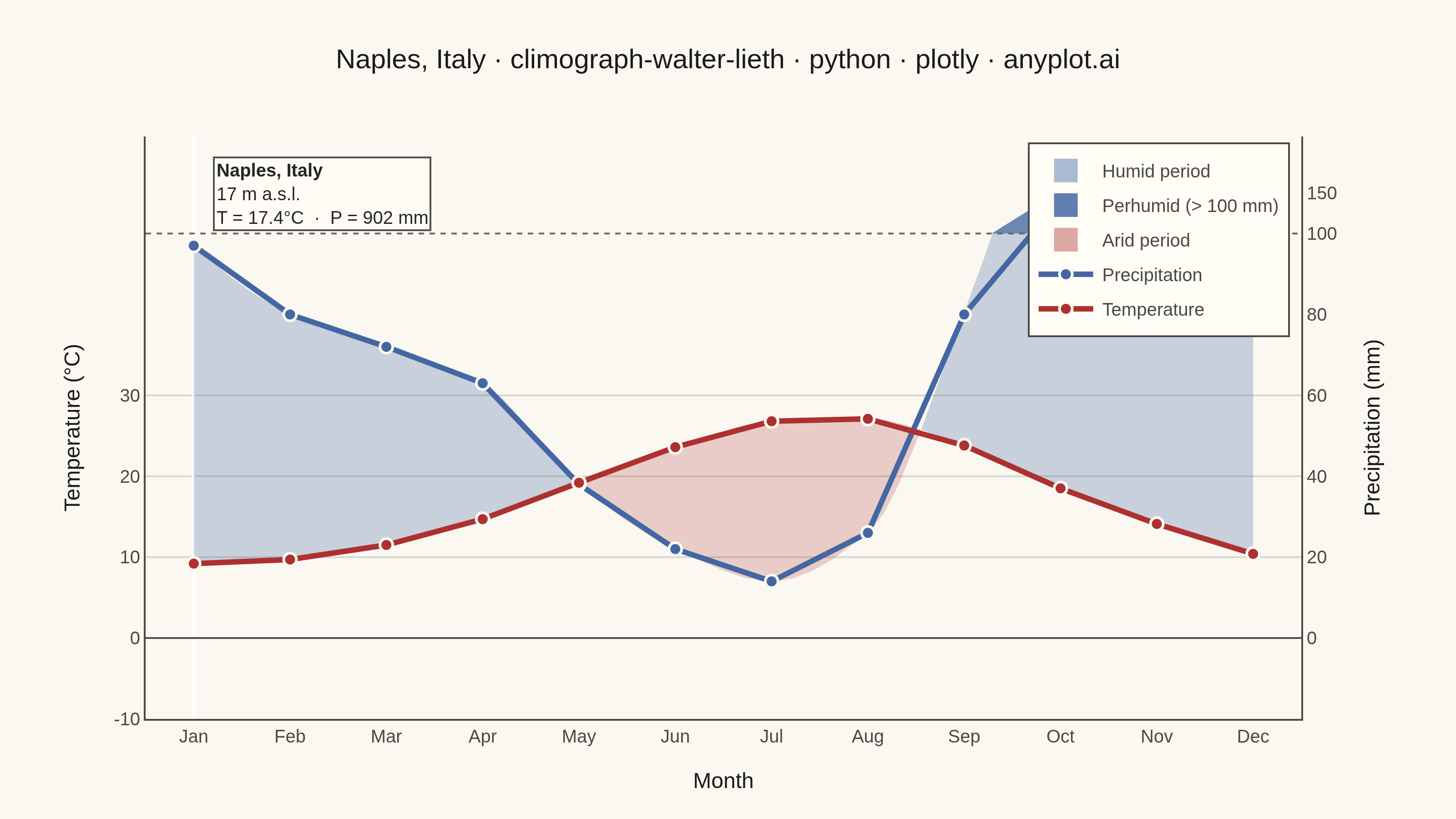
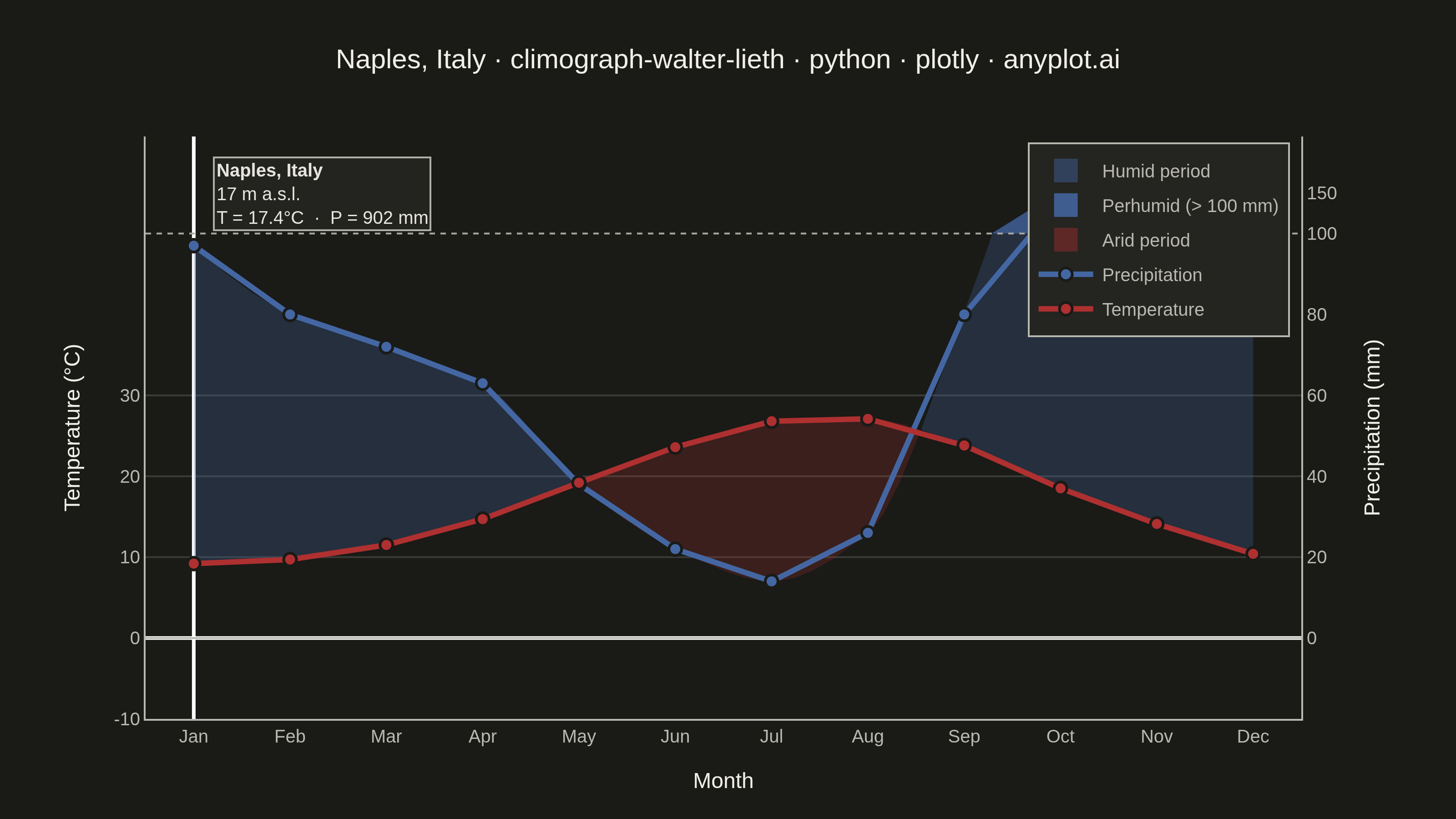
A Walter-Lieth climate diagram (climograph) is the canonical visualization of a location's annual climate, plotting monthly mean temperature and monthly precipitation over the twelve months on a single panel. It uses the classic 1:2 axis-scaling convention where 10 °C on the temperature axis aligns with 20 mm on the precipitation axis, so the relationship between the two curves directly reveals water availability: where precipitation exceeds the temperature curve the period is humid (filled blue/hatched), and where the temperature curve rises above precipitation the period is arid (filled red/dotted). A header carries station metadata and annual means, while frost indicators along the baseline mark cold months.
""" anyplot.ai
climograph-walter-lieth: Walter-Lieth Climate Diagram
Library: plotly 6.8.0 | Python 3.13.13
Quality: 88/100 | Created: 2026-06-15
"""

import os
import sys


# Prevent the local plotly.py from shadowing the installed plotly package.
_here = os.path.dirname(os.path.abspath(__file__))
sys.path = [p for p in sys.path if p != _here]

import numpy as np
import plotly.graph_objects as go
from scipy.interpolate import PchipInterpolator


# Theme tokens — Imprint style guide
THEME = os.getenv("ANYPLOT_THEME", "light")
PAGE_BG = "#FAF8F1" if THEME == "light" else "#1A1A17"
ELEVATED_BG = "#FFFDF6" if THEME == "light" else "#242420"
INK = "#1A1A17" if THEME == "light" else "#F0EFE8"
INK_SOFT = "#4A4A44" if THEME == "light" else "#B8B7B0"
INK_MUTED = "#6B6A63" if THEME == "light" else "#A8A79F"
GRID = "rgba(26,26,23,0.15)" if THEME == "light" else "rgba(240,239,232,0.15)"

# Imprint palette — semantic roles for this diagram
TEMP_COLOR = "#AE3030"  # matte red — temperature / heat (Imprint pos 5)
PRECIP_COLOR = "#4467A3"  # blue — water / precipitation  (Imprint pos 3)

# Station: Naples, Italy — 1991–2020 climate normals (Mediterranean Cfsa)
STATION = "Naples, Italy"
ELEVATION = 17  # m a.s.l.
TEMP_MEAN = 17.4  # °C annual mean
PRECIP_TOT = 902  # mm annual total

MONTHS = ["Jan", "Feb", "Mar", "Apr", "May", "Jun", "Jul", "Aug", "Sep", "Oct", "Nov", "Dec"]
TEMP = [9.2, 9.7, 11.5, 14.7, 19.2, 23.6, 26.8, 27.1, 23.8, 18.5, 14.1, 10.4]
PRECIP = [97, 80, 72, 63, 38, 22, 14, 26, 80, 142, 148, 120]


def p_to_y(mm):
    """Walter-Lieth transform: precipitation mm → temperature-axis units.
    2:1 scale up to 100 mm (10°C ↔ 20 mm); compressed 10:1 above 100 mm."""
    return mm / 2.0 if mm <= 100 else 50.0 + (mm - 100) / 10.0


# Smooth curves via PCHIP interpolation in original units, then transform
xi = np.arange(12, dtype=float)
xf = np.linspace(0, 11, 1200)

t_fine = PchipInterpolator(xi, TEMP)(xf)
p_fine_mm = np.clip(PchipInterpolator(xi, PRECIP)(xf), 0, None)
p_fine = np.array([p_to_y(v) for v in p_fine_mm])

P100 = 50.0  # 100 mm line in y-axis (temperature) units
Y_MIN, Y_MAX = -10.0, 62.0


def extract_segs(x, lo, hi, mask):
    """Split arrays into contiguous segments where mask is True."""
    segs, n, i = [], len(mask), 0
    while i < n:
        if mask[i]:
            j = i
            while j < n and mask[j]:
                j += 1
            segs.append((x[i:j], lo[i:j], hi[i:j]))
            i = j
        else:
            i += 1
    return segs


# Classify each fine-grid point
humid_mask = p_fine > t_fine
perhumid_mask = p_fine > P100

humid_segs = extract_segs(xf, t_fine, p_fine, humid_mask)
arid_segs = extract_segs(xf, p_fine, t_fine, ~humid_mask)
perhumid_segs = extract_segs(xf, np.full_like(p_fine, P100), p_fine, perhumid_mask)

fig = go.Figure()

# Humid fill — blue, between temp curve and precipitation curve (below 100 mm)
for sx, sl, sh in humid_segs:
    sh_clip = np.minimum(sh, P100)
    if np.any(sh_clip > sl + 0.05):
        px = np.concatenate([sx, sx[::-1]]).tolist()
        py = np.concatenate([sh_clip, sl[::-1]]).tolist()
        fig.add_trace(
            go.Scatter(
                x=px,
                y=py,
                fill="toself",
                fillcolor="rgba(68,103,163,0.28)",
                line={"width": 0},
                showlegend=False,
                hoverinfo="skip",
            )
        )

# Perhumid fill — solid blue above the 100 mm threshold line
for sx, sl, sh in perhumid_segs:
    px = np.concatenate([sx, sx[::-1]]).tolist()
    py = np.concatenate([sh, sl[::-1]]).tolist()
    fig.add_trace(
        go.Scatter(
            x=px,
            y=py,
            fill="toself",
            fillcolor="rgba(68,103,163,0.78)",
            line={"width": 0},
            showlegend=False,
            hoverinfo="skip",
        )
    )

# Arid fill — light red, between precipitation curve and temperature curve
for sx, sl, sh in arid_segs:
    px = np.concatenate([sx, sx[::-1]]).tolist()
    py = np.concatenate([sh, sl[::-1]]).tolist()
    fig.add_trace(
        go.Scatter(
            x=px,
            y=py,
            fill="toself",
            fillcolor="rgba(174,48,48,0.22)",
            line={"width": 0},
            showlegend=False,
            hoverinfo="skip",
        )
    )

# Legend swatches for fill regions
fig.add_trace(
    go.Scatter(
        x=[None],
        y=[None],
        mode="markers",
        name="Humid period",
        marker={"symbol": "square", "size": 13, "color": "rgba(68,103,163,0.45)"},
        showlegend=True,
    )
)
fig.add_trace(
    go.Scatter(
        x=[None],
        y=[None],
        mode="markers",
        name="Perhumid (> 100 mm)",
        marker={"symbol": "square", "size": 13, "color": "rgba(68,103,163,0.85)"},
        showlegend=True,
    )
)
fig.add_trace(
    go.Scatter(
        x=[None],
        y=[None],
        mode="markers",
        name="Arid period",
        marker={"symbol": "square", "size": 13, "color": "rgba(174,48,48,0.42)"},
        showlegend=True,
    )
)

# Precipitation curve (values transformed to temperature-axis units)
fig.add_trace(
    go.Scatter(
        x=list(range(12)),
        y=[p_to_y(p) for p in PRECIP],
        mode="lines+markers",
        name="Precipitation",
        line={"color": PRECIP_COLOR, "width": 3},
        marker={"color": PRECIP_COLOR, "size": 7, "line": {"color": PAGE_BG, "width": 1.5}},
        customdata=PRECIP,
        hovertemplate="%{customdata} mm<extra>Precipitation</extra>",
        showlegend=True,
    )
)

# Temperature curve
fig.add_trace(
    go.Scatter(
        x=list(range(12)),
        y=TEMP,
        mode="lines+markers",
        name="Temperature",
        line={"color": TEMP_COLOR, "width": 3},
        marker={"color": TEMP_COLOR, "size": 7, "line": {"color": PAGE_BG, "width": 1.5}},
        hovertemplate="%{y:.1f} °C<extra>Temperature</extra>",
        showlegend=True,
    )
)

# Ghost trace to anchor the right (precipitation) y-axis
fig.add_trace(
    go.Scatter(
        x=[0, 11],
        y=[Y_MIN, Y_MAX],
        yaxis="y2",
        mode="markers",
        marker={"color": "rgba(0,0,0,0.01)", "size": 1},
        showlegend=False,
        hoverinfo="skip",
    )
)

# Reference lines
fig.add_shape(type="line", x0=-0.5, x1=11.5, y0=P100, y1=P100, line={"color": INK_MUTED, "width": 1, "dash": "dot"})
fig.add_shape(type="line", x0=-0.5, x1=11.5, y0=0, y1=0, line={"color": INK_SOFT, "width": 1})

# Frost bands — months with mean temperature below 0°C (Naples: none)
for i, t in enumerate(TEMP):
    if t < 0:
        fig.add_shape(
            type="rect",
            x0=i - 0.4,
            x1=i + 0.4,
            y0=Y_MIN,
            y1=Y_MIN + 2,
            fillcolor=PRECIP_COLOR,
            line={"width": 0},
            opacity=0.85,
        )

# Title — scaled for length per style-guide formula
title_str = "Naples, Italy · climograph-walter-lieth · python · plotly · anyplot.ai"
n = len(title_str)
title_fs = max(round(16 * 67 / n), 11) if n > 67 else 16

# Right-axis tick positions (precipitation mm mapped to y-axis units)
raxis_mm = [0, 20, 40, 60, 80, 100, 150]
raxis_y = [p_to_y(m) for m in raxis_mm]

fig.update_layout(
    autosize=False,
    paper_bgcolor=PAGE_BG,
    plot_bgcolor=PAGE_BG,
    font={"color": INK, "family": "Arial, sans-serif"},
    title={"text": title_str, "font": {"size": title_fs, "color": INK}, "x": 0.5, "xanchor": "center"},
    margin={"l": 80, "r": 85, "t": 75, "b": 55},
    xaxis={
        "tickvals": list(range(12)),
        "ticktext": MONTHS,
        "tickfont": {"size": 10, "color": INK_SOFT},
        "gridcolor": GRID,
        "linecolor": INK_SOFT,
        "showgrid": False,
        "range": [-0.5, 11.5],
        "title": {"text": "Month", "font": {"size": 12, "color": INK}},
    },
    yaxis={
        "title": {"text": "Temperature (°C)", "font": {"size": 12, "color": INK}},
        "tickvals": [-10, 0, 10, 20, 30],
        "ticktext": ["-10", "0", "10", "20", "30"],
        "tickfont": {"size": 10, "color": INK_SOFT},
        "gridcolor": GRID,
        "linecolor": INK_SOFT,
        "zerolinecolor": INK_SOFT,
        "zerolinewidth": 1.5,
        "range": [Y_MIN, Y_MAX],
        "showgrid": True,
    },
    yaxis2={
        "overlaying": "y",
        "side": "right",
        "range": [Y_MIN, Y_MAX],
        "tickvals": raxis_y,
        "ticktext": [f"{m}" for m in raxis_mm],
        "title": {"text": "Precipitation (mm)", "font": {"size": 12, "color": INK}},
        "tickfont": {"size": 10, "color": INK_SOFT},
        "linecolor": INK_SOFT,
        "showgrid": False,
    },
    legend={
        "bgcolor": ELEVATED_BG,
        "bordercolor": INK_SOFT,
        "borderwidth": 1,
        "font": {"color": INK_SOFT, "size": 10},
        "x": 0.99,
        "y": 0.99,
        "xanchor": "right",
        "yanchor": "top",
        "tracegroupgap": 2,
    },
)

# Station metadata annotation — top-left inside the plot area
meta_text = f"<b>{STATION}</b><br>{ELEVATION} m a.s.l.<br>T = {TEMP_MEAN}°C  ·  P = {PRECIP_TOT} mm"
fig.add_annotation(
    xref="x",
    yref="y",
    x=0.2,
    y=59.5,
    text=meta_text,
    showarrow=False,
    align="left",
    bgcolor=ELEVATED_BG,
    bordercolor=INK_SOFT,
    borderwidth=1,
    font={"size": 10, "color": INK},
    xanchor="left",
    yanchor="top",
    opacity=0.95,
)

# Save
fig.write_image(f"plot-{THEME}.png", width=800, height=450, scale=4)
fig.write_html(f"plot-{THEME}.html", include_plotlyjs="cdn")
Runnable source as JSON, for any HTTP client: https://api.anyplot.ai/specs/climograph-walter-lieth/plotly/code. Any spec id and library id listed in llms-full.txt fit the same URL shape; every URL below is complete and callable.
{
  "spec_id": "climograph-walter-lieth",
  "language": "python",
  "library": "plotly",
  "page": "https://anyplot.ai/climograph-walter-lieth/python/plotly",
  "hub": "https://anyplot.ai/climograph-walter-lieth",
  "code_json": "https://api.anyplot.ai/specs/climograph-walter-lieth/plotly/code",
  "spec_json": "https://api.anyplot.ai/specs/climograph-walter-lieth",
  "render_light_png": "https://storage.googleapis.com/anyplot-images/plots/climograph-walter-lieth/python/plotly/plot-light.png",
  "render_dark_png": "https://storage.googleapis.com/anyplot-images/plots/climograph-walter-lieth/python/plotly/plot-dark.png",
  "interactive_light_html": "https://storage.googleapis.com/anyplot-images/plots/climograph-walter-lieth/python/plotly/plot-light.html",
  "interactive_dark_html": "https://storage.googleapis.com/anyplot-images/plots/climograph-walter-lieth/python/plotly/plot-dark.html",
  "quality_score": 88.0,
  "license": "MIT",
  "guide": "https://anyplot.ai/llms.txt"
}
Part of Walter-Lieth Climate Diagram on anyplot.ai.