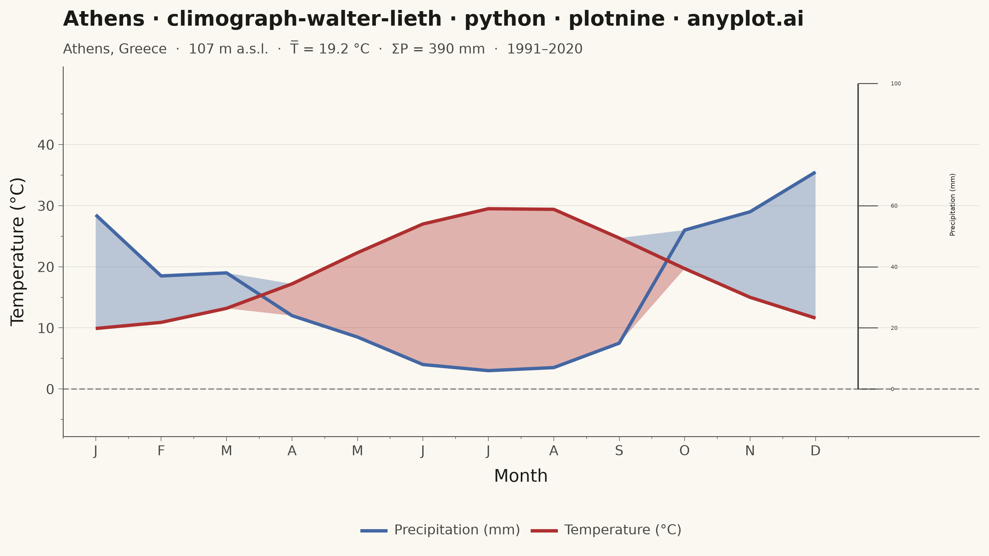
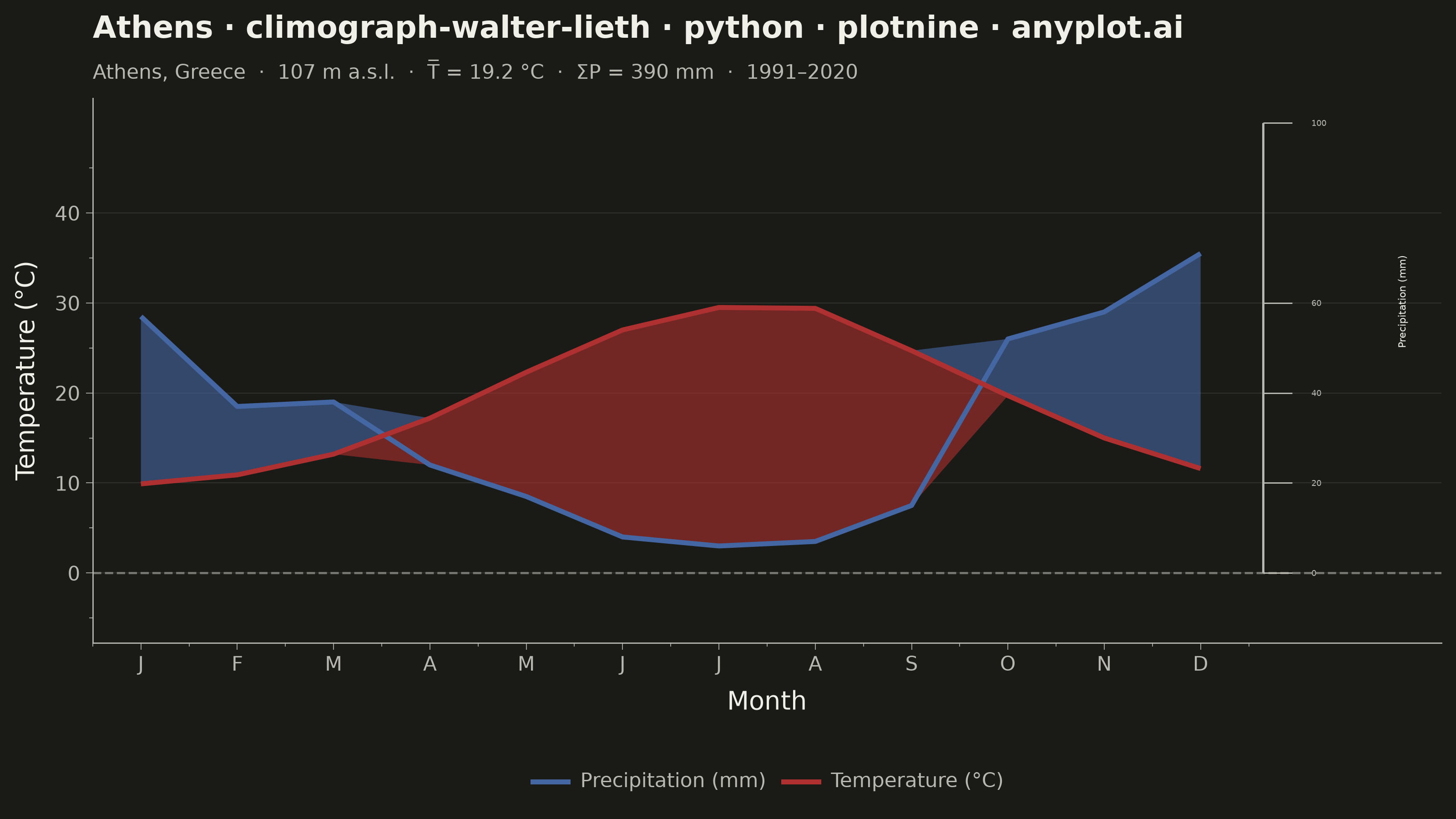
A Walter-Lieth climate diagram (climograph) is the canonical visualization of a location's annual climate, plotting monthly mean temperature and monthly precipitation over the twelve months on a single panel. It uses the classic 1:2 axis-scaling convention where 10 °C on the temperature axis aligns with 20 mm on the precipitation axis, so the relationship between the two curves directly reveals water availability: where precipitation exceeds the temperature curve the period is humid (filled blue/hatched), and where the temperature curve rises above precipitation the period is arid (filled red/dotted). A header carries station metadata and annual means, while frost indicators along the baseline mark cold months.
""" anyplot.ai
climograph-walter-lieth: Walter-Lieth Climate Diagram
Library: plotnine 0.15.7 | Python 3.13.13
Quality: 86/100 | Created: 2026-06-15
"""

import os
import sys


# Remove this script's own directory from sys.path so that
# `from plotnine import ...` resolves to the installed package, not this file.
_script_dir = os.path.dirname(os.path.abspath(__file__))
sys.path = [
    p for p in sys.path if os.path.normpath(os.path.abspath(p) if p else os.getcwd()) != os.path.normpath(_script_dir)
]

import numpy as np
import pandas as pd
from plotnine import (
    aes,
    annotate,
    element_blank,
    element_line,
    element_rect,
    element_text,
    geom_hline,
    geom_line,
    geom_ribbon,
    geom_segment,
    geom_text,
    ggplot,
    labs,
    scale_color_manual,
    scale_x_continuous,
    scale_y_continuous,
    theme,
)


# Theme tokens
THEME = os.getenv("ANYPLOT_THEME", "light")
PAGE_BG = "#FAF8F1" if THEME == "light" else "#1A1A17"
ELEVATED_BG = "#FFFDF6" if THEME == "light" else "#242420"
INK = "#1A1A17" if THEME == "light" else "#F0EFE8"
INK_SOFT = "#4A4A44" if THEME == "light" else "#B8B7B0"
INK_MUTED = "#6B6A63" if THEME == "light" else "#A8A79F"

# Imprint palette — semantic override: temperature=red (heat), precipitation=blue (water)
TEMP_COLOR = "#AE3030"
PRECIP_COLOR = "#4467A3"

# Fill alpha — higher in dark mode to keep fills visible on near-black background
FILL_ALPHA = 0.35 if THEME == "light" else 0.60

# Station: Athens, Greece — Mediterranean 1991–2020 climate normals
months_labels = ["J", "F", "M", "A", "M", "J", "J", "A", "S", "O", "N", "D"]
month_num = np.arange(1, 13)
temperature = np.array([9.9, 10.9, 13.2, 17.2, 22.3, 27.0, 29.5, 29.4, 24.7, 19.7, 15.0, 11.6])
precipitation = np.array([57, 37, 38, 24, 17, 8, 6, 7, 15, 52, 58, 71])

temp_annual = round(float(np.mean(temperature)), 1)
precip_annual = int(np.sum(precipitation))

# Walter-Lieth scaling: 10 °C ≡ 20 mm → divide precip by 2 to plot on temperature axis
precip_scaled = precipitation / 2.0

# Humid ribbon (blue): regions where precip_scaled ≥ temperature
humid_ymin = temperature.astype(float).copy()
humid_ymax = np.maximum(temperature, precip_scaled)
mask_arid = temperature > precip_scaled
humid_ymin[mask_arid] = temperature[mask_arid]
humid_ymax[mask_arid] = temperature[mask_arid]

# Arid ribbon (red): regions where temperature > precip_scaled
arid_ymin = np.minimum(temperature, precip_scaled).astype(float)
arid_ymax = temperature.astype(float).copy()
mask_humid = precip_scaled >= temperature
arid_ymin[mask_humid] = temperature[mask_humid]
arid_ymax[mask_humid] = temperature[mask_humid]

df = pd.DataFrame(
    {
        "month": month_num,
        "temperature": temperature,
        "precip_sc": precip_scaled,
        "hum_lo": humid_ymin,
        "hum_hi": humid_ymax,
        "ari_lo": arid_ymin,
        "ari_hi": arid_ymax,
    }
)

# Long-format dataframe for the two curves — enables a proper legend via color aesthetic
TEMP_LABEL = "Temperature (°C)"
PRECIP_LABEL = "Precipitation (mm)"
df_lines = pd.DataFrame(
    {
        "month": np.tile(month_num, 2),
        "value": np.concatenate([temperature, precip_scaled]),
        "variable": [TEMP_LABEL] * 12 + [PRECIP_LABEL] * 12,
    }
)

# Y and X axis limits — extend Y_MAX to 50 to accommodate the 100 mm right-axis tick
# (Walter-Lieth convention: 100 mm ≡ 50 °C on the temperature scale)
Y_MIN, Y_MAX = -5, 50
X_MAX_EXTENDED = 14.5

# Right-side precipitation axis: spec-mandated ticks 0/20/40/60/100 mm
# In temperature units: 0/10/20/30/50 °C
p_y_ticks = [0, 10, 20, 30, 50]
p_mm_labels = ["0", "20", "40", "60", "100"]

prec_ticks_df = pd.DataFrame(
    {"x": 12.65, "xend": 12.95, "y": p_y_ticks, "yend": p_y_ticks, "lx": 13.15, "label": p_mm_labels}
)
prec_axis_line_df = pd.DataFrame({"x": [12.65], "xend": [12.65], "y": [0], "yend": [50]})

# Title — 67 chars → default size 12
plot_title = "Athens · climograph-walter-lieth · python · plotnine · anyplot.ai"
title_len = len(plot_title)
title_size = max(8, round(12 * 67 / title_len))

subtitle = f"Athens, Greece  ·  107 m a.s.l.  ·  T̅ = {temp_annual} °C  ·  ΣP = {precip_annual} mm  ·  1991–2020"

anyplot_theme = theme(
    figure_size=(8, 4.5),
    plot_background=element_rect(fill=PAGE_BG, color=PAGE_BG),
    panel_background=element_rect(fill=PAGE_BG),
    panel_grid_major_y=element_line(color=INK_SOFT, size=0.3, alpha=0.18),
    panel_grid_major_x=element_blank(),
    panel_grid_minor=element_blank(),
    panel_border=element_blank(),
    axis_title=element_text(size=10, color=INK),
    axis_text=element_text(size=8, color=INK_SOFT),
    axis_line=element_line(color=INK_SOFT, size=0.5),
    axis_ticks=element_line(color=INK_SOFT, size=0.3),
    plot_title=element_text(size=title_size, color=INK, face="bold"),
    plot_subtitle=element_text(size=8, color=INK_SOFT),
    legend_position="bottom",
    legend_background=element_rect(fill=PAGE_BG, color="none"),
    legend_key=element_rect(fill=PAGE_BG),
    legend_text=element_text(size=8, color=INK_SOFT),
    legend_title=element_blank(),
)

plot = (
    ggplot(df, aes(x="month"))
    # Humid fill (blue — wet periods where precip > temp curve)
    + geom_ribbon(aes(ymin="hum_lo", ymax="hum_hi"), fill=PRECIP_COLOR, alpha=FILL_ALPHA)
    # Arid fill (red — dry periods where temp > precip curve)
    + geom_ribbon(aes(ymin="ari_lo", ymax="ari_hi"), fill=TEMP_COLOR, alpha=FILL_ALPHA)
    # 0 °C frost reference line
    + geom_hline(yintercept=0, color=INK_SOFT, size=0.5, linetype="dashed", alpha=0.55)
    # Temperature and precipitation curves — color mapped to variable for legend
    + geom_line(data=df_lines, mapping=aes(x="month", y="value", group="variable", color="variable"), size=1.1)
    + scale_color_manual(values={TEMP_LABEL: TEMP_COLOR, PRECIP_LABEL: PRECIP_COLOR}, name="")
    # Right-side precipitation axis: axis line
    + geom_segment(
        data=prec_axis_line_df, mapping=aes(x="x", xend="xend", y="y", yend="yend"), color=INK_SOFT, size=0.5
    )
    # Right-side precipitation axis: tick marks
    + geom_segment(data=prec_ticks_df, mapping=aes(x="x", xend="xend", y="y", yend="yend"), color=INK_SOFT, size=0.3)
    # Right-side precipitation axis: tick labels (mm)
    + geom_text(
        data=prec_ticks_df, mapping=aes(x="lx", y="y", label="label"), size=3.2, color=INK_SOFT, ha="left", va="center"
    )
    # Right-side precipitation axis: axis title (rotated)
    + annotate("text", x=14.1, y=25, label="Precipitation (mm)", angle=90, size=4, color=INK, ha="center", va="bottom")
    + scale_x_continuous(breaks=month_num.tolist(), labels=months_labels, limits=(0.5, X_MAX_EXTENDED), expand=(0, 0))
    + scale_y_continuous(name="Temperature (°C)", breaks=[0, 10, 20, 30, 40], limits=(Y_MIN, Y_MAX))
    + labs(title=plot_title, subtitle=subtitle, x="Month")
    + anyplot_theme
)

plot.save(f"plot-{THEME}.png", dpi=400, width=8, height=4.5, units="in")
Runnable source as JSON, for any HTTP client: https://api.anyplot.ai/specs/climograph-walter-lieth/plotnine/code. Any spec id and library id listed in llms-full.txt fit the same URL shape; every URL below is complete and callable.
{
  "spec_id": "climograph-walter-lieth",
  "language": "python",
  "library": "plotnine",
  "page": "https://anyplot.ai/climograph-walter-lieth/python/plotnine",
  "hub": "https://anyplot.ai/climograph-walter-lieth",
  "code_json": "https://api.anyplot.ai/specs/climograph-walter-lieth/plotnine/code",
  "spec_json": "https://api.anyplot.ai/specs/climograph-walter-lieth",
  "render_light_png": "https://storage.googleapis.com/anyplot-images/plots/climograph-walter-lieth/python/plotnine/plot-light.png",
  "render_dark_png": "https://storage.googleapis.com/anyplot-images/plots/climograph-walter-lieth/python/plotnine/plot-dark.png",
  "quality_score": 86.0,
  "license": "MIT",
  "guide": "https://anyplot.ai/llms.txt"
}
Part of Walter-Lieth Climate Diagram on anyplot.ai.