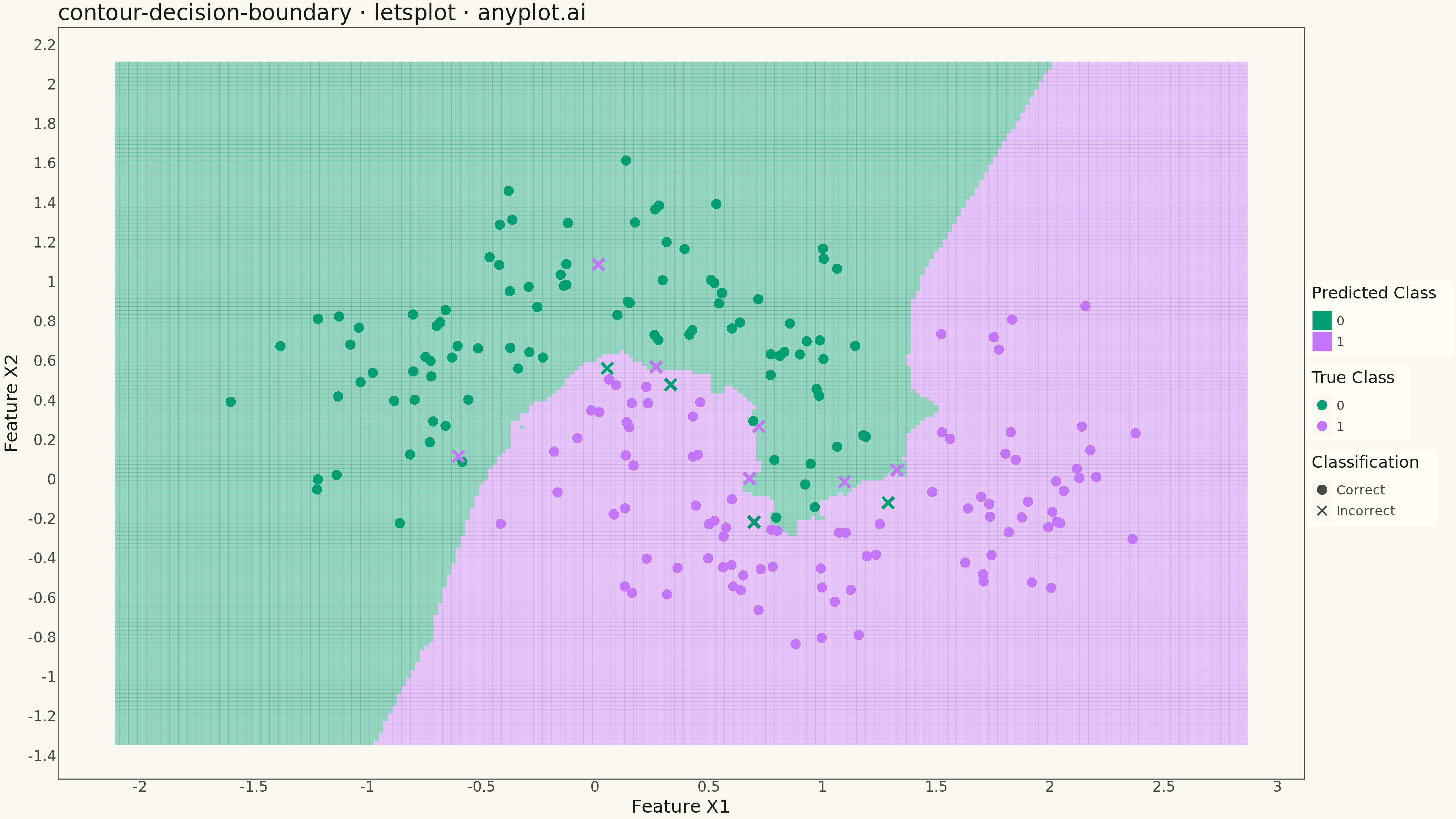
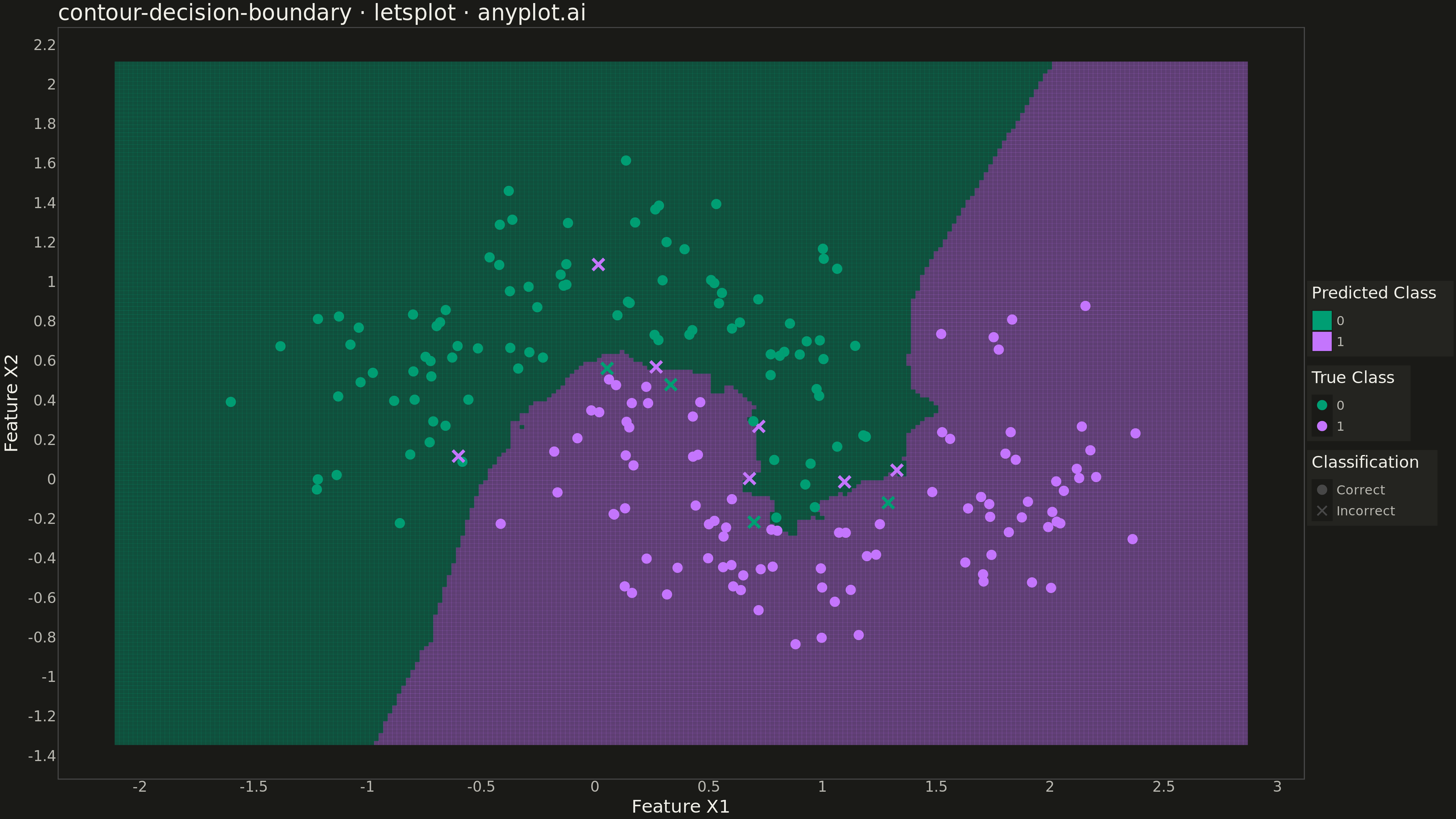
A decision boundary visualization showing how a classifier partitions 2D feature space into predicted class regions. Colored regions indicate the predicted class at each point in the feature space, with training data points overlaid to show how well the classifier separates different classes. This visualization is essential for understanding classifier behavior, identifying decision boundaries, and evaluating classification accuracy in machine learning.
""" anyplot.ai
contour-decision-boundary: Decision Boundary Classifier Visualization
Library: letsplot 4.9.0 | Python 3.13.13
Quality: 84/100 | Updated: 2026-05-16
"""

import os

import numpy as np
import pandas as pd
from lets_plot import (
    LetsPlot,
    aes,
    element_blank,
    element_rect,
    element_text,
    geom_point,
    geom_tile,
    ggplot,
    ggsave,
    ggsize,
    labs,
    scale_color_manual,
    scale_fill_manual,
    scale_shape_manual,
    theme,
    theme_minimal,
)
from sklearn.datasets import make_moons
from sklearn.neighbors import KNeighborsClassifier


LetsPlot.setup_html()

# Theme tokens
THEME = os.getenv("ANYPLOT_THEME", "light")
PAGE_BG = "#FAF8F1" if THEME == "light" else "#1A1A17"
ELEVATED_BG = "#FFFDF6" if THEME == "light" else "#242420"
INK = "#1A1A17" if THEME == "light" else "#F0EFE8"
INK_SOFT = "#4A4A44" if THEME == "light" else "#B8B7B0"

IMPRINT = ["#009E73", "#C475FD", "#4467A3", "#BD8233"]

# Data
np.random.seed(42)
X, y = make_moons(n_samples=200, noise=0.25, random_state=42)

# Train classifier
classifier = KNeighborsClassifier(n_neighbors=5)
classifier.fit(X, y)

# Create mesh grid for decision boundary
h = 0.02
x_min, x_max = X[:, 0].min() - 0.5, X[:, 0].max() + 0.5
y_min, y_max = X[:, 1].min() - 0.5, X[:, 1].max() + 0.5
xx, yy = np.meshgrid(np.arange(x_min, x_max, h), np.arange(y_min, y_max, h))

# Predict on mesh
Z = classifier.predict(np.c_[xx.ravel(), yy.ravel()])
Z = Z.reshape(xx.shape)

# Create dataframes
mesh_df = pd.DataFrame({"X1": xx.ravel(), "X2": yy.ravel(), "Predicted": Z.ravel().astype(str)})
train_df = pd.DataFrame({"X1": X[:, 0], "X2": X[:, 1], "Class": y.astype(str)})
predictions = classifier.predict(X)
train_df["Correct"] = np.where(predictions == y, "Correct", "Incorrect")

# Plot
plot = (
    ggplot()
    + geom_tile(aes(x="X1", y="X2", fill="Predicted"), data=mesh_df, alpha=0.4)
    + geom_point(aes(x="X1", y="X2", color="Class", shape="Correct"), data=train_df, size=5, stroke=1.5)
    + scale_fill_manual(values=[IMPRINT[0], IMPRINT[1]], name="Predicted Class")
    + scale_color_manual(values=[IMPRINT[0], IMPRINT[1]], name="True Class")
    + scale_shape_manual(values=[16, 4], name="Classification")
    + labs(title="contour-decision-boundary · letsplot · anyplot.ai", x="Feature X1", y="Feature X2")
    + theme_minimal()
    + theme(
        plot_background=element_rect(fill=PAGE_BG, color=PAGE_BG),
        panel_background=element_rect(fill=PAGE_BG),
        panel_grid_major=element_blank(),
        panel_grid_minor=element_blank(),
        plot_title=element_text(size=24, color=INK),
        axis_title=element_text(size=20, color=INK),
        axis_text=element_text(size=16, color=INK_SOFT),
        legend_background=element_rect(fill=ELEVATED_BG, color=INK_SOFT),
        legend_title=element_text(size=18, color=INK),
        legend_text=element_text(size=14, color=INK_SOFT),
        legend_position="right",
    )
    + ggsize(1600, 900)
)

# Save
ggsave(plot, filename=f"plot-{THEME}.png", path=".", scale=3)
ggsave(plot, filename=f"plot-{THEME}.html", path=".")
Runnable source as JSON, for any HTTP client: https://api.anyplot.ai/specs/contour-decision-boundary/letsplot/code. Any spec id and library id listed in llms-full.txt fit the same URL shape; every URL below is complete and callable.
{
  "spec_id": "contour-decision-boundary",
  "language": "python",
  "library": "letsplot",
  "page": "https://anyplot.ai/contour-decision-boundary/python/letsplot",
  "hub": "https://anyplot.ai/contour-decision-boundary",
  "code_json": "https://api.anyplot.ai/specs/contour-decision-boundary/letsplot/code",
  "spec_json": "https://api.anyplot.ai/specs/contour-decision-boundary",
  "render_light_png": "https://storage.googleapis.com/anyplot-images/plots/contour-decision-boundary/python/letsplot/plot-light.png",
  "render_dark_png": "https://storage.googleapis.com/anyplot-images/plots/contour-decision-boundary/python/letsplot/plot-dark.png",
  "interactive_light_html": "https://storage.googleapis.com/anyplot-images/plots/contour-decision-boundary/python/letsplot/plot-light.html",
  "interactive_dark_html": "https://storage.googleapis.com/anyplot-images/plots/contour-decision-boundary/python/letsplot/plot-dark.html",
  "quality_score": 84.0,
  "license": "MIT",
  "guide": "https://anyplot.ai/llms.txt"
}
Part of Decision Boundary Classifier Visualization on anyplot.ai.