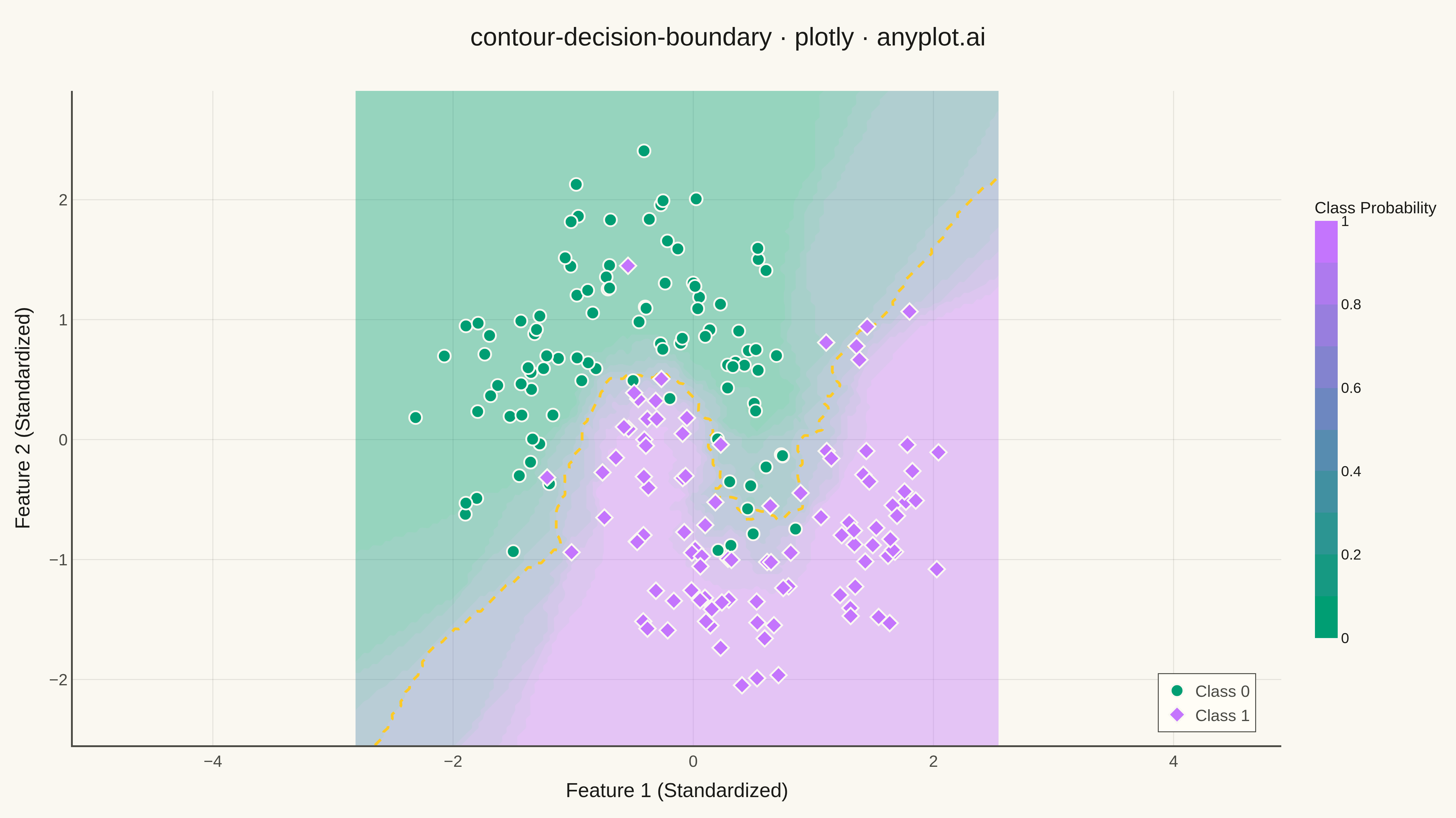
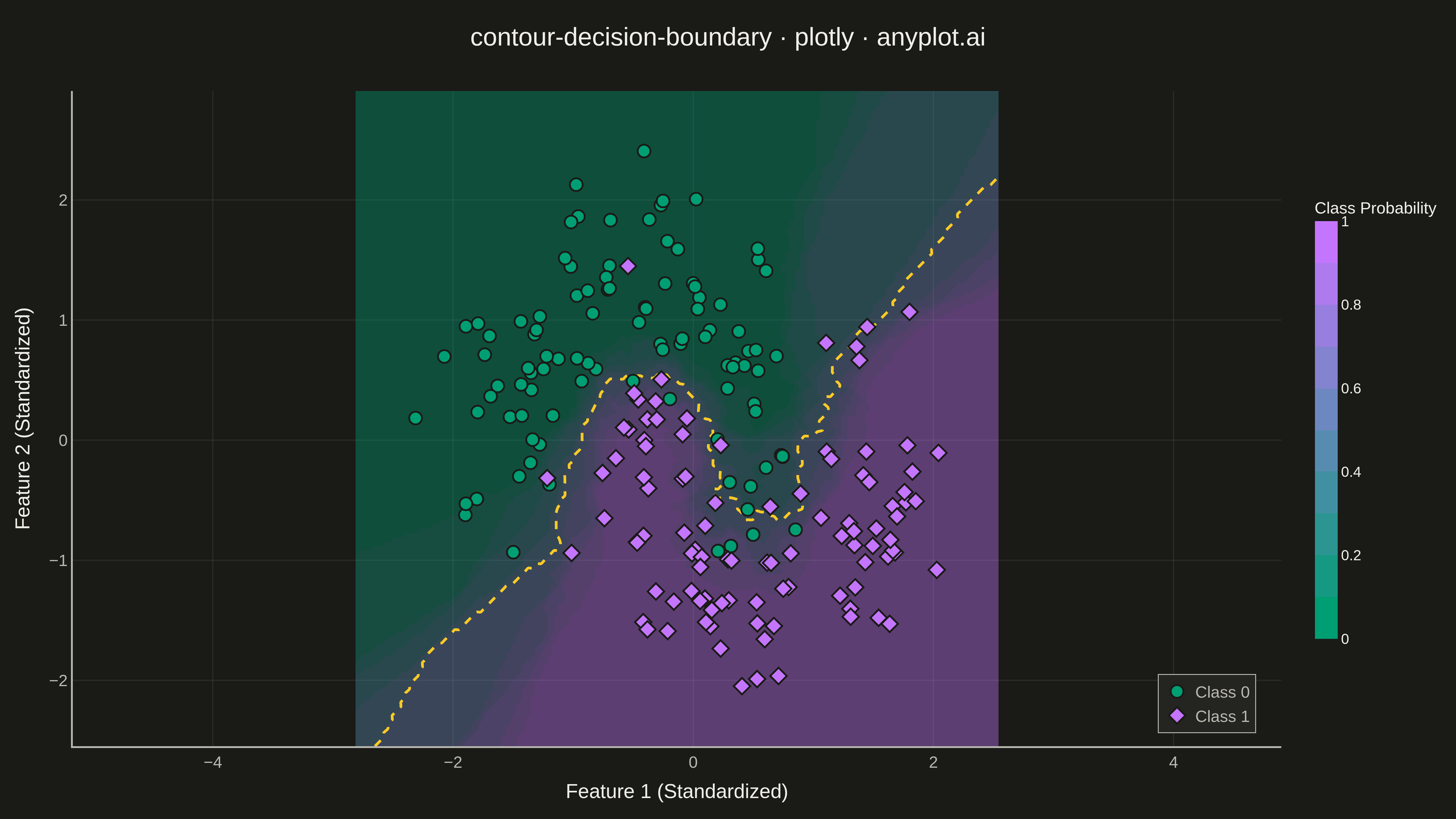
A decision boundary visualization showing how a classifier partitions 2D feature space into predicted class regions. Colored regions indicate the predicted class at each point in the feature space, with training data points overlaid to show how well the classifier separates different classes. This visualization is essential for understanding classifier behavior, identifying decision boundaries, and evaluating classification accuracy in machine learning.
""" anyplot.ai
contour-decision-boundary: Decision Boundary Classifier Visualization
Library: plotly 6.7.0 | Python 3.13.13
Quality: 95/100 | Updated: 2026-05-16
"""

import os

import numpy as np
import plotly.graph_objects as go
from sklearn.datasets import make_moons
from sklearn.neighbors import KNeighborsClassifier
from sklearn.preprocessing import StandardScaler


THEME = os.getenv("ANYPLOT_THEME", "light")
PAGE_BG = "#FAF8F1" if THEME == "light" else "#1A1A17"
ELEVATED_BG = "#FFFDF6" if THEME == "light" else "#242420"
INK = "#1A1A17" if THEME == "light" else "#F0EFE8"
INK_SOFT = "#4A4A44" if THEME == "light" else "#B8B7B0"
GRID = "rgba(26,26,23,0.10)" if THEME == "light" else "rgba(240,239,232,0.10)"

IMPRINT = ["#009E73", "#C475FD", "#4467A3", "#BD8233"]

# Data - Generate moon-shaped classification data
np.random.seed(42)
X, y = make_moons(n_samples=200, noise=0.25, random_state=42)

# Scale features for better visualization
scaler = StandardScaler()
X = scaler.fit_transform(X)

# Train a KNN classifier
clf = KNeighborsClassifier(n_neighbors=15)
clf.fit(X, y)

# Create mesh grid for decision boundary
x_min, x_max = X[:, 0].min() - 0.5, X[:, 0].max() + 0.5
y_min, y_max = X[:, 1].min() - 0.5, X[:, 1].max() + 0.5
xx, yy = np.meshgrid(np.linspace(x_min, x_max, 150), np.linspace(y_min, y_max, 150))

# Get prediction probabilities for smooth contours
Z_prob = clf.predict_proba(np.c_[xx.ravel(), yy.ravel()])[:, 1]
Z_prob = Z_prob.reshape(xx.shape)

# Create figure
fig = go.Figure()

# Add decision boundary contour using probability
fig.add_trace(
    go.Contour(
        x=np.linspace(x_min, x_max, 150),
        y=np.linspace(y_min, y_max, 150),
        z=Z_prob,
        colorscale=[[0, IMPRINT[0]], [1, IMPRINT[1]]],
        opacity=0.4,
        showscale=True,
        colorbar=dict(
            title=dict(text="Class Probability", font=dict(size=18)),
            tickfont=dict(size=16),
            len=0.7,
            thickness=25,
            bordercolor=INK_SOFT,
        ),
        contours=dict(showlines=False),
        hovertemplate="Feature 1: %{x:.2f}<br>Feature 2: %{y:.2f}<br>Probability: %{z:.2f}<extra></extra>",
    )
)

# Add decision boundary line (where probability = 0.5)
fig.add_trace(
    go.Contour(
        x=np.linspace(x_min, x_max, 150),
        y=np.linspace(y_min, y_max, 150),
        z=Z_prob,
        showscale=False,
        contours=dict(start=0.5, end=0.5, size=0.1, coloring="lines", showlabels=False),
        line=dict(color=INK_SOFT, width=3, dash="dash"),
        hoverinfo="skip",
    )
)

# Separate training points by class
X_class0 = X[y == 0]
X_class1 = X[y == 1]

# Add training points - Class 0
fig.add_trace(
    go.Scatter(
        x=X_class0[:, 0],
        y=X_class0[:, 1],
        mode="markers",
        marker=dict(size=14, color=IMPRINT[0], line=dict(color=PAGE_BG, width=2), symbol="circle"),
        name="Class 0",
        hovertemplate="Feature 1: %{x:.2f}<br>Feature 2: %{y:.2f}<br>Class: 0<extra></extra>",
    )
)

# Add training points - Class 1
fig.add_trace(
    go.Scatter(
        x=X_class1[:, 0],
        y=X_class1[:, 1],
        mode="markers",
        marker=dict(size=14, color=IMPRINT[1], line=dict(color=PAGE_BG, width=2), symbol="diamond"),
        name="Class 1",
        hovertemplate="Feature 1: %{x:.2f}<br>Feature 2: %{y:.2f}<br>Class: 1<extra></extra>",
    )
)

# Update layout with theme-adaptive colors
fig.update_layout(
    title=dict(
        text="contour-decision-boundary · plotly · anyplot.ai", font=dict(size=28, color=INK), x=0.5, xanchor="center"
    ),
    xaxis=dict(
        title=dict(text="Feature 1 (Standardized)", font=dict(size=22, color=INK)),
        tickfont=dict(size=18, color=INK_SOFT),
        showgrid=True,
        gridwidth=1,
        gridcolor=GRID,
        zeroline=False,
        linecolor=INK_SOFT,
        linewidth=2,
    ),
    yaxis=dict(
        title=dict(text="Feature 2 (Standardized)", font=dict(size=22, color=INK)),
        tickfont=dict(size=18, color=INK_SOFT),
        showgrid=True,
        gridwidth=1,
        gridcolor=GRID,
        zeroline=False,
        linecolor=INK_SOFT,
        linewidth=2,
        scaleanchor="x",
        scaleratio=1,
    ),
    paper_bgcolor=PAGE_BG,
    plot_bgcolor=PAGE_BG,
    font=dict(color=INK),
    legend=dict(
        font=dict(size=18, color=INK_SOFT),
        x=0.98,
        y=0.02,
        xanchor="right",
        yanchor="bottom",
        bgcolor=ELEVATED_BG,
        bordercolor=INK_SOFT,
        borderwidth=1,
    ),
    margin=dict(l=80, r=100, t=100, b=80),
    hovermode="closest",
)

# Save as PNG and HTML
fig.write_image(f"plot-{THEME}.png", width=1600, height=900, scale=3)
fig.write_html(f"plot-{THEME}.html", include_plotlyjs="cdn")
Runnable source as JSON, for any HTTP client: https://api.anyplot.ai/specs/contour-decision-boundary/plotly/code. Any spec id and library id listed in llms-full.txt fit the same URL shape; every URL below is complete and callable.
{
  "spec_id": "contour-decision-boundary",
  "language": "python",
  "library": "plotly",
  "page": "https://anyplot.ai/contour-decision-boundary/python/plotly",
  "hub": "https://anyplot.ai/contour-decision-boundary",
  "code_json": "https://api.anyplot.ai/specs/contour-decision-boundary/plotly/code",
  "spec_json": "https://api.anyplot.ai/specs/contour-decision-boundary",
  "render_light_png": "https://storage.googleapis.com/anyplot-images/plots/contour-decision-boundary/python/plotly/plot-light.png",
  "render_dark_png": "https://storage.googleapis.com/anyplot-images/plots/contour-decision-boundary/python/plotly/plot-dark.png",
  "interactive_light_html": "https://storage.googleapis.com/anyplot-images/plots/contour-decision-boundary/python/plotly/plot-light.html",
  "interactive_dark_html": "https://storage.googleapis.com/anyplot-images/plots/contour-decision-boundary/python/plotly/plot-dark.html",
  "quality_score": 95.0,
  "license": "MIT",
  "guide": "https://anyplot.ai/llms.txt"
}
Part of Decision Boundary Classifier Visualization on anyplot.ai.