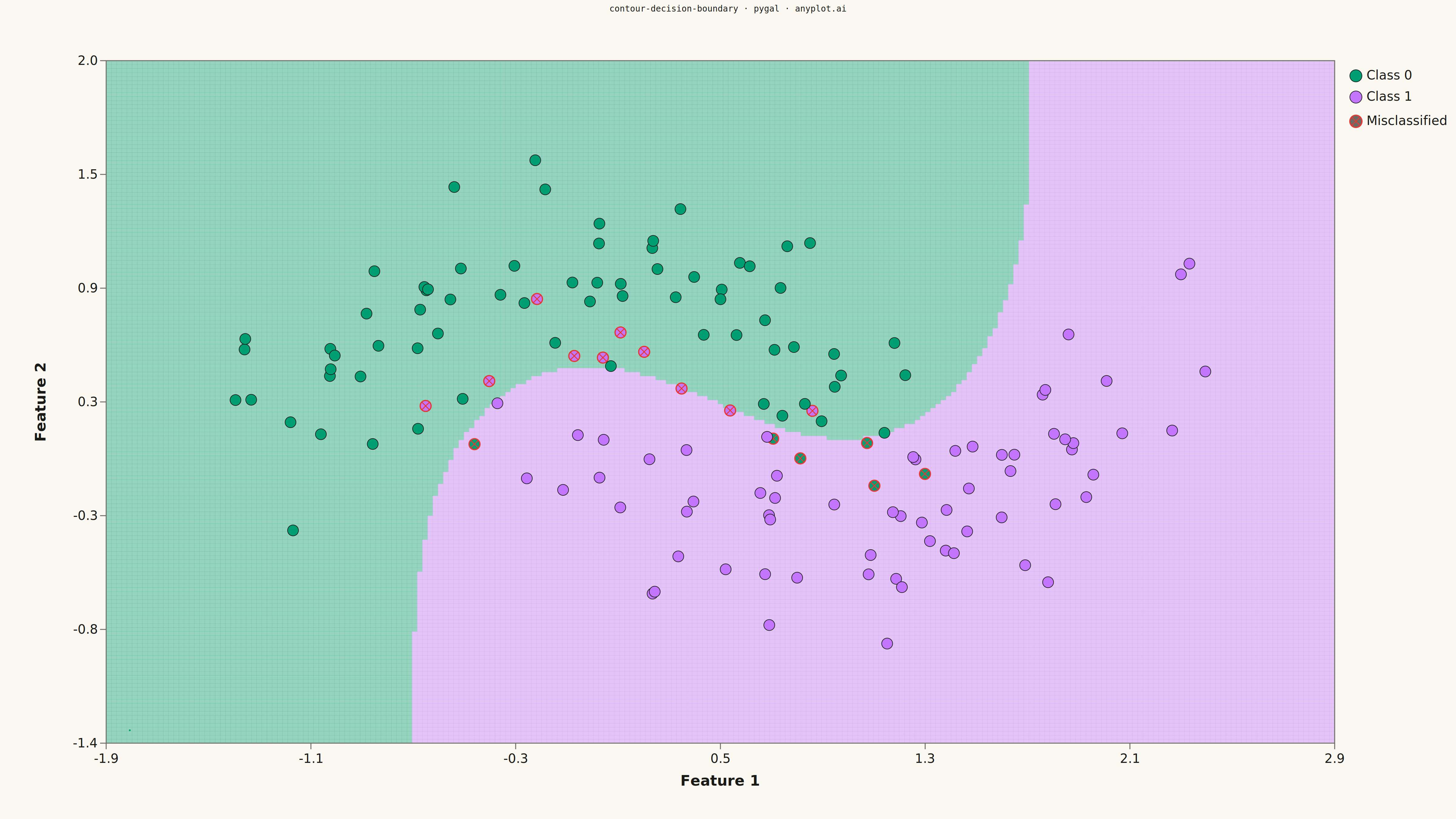
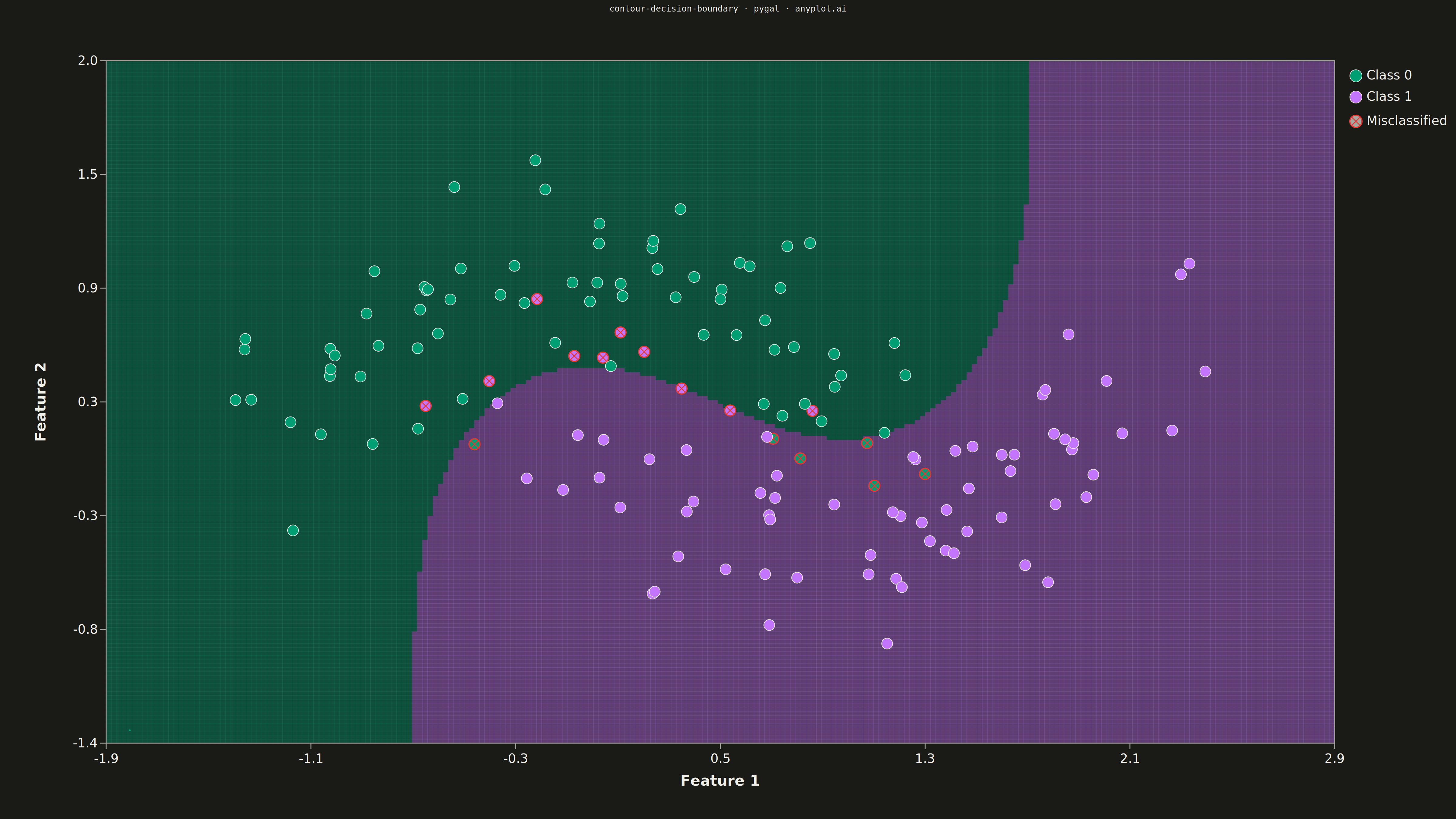
A decision boundary visualization showing how a classifier partitions 2D feature space into predicted class regions. Colored regions indicate the predicted class at each point in the feature space, with training data points overlaid to show how well the classifier separates different classes. This visualization is essential for understanding classifier behavior, identifying decision boundaries, and evaluating classification accuracy in machine learning.
""" anyplot.ai
contour-decision-boundary: Decision Boundary Classifier Visualization
Library: pygal 3.1.0 | Python 3.13.13
Quality: 86/100 | Updated: 2026-05-16
"""

import os
import sys
from pathlib import Path


# Remove script directory from path to avoid name collision with pygal package
_script_dir = str(Path(__file__).parent)
sys.path = [p for p in sys.path if p != _script_dir]

import cairosvg
import numpy as np
import pygal
from pygal.style import Style
from sklearn.datasets import make_moons
from sklearn.svm import SVC


# Theme tokens
THEME = os.getenv("ANYPLOT_THEME", "light")
PAGE_BG = "#FAF8F1" if THEME == "light" else "#1A1A17"
INK = "#1A1A17" if THEME == "light" else "#F0EFE8"
INK_MUTED = "#6B6A63" if THEME == "light" else "#A8A79F"

# Okabe-Ito palette
BRAND = "#009E73"  # First series
COLORS = ("#009E73", "#C475FD")  # Two classes

# Data: Generate synthetic classification data (moon shapes)
np.random.seed(42)
X, y = make_moons(n_samples=150, noise=0.25, random_state=42)

# Train SVM classifier
clf = SVC(kernel="rbf", C=1.0, gamma="scale")
clf.fit(X, y)

# Create mesh grid for decision boundary
h = 0.02  # Step size
x_min, x_max = X[:, 0].min() - 0.5, X[:, 0].max() + 0.5
y_min, y_max = X[:, 1].min() - 0.5, X[:, 1].max() + 0.5
xx, yy = np.meshgrid(np.arange(x_min, x_max, h), np.arange(y_min, y_max, h))

# Get predictions on mesh grid
Z = clf.predict(np.c_[xx.ravel(), yy.ravel()])
Z = Z.reshape(xx.shape)

# Style for 4800x2700 canvas
custom_style = Style(
    background=PAGE_BG,
    plot_background=PAGE_BG,
    foreground=INK,
    foreground_strong=INK,
    foreground_subtle=INK_MUTED,
    colors=COLORS,
    title_font_size=28,
    label_font_size=22,
    major_label_font_size=18,
    legend_font_size=16,
    value_font_size=14,
    stroke_width=3,
)

# Create base XY chart
chart = pygal.XY(
    width=4800,
    height=2700,
    style=custom_style,
    title="contour-decision-boundary · pygal · anyplot.ai",
    show_legend=False,
    margin=120,
    margin_top=200,
    margin_bottom=250,
    margin_left=350,
    margin_right=400,
    show_x_labels=False,
    show_y_labels=False,
    show_x_guides=False,
    show_y_guides=False,
    x_title="",
    y_title="",
)

# Plot dimensions (matching chart margins)
plot_x = 350
plot_y = 200
plot_width = 4800 - 350 - 400
plot_height = 2700 - 200 - 250


# Helper function to map data coordinates to SVG coordinates
def data_to_svg(data_x, data_y):
    svg_x = plot_x + (data_x - x_min) / (x_max - x_min) * plot_width
    svg_y = plot_y + plot_height - (data_y - y_min) / (y_max - y_min) * plot_height
    return svg_x, svg_y


# Build SVG content
svg_parts = []

# Draw decision boundary regions (filled cells)
n_rows, n_cols = Z.shape
cell_w = plot_width / (n_cols - 1)
cell_h = plot_height / (n_rows - 1)

# Alpha values for background regions
region_opacity = 0.4

for i in range(n_rows - 1):
    for j in range(n_cols - 1):
        # Use the class prediction for this cell
        cell_class = Z[i, j]
        # Use Okabe-Ito colors for regions
        color = COLORS[int(cell_class)]
        cx = plot_x + j * cell_w
        cy = plot_y + plot_height - (i + 1) * cell_h
        svg_parts.append(
            f'<rect x="{cx:.1f}" y="{cy:.1f}" width="{cell_w + 0.5:.1f}" '
            f'height="{cell_h + 0.5:.1f}" fill="{color}" stroke="none" opacity="{region_opacity}"/>'
        )

# Axis frame
svg_parts.append(
    f'<rect x="{plot_x}" y="{plot_y}" width="{plot_width}" height="{plot_height}" '
    f'fill="none" stroke="{INK_MUTED}" stroke-width="3"/>'
)

# Draw training points on top
marker_size = 18
for idx in range(len(X)):
    px, py = X[idx]
    svg_x, svg_y = data_to_svg(px, py)
    point_class = y[idx]
    color = COLORS[point_class]

    # Predict class for this point to check if correctly classified
    pred = clf.predict([[px, py]])[0]
    is_correct = pred == point_class

    # Use different marker for correct vs incorrect
    if is_correct:
        # Filled circle for correctly classified
        svg_parts.append(
            f'<circle cx="{svg_x:.1f}" cy="{svg_y:.1f}" r="{marker_size}" '
            f'fill="{color}" stroke="{INK}" stroke-width="2"/>'
        )
    else:
        # X marker for misclassified
        svg_parts.append(
            f'<circle cx="{svg_x:.1f}" cy="{svg_y:.1f}" r="{marker_size}" '
            f'fill="{color}" stroke="#E53935" stroke-width="4"/>'
        )
        size = marker_size * 0.7
        svg_parts.append(
            f'<line x1="{svg_x - size:.1f}" y1="{svg_y - size:.1f}" '
            f'x2="{svg_x + size:.1f}" y2="{svg_y + size:.1f}" stroke="#E53935" stroke-width="3"/>'
        )
        svg_parts.append(
            f'<line x1="{svg_x + size:.1f}" y1="{svg_y - size:.1f}" '
            f'x2="{svg_x - size:.1f}" y2="{svg_y + size:.1f}" stroke="#E53935" stroke-width="3"/>'
        )

# X-axis labels and ticks
n_x_ticks = 7
for i in range(n_x_ticks):
    frac = i / (n_x_ticks - 1)
    tick_x = plot_x + frac * plot_width
    tick_y = plot_y + plot_height
    val = x_min + frac * (x_max - x_min)
    svg_parts.append(
        f'<line x1="{tick_x:.1f}" y1="{tick_y}" x2="{tick_x:.1f}" y2="{tick_y + 20}" '
        f'stroke="{INK_MUTED}" stroke-width="3"/>'
    )
    svg_parts.append(
        f'<text x="{tick_x:.1f}" y="{tick_y + 65}" text-anchor="middle" fill="{INK}" '
        f'style="font-size:42px;font-family:sans-serif">{val:.1f}</text>'
    )

# X-axis title
svg_parts.append(
    f'<text x="{plot_x + plot_width / 2}" y="{plot_y + plot_height + 140}" text-anchor="middle" '
    f'fill="{INK}" style="font-size:48px;font-weight:bold;font-family:sans-serif">Feature 1</text>'
)

# Y-axis labels and ticks
n_y_ticks = 7
for i in range(n_y_ticks):
    frac = i / (n_y_ticks - 1)
    tick_y = plot_y + plot_height - frac * plot_height
    tick_x = plot_x
    val = y_min + frac * (y_max - y_min)
    svg_parts.append(
        f'<line x1="{tick_x - 20}" y1="{tick_y:.1f}" x2="{tick_x}" y2="{tick_y:.1f}" '
        f'stroke="{INK_MUTED}" stroke-width="3"/>'
    )
    svg_parts.append(
        f'<text x="{tick_x - 30}" y="{tick_y + 14:.1f}" text-anchor="end" fill="{INK}" '
        f'style="font-size:42px;font-family:sans-serif">{val:.1f}</text>'
    )

# Y-axis title (rotated)
y_title_x = plot_x - 200
y_title_y = plot_y + plot_height / 2
svg_parts.append(
    f'<text x="{y_title_x}" y="{y_title_y}" text-anchor="middle" fill="{INK}" '
    f'style="font-size:48px;font-weight:bold;font-family:sans-serif" '
    f'transform="rotate(-90, {y_title_x}, {y_title_y})">Feature 2</text>'
)

# Legend
legend_x = plot_x + plot_width + 50
legend_y = plot_y + 50

# Class 0 legend
svg_parts.append(
    f'<circle cx="{legend_x + 20}" cy="{legend_y}" r="20" fill="{COLORS[0]}" stroke="{INK}" stroke-width="2"/>'
)
svg_parts.append(
    f'<text x="{legend_x + 55}" y="{legend_y + 12}" fill="{INK}" '
    f'style="font-size:42px;font-family:sans-serif">Class 0</text>'
)

# Class 1 legend
svg_parts.append(
    f'<circle cx="{legend_x + 20}" cy="{legend_y + 70}" r="20" fill="{COLORS[1]}" stroke="{INK}" stroke-width="2"/>'
)
svg_parts.append(
    f'<text x="{legend_x + 55}" y="{legend_y + 82}" fill="{INK}" '
    f'style="font-size:42px;font-family:sans-serif">Class 1</text>'
)

# Misclassified legend
svg_parts.append(
    f'<circle cx="{legend_x + 20}" cy="{legend_y + 150}" r="20" fill="{INK_MUTED}" stroke="#E53935" stroke-width="4"/>'
)
size = 14
svg_parts.append(
    f'<line x1="{legend_x + 20 - size}" y1="{legend_y + 150 - size}" '
    f'x2="{legend_x + 20 + size}" y2="{legend_y + 150 + size}" stroke="#E53935" stroke-width="3"/>'
)
svg_parts.append(
    f'<line x1="{legend_x + 20 + size}" y1="{legend_y + 150 - size}" '
    f'x2="{legend_x + 20 - size}" y2="{legend_y + 150 + size}" stroke="#E53935" stroke-width="3"/>'
)
svg_parts.append(
    f'<text x="{legend_x + 55}" y="{legend_y + 162}" fill="{INK}" '
    f'style="font-size:42px;font-family:sans-serif">Misclassified</text>'
)

# Combine all SVG parts
custom_svg = "\n".join(svg_parts)

# Add dummy data point (required by pygal)
chart.add("", [(0, 0)])

# Render base chart and inject custom SVG
base_svg = chart.render(is_unicode=True)

# Insert custom SVG before the closing </svg> tag
output_svg = base_svg.replace("</svg>", f"{custom_svg}\n</svg>")

# Save SVG and convert to PNG using cairosvg
cairosvg.svg2png(bytestring=output_svg.encode("utf-8"), write_to=f"plot-{THEME}.png")

# Save interactive HTML
html_content = f"""<!DOCTYPE html>
<html>
<head>
    <meta charset="utf-8">
    <title>contour-decision-boundary - pygal</title>
    <style>
        body {{ margin: 0; display: flex; justify-content: center; align-items: center; min-height: 100vh; background: {PAGE_BG}; }}
        .chart {{ max-width: 100%; height: auto; }}
    </style>
</head>
<body>
    <figure class="chart">
        {output_svg}
    </figure>
</body>
</html>
"""

with open(f"plot-{THEME}.html", "w", encoding="utf-8") as f:
    f.write(html_content)
Runnable source as JSON, for any HTTP client: https://api.anyplot.ai/specs/contour-decision-boundary/pygal/code. Any spec id and library id listed in llms-full.txt fit the same URL shape; every URL below is complete and callable.
{
  "spec_id": "contour-decision-boundary",
  "language": "python",
  "library": "pygal",
  "page": "https://anyplot.ai/contour-decision-boundary/python/pygal",
  "hub": "https://anyplot.ai/contour-decision-boundary",
  "code_json": "https://api.anyplot.ai/specs/contour-decision-boundary/pygal/code",
  "spec_json": "https://api.anyplot.ai/specs/contour-decision-boundary",
  "render_light_png": "https://storage.googleapis.com/anyplot-images/plots/contour-decision-boundary/python/pygal/plot-light.png",
  "render_dark_png": "https://storage.googleapis.com/anyplot-images/plots/contour-decision-boundary/python/pygal/plot-dark.png",
  "interactive_light_html": "https://storage.googleapis.com/anyplot-images/plots/contour-decision-boundary/python/pygal/plot-light.html",
  "interactive_dark_html": "https://storage.googleapis.com/anyplot-images/plots/contour-decision-boundary/python/pygal/plot-dark.html",
  "quality_score": 86.0,
  "license": "MIT",
  "guide": "https://anyplot.ai/llms.txt"
}
Part of Decision Boundary Classifier Visualization on anyplot.ai.