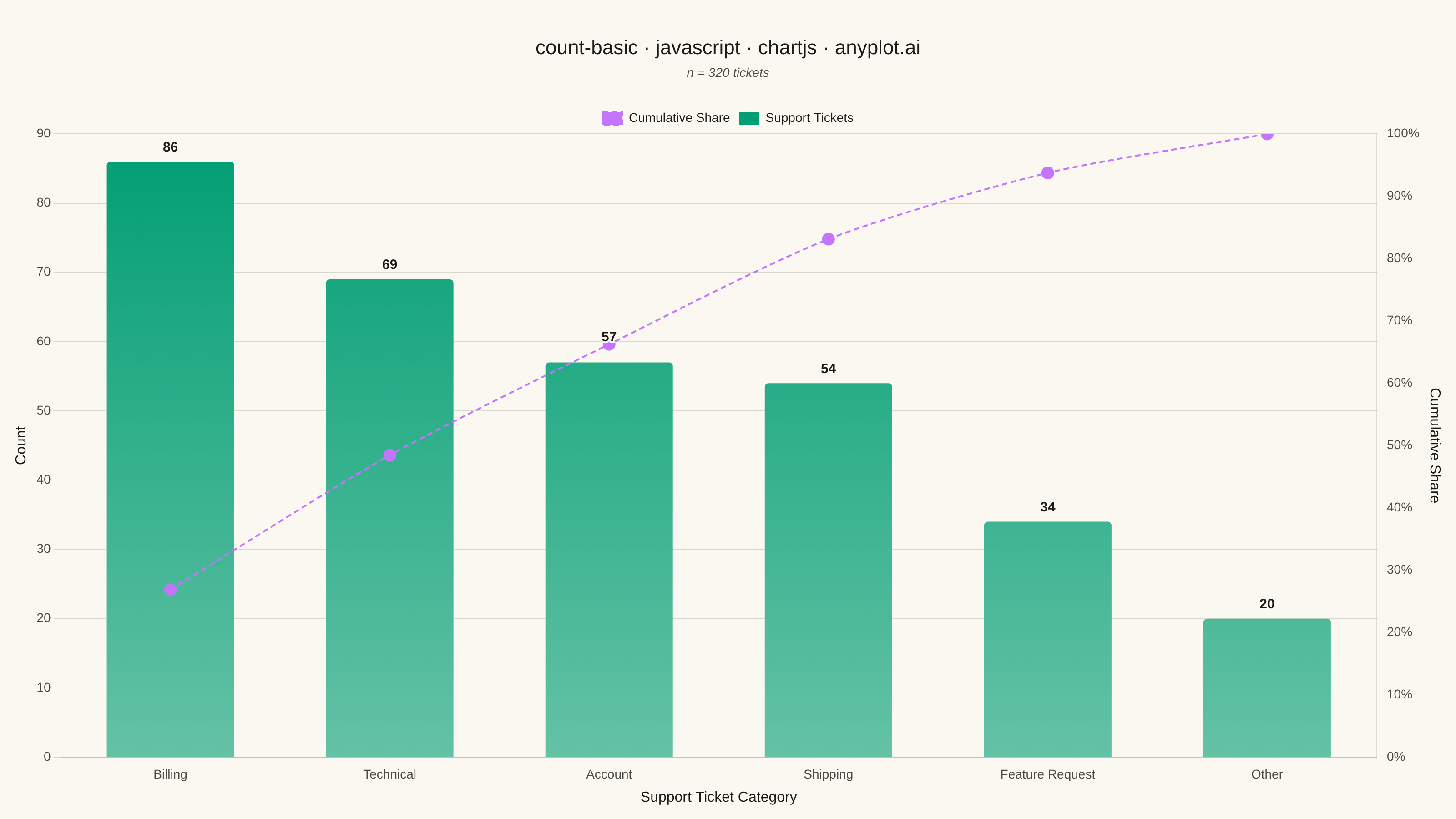
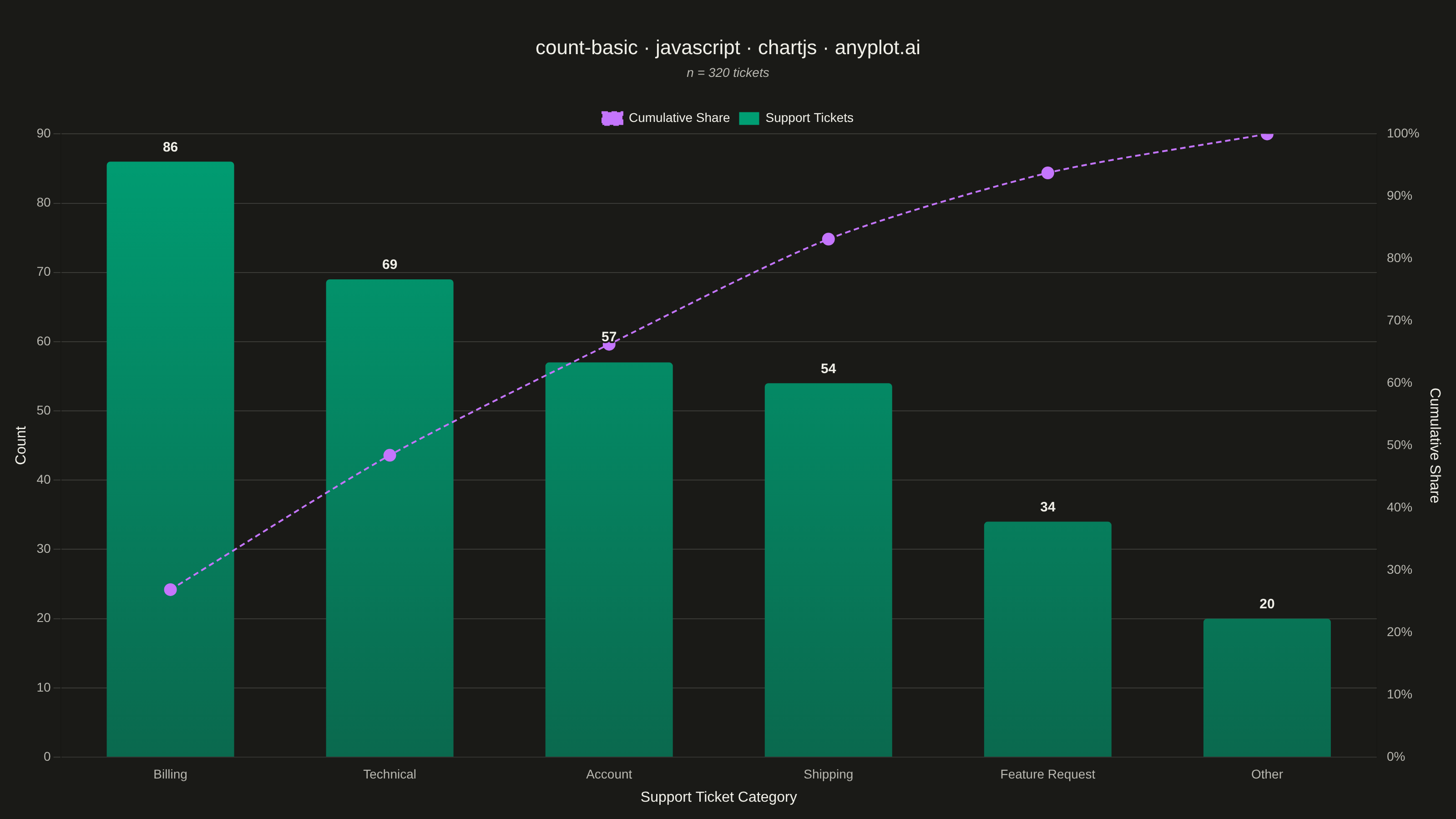
The same plot in 14 other libraries — JavaScript: D3.js, Apache ECharts, Highcharts, MUI X Charts; Python: Altair, Bokeh, lets-plot, Matplotlib, Plotly, plotnine, Pygal, Seaborn; R: ggplot2; Julia: Makie.jl. Compare all 15 side by side: Basic Count Plot in Python, R, Julia and JavaScript.
A count plot displays the frequency of observations in each category of a categorical variable using vertical bars. Unlike a basic bar chart that requires pre-computed values, a count plot automatically counts occurrences from raw data. This makes it ideal for quick exploratory analysis of categorical distributions without manual aggregation.
// anyplot.ai
// count-basic: Basic Count Plot
// Library: chartjs 4.4.7 | JavaScript 22.23.1
// Quality: 94/100 | Created: 2026-08-11

const t = window.ANYPLOT_TOKENS;

// --- Data: raw categorical observations, counted client-side --------------
// (mirrors a countplot / value_counts() workflow rather than pre-aggregated bars)
function lcg(seed) {
  let state = seed;
  return function () {
    state = (state * 1664525 + 1013904223) % 4294967296;
    return state / 4294967296;
  };
}
const rand = lcg(42);

const categories = [
  "Billing",
  "Technical",
  "Shipping",
  "Account",
  "Feature Request",
  "Other",
];
const weights = [0.27, 0.24, 0.18, 0.15, 0.11, 0.05];
const cumulative = weights.reduce((acc, w) => {
  acc.push((acc.length ? acc[acc.length - 1] : 0) + w);
  return acc;
}, []);

const ticketCount = 320;
const counts = new Map(categories.map((category) => [category, 0]));
for (let i = 0; i < ticketCount; i++) {
  const r = rand();
  const idx = cumulative.findIndex((c) => r <= c);
  const category = categories[idx === -1 ? categories.length - 1 : idx];
  counts.set(category, counts.get(category) + 1);
}

const sorted = [...counts.entries()].sort((a, b) => b[1] - a[1]);
const labels = sorted.map(([label]) => label);
const values = sorted.map(([, value]) => value);

// Pareto overlay: running share of all tickets covered as categories are
// added left-to-right along the descending sort. This is the spec's own
// "optional percentage annotations" note, expressed as a genuine Chart.js
// mixed-type dataset (bar + line, dual y-axis) rather than a plain % label.
let runningTotal = 0;
const cumulativeShare = values.map((value) => {
  runningTotal += value;
  return (runningTotal / ticketCount) * 100;
});

// --- Mount ------------------------------------------------------------------
const canvas = document.createElement("canvas");
document.getElementById("container").appendChild(canvas);

// --- Distinctive Chart.js touches -------------------------------------------
// Top-to-bottom color falloff on each bar (same brand hue in both themes, only
// the gradient stop mix differs), a custom draw plugin that renders the exact
// count above every bar, and a mixed bar+line dataset (dual y-axis) that
// overlays the Pareto cumulative-share curve from the second Imprint color.
function mixHex(hexA, hexB, weightA) {
  const a = parseInt(hexA.slice(1), 16);
  const b = parseInt(hexB.slice(1), 16);
  const mix = (shift) => {
    const va = (a >> shift) & 0xff;
    const vb = (b >> shift) & 0xff;
    return Math.round(va * weightA + vb * (1 - weightA));
  };
  const r = mix(16);
  const g = mix(8);
  const bl = mix(0);
  return `#${((r << 16) | (g << 8) | bl).toString(16).padStart(6, "0")}`;
}

// Fully opaque bottom stop (blended toward the page background instead of
// using alpha) so the line dataset drawn on top never composites with the
// bar and shifts hue.
function barGradient(context) {
  const { chart } = context;
  const { ctx, chartArea } = chart;
  if (!chartArea) return t.palette[0];
  const gradient = ctx.createLinearGradient(
    0,
    chartArea.top,
    0,
    chartArea.bottom,
  );
  gradient.addColorStop(0, t.palette[0]);
  gradient.addColorStop(1, mixHex(t.palette[0], t.pageBg, 0.6));
  return gradient;
}

const countLabelPlugin = {
  id: "countLabels",
  afterDatasetsDraw(chart) {
    const { ctx } = chart;
    const meta = chart.getDatasetMeta(0);
    const lineMeta = chart.getDatasetMeta(1);
    ctx.save();
    ctx.font = "600 15px sans-serif";
    ctx.textAlign = "center";
    ctx.textBaseline = "bottom";
    // Halo stroke in the page background color keeps the label legible even
    // where the cumulative-share line crosses behind it (data-dependent, so
    // the crossing point can't be avoided by fixed positioning alone). When
    // the line point lands close to the default offset, push the label
    // further up so it clears the dashed stroke entirely.
    ctx.strokeStyle = t.pageBg;
    ctx.lineWidth = 4;
    ctx.lineJoin = "round";
    ctx.fillStyle = t.ink;
    meta.data.forEach((bar, i) => {
      const text = String(chart.data.datasets[0].data[i]);
      const linePoint = lineMeta.data[i];
      const nearLine = linePoint && Math.abs(linePoint.y - (bar.y - 8)) < 14;
      const yOffset = nearLine ? 20 : 8;
      ctx.strokeText(text, bar.x, bar.y - yOffset);
      ctx.fillText(text, bar.x, bar.y - yOffset);
    });
    ctx.restore();
  },
};

// --- Chart --------------------------------------------------------------
new Chart(canvas, {
  type: "bar",
  data: {
    labels,
    datasets: [
      {
        type: "bar",
        label: "Support Tickets",
        data: values,
        backgroundColor: barGradient,
        borderRadius: 4,
        maxBarThickness: 140,
        categoryPercentage: 0.85,
        barPercentage: 0.9,
        yAxisID: "count",
        order: 2,
      },
      {
        type: "line",
        label: "Cumulative Share",
        data: cumulativeShare,
        borderColor: t.palette[1],
        backgroundColor: t.palette[1],
        borderWidth: 2,
        borderDash: [6, 4],
        pointRadius: 6,
        pointBackgroundColor: t.palette[1],
        tension: 0.25,
        yAxisID: "percentage",
        order: 1,
      },
    ],
  },
  plugins: [countLabelPlugin],
  options: {
    responsive: true,
    maintainAspectRatio: false,
    animation: false,
    layout: { padding: { top: 40, right: 10, bottom: 10, left: 10 } },
    plugins: {
      title: {
        display: true,
        text: "count-basic · javascript · chartjs · anyplot.ai",
        color: t.ink,
        font: { size: 22, weight: "500" },
        padding: { bottom: 6 },
      },
      subtitle: {
        display: true,
        text: `n = ${ticketCount} tickets`,
        color: t.inkSoft,
        font: { size: 14, style: "italic" },
        padding: { bottom: 24 },
      },
      legend: {
        display: true,
        labels: { color: t.ink, font: { size: 14 }, boxWidth: 22 },
      },
      tooltip: { enabled: false },
    },
    scales: {
      x: {
        ticks: { color: t.inkSoft, font: { size: 14 } },
        grid: { display: false },
        title: {
          display: true,
          text: "Support Ticket Category",
          color: t.ink,
          font: { size: 16 },
        },
      },
      count: {
        type: "linear",
        position: "left",
        beginAtZero: true,
        ticks: { color: t.inkSoft, font: { size: 14 }, precision: 0 },
        grid: { color: t.grid },
        title: {
          display: true,
          text: "Count",
          color: t.ink,
          font: { size: 16 },
        },
      },
      percentage: {
        type: "linear",
        position: "right",
        min: 0,
        max: 100,
        ticks: {
          color: t.inkSoft,
          font: { size: 14 },
          callback: (value) => `${value}%`,
        },
        grid: { display: false },
        title: {
          display: true,
          text: "Cumulative Share",
          color: t.ink,
          font: { size: 16 },
        },
      },
    },
  },
});
Runnable source as JSON, for any HTTP client: https://api.anyplot.ai/specs/count-basic/chartjs/code. Any spec id and library id listed in llms-full.txt fit the same URL shape; every URL below is complete and callable.
{
  "spec_id": "count-basic",
  "language": "javascript",
  "library": "chartjs",
  "page": "https://anyplot.ai/count-basic/javascript/chartjs",
  "hub": "https://anyplot.ai/count-basic",
  "code_json": "https://api.anyplot.ai/specs/count-basic/chartjs/code",
  "spec_json": "https://api.anyplot.ai/specs/count-basic",
  "render_light_png": "https://storage.googleapis.com/anyplot-images/plots/count-basic/javascript/chartjs/plot-light.png",
  "render_dark_png": "https://storage.googleapis.com/anyplot-images/plots/count-basic/javascript/chartjs/plot-dark.png",
  "interactive_light_html": "https://storage.googleapis.com/anyplot-images/plots/count-basic/javascript/chartjs/plot-light.html",
  "interactive_dark_html": "https://storage.googleapis.com/anyplot-images/plots/count-basic/javascript/chartjs/plot-dark.html",
  "quality_score": 94.0,
  "license": "MIT",
  "guide": "https://anyplot.ai/llms.txt"
}
Part of Basic Count Plot on anyplot.ai.