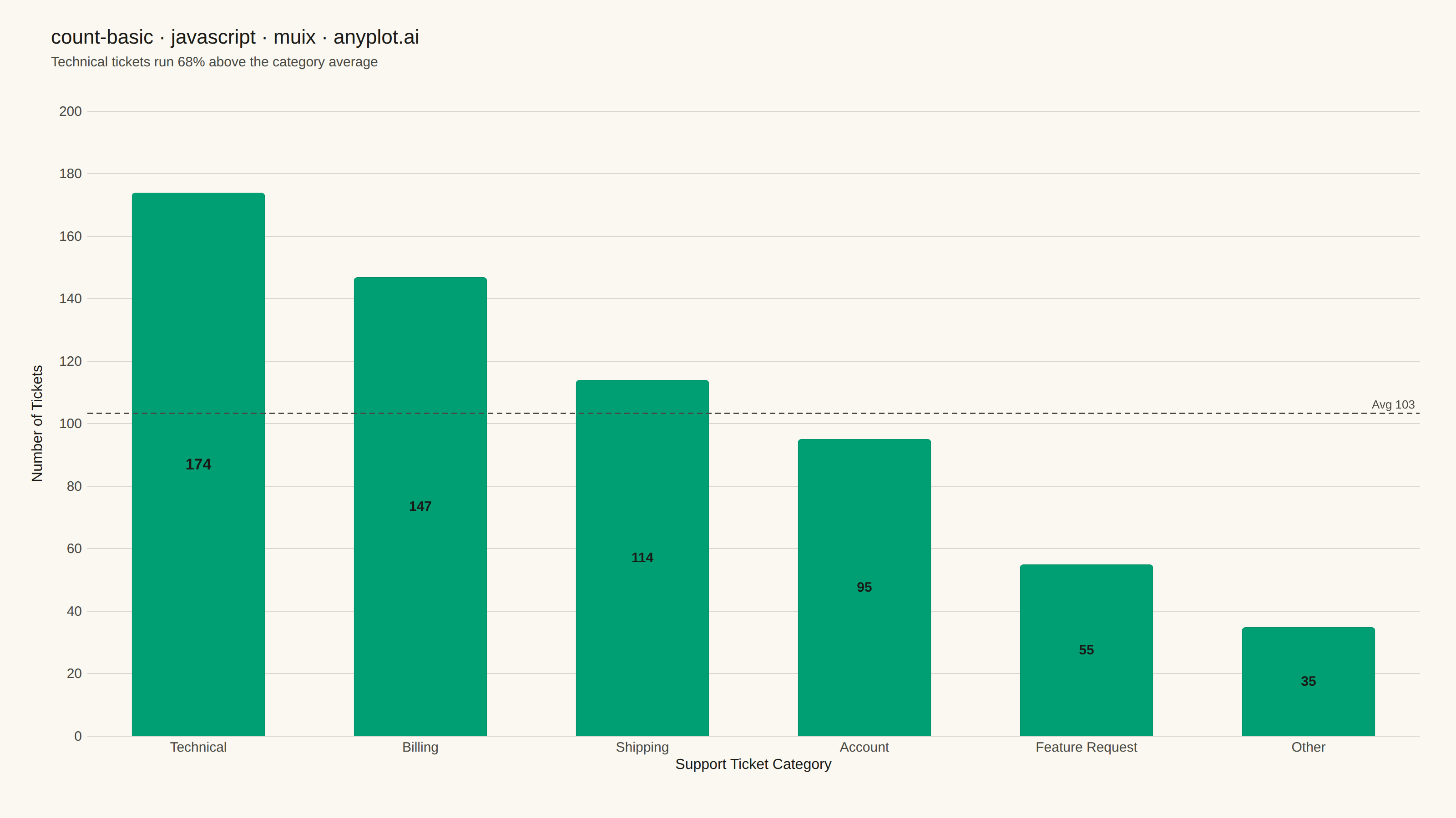
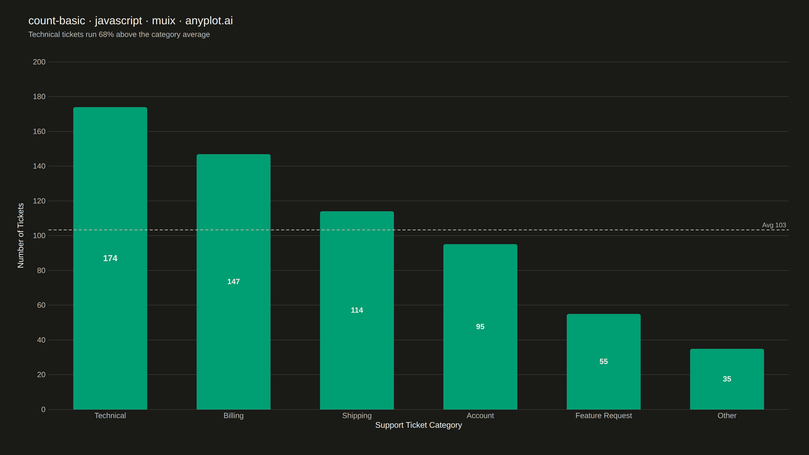
The same plot in 14 other libraries — JavaScript: Chart.js, D3.js, Apache ECharts, Highcharts; Python: Altair, Bokeh, lets-plot, Matplotlib, Plotly, plotnine, Pygal, Seaborn; R: ggplot2; Julia: Makie.jl. Compare all 15 side by side: Basic Count Plot in Python, R, Julia and JavaScript.
A count plot displays the frequency of observations in each category of a categorical variable using vertical bars. Unlike a basic bar chart that requires pre-computed values, a count plot automatically counts occurrences from raw data. This makes it ideal for quick exploratory analysis of categorical distributions without manual aggregation.
// anyplot.ai
// count-basic: Basic Count Plot
// Library: muix 7.29.1 | JavaScript 22.23.1
// Quality: 95/100 | Created: 2026-08-11
import { BarChart } from "@mui/x-charts/BarChart";
import { ChartsReferenceLine } from "@mui/x-charts/ChartsReferenceLine";
import Box from "@mui/material/Box";
import Typography from "@mui/material/Typography";

const t = window.ANYPLOT_TOKENS;

// --- Data: raw support-ticket categories, counted (not pre-aggregated) ------
// A count plot tallies occurrences from raw observations rather than plotting
// pre-computed values, so we simulate individual ticket records first and only
// derive the bar heights by counting them.
function lcg(seed) {
  let state = seed;
  return () => {
    state = (state * 1664525 + 1013904223) % 4294967296;
    return state / 4294967296;
  };
}

const rand = lcg(42);
const TICKET_TYPES = [
  "Technical",
  "Billing",
  "Shipping",
  "Account",
  "Feature Request",
  "Other",
];
const TYPE_WEIGHTS = [0.3, 0.24, 0.18, 0.14, 0.09, 0.05];
const TICKET_COUNT = 620;

const rawTickets = Array.from({ length: TICKET_COUNT }, () => {
  const r = rand();
  let cumulative = 0;
  for (let i = 0; i < TICKET_TYPES.length; i++) {
    cumulative += TYPE_WEIGHTS[i];
    if (r < cumulative) return TICKET_TYPES[i];
  }
  return TICKET_TYPES[TICKET_TYPES.length - 1];
});

const countByType = new Map();
for (const ticketType of rawTickets) {
  countByType.set(ticketType, (countByType.get(ticketType) ?? 0) + 1);
}

// Sorted by frequency, descending — the default reading order for a count plot.
const sortedEntries = [...countByType.entries()].sort((a, b) => b[1] - a[1]);
const categories = sortedEntries.map(([category]) => category);
const counts = sortedEntries.map(([, count]) => count);
const meanCount = counts.reduce((sum, c) => sum + c, 0) / counts.length;

// Leading category vs. the average — surfaces the takeaway instead of leaving
// the viewer to read it off the bars themselves.
const topCategory = categories[0];
const pctAboveAvg = Math.round(((counts[0] - meanCount) / meanCount) * 100);

// The y-axis label's offset from the axis line is computed internally by MUI X
// as `tickFontSize + tickSize + 10` (not from tickLabelStyle.fontSize, the
// prop that actually sets the rendered glyph size) — so tickFontSize has to be
// sized to clear the widest tick number, or the label collides with it. Scale
// it off the real digit count instead of a fixed magic number so the offset
// stays correct if the data range changes.
const yTickDigits = String(Math.max(...counts)).length;
const yTickFontSize = 12 + yTickDigits * 8;

export default function Chart() {
  const W = window.ANYPLOT_SIZE.width; // 1600 CSS px (landscape mount)
  const H = window.ANYPLOT_SIZE.height; // 900 CSS px
  const CHART_TOP = 108;

  return (
    <Box sx={{ position: "relative", width: W, height: H, bgcolor: t.pageBg }}>
      {/* Title */}
      <Box sx={{ position: "absolute", top: 24, left: 56, right: 56 }}>
        <Typography sx={{ color: t.ink, fontSize: 22, fontWeight: 500 }}>
          count-basic · javascript · muix · anyplot.ai
        </Typography>
      </Box>

      {/* Subtitle: surfaces the takeaway directly rather than leaving the
          viewer to read the sort order + average line themselves. */}
      <Box sx={{ position: "absolute", top: 58, left: 56, right: 56 }}>
        <Typography sx={{ color: t.inkSoft, fontSize: 15, fontWeight: 400 }}>
          {topCategory} tickets run {pctAboveAvg}% above the category average
        </Typography>
      </Box>

      {/* Bar chart */}
      <Box
        sx={{
          position: "absolute",
          top: CHART_TOP,
          left: 0,
          right: 0,
          bottom: 0,
        }}
      >
        <BarChart
          width={W}
          height={H - CHART_TOP}
          colors={[t.palette[0]]}
          skipAnimation
          borderRadius={4}
          xAxis={[
            {
              scaleType: "band",
              data: categories,
              label: "Support Ticket Category",
              disableTicks: true,
              disableLine: true,
              labelStyle: { fontSize: 16, fill: t.ink },
              tickLabelStyle: { fontSize: 15, fill: t.inkSoft },
              categoryGapRatio: 0.4,
            },
          ]}
          yAxis={[
            {
              label: "Number of Tickets",
              labelStyle: { fontSize: 16, fill: t.ink },
              tickLabelStyle: { fontSize: 15, fill: t.inkSoft },
              // tickFontSize only sizes the *reserved layout offset* between the
              // tick labels and the axis label (tickLabelStyle.fontSize above
              // wins for the rendered glyph size) — derived from yTickFontSize
              // above so it stays correct if the data range changes.
              tickFontSize: yTickFontSize,
              disableTicks: true,
              disableLine: true,
              max: Math.max(...counts) * 1.15,
            },
          ]}
          series={[{ data: counts, label: "Tickets" }]}
          barLabel="value"
          margin={{ top: 14, right: 40, bottom: 90, left: 96 }}
          grid={{ horizontal: true }}
          slotProps={{
            legend: { hidden: true },
            // The leading category (dataIndex 0, since bars are sorted
            // descending) gets a slightly bolder/larger label — a focal-point
            // emphasis that reinforces the subtitle without changing the
            // brand-green fill, so data color stays identical across themes.
            barLabel: (ownerState) => ({
              style: {
                fontSize: ownerState.dataIndex === 0 ? 17 : 15,
                fontWeight: ownerState.dataIndex === 0 ? 700 : 600,
                fill: t.ink,
              },
            }),
            // A thin ink-colored stroke crisps the bar edges against the page
            // background — the style guide's sanctioned outline pattern, not
            // a color/gradient change, so it doesn't affect data color parity.
            bar: { style: { stroke: t.ink, strokeOpacity: 0.15, strokeWidth: 1 } },
          }}
          sx={{
            "& .MuiChartsGrid-line": { stroke: t.grid },
          }}
        >
          {/* Mean reference line: turns "6 bars" into "which categories run
              above/below the average ticket volume" — lands in open canvas at
              the right (short bars), never crossing the in-bar value labels. */}
          <ChartsReferenceLine
            y={meanCount}
            label={`Avg ${Math.round(meanCount)}`}
            labelAlign="end"
            lineStyle={{
              stroke: t.inkSoft,
              strokeDasharray: "6 4",
              strokeWidth: 1.5,
            }}
            labelStyle={{ fill: t.inkSoft, fontSize: 13, fontWeight: 500 }}
          />
        </BarChart>
      </Box>
    </Box>
  );
}
Runnable source as JSON, for any HTTP client: https://api.anyplot.ai/specs/count-basic/muix/code. Any spec id and library id listed in llms-full.txt fit the same URL shape; every URL below is complete and callable.
{
  "spec_id": "count-basic",
  "language": "javascript",
  "library": "muix",
  "page": "https://anyplot.ai/count-basic/javascript/muix",
  "hub": "https://anyplot.ai/count-basic",
  "code_json": "https://api.anyplot.ai/specs/count-basic/muix/code",
  "spec_json": "https://api.anyplot.ai/specs/count-basic",
  "render_light_png": "https://storage.googleapis.com/anyplot-images/plots/count-basic/javascript/muix/plot-light.png",
  "render_dark_png": "https://storage.googleapis.com/anyplot-images/plots/count-basic/javascript/muix/plot-dark.png",
  "interactive_light_html": "https://storage.googleapis.com/anyplot-images/plots/count-basic/javascript/muix/plot-light.html",
  "interactive_dark_html": "https://storage.googleapis.com/anyplot-images/plots/count-basic/javascript/muix/plot-dark.html",
  "quality_score": 95.0,
  "license": "MIT",
  "guide": "https://anyplot.ai/llms.txt"
}
Part of Basic Count Plot on anyplot.ai.