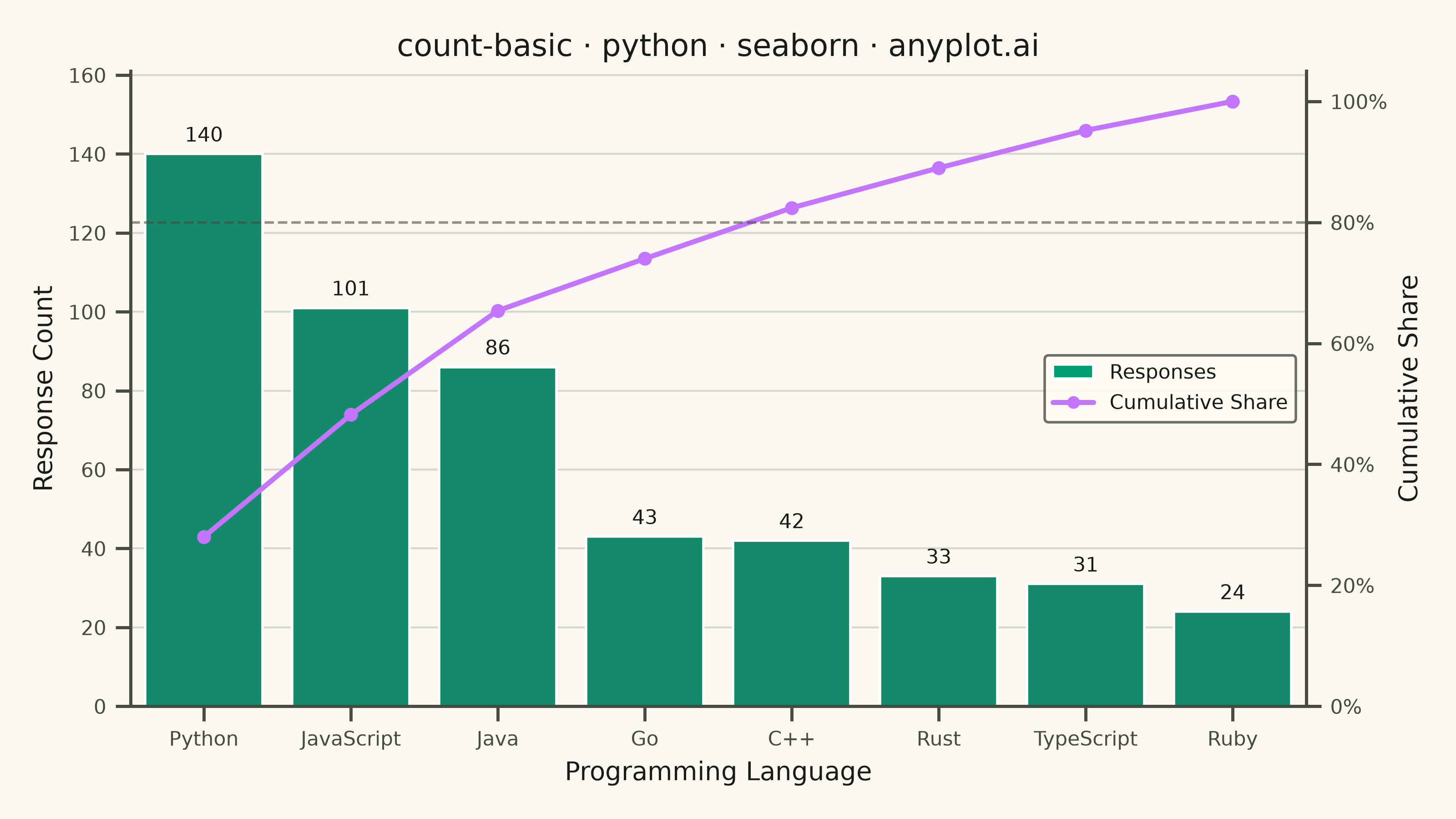
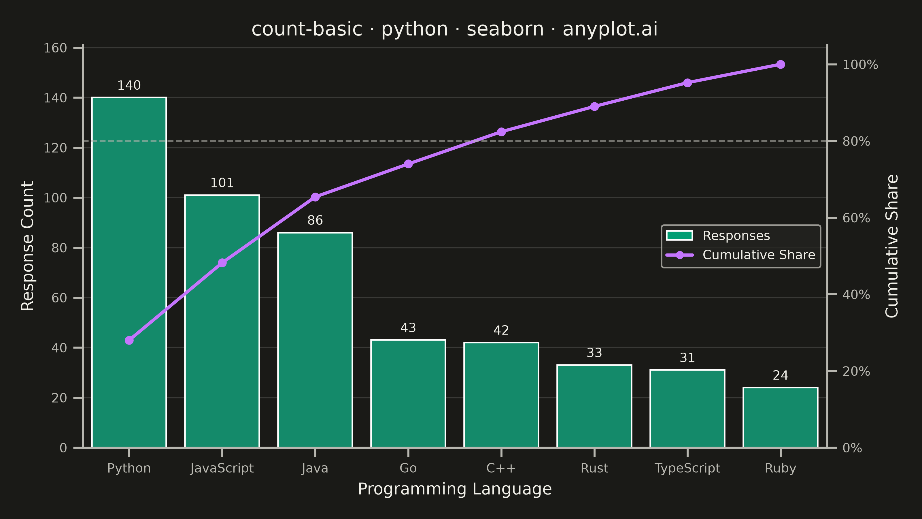
A count plot displays the frequency of observations in each category of a categorical variable using vertical bars. Unlike a basic bar chart that requires pre-computed values, a count plot automatically counts occurrences from raw data. This makes it ideal for quick exploratory analysis of categorical distributions without manual aggregation.
""" anyplot.ai
count-basic: Basic Count Plot
Library: seaborn 0.13.2 | Python 3.13.14
Quality: 93/100 | Updated: 2026-08-11
"""

import os
import sys
from pathlib import Path


# Avoid shadowing by the matplotlib.py file in same directory
script_dir = Path(__file__).parent
old_path = sys.path[:]
sys.path = [p for p in sys.path if str(p) != str(script_dir)]

import matplotlib.pyplot as plt
import numpy as np
import pandas as pd
import seaborn as sns
from matplotlib.lines import Line2D
from matplotlib.patches import Patch
from matplotlib.ticker import PercentFormatter


sys.path = old_path


# Theme tokens
THEME = os.getenv("ANYPLOT_THEME", "light")
PAGE_BG = "#FAF8F1" if THEME == "light" else "#1A1A17"
ELEVATED_BG = "#FFFDF6" if THEME == "light" else "#242420"
INK = "#1A1A17" if THEME == "light" else "#F0EFE8"
INK_SOFT = "#4A4A44" if THEME == "light" else "#B8B7B0"
BRAND = "#009E73"
CUM_LINE = "#C475FD"  # Imprint palette position 2 - second series (cumulative %)

# Data - Survey responses about preferred programming languages
np.random.seed(42)
languages = ["Python", "JavaScript", "Java", "C++", "Go", "Rust", "TypeScript", "Ruby"]
weights = [0.28, 0.22, 0.15, 0.10, 0.08, 0.07, 0.06, 0.04]
n_responses = 500
responses = np.random.choice(languages, size=n_responses, p=weights)

df = pd.DataFrame({"language": responses})

# Configure seaborn with theme-adaptive styling
sns.set_theme(
    style="ticks",
    rc={
        "figure.facecolor": PAGE_BG,
        "axes.facecolor": PAGE_BG,
        "axes.edgecolor": INK_SOFT,
        "axes.labelcolor": INK,
        "text.color": INK,
        "xtick.color": INK_SOFT,
        "ytick.color": INK_SOFT,
        "grid.color": INK,
        "grid.alpha": 0.10,
        "legend.facecolor": ELEVATED_BG,
        "legend.edgecolor": INK_SOFT,
    },
)

# Plot
fig, ax = plt.subplots(figsize=(8, 4.5), dpi=400, facecolor=PAGE_BG)

# Count plot sorted by frequency (descending)
counts = df["language"].value_counts()
order = counts.index.tolist()
sns.countplot(data=df, x="language", order=order, color=BRAND, ax=ax)

# Explicit headroom on the primary axis so the count-label collision check
# below can reason about label position relative to the cumulative-share line.
count_max = counts.max()
ax.set_ylim(0, count_max * 1.15)

# Pareto overlay: cumulative share of responses on a secondary axis, with the
# classic 80% reference line to call out how few categories dominate the total.
# twinx() is unavoidable (matplotlib/seaborn has no native dual-axis primitive),
# but the connector itself is drawn with sns.pointplot rather than a raw
# matplotlib .plot() call, so the categorical point-estimate machinery (order=,
# errorbar=, native categorical positioning) stays seaborn-idiomatic instead of
# generic.
cum_pct = counts.cumsum() / counts.sum() * 100
ax2 = ax.twinx()
sns.pointplot(
    x=order,
    y=cum_pct.to_numpy(),
    order=order,
    color=CUM_LINE,
    markers="o",
    linestyles="-",
    markersize=4,
    linewidth=2,
    errorbar=None,
    ax=ax2,
)
ax2.axhline(80, color=INK_SOFT, linewidth=1, linestyle="--", alpha=0.6, zorder=2)

# twinx() creates a second, fully-opaque drawing layer that always paints over
# the first, so count labels are added to ax2 (not ax) — via ax.transData for
# positioning — to stay legible above the cumulative line rather than under it.
# Wherever a bar's height and the cumulative-line marker land close together on
# their respective axis scales, lift that label further above the bar so the
# text clears the marker instead of sitting on top of it.
cum_arr = cum_pct.to_numpy()
for i, count in enumerate(counts.to_numpy()):
    count_frac = count / (count_max * 1.15)
    cum_frac = cum_arr[i] / 105
    y_offset = 13 if abs(count_frac - cum_frac) < 0.08 else 3
    ax2.annotate(
        str(count),
        xy=(i, count),
        xycoords=ax.transData,
        xytext=(0, y_offset),
        textcoords="offset points",
        ha="center",
        va="bottom",
        fontsize=8,
        color=INK,
        zorder=6,
    )
ax2.set_ylim(0, 105)
ax2.yaxis.set_major_formatter(PercentFormatter())
ax2.set_ylabel("Cumulative Share", fontsize=10, color=INK)
ax2.tick_params(axis="y", labelsize=8, colors=INK_SOFT)
ax2.spines["top"].set_visible(False)
ax2.spines["left"].set_visible(False)
ax2.spines["right"].set_color(INK_SOFT)

# Style
ax.set_xlabel("Programming Language", fontsize=10, color=INK)
ax.set_ylabel("Response Count", fontsize=10, color=INK)
ax.set_title("count-basic · python · seaborn · anyplot.ai", fontsize=12, fontweight="medium", color=INK)
ax.tick_params(axis="both", labelsize=8, colors=INK_SOFT)

# Subtle grid on y-axis only
ax.yaxis.grid(True, alpha=0.15, linewidth=0.8, color=INK)
ax.set_axisbelow(True)

# Remove top and right spines for cleaner look
ax.spines["top"].set_visible(False)
ax.spines["right"].set_visible(False)
ax.spines["left"].set_color(INK_SOFT)
ax.spines["bottom"].set_color(INK_SOFT)

legend_handles = [
    Patch(facecolor=BRAND, label="Responses"),
    Line2D([0], [0], color=CUM_LINE, marker="o", markersize=4, linewidth=2, label="Cumulative Share"),
]
ax.legend(
    handles=legend_handles,
    fontsize=8,
    loc="center right",
    frameon=True,
    facecolor=ELEVATED_BG,
    edgecolor=INK_SOFT,
    labelcolor=INK,
)

fig.tight_layout()
plt.savefig(f"plot-{THEME}.png", dpi=400, facecolor=PAGE_BG)
Runnable source as JSON, for any HTTP client: https://api.anyplot.ai/specs/count-basic/seaborn/code. Any spec id and library id listed in llms-full.txt fit the same URL shape; every URL below is complete and callable.
{
  "spec_id": "count-basic",
  "language": "python",
  "library": "seaborn",
  "page": "https://anyplot.ai/count-basic/python/seaborn",
  "hub": "https://anyplot.ai/count-basic",
  "code_json": "https://api.anyplot.ai/specs/count-basic/seaborn/code",
  "spec_json": "https://api.anyplot.ai/specs/count-basic",
  "render_light_png": "https://storage.googleapis.com/anyplot-images/plots/count-basic/python/seaborn/plot-light.png",
  "render_dark_png": "https://storage.googleapis.com/anyplot-images/plots/count-basic/python/seaborn/plot-dark.png",
  "quality_score": 93.0,
  "license": "MIT",
  "guide": "https://anyplot.ai/llms.txt"
}
Part of Basic Count Plot on anyplot.ai.