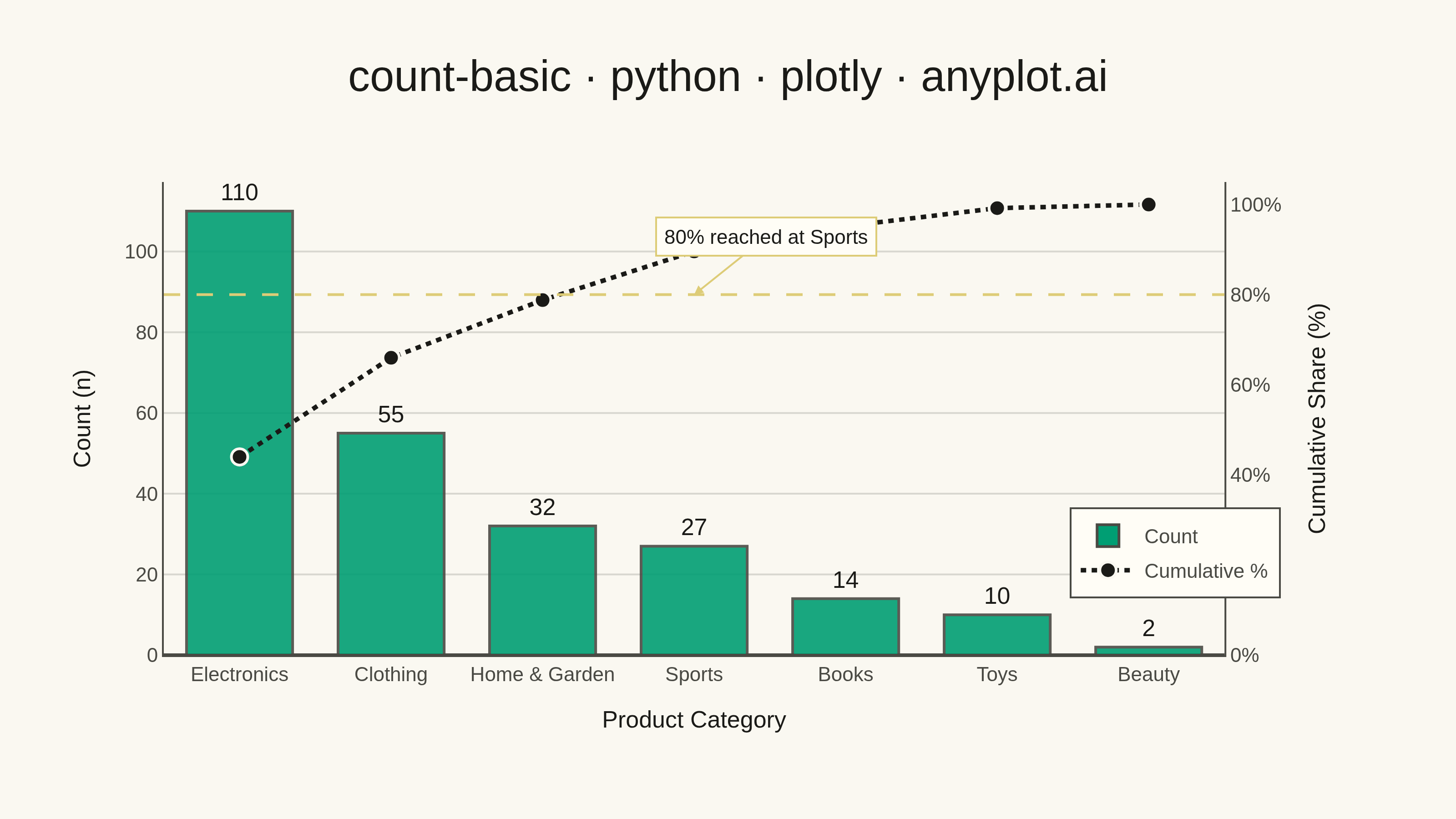
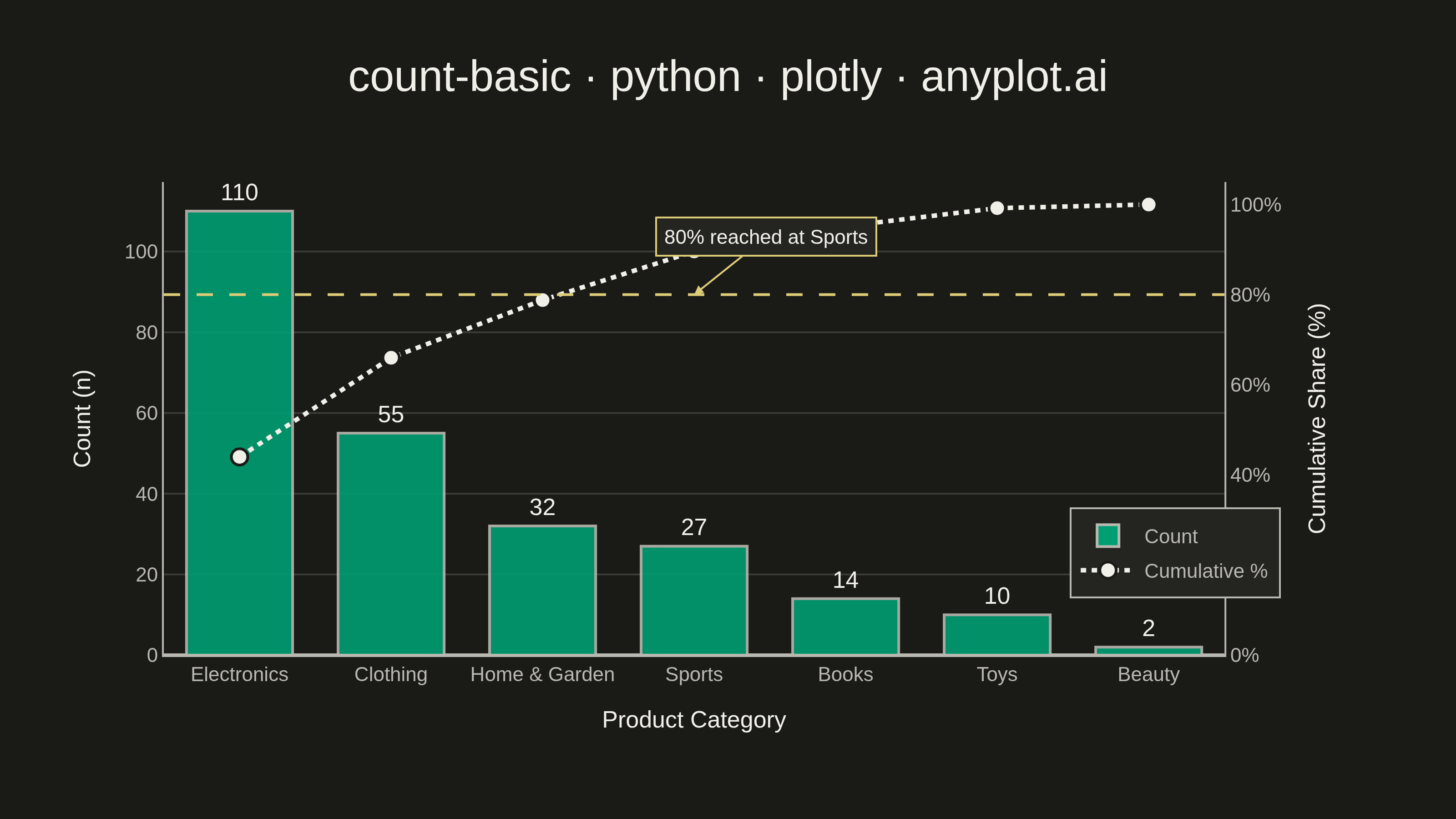
A count plot displays the frequency of observations in each category of a categorical variable using vertical bars. Unlike a basic bar chart that requires pre-computed values, a count plot automatically counts occurrences from raw data. This makes it ideal for quick exploratory analysis of categorical distributions without manual aggregation.
""" anyplot.ai
count-basic: Basic Count Plot
Library: plotly 6.9.0 | Python 3.13.14
Quality: 94/100 | Updated: 2026-08-11
"""

import os

import numpy as np
import plotly.graph_objects as go
from plotly.subplots import make_subplots


# Theme tokens (see prompts/default-style-guide.md "Theme-adaptive Chrome")
THEME = os.getenv("ANYPLOT_THEME", "light")
PAGE_BG = "#FAF8F1" if THEME == "light" else "#1A1A17"
ELEVATED_BG = "#FFFDF6" if THEME == "light" else "#242420"
INK = "#1A1A17" if THEME == "light" else "#F0EFE8"
INK_SOFT = "#4A4A44" if THEME == "light" else "#B8B7B0"
GRID = "rgba(26,26,23,0.15)" if THEME == "light" else "rgba(240,239,232,0.15)"
BRAND = "#009E73"  # Imprint palette position 1 — ALWAYS first series
NEUTRAL = INK  # Imprint semantic anchor — cumulative line, theme-adaptive
AMBER = "#DDCC77"  # Imprint semantic anchor — 80% threshold reference

# Data - Product category purchases with heavily skewed distribution
np.random.seed(42)
categories = ["Electronics", "Clothing", "Home & Garden", "Sports", "Books", "Toys", "Beauty"]
# Generate raw purchase data with heavily right-skewed distribution
# Electronics dominates, others taper off
probabilities = [0.40, 0.25, 0.15, 0.10, 0.05, 0.03, 0.02]
raw_data = np.random.choice(categories, size=250, p=probabilities)

# Count occurrences
unique, counts = np.unique(raw_data, return_counts=True)
# Sort by frequency (descending)
sort_idx = np.argsort(counts)[::-1]
sorted_categories = unique[sort_idx]
sorted_counts = counts[sort_idx]

# Per-category share and running (Pareto) cumulative share
total = sorted_counts.sum()
percentages = sorted_counts / total * 100
cumulative_pct = np.cumsum(sorted_counts) / total * 100

# Category index where the cumulative share first reaches/exceeds 80% ("vital few")
vital_few_idx = int(np.searchsorted(cumulative_pct, 80.0))

bar_hover = [
    f"{cat}<br>Count: {count}<br>Share: {pct:.1f}%"
    for cat, count, pct in zip(sorted_categories, sorted_counts, percentages, strict=True)
]
line_hover = [f"{cat}<br>Cumulative: {pct:.1f}%" for cat, pct in zip(sorted_categories, cumulative_pct, strict=True)]

# Title fontsize scales linearly with title length off the 67-char baseline,
# both up (short titles) and down (long titles), clamped to a legible range
title_text = "count-basic · python · plotly · anyplot.ai"
title_fontsize = max(11, min(24, round(16 * 67 / len(title_text))))

fig = make_subplots(specs=[[{"secondary_y": True}]])

fig.add_trace(
    go.Bar(
        name="Count",
        x=sorted_categories,
        y=sorted_counts,
        marker=dict(color=BRAND, opacity=0.9, line=dict(color=INK_SOFT, width=1.5)),
        text=sorted_counts,
        textposition="outside",
        textfont=dict(size=13, color=INK),
        hovertext=bar_hover,
        hoverinfo="text",
    ),
    secondary_y=False,
)

fig.add_trace(
    go.Scatter(
        name="Cumulative %",
        x=sorted_categories,
        y=cumulative_pct,
        mode="lines+markers",
        line=dict(color=NEUTRAL, width=2.5, dash="dot"),
        marker=dict(size=9, color=NEUTRAL, line=dict(width=1.5, color=PAGE_BG)),
        hovertext=line_hover,
        hoverinfo="text",
    ),
    secondary_y=True,
)

# 80% Pareto threshold — reference line + "vital few" callout on the secondary axis
fig.add_hline(y=80, line=dict(color=AMBER, width=1.5, dash="dash"), secondary_y=True)
fig.add_annotation(
    x=sorted_categories[vital_few_idx],
    y=80,
    yref="y2",
    text=f"80% reached at {sorted_categories[vital_few_idx]}",
    showarrow=True,
    arrowhead=2,
    arrowcolor=AMBER,
    ax=40,
    ay=-32,
    font=dict(size=11, color=INK),
    bgcolor=ELEVATED_BG,
    bordercolor=AMBER,
    borderwidth=1,
    borderpad=4,
)

# Layout — hard target 3200 x 1800 (see "Canvas — hard rule" in prompts/library/plotly.md)
fig.update_layout(
    autosize=False,
    title=dict(text=title_text, font=dict(size=title_fontsize, color=INK), x=0.5, xanchor="center"),
    xaxis=dict(
        title=dict(text="Product Category", font=dict(size=13, color=INK)),
        tickfont=dict(size=11, color=INK_SOFT),
        showline=True,
        linecolor=INK_SOFT,
        zerolinecolor=INK_SOFT,
    ),
    paper_bgcolor=PAGE_BG,
    plot_bgcolor=PAGE_BG,
    bargap=0.3,
    margin=dict(l=90, r=90, t=100, b=90),
    legend=dict(
        x=0.99,
        y=0.12,
        xanchor="right",
        yanchor="bottom",
        bgcolor=ELEVATED_BG,
        bordercolor=INK_SOFT,
        borderwidth=1,
        font=dict(size=11, color=INK_SOFT),
    ),
)

fig.update_yaxes(
    title=dict(text="Count (n)", font=dict(size=13, color=INK)),
    tickfont=dict(size=11, color=INK_SOFT),
    gridcolor=GRID,
    gridwidth=1,
    showline=True,
    linecolor=INK_SOFT,
    zerolinecolor=INK_SOFT,
    rangemode="tozero",
    secondary_y=False,
)
fig.update_yaxes(
    title=dict(text="Cumulative Share (%)", font=dict(size=13, color=INK)),
    tickfont=dict(size=11, color=INK_SOFT),
    range=[0, 105],
    ticksuffix="%",
    showgrid=False,
    showline=True,
    linecolor=INK_SOFT,
    zeroline=False,
    secondary_y=True,
)

# Save as PNG — hard target 3200 x 1800 (landscape)
fig.write_image(f"plot-{THEME}.png", width=800, height=450, scale=4)

# Save as HTML for interactivity
fig.write_html(f"plot-{THEME}.html", include_plotlyjs="cdn")
Runnable source as JSON, for any HTTP client: https://api.anyplot.ai/specs/count-basic/plotly/code. Any spec id and library id listed in llms-full.txt fit the same URL shape; every URL below is complete and callable.
{
  "spec_id": "count-basic",
  "language": "python",
  "library": "plotly",
  "page": "https://anyplot.ai/count-basic/python/plotly",
  "hub": "https://anyplot.ai/count-basic",
  "code_json": "https://api.anyplot.ai/specs/count-basic/plotly/code",
  "spec_json": "https://api.anyplot.ai/specs/count-basic",
  "render_light_png": "https://storage.googleapis.com/anyplot-images/plots/count-basic/python/plotly/plot-light.png",
  "render_dark_png": "https://storage.googleapis.com/anyplot-images/plots/count-basic/python/plotly/plot-dark.png",
  "interactive_light_html": "https://storage.googleapis.com/anyplot-images/plots/count-basic/python/plotly/plot-light.html",
  "interactive_dark_html": "https://storage.googleapis.com/anyplot-images/plots/count-basic/python/plotly/plot-dark.html",
  "quality_score": 94.0,
  "license": "MIT",
  "guide": "https://anyplot.ai/llms.txt"
}
Part of Basic Count Plot on anyplot.ai.