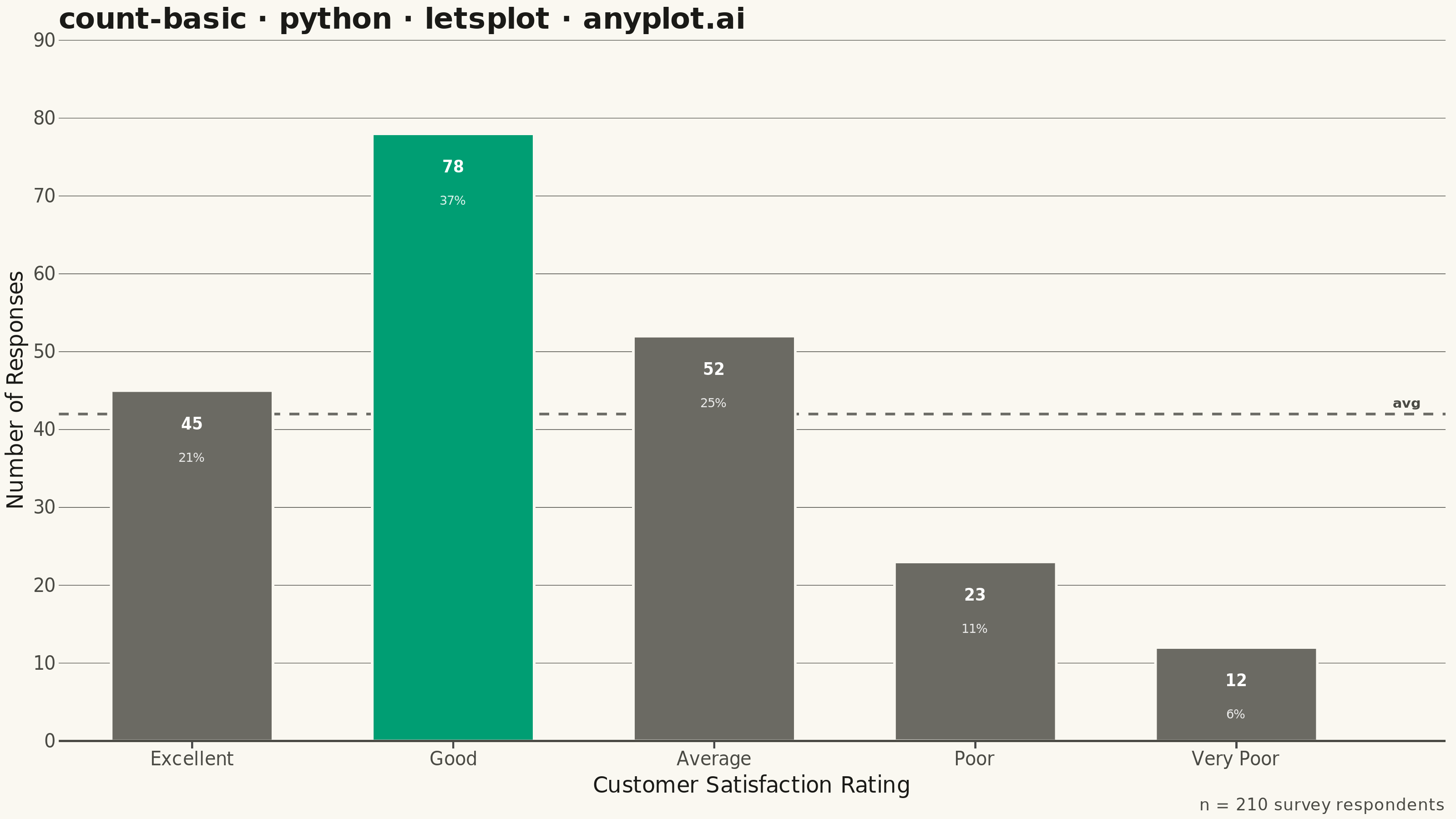
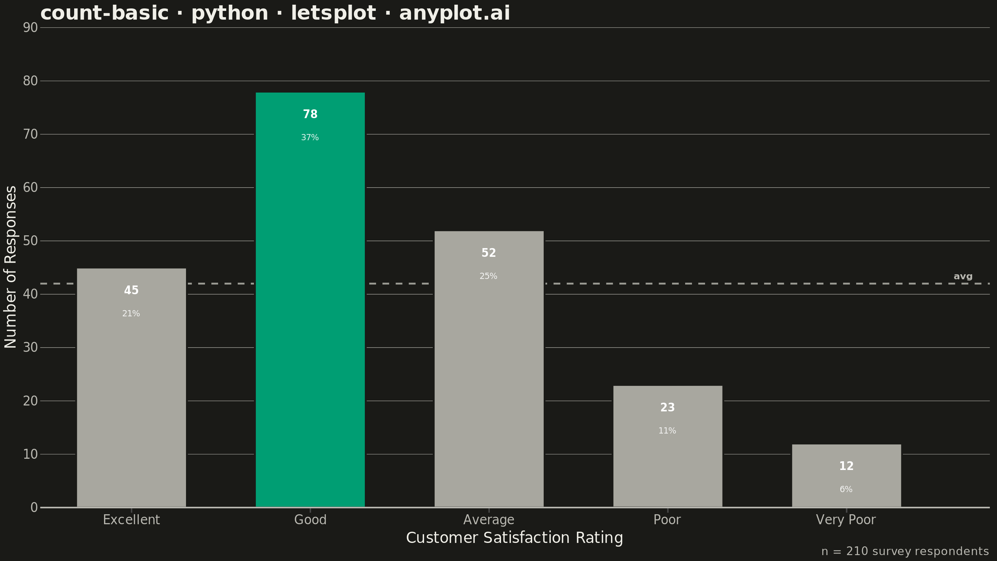
A count plot displays the frequency of observations in each category of a categorical variable using vertical bars. Unlike a basic bar chart that requires pre-computed values, a count plot automatically counts occurrences from raw data. This makes it ideal for quick exploratory analysis of categorical distributions without manual aggregation.
""" anyplot.ai
count-basic: Basic Count Plot
Library: letsplot 4.11.0 | Python 3.13.14
Quality: 89/100 | Updated: 2026-08-11
"""

import os

import pandas as pd
from lets_plot import (
    LetsPlot,
    aes,
    element_blank,
    element_line,
    element_rect,
    element_text,
    geom_bar,
    geom_hline,
    geom_text,
    ggplot,
    ggsize,
    labs,
    scale_fill_manual,
    scale_y_continuous,
    theme,
)
from lets_plot.export import ggsave


LetsPlot.setup_html()

# Theme tokens (see prompts/default-style-guide.md)
THEME = os.getenv("ANYPLOT_THEME", "light")
PAGE_BG = "#FAF8F1" if THEME == "light" else "#1A1A17"
INK = "#1A1A17" if THEME == "light" else "#F0EFE8"
INK_SOFT = "#4A4A44" if THEME == "light" else "#B8B7B0"

BRAND = "#009E73"  # Imprint palette position 1 — always first series
# `muted` semantic anchor (theme-adaptive) de-emphasizes the non-modal bars
# without introducing a custom hex outside the Imprint palette/anchors.
BRAND_SOFT = "#6B6A63" if THEME == "light" else "#A8A79F"

# Data - raw per-observation customer satisfaction survey responses (one row
# per respondent). Likert order is kept (Excellent -> Very Poor) rather than
# sorted by frequency: a reader's mental model of the scale matters more
# here than a strict count ranking.
response_order = ["Excellent", "Good", "Average", "Poor", "Very Poor"]
counts = {"Excellent": 45, "Good": 78, "Average": 52, "Poor": 23, "Very Poor": 12}
modal_response = max(counts, key=counts.get)
responses = [r for r, n in counts.items() for _ in range(n)]
df = pd.DataFrame({"Response": pd.Categorical(responses, categories=response_order, ordered=True)})
df["Modal"] = df["Response"] == modal_response

total = len(df)
avg_count = total / len(response_order)

# Create count plot - geom_bar()'s default stat='count' tallies the raw
# observations directly (no manual pre-aggregation). The modal response
# ("Good") renders in full-strength brand green while the rest use the
# muted anchor -- a second layer of visual emphasis beyond bar height
# alone, without introducing a second Imprint hue or a legend.
# Two geom_text(stat='count') layers annotate each bar with its count (bold,
# larger) and share of the total (lighter, smaller), giving the in-bar
# labels a deliberate typographic hierarchy instead of one flat style.
plot = (
    ggplot(df, aes(x="Response"))
    + geom_hline(yintercept=avg_count, linetype="dashed", color=INK_SOFT, size=0.6, alpha=0.8)
    + geom_text(x=4.6, y=avg_count, label="avg", color=INK_SOFT, size=3.8, fontface="bold", vjust=-0.6, hjust=0)
    + geom_bar(aes(fill="Modal"), width=0.62, color=PAGE_BG, size=0.6, show_legend=False)
    + geom_text(
        aes(y="..count..", label="..count.."),
        stat="count",
        color="white",
        size=4.3,
        fontface="bold",
        vjust=1,
        nudge_y=-3.5,
    )
    + geom_text(
        aes(y="..count..", label="..sumpct.."),
        stat="count",
        label_format="{.0f}%",
        color="white",
        alpha=0.85,
        size=3.4,
        vjust=1,
        nudge_y=-8,
    )
    + scale_fill_manual(values={True: BRAND, False: BRAND_SOFT}, guide="none")
    + labs(
        x="Customer Satisfaction Rating",
        y="Number of Responses",
        title="count-basic · python · letsplot · anyplot.ai",
        caption=f"n = {total} survey respondents",
    )
    + scale_y_continuous(expand=[0, 0, 0.16, 0], limits=[0, 90])
    + theme(
        plot_background=element_rect(fill=PAGE_BG, color=PAGE_BG),
        panel_grid_major_x=element_blank(),
        panel_grid_major_y=element_line(color=INK_SOFT, size=0.3),
        panel_grid_minor=element_blank(),
        plot_title=element_text(size=16, face="bold", color=INK),
        axis_title=element_text(size=12, color=INK),
        axis_text=element_text(size=10, color=INK_SOFT),
        axis_line=element_line(color=INK_SOFT),
        plot_caption=element_text(size=9, color=INK_SOFT),
    )
    + ggsize(800, 450)
)

# Save as PNG (scale 4x for 3200 x 1800 px) and interactive HTML
ggsave(plot, f"plot-{THEME}.png", path=".", scale=4)
ggsave(plot, f"plot-{THEME}.html", path=".")
Runnable source as JSON, for any HTTP client: https://api.anyplot.ai/specs/count-basic/letsplot/code. Any spec id and library id listed in llms-full.txt fit the same URL shape; every URL below is complete and callable.
{
  "spec_id": "count-basic",
  "language": "python",
  "library": "letsplot",
  "page": "https://anyplot.ai/count-basic/python/letsplot",
  "hub": "https://anyplot.ai/count-basic",
  "code_json": "https://api.anyplot.ai/specs/count-basic/letsplot/code",
  "spec_json": "https://api.anyplot.ai/specs/count-basic",
  "render_light_png": "https://storage.googleapis.com/anyplot-images/plots/count-basic/python/letsplot/plot-light.png",
  "render_dark_png": "https://storage.googleapis.com/anyplot-images/plots/count-basic/python/letsplot/plot-dark.png",
  "interactive_light_html": "https://storage.googleapis.com/anyplot-images/plots/count-basic/python/letsplot/plot-light.html",
  "interactive_dark_html": "https://storage.googleapis.com/anyplot-images/plots/count-basic/python/letsplot/plot-dark.html",
  "quality_score": 89.0,
  "license": "MIT",
  "guide": "https://anyplot.ai/llms.txt"
}
Part of Basic Count Plot on anyplot.ai.