The same plot in 14 other libraries — Python: Altair, Bokeh, lets-plot, Matplotlib, Plotly, plotnine, Pygal, Seaborn; Julia: Makie.jl; JavaScript: Chart.js, D3.js, Apache ECharts, Highcharts, MUI X Charts. Compare all 15 side by side: Basic Count Plot in Python, R, Julia and JavaScript.
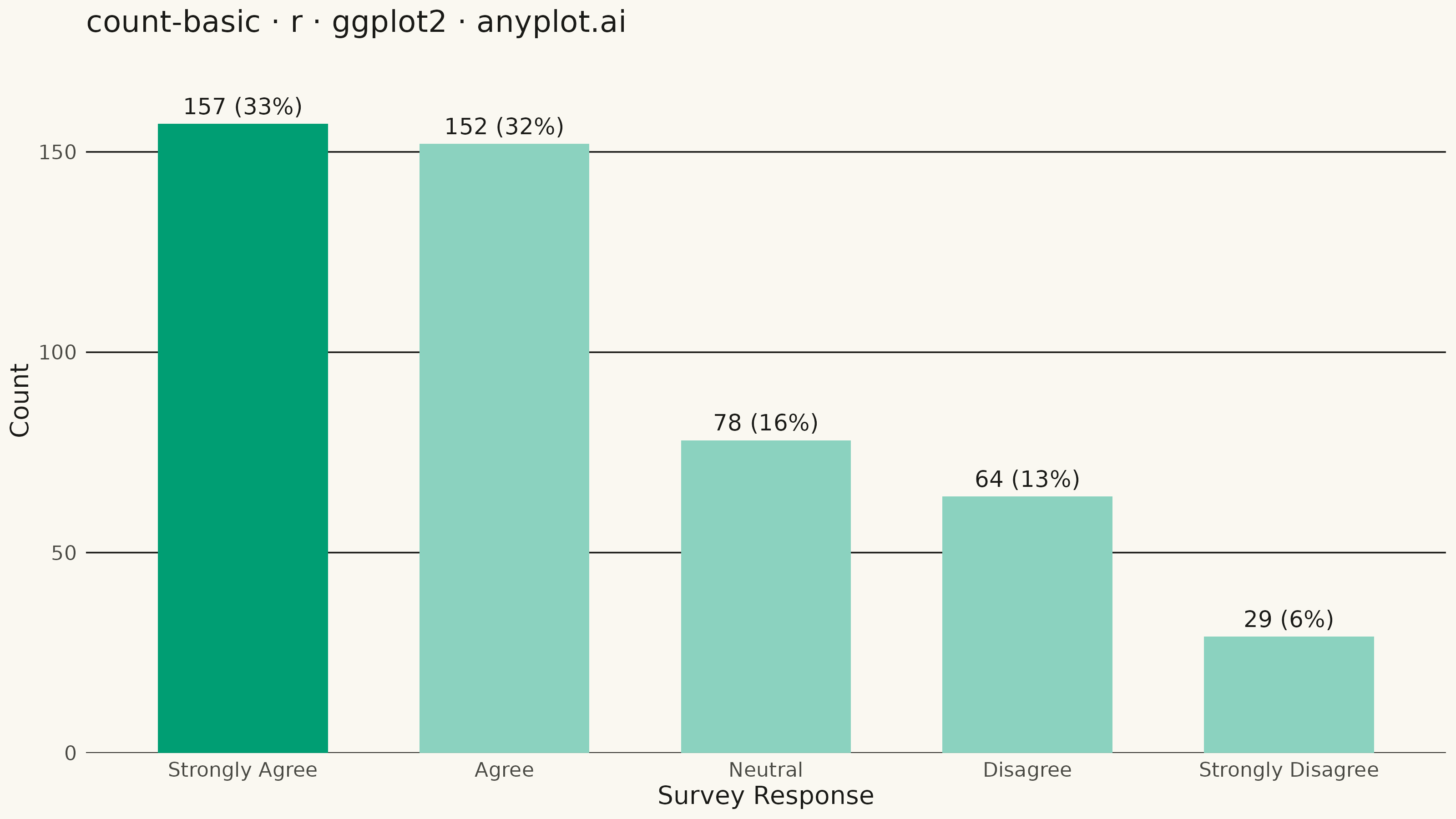
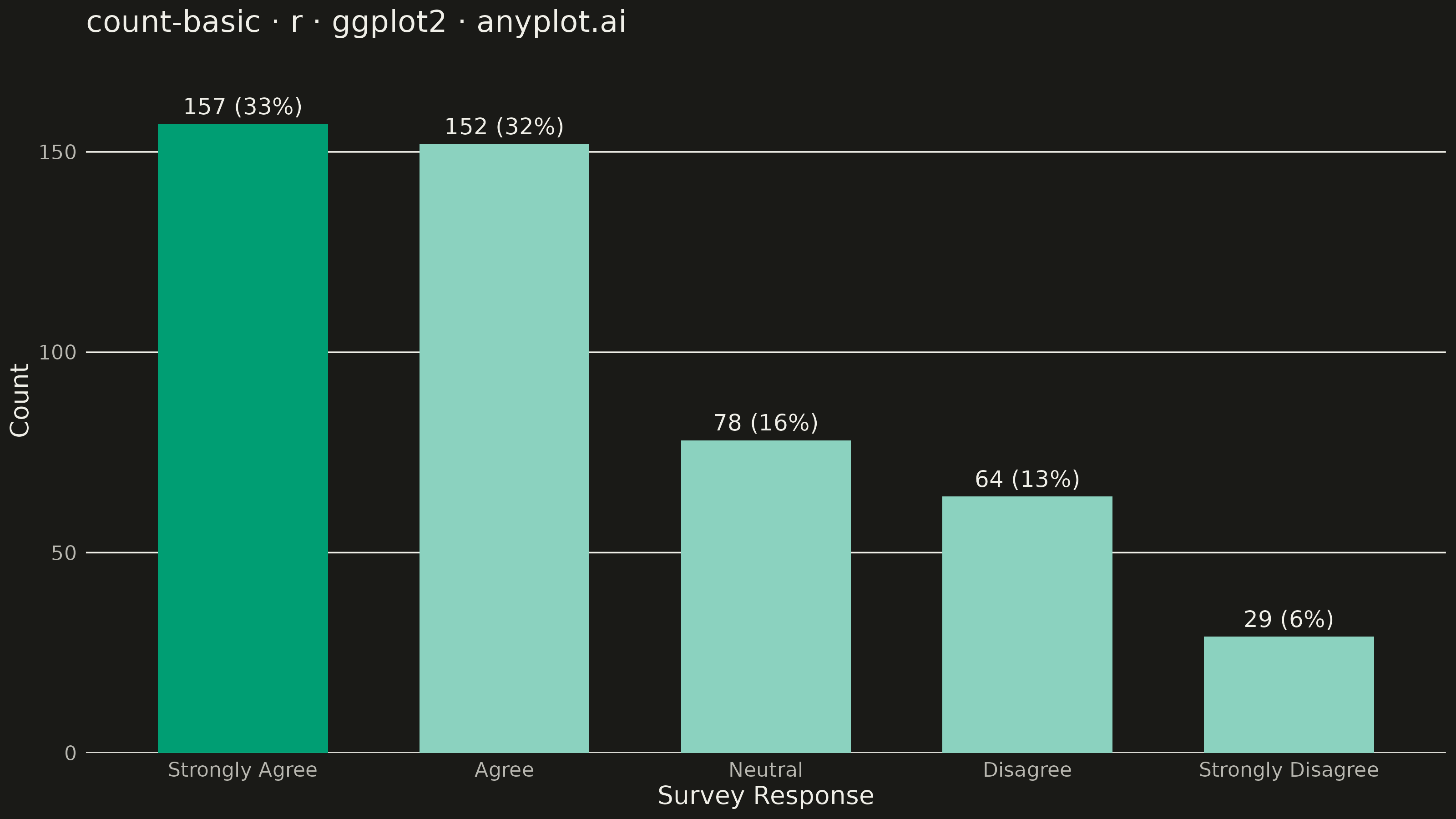
A count plot displays the frequency of observations in each category of a categorical variable using vertical bars. Unlike a basic bar chart that requires pre-computed values, a count plot automatically counts occurrences from raw data. This makes it ideal for quick exploratory analysis of categorical distributions without manual aggregation.
#' anyplot.ai
#' count-basic: Basic Count Plot
#' Library: ggplot2 3.5.1 | R 4.4.1
#' Quality: 87/100 | Updated: 2026-09-30

library(ggplot2)
library(dplyr)
library(scales)
library(ragg)

set.seed(42)

# --- Theme tokens -----------------------------------------------------------
THEME       <- Sys.getenv("ANYPLOT_THEME", "light")
PAGE_BG     <- if (THEME == "light") "#FAF8F1" else "#1A1A17"
INK         <- if (THEME == "light") "#1A1A17" else "#F0EFE8"
INK_SOFT    <- if (THEME == "light") "#4A4A44" else "#B8B7B0"
IMPRINT_PALETTE <- c("#009E73", "#C475FD", "#4467A3", "#BD8233",
                     "#AE3030", "#2ABCCD", "#954477", "#99B314")
BAR_FILL    <- IMPRINT_PALETTE[1]
# Bar edge uses the ink token -- the style guide's endorsed outline pattern --
# never a custom hex; a crisp stroke for depth, not a second color encoding.
BAR_EDGE    <- INK
# Faint gridline tone -- ggplot2 has no grid alpha, so blend INK ~15% into
# PAGE_BG instead of using full-opacity INK (which reads as bold as the axis).
GRID_COLOR  <- colorRampPalette(c(PAGE_BG, INK))(100)[15]

# --- Data ---------------------------------------------------------------
# Raw, uncounted survey responses -- ggplot2's geom_bar() tallies them itself.
support_levels <- c(
  "Strongly Agree", "Agree", "Neutral", "Disagree", "Strongly Disagree"
)
response_weights <- c(0.32, 0.30, 0.19, 0.13, 0.06)
survey_responses <- sample(
  support_levels,
  size = 480,
  replace = TRUE,
  prob = response_weights
)

df <- tibble::tibble(
  response = factor(survey_responses, levels = support_levels)
)

# Order categories by descending frequency for readability
freq_order <- df %>%
  count(response, name = "n") %>%
  arrange(desc(n)) %>%
  pull(response)
df$response <- factor(df$response, levels = freq_order)
n_total <- nrow(df)

# --- Plot -----------------------------------------------------------------
title_text <- "count-basic · r · ggplot2 · anyplot.ai"

# Basic variant: single categorical variable, one bar color, no reference
# line, highlighted bar or second grouping. geom_text(stat = "count") tallies
# and labels the bars in the same pass as geom_bar() -- no separate
# dplyr::count() table needed for the labels.
p <- ggplot(df, aes(x = response)) +
  geom_bar(width = 0.62, fill = BAR_FILL, color = BAR_EDGE, linewidth = 0.4) +
  geom_text(
    stat = "count",
    aes(
      label = sprintf(
        "%s (%s)",
        scales::comma(after_stat(count)),
        scales::percent(after_stat(count) / n_total, accuracy = 1)
      ),
      # Most-frequent bar's label reads bolder and larger for a single focal
      # point -- same fill color throughout, emphasis from type weight alone.
      fontface = ifelse(after_stat(count) == max(after_stat(count)), "bold", "plain"),
      size     = ifelse(after_stat(count) == max(after_stat(count)), 3.8, 3.2)
    ),
    vjust = -0.7,
    color = INK
  ) +
  scale_size_identity() +
  # Extra headroom above the tallest bar (was 0.14) so its bold label sits
  # clear of the panel edge -- a deliberate breathing-room refinement, not a
  # change to the data-to-baseline mapping.
  scale_y_continuous(expand = expansion(mult = c(0, 0.19))) +
  labs(
    title    = title_text,
    subtitle = sprintf("Likert-scale survey responses, n = %d", n_total),
    x = "Survey Response",
    y = "Count"
  ) +
  theme_minimal(base_size = 8) +
  theme(
    plot.background   = element_rect(fill = PAGE_BG, color = PAGE_BG),
    panel.background  = element_rect(fill = PAGE_BG, color = NA),
    panel.grid.major.x = element_blank(),
    panel.grid.minor   = element_blank(),
    panel.grid.major.y = element_line(color = GRID_COLOR, linewidth = 0.3),
    axis.title        = element_text(color = INK, size = 10),
    axis.text         = element_text(color = INK_SOFT, size = 8),
    axis.text.x       = element_text(margin = margin(t = 6)),
    axis.ticks         = element_blank(),
    axis.line.x        = element_line(color = INK_SOFT, linewidth = 0.3),
    plot.title        = element_text(color = INK, size = 12, face = "bold"),
    plot.subtitle     = element_text(color = INK_SOFT, size = 8.5, margin = margin(b = 8)),
    # Title/subtitle flush to the full plot width (not just the panel) and a
    # touch more canvas whitespace all around -- a spacing/typography-only
    # refinement, no new marks or color.
    plot.title.position = "plot",
    plot.margin          = margin(t = 14, r = 18, b = 10, l = 10)
  )

# --- Save -------------------------------------------------------------------
ggsave(
  filename = sprintf("plot-%s.png", THEME),
  plot     = p,
  device   = ragg::agg_png,
  width    = 8,
  height   = 4.5,
  units    = "in",
  dpi      = 400
)
Runnable source as JSON, for any HTTP client: https://api.anyplot.ai/specs/count-basic/ggplot2/code. Any spec id and library id listed in llms-full.txt fit the same URL shape; every URL below is complete and callable.
{
  "spec_id": "count-basic",
  "language": "r",
  "library": "ggplot2",
  "page": "https://anyplot.ai/count-basic/r/ggplot2",
  "hub": "https://anyplot.ai/count-basic",
  "code_json": "https://api.anyplot.ai/specs/count-basic/ggplot2/code",
  "spec_json": "https://api.anyplot.ai/specs/count-basic",
  "render_light_png": "https://storage.googleapis.com/anyplot-images/plots/count-basic/r/ggplot2/plot-light.png",
  "render_dark_png": "https://storage.googleapis.com/anyplot-images/plots/count-basic/r/ggplot2/plot-dark.png",
  "quality_score": 87.0,
  "license": "MIT",
  "guide": "https://anyplot.ai/llms.txt"
}
Part of Basic Count Plot on anyplot.ai.