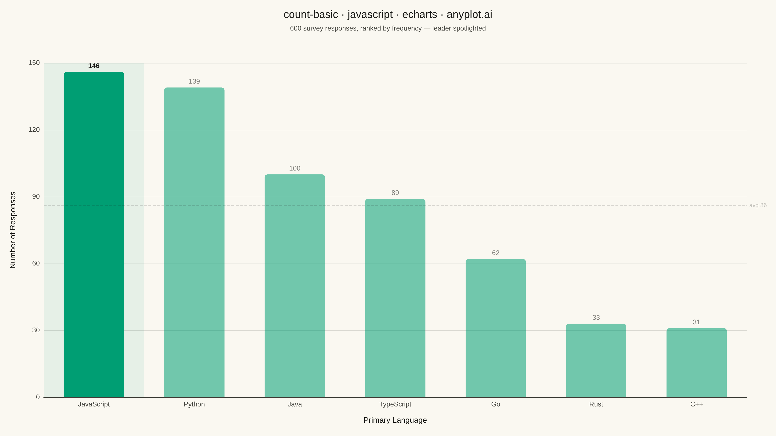
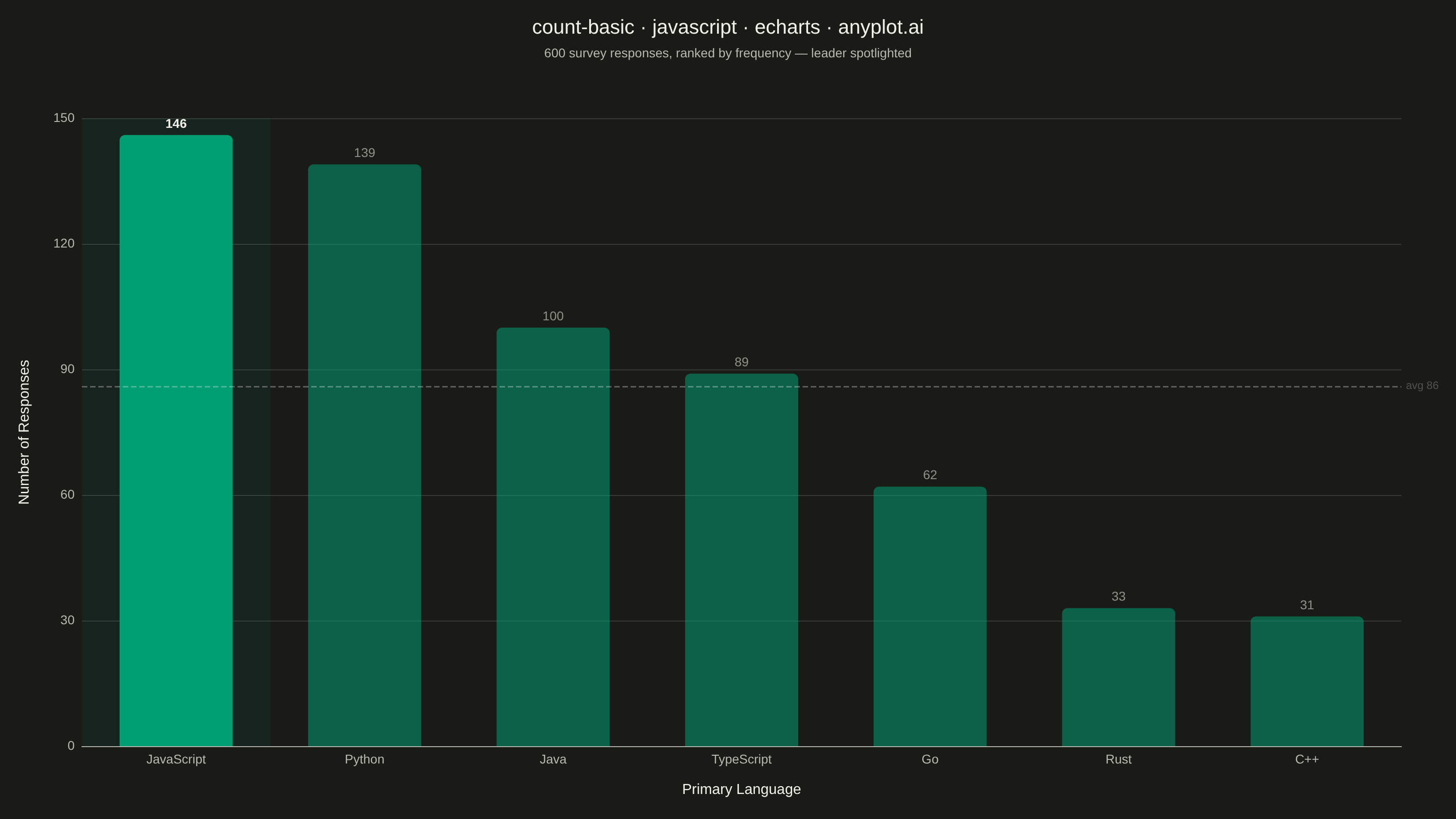
The same plot in 14 other libraries — JavaScript: Chart.js, D3.js, Highcharts, MUI X Charts; Python: Altair, Bokeh, lets-plot, Matplotlib, Plotly, plotnine, Pygal, Seaborn; R: ggplot2; Julia: Makie.jl. Compare all 15 side by side: Basic Count Plot in Python, R, Julia and JavaScript.
A count plot displays the frequency of observations in each category of a categorical variable using vertical bars. Unlike a basic bar chart that requires pre-computed values, a count plot automatically counts occurrences from raw data. This makes it ideal for quick exploratory analysis of categorical distributions without manual aggregation.
// anyplot.ai
// count-basic: Basic Count Plot
// Library: echarts 6.1.0 | JavaScript 22.23.1
// Quality: 96/100 | Created: 2026-08-11

//# anyplot-orientation: landscape
const t = window.ANYPLOT_TOKENS;

// --- Data: raw, uncounted observations ---------------------------------------
// Simulates 600 individual survey responses ("which language did you use most
// this year?") — a count plot's job is to tally these itself, no pre-aggregation.
function lcg(seed) {
  let state = seed;
  return () => {
    state = (state * 1664525 + 1013904223) % 4294967296;
    return state / 4294967296;
  };
}
const rand = lcg(42);

const languages = ["JavaScript", "Python", "Java", "TypeScript", "Go", "Rust", "C++"];
const shares = [0.26, 0.24, 0.16, 0.14, 0.09, 0.07, 0.04];

const responses = [];
for (let i = 0; i < 600; i++) {
  const r = rand();
  let cumulative = 0;
  for (let j = 0; j < languages.length; j++) {
    cumulative += shares[j];
    if (r < cumulative) {
      responses.push(languages[j]);
      break;
    }
  }
}

// --- Count occurrences per category, sort descending -------------------------
const counts = {};
for (const language of responses) counts[language] = (counts[language] || 0) + 1;
const ranked = Object.entries(counts).sort((a, b) => b[1] - a[1]);
const categories = ranked.map(([language]) => language);
const frequencies = ranked.map(([, count]) => count);
const total = frequencies.reduce((sum, count) => sum + count, 0);
const average = Math.round(total / frequencies.length);

// The leader (rank 1) is rendered at full opacity with a bolder label; the rest
// sit at reduced opacity so the top bar reads as an immediate focal point.
const barData = frequencies.map((count, i) => ({
  value: count,
  itemStyle: {
    color: t.palette[0],
    opacity: i === 0 ? 1 : 0.55,
    borderRadius: [6, 6, 0, 0],
  },
  label: i === 0 ? { fontWeight: 700 } : {},
}));

// --- Init ---------------------------------------------------------------------
const chart = echarts.init(document.getElementById("container"));

// --- Option ---------------------------------------------------------------------
chart.setOption({
  animation: false,
  color: t.palette,
  backgroundColor: "transparent",
  title: {
    text: "count-basic · javascript · echarts · anyplot.ai",
    subtext: "600 survey responses, ranked by frequency — leader spotlighted",
    left: "center",
    textStyle: { color: t.ink, fontSize: 22, fontWeight: 500 },
    subtextStyle: { color: t.inkSoft, fontSize: 14 },
    itemGap: 10,
  },
  tooltip: {
    trigger: "axis",
    axisPointer: { type: "shadow" },
    formatter: (params) => {
      const p = params[0];
      const pct = ((p.value / total) * 100).toFixed(1);
      return `${p.name}<br/>${p.value} responses (${pct}%)`;
    },
  },
  grid: { left: 90, right: 60, top: 130, bottom: 80 },
  xAxis: {
    type: "category",
    data: categories,
    name: "Primary Language",
    nameLocation: "middle",
    nameGap: 40,
    nameTextStyle: { color: t.ink, fontSize: 16 },
    axisLabel: { color: t.inkSoft, fontSize: 14 },
    axisLine: { lineStyle: { color: t.inkSoft } },
    axisTick: { show: false },
    splitLine: { show: false },
  },
  yAxis: {
    type: "value",
    name: "Number of Responses",
    nameLocation: "middle",
    nameGap: 55,
    nameTextStyle: { color: t.ink, fontSize: 16 },
    axisLabel: { color: t.inkSoft, fontSize: 14 },
    axisLine: { show: false },
    axisTick: { show: false },
    splitLine: { lineStyle: { color: t.grid } },
  },
  series: [
    {
      type: "bar",
      data: barData,
      barWidth: "60%",
      label: {
        show: true,
        position: "top",
        color: t.ink,
        fontSize: 14,
      },
      emphasis: {
        focus: "series",
        itemStyle: { opacity: 1, shadowBlur: 12, shadowColor: "rgba(0, 0, 0, 0.25)" },
      },
      // Spotlight band: a translucent brand-green column behind the leader
      // category, from axis floor to chart ceiling — reinforces the focal
      // point beyond the bar's own opacity contrast.
      markArea: {
        silent: true,
        itemStyle: { color: "rgba(0, 158, 115, 0.08)" },
        data: [[{ xAxis: categories[0] }, { xAxis: categories[0] }]],
      },
      // Reference line at the mean count — a distinctive ECharts feature
      // (markLine) rendered in the theme's neutral/structural ink tone so it
      // reads as chart scaffolding, not a competing data series.
      markLine: {
        silent: true,
        symbol: "none",
        lineStyle: { color: t.ink, opacity: 0.35, type: "dashed", width: 1.5 },
        label: { color: t.inkSoft, fontSize: 12, formatter: "avg {c}" },
        data: [{ yAxis: average }],
      },
    },
  ],
});
Runnable source as JSON, for any HTTP client: https://api.anyplot.ai/specs/count-basic/echarts/code. Any spec id and library id listed in llms-full.txt fit the same URL shape; every URL below is complete and callable.
{
  "spec_id": "count-basic",
  "language": "javascript",
  "library": "echarts",
  "page": "https://anyplot.ai/count-basic/javascript/echarts",
  "hub": "https://anyplot.ai/count-basic",
  "code_json": "https://api.anyplot.ai/specs/count-basic/echarts/code",
  "spec_json": "https://api.anyplot.ai/specs/count-basic",
  "render_light_png": "https://storage.googleapis.com/anyplot-images/plots/count-basic/javascript/echarts/plot-light.png",
  "render_dark_png": "https://storage.googleapis.com/anyplot-images/plots/count-basic/javascript/echarts/plot-dark.png",
  "interactive_light_html": "https://storage.googleapis.com/anyplot-images/plots/count-basic/javascript/echarts/plot-light.html",
  "interactive_dark_html": "https://storage.googleapis.com/anyplot-images/plots/count-basic/javascript/echarts/plot-dark.html",
  "quality_score": 96.0,
  "license": "MIT",
  "guide": "https://anyplot.ai/llms.txt"
}
Part of Basic Count Plot on anyplot.ai.