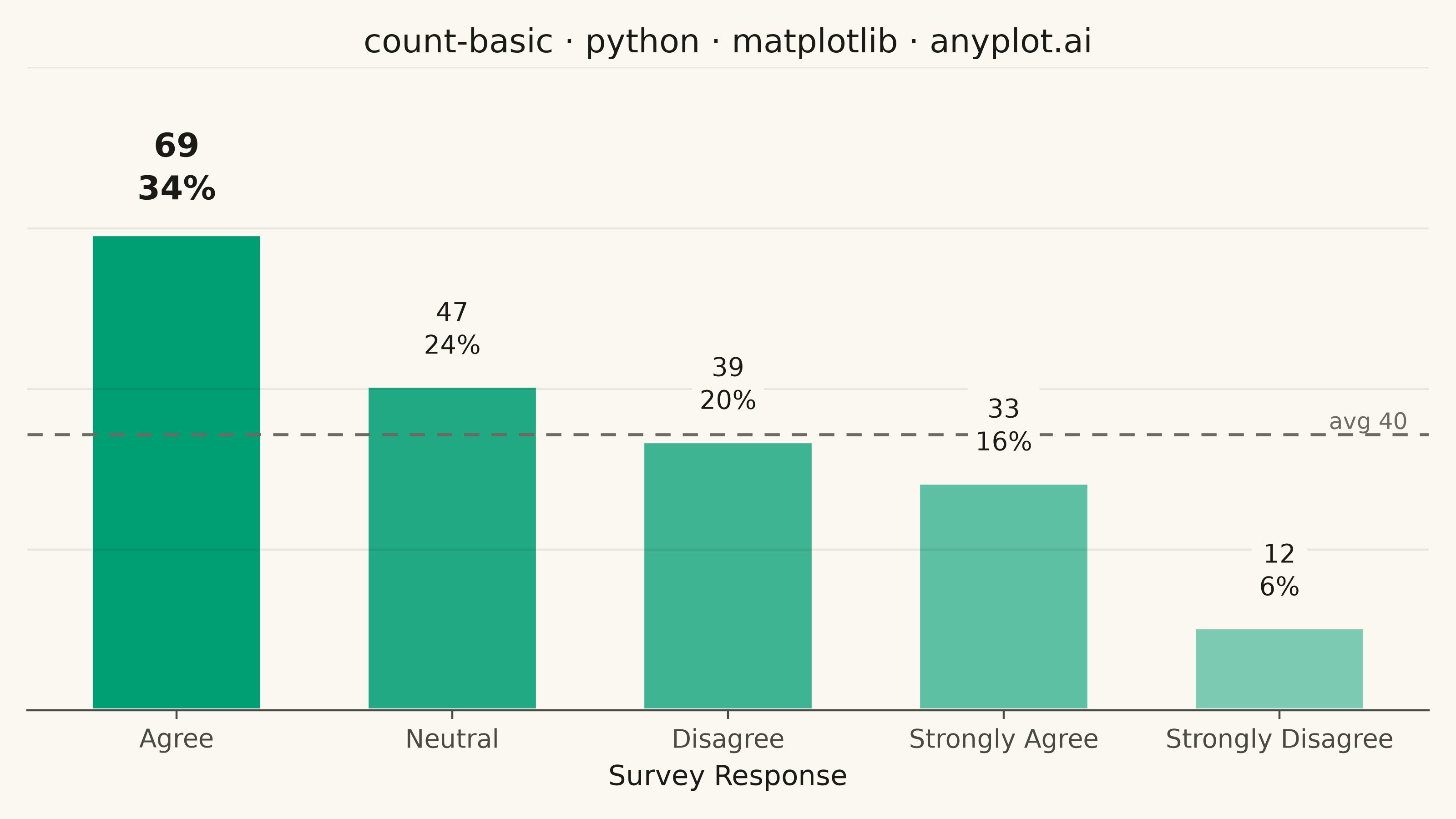
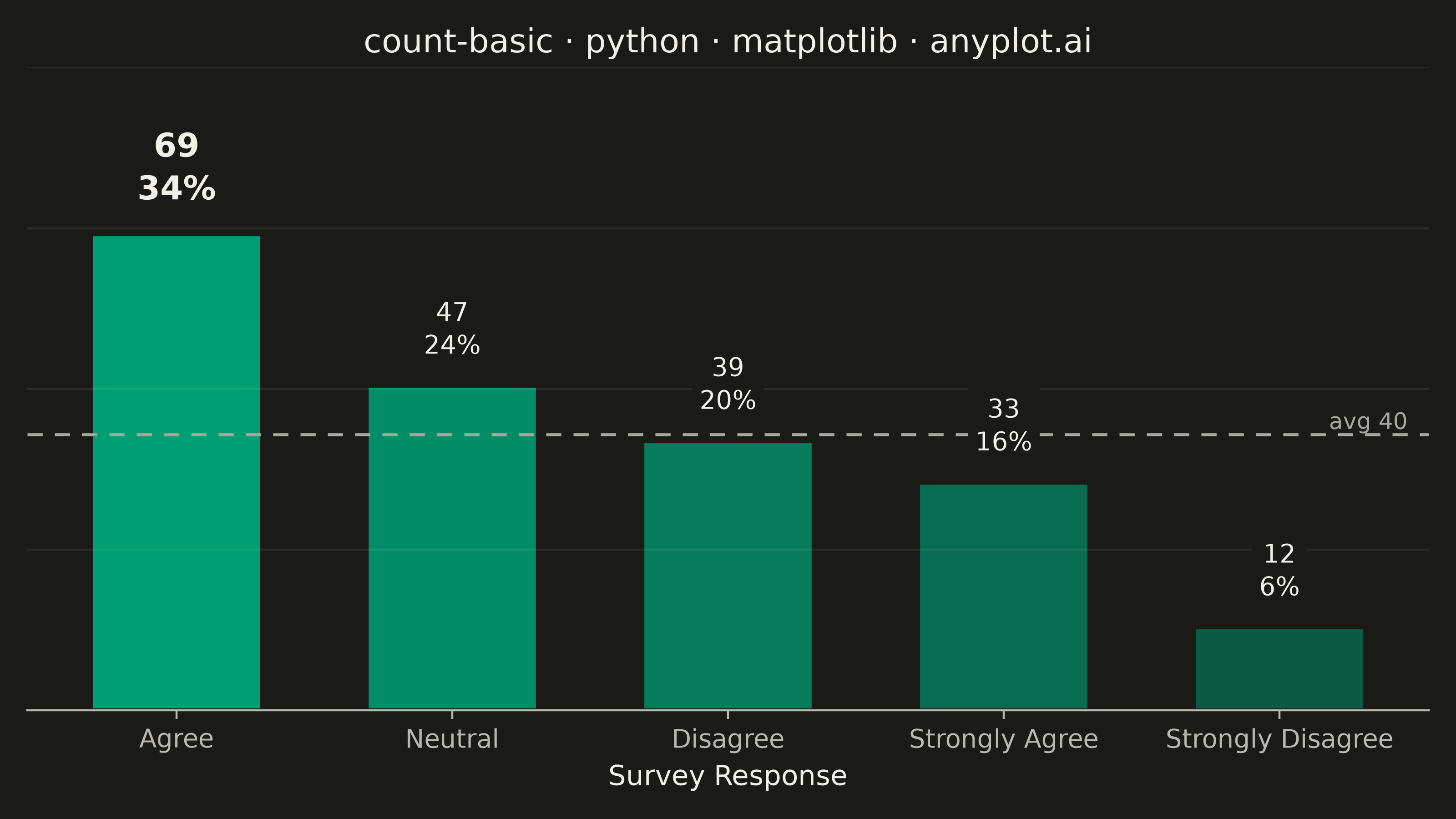
A count plot displays the frequency of observations in each category of a categorical variable using vertical bars. Unlike a basic bar chart that requires pre-computed values, a count plot automatically counts occurrences from raw data. This makes it ideal for quick exploratory analysis of categorical distributions without manual aggregation.
""" anyplot.ai
count-basic: Basic Count Plot
Library: matplotlib 3.11.1 | Python 3.13.14
Quality: 94/100 | Updated: 2026-08-11
"""

import os
import sys


sys.path.pop(0)
import matplotlib.patheffects as path_effects
import matplotlib.pyplot as plt
import numpy as np
from matplotlib.colors import to_rgba


# Theme tokens
THEME = os.getenv("ANYPLOT_THEME", "light")
PAGE_BG = "#FAF8F1" if THEME == "light" else "#1A1A17"
INK = "#1A1A17" if THEME == "light" else "#F0EFE8"
INK_SOFT = "#4A4A44" if THEME == "light" else "#B8B7B0"
INK_MUTED = "#6B6A63" if THEME == "light" else "#A8A79F"
BRAND = "#009E73"  # Imprint palette position 1 — ALWAYS first series

# Data - Survey responses with varying frequencies
np.random.seed(42)
categories = ["Strongly Agree", "Agree", "Neutral", "Disagree", "Strongly Disagree"]
weights = [0.15, 0.35, 0.25, 0.18, 0.07]
responses = np.random.choice(categories, size=200, p=weights)

# Count occurrences
unique, counts = np.unique(responses, return_counts=True)

# Sort by frequency (descending)
sort_idx = np.argsort(counts)[::-1]
unique = unique[sort_idx]
counts = counts[sort_idx]
total = counts.sum()
percentages = counts / total * 100

# Plot
fig, ax = plt.subplots(figsize=(8, 4.5), dpi=400, facecolor=PAGE_BG)
ax.set_facecolor(PAGE_BG)

# Rank-graded opacity on the single brand hue — draws the eye to the leading
# response without introducing a second color (single-series data stays one series).
fade = np.linspace(1.0, 0.5, len(counts))
bar_colors = [to_rgba(BRAND, alpha=a) for a in fade]
bars = ax.bar(unique, counts, color=bar_colors, edgecolor=PAGE_BG, linewidth=1.5, width=0.62)

# Average reference line for storytelling context (how far each bar sits from the mean)
avg = counts.mean()
ax.axhline(avg, color=INK_MUTED, linewidth=1.2, linestyle=(0, (5, 4)), zorder=1)
ax.text(
    0.985,
    avg,
    f"avg {avg:.0f}",
    transform=ax.get_yaxis_transform(),
    ha="right",
    va="bottom",
    fontsize=9,
    color=INK_MUTED,
)

# Direct value + share labels replace the y-axis (matplotlib's bar_label API
# returns the created Text artists, letting the leading category stand out).
value_labels = ax.bar_label(
    bars,
    labels=[f"{c}\n{p:.0f}%" for c, p in zip(counts, percentages, strict=True)],
    padding=10,
    fontsize=10,
    color=INK,
    linespacing=1.3,
)
value_labels[0].set_fontsize(13)
value_labels[0].set_fontweight("bold")
# Path-effect stroke on the leading label — a matplotlib-specific text-rendering
# trick (draws a background-colored outline pass under the glyphs) that makes the
# winner pop a little further without adding a second color or a heavier box.
value_labels[0].set_path_effects([path_effects.withStroke(linewidth=4, foreground=PAGE_BG)])
# Mask the average line where a label would otherwise cross it
for lbl in value_labels:
    lbl.set_bbox({"facecolor": PAGE_BG, "edgecolor": "none", "pad": 3})

# Style — minimalist: no y-axis labels, values are direct-labeled on the bars instead
ax.set_xlabel("Survey Response", fontsize=11, color=INK)
ax.set_title("count-basic · python · matplotlib · anyplot.ai", fontsize=13, fontweight="medium", color=INK)
ax.tick_params(axis="x", labelsize=10, colors=INK_SOFT)
ax.spines["top"].set_visible(False)
ax.spines["right"].set_visible(False)
ax.spines["left"].set_visible(False)
ax.spines["bottom"].set_color(INK_SOFT)

# Headroom for the two-line bar labels above the tallest bar
ax.set_ylim(0, counts.max() * 1.35)

# Faint reference gridlines (no numeric labels) give returning readers a scale
# anchor without reintroducing a full y-axis — the direct bar labels stay the
# primary reading mode.
ax.set_yticks(np.linspace(0, counts.max() * 1.35, 5))
ax.set_yticklabels([])
ax.tick_params(axis="y", length=0)
ax.yaxis.grid(True, color=INK, alpha=0.08, linewidth=0.8, zorder=0)

plt.tight_layout()
plt.savefig(f"plot-{THEME}.png", dpi=400, facecolor=PAGE_BG)
Runnable source as JSON, for any HTTP client: https://api.anyplot.ai/specs/count-basic/matplotlib/code. Any spec id and library id listed in llms-full.txt fit the same URL shape; every URL below is complete and callable.
{
  "spec_id": "count-basic",
  "language": "python",
  "library": "matplotlib",
  "page": "https://anyplot.ai/count-basic/python/matplotlib",
  "hub": "https://anyplot.ai/count-basic",
  "code_json": "https://api.anyplot.ai/specs/count-basic/matplotlib/code",
  "spec_json": "https://api.anyplot.ai/specs/count-basic",
  "render_light_png": "https://storage.googleapis.com/anyplot-images/plots/count-basic/python/matplotlib/plot-light.png",
  "render_dark_png": "https://storage.googleapis.com/anyplot-images/plots/count-basic/python/matplotlib/plot-dark.png",
  "quality_score": 94.0,
  "license": "MIT",
  "guide": "https://anyplot.ai/llms.txt"
}
Part of Basic Count Plot on anyplot.ai.