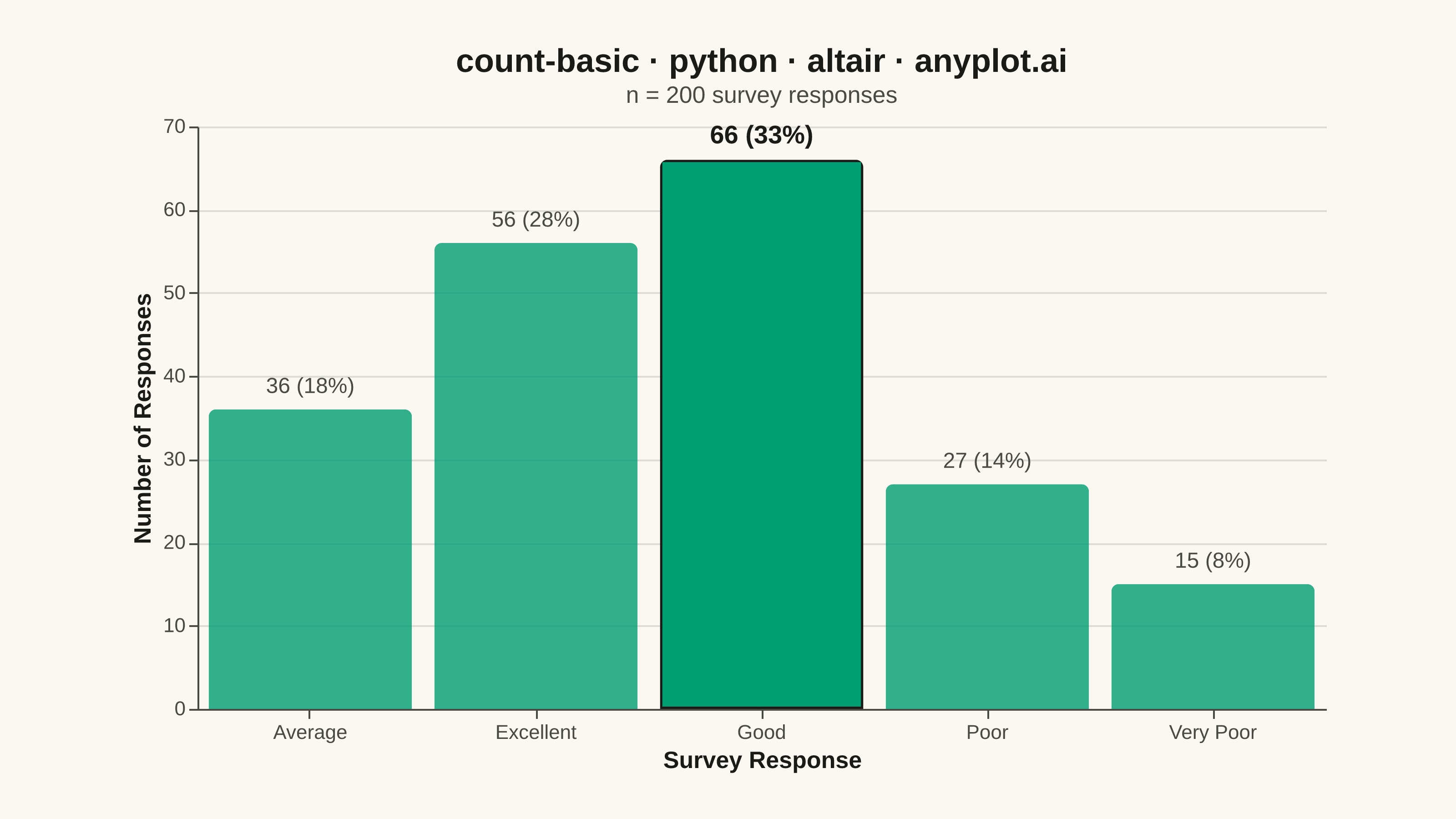
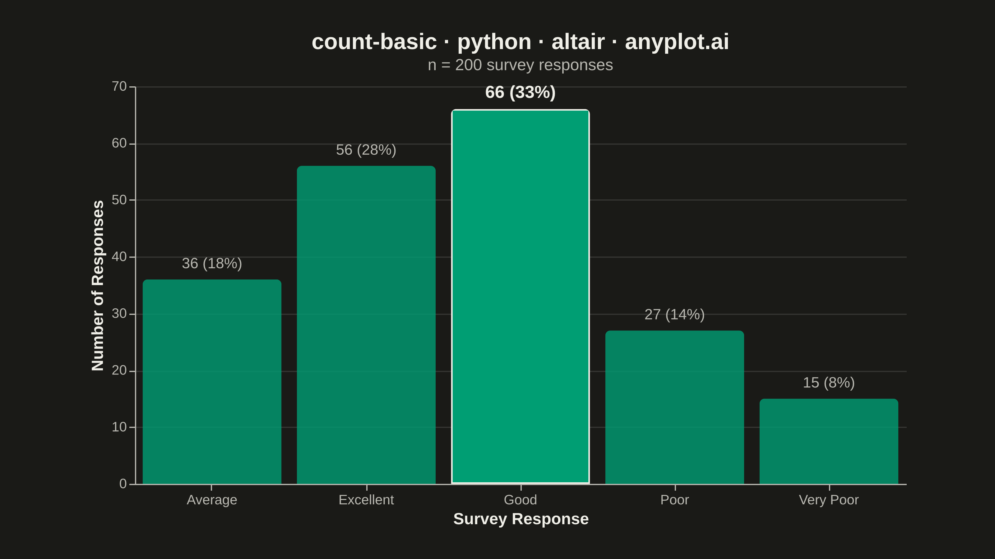
A count plot displays the frequency of observations in each category of a categorical variable using vertical bars. Unlike a basic bar chart that requires pre-computed values, a count plot automatically counts occurrences from raw data. This makes it ideal for quick exploratory analysis of categorical distributions without manual aggregation.
""" anyplot.ai
count-basic: Basic Count Plot
Library: altair 6.2.2 | Python 3.13.14
Quality: 91/100 | Updated: 2026-08-11
"""

import os
import sys


sys.path = [p for p in sys.path if not p.endswith("implementations/python")]

import altair as alt
import numpy as np
import pandas as pd
from PIL import Image


# Theme tokens
THEME = os.getenv("ANYPLOT_THEME", "light")
PAGE_BG = "#FAF8F1" if THEME == "light" else "#1A1A17"
INK = "#1A1A17" if THEME == "light" else "#F0EFE8"
INK_SOFT = "#4A4A44" if THEME == "light" else "#B8B7B0"

BRAND = "#009E73"  # Imprint palette position 1

# Data: Survey responses with varying frequencies
np.random.seed(42)
responses = np.random.choice(
    ["Excellent", "Good", "Average", "Poor", "Very Poor"], size=200, p=[0.25, 0.35, 0.20, 0.12, 0.08]
)
df = pd.DataFrame({"Response": responses})

TITLE = "count-basic · python · altair · anyplot.ai"

# Aggregate counts and each category's share of the total via Altair's
# declarative transform pipeline, so the percentage annotation is computed
# inside the chart spec rather than pre-calculated in pandas. `isLeading`
# flags the top category so it can carry a deliberate focal-point treatment
# (stroke + full opacity + bold label) instead of a single flat green fill.
base = (
    alt.Chart(df)
    .transform_aggregate(count="count()", groupby=["Response"])
    .transform_joinaggregate(total="sum(count)", max="max(count)")
    .transform_calculate(pct="datum.count / datum.total * 100")
    .transform_calculate(label="format(datum.count, 'd') + ' (' + format(datum.pct, '.0f') + '%)'")
    .transform_calculate(isLeading="datum.count == datum.max")
)

# Hover highlight: a real Altair selection, not a decorative effect — fully
# functional in the interactive plot-{THEME}.html export.
hover = alt.selection_point(on="pointerover", fields=["Response"], empty=False)

bars = (
    base.mark_bar(color=BRAND, cornerRadiusTopLeft=4, cornerRadiusTopRight=4, stroke=INK)
    .encode(
        x=alt.X("Response:N", sort="-y", title="Survey Response", axis=alt.Axis(labelAngle=0)),
        y=alt.Y("count:Q", title="Number of Responses"),
        opacity=alt.when(hover)
        .then(alt.value(1.0))
        .when("datum.isLeading")
        .then(alt.value(1.0))
        .otherwise(alt.value(0.8)),
        strokeWidth=alt.condition("datum.isLeading", alt.value(2.5), alt.value(0)),
        tooltip=[
            alt.Tooltip("Response:N", title="Response"),
            alt.Tooltip("count:Q", title="Count"),
            alt.Tooltip("pct:Q", title="Share", format=".1f"),
        ],
    )
    .add_params(hover)
)

# fontWeight isn't a data-driven Vega-Lite encoding channel, so the
# bold-vs-muted label hierarchy is split into two filtered layers instead of
# a single conditional encoding.
label_encode = {"x": alt.X("Response:N", sort="-y"), "y": "count:Q", "text": "label:N"}
label_leading = (
    base.transform_filter("datum.isLeading")
    .mark_text(align="center", baseline="bottom", dy=-6, fontSize=14, fontWeight="bold", color=INK)
    .encode(**label_encode)
)
label_rest = (
    base.transform_filter("!datum.isLeading")
    .mark_text(align="center", baseline="bottom", dy=-6, fontSize=12, fontWeight="normal", color=INK_SOFT)
    .encode(**label_encode)
)
labels = label_rest + label_leading

chart = (
    (bars + labels)
    .properties(
        width=620,  # inner-view landscape target — see prompts/library/altair.md "Canvas"
        height=320,
        background=PAGE_BG,
        title=alt.Title(
            TITLE,
            subtitle=f"n = {len(df)} survey responses",
            fontSize=18,
            color=INK,
            subtitleFontSize=13,
            subtitleColor=INK_SOFT,
        ),
    )
    .configure_view(fill=PAGE_BG, strokeWidth=0)  # no boxed frame — L-shaped spines via axis domain lines only
    .configure_axis(
        domainColor=INK_SOFT,
        tickColor=INK_SOFT,
        gridColor=INK,
        gridOpacity=0.12,
        labelColor=INK_SOFT,
        titleColor=INK,
        labelFontSize=11,
        titleFontSize=13,
    )
)

# Save
chart.save(f"plot-{THEME}.png", scale_factor=4.0)
chart.save(f"plot-{THEME}.html")

# Canvas contract: pad the rendered PNG up to the exact target — never crop,
# since cropping would clip the title/axis labels (see prompts/library/altair.md).
TARGET_W, TARGET_H = 3200, 1800
img = Image.open(f"plot-{THEME}.png").convert("RGB")
w, h = img.size
if w > TARGET_W or h > TARGET_H:
    raise SystemExit(
        f"altair vl-convert produced {w}x{h}, exceeds target {TARGET_W}x{TARGET_H}. "
        f"Shrink chart .properties(width=, height=) values and re-render."
    )
if w < TARGET_W or h < TARGET_H:
    canvas = Image.new("RGB", (TARGET_W, TARGET_H), PAGE_BG)
    canvas.paste(img, ((TARGET_W - w) // 2, (TARGET_H - h) // 2))
    canvas.save(f"plot-{THEME}.png")
Runnable source as JSON, for any HTTP client: https://api.anyplot.ai/specs/count-basic/altair/code. Any spec id and library id listed in llms-full.txt fit the same URL shape; every URL below is complete and callable.
{
  "spec_id": "count-basic",
  "language": "python",
  "library": "altair",
  "page": "https://anyplot.ai/count-basic/python/altair",
  "hub": "https://anyplot.ai/count-basic",
  "code_json": "https://api.anyplot.ai/specs/count-basic/altair/code",
  "spec_json": "https://api.anyplot.ai/specs/count-basic",
  "render_light_png": "https://storage.googleapis.com/anyplot-images/plots/count-basic/python/altair/plot-light.png",
  "render_dark_png": "https://storage.googleapis.com/anyplot-images/plots/count-basic/python/altair/plot-dark.png",
  "interactive_light_html": "https://storage.googleapis.com/anyplot-images/plots/count-basic/python/altair/plot-light.html",
  "interactive_dark_html": "https://storage.googleapis.com/anyplot-images/plots/count-basic/python/altair/plot-dark.html",
  "quality_score": 91.0,
  "license": "MIT",
  "guide": "https://anyplot.ai/llms.txt"
}
Part of Basic Count Plot on anyplot.ai.