The same plot in 14 other libraries — Python: Altair, Bokeh, lets-plot, Matplotlib, Plotly, plotnine, Pygal, Seaborn; R: ggplot2; JavaScript: Chart.js, D3.js, Apache ECharts, Highcharts, MUI X Charts. Compare all 15 side by side: Real-Time Dashboard Tiles in Python, R, Julia and JavaScript.
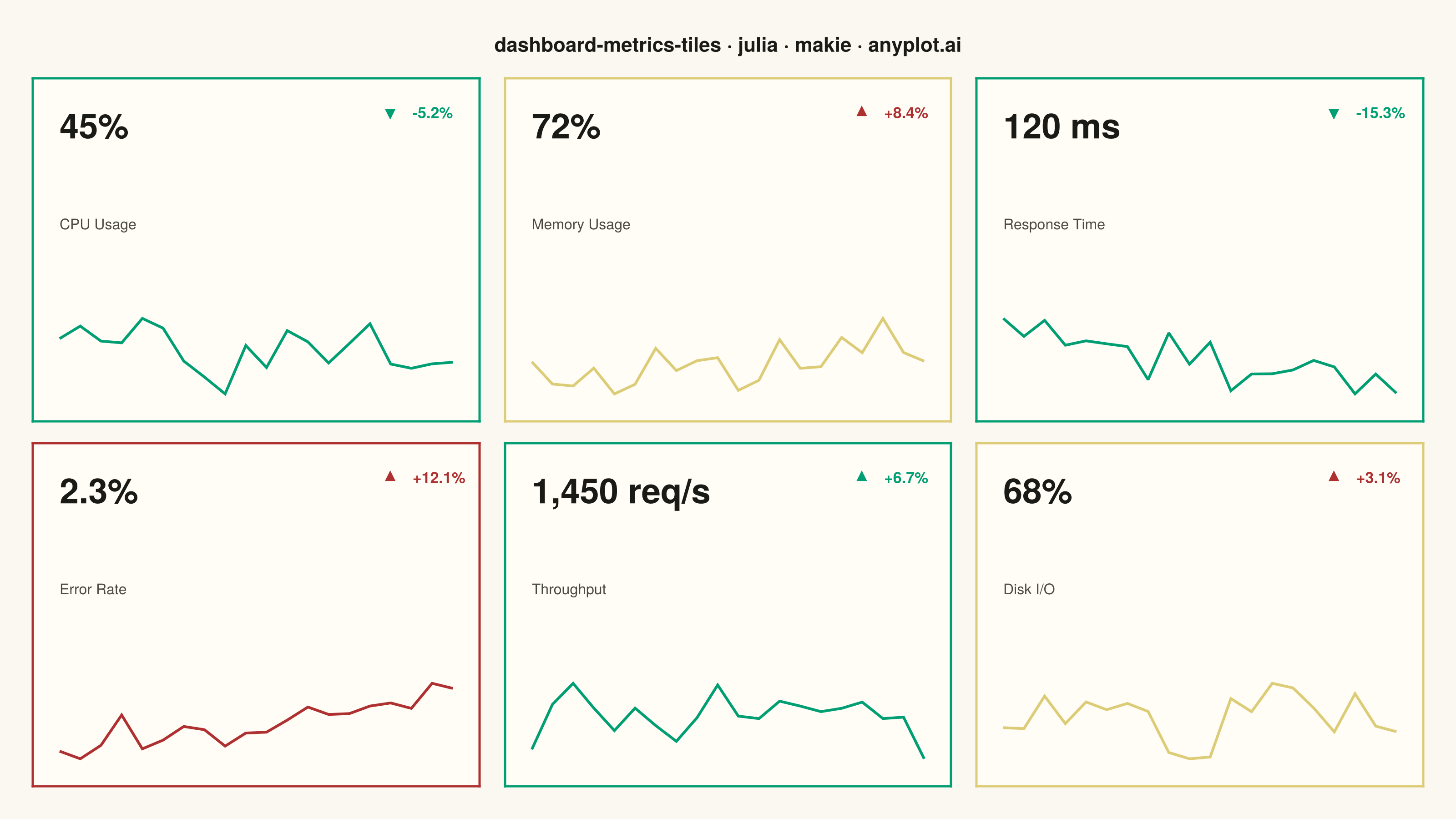
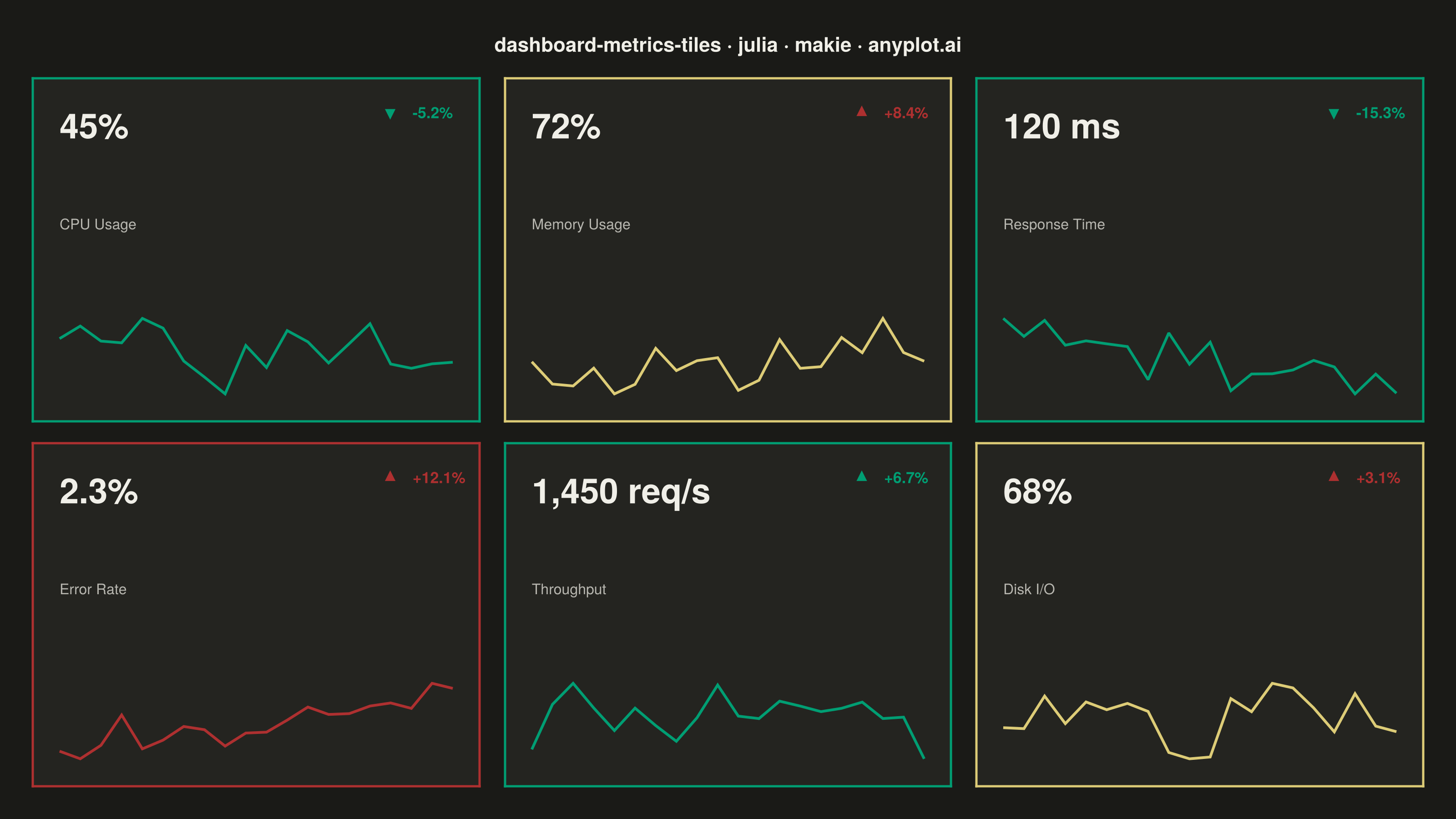
A dashboard layout displaying multiple metric tiles in a responsive grid, where each tile shows a KPI value with its label, an embedded sparkline showing recent trend, and a change indicator (up/down arrow with percentage). This visualization is essential for operations monitoring and business dashboards where multiple metrics need to be tracked simultaneously at a glance. The combination of current value, trend visualization, and change direction provides comprehensive metric context in a compact format.
# anyplot.ai
# dashboard-metrics-tiles: Real-Time Dashboard Tiles
# Library: makie 0.21.9 | Julia 1.11.9
# Quality: 91/100 | Created: 2026-09-01

using CairoMakie
using Colors
using Random

Random.seed!(42)

# --- Theme tokens -----------------------------------------------------------
const THEME       = get(ENV, "ANYPLOT_THEME", "light")
const PAGE_BG     = THEME == "light" ? colorant"#FAF8F1" : colorant"#1A1A17"
const ELEVATED_BG = THEME == "light" ? colorant"#FFFDF6" : colorant"#242420"
const INK         = THEME == "light" ? colorant"#1A1A17" : colorant"#F0EFE8"
const INK_SOFT    = THEME == "light" ? colorant"#4A4A44" : colorant"#B8B7B0"

# Imprint palette — status colors use the semantic anchors + slot 5 (matte
# red), since "good / warning / critical" is a labelled status field, not an
# abstract category (see default-style-guide.md "Semantic exception").
const IMPRINT_GOOD    = colorant"#009E73"  # brand green — status: good
const IMPRINT_WARNING = colorant"#DDCC77"  # amber anchor — status: warning
const IMPRINT_BAD     = colorant"#AE3030"  # matte red — status: critical

# --- Data ---------------------------------------------------------------
# Six KPI tiles for an operations dashboard, arranged 3x2. Each tile carries
# a current value, a 20-point recent-trend sparkline, and a change indicator
# relative to the prior period.
metric_names   = ["CPU Usage", "Memory Usage", "Response Time", "Error Rate", "Throughput", "Disk I/O"]
value_labels   = ["45%", "72%", "120 ms", "2.3%", "1,450 req/s", "68%"]
base_values    = [50.0, 65.0, 140.0, 1.5, 1350.0, 63.0]
change_percent = [-5.2, 8.4, -15.3, 12.1, 6.7, 3.1]
statuses       = ["good", "warning", "good", "critical", "good", "warning"]
favorable_up   = [false, false, false, false, true, false]  # true: rising is favorable for this metric

n_points  = 20
histories = Vector{Vector{Float64}}(undef, length(metric_names))
for i in eachindex(metric_names)
    drift = range(0.0, change_percent[i] / 100; length = n_points)
    noise = randn(n_points) .* (0.035 * base_values[i])
    histories[i] = base_values[i] .* (1.0 .+ drift) .+ noise
end

# --- Plot -----------------------------------------------------------------
title_text = "dashboard-metrics-tiles · julia · makie · anyplot.ai"

fig = Figure(
    resolution = (1600, 900),
    fontsize   = 14,
    backgroundcolor = PAGE_BG,
    figure_padding = 36,
)

Label(fig[1, 1:3], title_text; fontsize = 22, color = INK, font = :bold, halign = :center)

n_cols = 3
for i in eachindex(metric_names)
    row = 2 + div(i - 1, n_cols)
    col = 1 + mod(i - 1, n_cols)

    status = statuses[i]
    accent = status == "good" ? IMPRINT_GOOD : status == "warning" ? IMPRINT_WARNING : IMPRINT_BAD
    rising = change_percent[i] >= 0
    favorable = rising == favorable_up[i]
    change_color = favorable ? IMPRINT_GOOD : IMPRINT_BAD
    change_label = (rising ? "+" : "") * string(round(change_percent[i]; digits = 1)) * "%"
    arrow_marker = rising ? :utriangle : :dtriangle

    ax = Axis(
        fig[row, col];
        limits = (0, 1, 0, 1),
        backgroundcolor = ELEVATED_BG,
        topspinevisible = true,
        rightspinevisible = true,
        leftspinevisible = true,
        bottomspinevisible = true,
        topspinecolor = accent,
        rightspinecolor = accent,
        leftspinecolor = accent,
        bottomspinecolor = accent,
        spinewidth = 2.5,
    )
    hidedecorations!(ax)

    # Value + metric name
    text!(ax, 0.06, 0.92; text = value_labels[i], fontsize = 38, color = INK,
          font = :bold, align = (:left, :top))
    text!(ax, 0.06, 0.60; text = metric_names[i], fontsize = 16, color = INK_SOFT,
          align = (:left, :top))

    # Change indicator: triangle marker + signed percentage
    scatter!(ax, [0.80], [0.90]; marker = arrow_marker, markersize = 16,
             color = change_color, strokewidth = 0)
    text!(ax, 0.85, 0.90; text = change_label, fontsize = 17, color = change_color,
          font = :bold, align = (:left, :center))

    # Sparkline in the lower band of the tile
    history = histories[i]
    lo, hi = extrema(history)
    normed = (history .- lo) ./ (hi - lo)
    xs = range(0.06, 0.94; length = n_points)
    ys = 0.08 .+ 0.22 .* normed
    lines!(ax, xs, ys; color = accent, linewidth = 3)
end

colgap!(fig.layout, 28)
rowgap!(fig.layout, 24)
rowsize!(fig.layout, 1, Auto())

# --- Save -------------------------------------------------------------------
save("plot-$(THEME).png", fig; px_per_unit = 2)
Runnable source as JSON, for any HTTP client: https://api.anyplot.ai/specs/dashboard-metrics-tiles/makie/code. Any spec id and library id listed in llms-full.txt fit the same URL shape; every URL below is complete and callable.
{
  "spec_id": "dashboard-metrics-tiles",
  "language": "julia",
  "library": "makie",
  "page": "https://anyplot.ai/dashboard-metrics-tiles/julia/makie",
  "hub": "https://anyplot.ai/dashboard-metrics-tiles",
  "code_json": "https://api.anyplot.ai/specs/dashboard-metrics-tiles/makie/code",
  "spec_json": "https://api.anyplot.ai/specs/dashboard-metrics-tiles",
  "render_light_png": "https://storage.googleapis.com/anyplot-images/plots/dashboard-metrics-tiles/julia/makie/plot-light.png",
  "render_dark_png": "https://storage.googleapis.com/anyplot-images/plots/dashboard-metrics-tiles/julia/makie/plot-dark.png",
  "quality_score": 91.0,
  "license": "MIT",
  "guide": "https://anyplot.ai/llms.txt"
}
Part of Real-Time Dashboard Tiles on anyplot.ai.