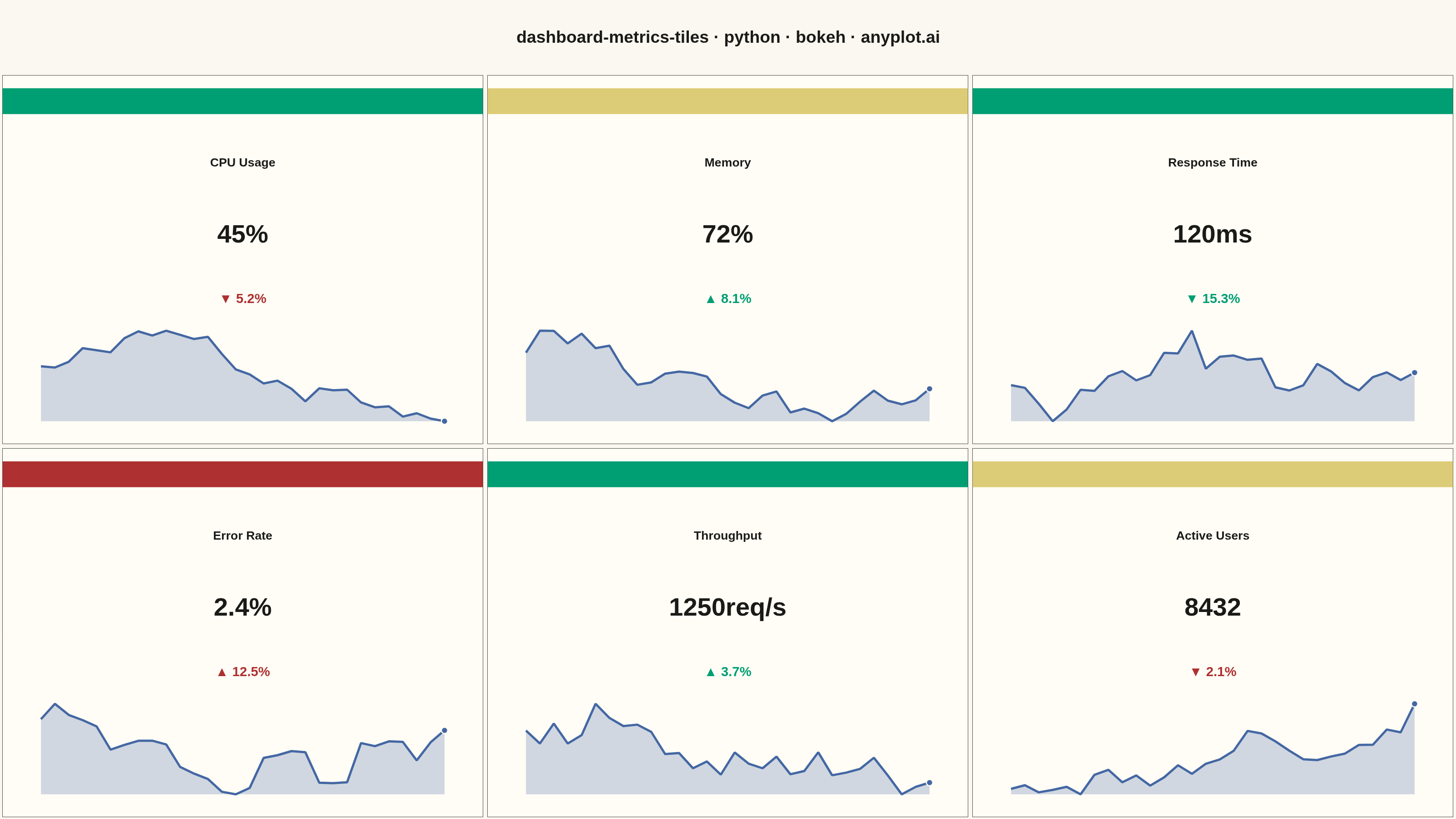
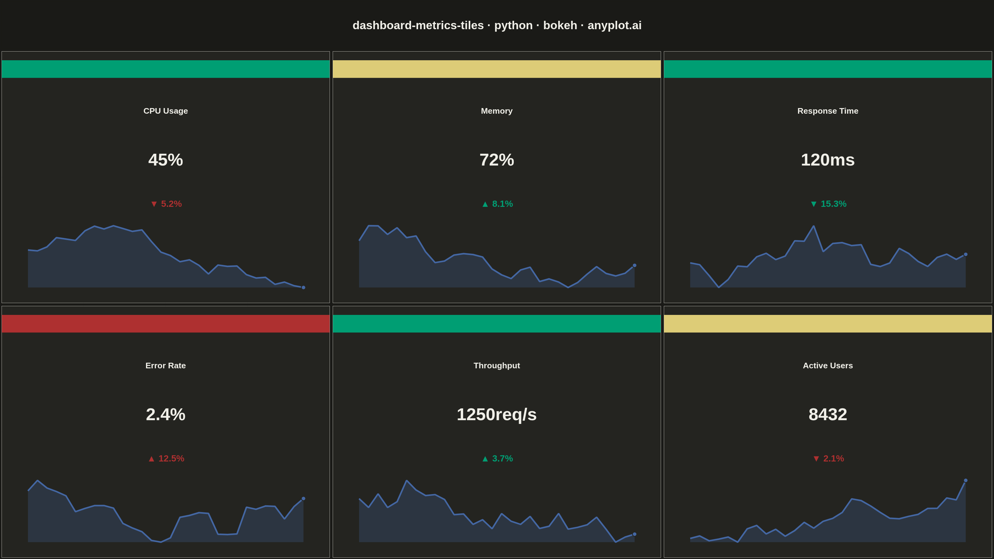
A dashboard layout displaying multiple metric tiles in a responsive grid, where each tile shows a KPI value with its label, an embedded sparkline showing recent trend, and a change indicator (up/down arrow with percentage). This visualization is essential for operations monitoring and business dashboards where multiple metrics need to be tracked simultaneously at a glance. The combination of current value, trend visualization, and change direction provides comprehensive metric context in a compact format.
""" anyplot.ai
dashboard-metrics-tiles: Real-Time Dashboard Tiles
Library: bokeh 3.9.0 | Python 3.13.13
Quality: 91/100 | Updated: 2026-05-21
"""

import os
import sys
import time
from pathlib import Path


# bokeh.py shadows the installed bokeh package when Python adds this file's
# directory to sys.path[0]; remove it so imports resolve to the package.
_here = os.path.dirname(os.path.abspath(__file__))
sys.path[:] = [p for p in sys.path if os.path.abspath(p or ".") != _here]
del _here

import numpy as np
from bokeh.io import output_file, save
from bokeh.layouts import column, gridplot
from bokeh.models import ColumnDataSource, Label
from bokeh.plotting import figure
from selenium import webdriver
from selenium.webdriver.chrome.options import Options


# Theme tokens
THEME = os.getenv("ANYPLOT_THEME", "light")
PAGE_BG = "#FAF8F1" if THEME == "light" else "#1A1A17"
ELEVATED_BG = "#FFFDF6" if THEME == "light" else "#242420"
INK = "#1A1A17" if THEME == "light" else "#F0EFE8"
INK_SOFT = "#4A4A44" if THEME == "light" else "#B8B7B0"

# Okabe-Ito semantic colors for status and change indicators
STATUS_COLORS = {"good": "#009E73", "warning": "#DDCC77", "critical": "#AE3030"}  # imprint semantic anchors
SPARKLINE_COLOR = "#4467A3"  # Okabe-Ito position 3
FAVORABLE_COLOR = "#009E73"  # Okabe-Ito position 1
UNFAVORABLE_COLOR = "#AE3030"  # imprint red — unfavorable

# Metrics where a positive change is unfavorable
UNFAVORABLE_WHEN_UP = {"Error Rate", "Response Time"}

# Data - 6 ops monitoring metric tiles
np.random.seed(42)

metrics = [
    {
        "name": "CPU Usage",
        "value": 45,
        "unit": "%",
        "history": np.clip(40 + np.cumsum(np.random.randn(30) * 2), 20, 80),
        "change": -5.2,
        "status": "good",
    },
    {
        "name": "Memory",
        "value": 72,
        "unit": "%",
        "history": np.clip(65 + np.cumsum(np.random.randn(30) * 1.5), 50, 90),
        "change": 8.1,
        "status": "warning",
    },
    {
        "name": "Response Time",
        "value": 120,
        "unit": "ms",
        "history": np.clip(100 + np.cumsum(np.random.randn(30) * 10), 50, 200),
        "change": -15.3,
        "status": "good",
    },
    {
        "name": "Error Rate",
        "value": 2.4,
        "unit": "%",
        "history": np.clip(2 + np.cumsum(np.random.randn(30) * 0.3), 0.5, 5),
        "change": 12.5,
        "status": "critical",
    },
    {
        "name": "Throughput",
        "value": 1250,
        "unit": "req/s",
        "history": np.clip(1200 + np.cumsum(np.random.randn(30) * 50), 900, 1500),
        "change": 3.7,
        "status": "good",
    },
    {
        "name": "Active Users",
        "value": 8432,
        "unit": "",
        "history": np.clip(8000 + np.cumsum(np.random.randn(30) * 200), 7000, 10000),
        "change": -2.1,
        "status": "warning",
    },
]

# Canvas: 3200x1800 total
# title_fig=160h, gridplot=2x820h rows × 3x1066w cols → 1640h + 160h = 1800h; 3198w ≈ 3200w
TILE_WIDTH = 1066
TILE_HEIGHT = 820

tiles = []

for metric in metrics:
    is_positive_change = metric["change"] > 0
    is_favorable = not is_positive_change if metric["name"] in UNFAVORABLE_WHEN_UP else is_positive_change
    change_color = FAVORABLE_COLOR if is_favorable else UNFAVORABLE_COLOR
    arrow = "▲" if is_positive_change else "▼"
    status_color = STATUS_COLORS[metric["status"]]

    p = figure(
        width=TILE_WIDTH, height=TILE_HEIGHT, toolbar_location=None, tools="", x_range=(0, 1), y_range=(-0.02, 1.12)
    )

    # Hide axes and grid; apply tile chrome
    p.xaxis.visible = False
    p.yaxis.visible = False
    p.xgrid.visible = False
    p.ygrid.visible = False
    p.outline_line_color = INK_SOFT
    p.background_fill_color = ELEVATED_BG
    p.border_fill_color = PAGE_BG

    # Status bar across top of tile
    p.quad(left=0, right=1, top=1.08, bottom=1.0, fill_color=status_color, line_color=None)

    # Metric name
    p.add_layout(
        Label(
            x=0.5,
            y=0.85,
            text=metric["name"],
            text_font_size="20pt",
            text_font_style="bold",
            text_color=INK,
            text_align="center",
            text_baseline="middle",
        )
    )

    # Prominent current value
    value_text = f"{metric['value']}{metric['unit']}"
    p.add_layout(
        Label(
            x=0.5,
            y=0.63,
            text=value_text,
            text_font_size="42pt",
            text_font_style="bold",
            text_color=INK,
            text_align="center",
            text_baseline="middle",
        )
    )

    # Change indicator with directional arrow
    change_text = f"{arrow} {abs(metric['change']):.1f}%"
    p.add_layout(
        Label(
            x=0.5,
            y=0.43,
            text=change_text,
            text_font_size="22pt",
            text_font_style="bold",
            text_color=change_color,
            text_align="center",
            text_baseline="middle",
        )
    )

    # Sparkline — normalize history to [0.05, 0.33]
    history = np.array(metric["history"])
    hist_min, hist_max = history.min(), history.max()
    hist_range = hist_max - hist_min if hist_max != hist_min else 1.0
    y_norm = 0.05 + (history - hist_min) / hist_range * 0.28
    x_norm = np.linspace(0.08, 0.92, len(history))

    # Filled area under sparkline
    y_fill = np.concatenate([y_norm, [0.05, 0.05]])
    x_fill = np.concatenate([x_norm, [x_norm[-1], x_norm[0]]])
    p.patch(x_fill, y_fill, fill_color=SPARKLINE_COLOR, fill_alpha=0.25, line_color=None)

    # Sparkline line (thicker for visibility)
    source = ColumnDataSource(data={"x": x_norm, "y": y_norm})
    p.line("x", "y", source=source, line_width=5, line_color=SPARKLINE_COLOR)

    # Endpoint dot marking the current value
    p.scatter(
        x=[x_norm[-1]], y=[y_norm[-1]], size=14, fill_color=SPARKLINE_COLOR, line_color=ELEVATED_BG, line_width=2.5
    )

    tiles.append(p)

# 3x2 grid of tiles — toolbar_location=None is critical: gridplot default toolbar
# adds ~139px above the canvas, shrinking the screenshot height below 1800
grid = gridplot(
    [[tiles[0], tiles[1], tiles[2]], [tiles[3], tiles[4], tiles[5]]], merge_tools=False, toolbar_location=None
)

# Title figure (full canvas width, 160px tall)
title_fig = figure(width=3200, height=160, toolbar_location=None, tools="", x_range=(0, 1), y_range=(0, 1))
title_fig.xaxis.visible = False
title_fig.yaxis.visible = False
title_fig.xgrid.visible = False
title_fig.ygrid.visible = False
title_fig.outline_line_color = None
title_fig.background_fill_color = PAGE_BG
title_fig.border_fill_color = PAGE_BG

title_fig.add_layout(
    Label(
        x=0.5,
        y=0.5,
        text="dashboard-metrics-tiles · python · bokeh · anyplot.ai",
        text_font_size="28pt",
        text_font_style="bold",
        text_color=INK,
        text_align="center",
        text_baseline="middle",
    )
)

final_layout = column(title_fig, grid)

# Save interactive HTML
output_file(f"plot-{THEME}.html")
save(final_layout)

# Screenshot to PNG via headless Chrome (Selenium 4 / Selenium Manager)
W, H = 3200, 1800
opts = Options()
for arg in (
    "--headless=new",
    "--no-sandbox",
    "--disable-dev-shm-usage",
    "--disable-gpu",
    f"--window-size={W},{H}",
    "--hide-scrollbars",
):
    opts.add_argument(arg)
driver = webdriver.Chrome(options=opts)
# --window-size includes browser chrome; use CDP to set exact viewport
driver.execute_cdp_cmd(
    "Emulation.setDeviceMetricsOverride", {"width": W, "height": H, "deviceScaleFactor": 1, "mobile": False}
)
driver.get(f"file://{Path(f'plot-{THEME}.html').resolve()}")
time.sleep(3)
driver.execute_script(
    f"document.body.style.margin='0'; document.body.style.padding='0';document.body.style.backgroundColor='{PAGE_BG}';"
)
driver.save_screenshot(f"plot-{THEME}.png")
driver.quit()
Runnable source as JSON, for any HTTP client: https://api.anyplot.ai/specs/dashboard-metrics-tiles/bokeh/code. Any spec id and library id listed in llms-full.txt fit the same URL shape; every URL below is complete and callable.
{
  "spec_id": "dashboard-metrics-tiles",
  "language": "python",
  "library": "bokeh",
  "page": "https://anyplot.ai/dashboard-metrics-tiles/python/bokeh",
  "hub": "https://anyplot.ai/dashboard-metrics-tiles",
  "code_json": "https://api.anyplot.ai/specs/dashboard-metrics-tiles/bokeh/code",
  "spec_json": "https://api.anyplot.ai/specs/dashboard-metrics-tiles",
  "render_light_png": "https://storage.googleapis.com/anyplot-images/plots/dashboard-metrics-tiles/python/bokeh/plot-light.png",
  "render_dark_png": "https://storage.googleapis.com/anyplot-images/plots/dashboard-metrics-tiles/python/bokeh/plot-dark.png",
  "interactive_light_html": "https://storage.googleapis.com/anyplot-images/plots/dashboard-metrics-tiles/python/bokeh/plot-light.html",
  "interactive_dark_html": "https://storage.googleapis.com/anyplot-images/plots/dashboard-metrics-tiles/python/bokeh/plot-dark.html",
  "quality_score": 91.0,
  "license": "MIT",
  "guide": "https://anyplot.ai/llms.txt"
}
Part of Real-Time Dashboard Tiles on anyplot.ai.