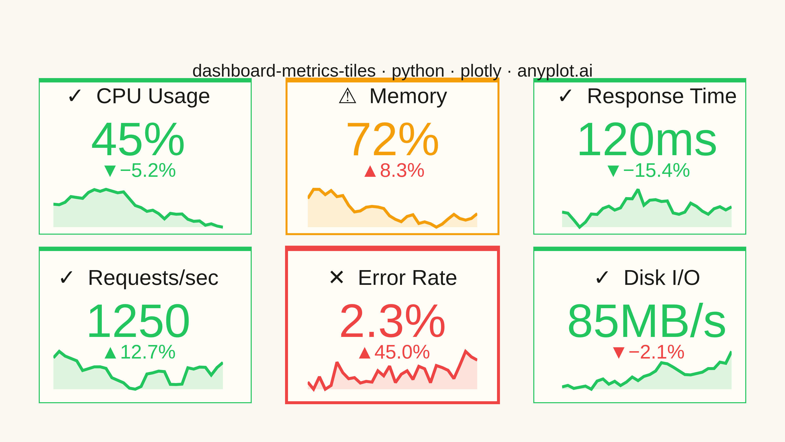
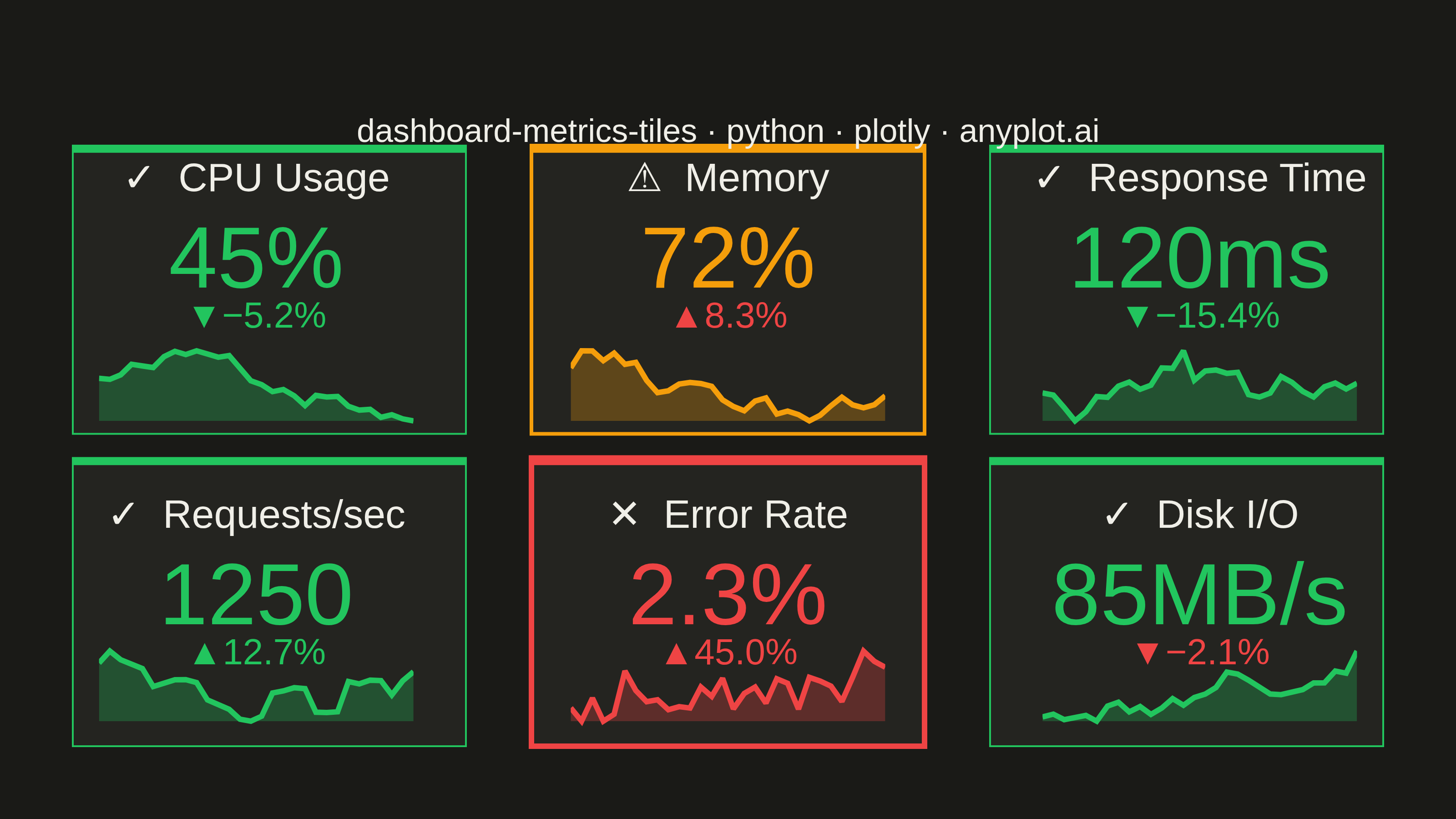
A dashboard layout displaying multiple metric tiles in a responsive grid, where each tile shows a KPI value with its label, an embedded sparkline showing recent trend, and a change indicator (up/down arrow with percentage). This visualization is essential for operations monitoring and business dashboards where multiple metrics need to be tracked simultaneously at a glance. The combination of current value, trend visualization, and change direction provides comprehensive metric context in a compact format.
""" anyplot.ai
dashboard-metrics-tiles: Real-Time Dashboard Tiles
Library: plotly 6.7.0 | Python 3.13.13
Quality: 84/100 | Updated: 2026-05-21
"""

import os

import numpy as np
import plotly.graph_objects as go
from plotly.subplots import make_subplots


# Theme tokens
THEME = os.getenv("ANYPLOT_THEME", "light")
PAGE_BG = "#FAF8F1" if THEME == "light" else "#1A1A17"
ELEVATED_BG = "#FFFDF6" if THEME == "light" else "#242420"
INK = "#1A1A17" if THEME == "light" else "#F0EFE8"
INK_SOFT = "#4A4A44" if THEME == "light" else "#B8B7B0"

# Sparkline fill alpha: brighter in dark mode to compensate for blending
FILL_ALPHA = 0.15 if THEME == "light" else 0.28

# Data - 6 metric tiles for a 3x2 dashboard layout
np.random.seed(42)

metrics = [
    {
        "name": "CPU Usage",
        "value": 45,
        "unit": "%",
        "history": 30 + np.cumsum(np.random.randn(30) * 2),
        "change": -5.2,
        "status": "good",
        "higher_is_bad": True,
    },
    {
        "name": "Memory",
        "value": 72,
        "unit": "%",
        "history": 60 + np.cumsum(np.random.randn(30) * 1.5),
        "change": 8.3,
        "status": "warning",
        "higher_is_bad": True,
    },
    {
        "name": "Response Time",
        "value": 120,
        "unit": "ms",
        "history": 100 + np.cumsum(np.random.randn(30) * 5),
        "change": -15.4,
        "status": "good",
        "higher_is_bad": True,
    },
    {
        "name": "Requests/sec",
        "value": 1250,
        "unit": "",
        "history": 1000 + np.cumsum(np.random.randn(30) * 50),
        "change": 12.7,
        "status": "good",
        "higher_is_bad": False,
    },
    {
        "name": "Error Rate",
        "value": 2.3,
        "unit": "%",
        "history": 1 + np.abs(np.cumsum(np.random.randn(30) * 0.3)),
        "change": 45.0,
        "status": "critical",
        "higher_is_bad": True,
    },
    {
        "name": "Disk I/O",
        "value": 85,
        "unit": "MB/s",
        "history": 70 + np.cumsum(np.random.randn(30) * 3),
        "change": -2.1,
        "status": "good",
        "higher_is_bad": False,
    },
]

# Normalize history for sparklines
for m in metrics:
    hist = np.array(m["history"])
    m["history_norm"] = (hist - hist.min()) / (hist.max() - hist.min() + 1e-6)

# Status config: color + shape symbol (CVD-safe: shape encodes status independently of color)
status_colors = {"good": "#22c55e", "warning": "#f59e0b", "critical": "#ef4444"}
# Shape symbols provide non-color differentiation for CVD viewers
status_symbols = {"good": "✓", "warning": "⚠", "critical": "✕"}
# Border thickness further reinforces status via shape/size cue
status_border_widths = {"good": 1, "warning": 2, "critical": 3}

# Grid layout: 3 columns x 2 rows
n_cols, n_rows = 3, 2

# Create subplots - indicator type for metric tiles
fig = make_subplots(
    rows=n_rows,
    cols=n_cols,
    horizontal_spacing=0.08,
    vertical_spacing=0.12,
    specs=[[{"type": "indicator"} for _ in range(n_cols)] for _ in range(n_rows)],
)

# Add indicator tiles
for idx, metric in enumerate(metrics):
    row = idx // n_cols + 1
    col = idx % n_cols + 1

    # Delta colors respect direction semantics (decrease is good for CPU, bad for throughput)
    if metric["higher_is_bad"]:
        delta_increasing_color = "#ef4444"
        delta_decreasing_color = "#22c55e"
    else:
        delta_increasing_color = "#22c55e"
        delta_decreasing_color = "#ef4444"

    # Include status symbol in label — provides shape cue independent of color for CVD viewers
    label_with_symbol = f"{status_symbols[metric['status']]}  {metric['name']}"

    fig.add_trace(
        go.Indicator(
            mode="number+delta",
            value=metric["value"],
            number=dict(font=dict(size=48, color=status_colors[metric["status"]]), suffix=metric["unit"]),
            delta=dict(
                reference=metric["value"] / (1 + metric["change"] / 100),
                relative=True,
                valueformat=".1%",
                font=dict(size=20),
                increasing=dict(color=delta_increasing_color, symbol="▲"),
                decreasing=dict(color=delta_decreasing_color, symbol="▼"),
            ),
            title=dict(text=label_with_symbol, font=dict(size=22, color=INK)),
        ),
        row=row,
        col=col,
    )

# Add sparklines as scatter traces with custom axes
for idx, metric in enumerate(metrics):
    row = idx // n_cols + 1
    col = idx % n_cols + 1

    if row == 1:
        y_domain = [0.55, 0.95]
    else:
        y_domain = [0.05, 0.45]

    if col == 1:
        x_domain = [0.0, 0.28]
    elif col == 2:
        x_domain = [0.36, 0.64]
    else:
        x_domain = [0.72, 1.0]

    axis_num = idx + 2
    x_axis = f"x{axis_num}"
    y_axis = f"y{axis_num}"

    x_spark = list(range(len(metric["history_norm"])))
    y_spark = metric["history_norm"].tolist()

    hex_color = status_colors[metric["status"]]
    r, g, b = int(hex_color[1:3], 16), int(hex_color[3:5], 16), int(hex_color[5:7], 16)

    fig.add_trace(
        go.Scatter(
            x=x_spark,
            y=y_spark,
            mode="lines",
            line=dict(color=hex_color, width=3),
            fill="tozeroy",
            fillcolor=f"rgba({r}, {g}, {b}, {FILL_ALPHA})",
            showlegend=False,
            hoverinfo="skip",
            xaxis=x_axis,
            yaxis=y_axis,
        )
    )

    sparkline_height = 0.12
    fig.update_layout(
        **{
            f"xaxis{axis_num}": dict(
                domain=[x_domain[0] + 0.02, x_domain[1] - 0.02],
                range=[0, len(x_spark) - 1],
                showticklabels=False,
                showgrid=False,
                zeroline=False,
                showline=False,
                anchor=y_axis,
            ),
            f"yaxis{axis_num}": dict(
                domain=[y_domain[0] - 0.02, y_domain[0] + sparkline_height],
                range=[-0.1, 1.1],
                showticklabels=False,
                showgrid=False,
                zeroline=False,
                showline=False,
                anchor=x_axis,
            ),
        }
    )

# Add tile backgrounds with status-aware borders (thickness = additional shape cue for CVD)
for idx, metric in enumerate(metrics):
    row = idx // n_cols + 1
    col = idx % n_cols + 1

    if row == 1:
        y_domain = [0.52, 1.0]
    else:
        y_domain = [0.0, 0.48]

    if col == 1:
        x_domain = [0.0, 0.30]
    elif col == 2:
        x_domain = [0.35, 0.65]
    else:
        x_domain = [0.70, 1.0]

    border_width = status_border_widths[metric["status"]]
    status_color = status_colors[metric["status"]]

    # Tile fill
    fig.add_shape(
        type="rect",
        xref="paper",
        yref="paper",
        x0=x_domain[0],
        y0=y_domain[0],
        x1=x_domain[1],
        y1=y_domain[1],
        fillcolor=ELEVATED_BG,
        line=dict(color=status_color, width=border_width),
        layer="below",
    )

    # Status accent bar along the top edge of each tile (position cue + color cue)
    bar_height = 0.012
    fig.add_shape(
        type="rect",
        xref="paper",
        yref="paper",
        x0=x_domain[0],
        y0=y_domain[1] - bar_height,
        x1=x_domain[1],
        y1=y_domain[1],
        fillcolor=status_color,
        line=dict(width=0),
        layer="above",
    )

# Title annotation
fig.add_annotation(
    text="dashboard-metrics-tiles · python · plotly · anyplot.ai",
    x=0.5,
    y=1.06,
    xref="paper",
    yref="paper",
    showarrow=False,
    font=dict(size=18, color=INK, family="Arial"),
    xanchor="center",
    yanchor="top",
)

# Layout
fig.update_layout(autosize=False, paper_bgcolor=PAGE_BG, margin=dict(l=40, r=40, t=80, b=40), showlegend=False)

# Save
fig.write_image(f"plot-{THEME}.png", width=800, height=450, scale=4)
fig.write_html(f"plot-{THEME}.html", include_plotlyjs="cdn")
Runnable source as JSON, for any HTTP client: https://api.anyplot.ai/specs/dashboard-metrics-tiles/plotly/code. Any spec id and library id listed in llms-full.txt fit the same URL shape; every URL below is complete and callable.
{
  "spec_id": "dashboard-metrics-tiles",
  "language": "python",
  "library": "plotly",
  "page": "https://anyplot.ai/dashboard-metrics-tiles/python/plotly",
  "hub": "https://anyplot.ai/dashboard-metrics-tiles",
  "code_json": "https://api.anyplot.ai/specs/dashboard-metrics-tiles/plotly/code",
  "spec_json": "https://api.anyplot.ai/specs/dashboard-metrics-tiles",
  "render_light_png": "https://storage.googleapis.com/anyplot-images/plots/dashboard-metrics-tiles/python/plotly/plot-light.png",
  "render_dark_png": "https://storage.googleapis.com/anyplot-images/plots/dashboard-metrics-tiles/python/plotly/plot-dark.png",
  "interactive_light_html": "https://storage.googleapis.com/anyplot-images/plots/dashboard-metrics-tiles/python/plotly/plot-light.html",
  "interactive_dark_html": "https://storage.googleapis.com/anyplot-images/plots/dashboard-metrics-tiles/python/plotly/plot-dark.html",
  "quality_score": 84.0,
  "license": "MIT",
  "guide": "https://anyplot.ai/llms.txt"
}
Part of Real-Time Dashboard Tiles on anyplot.ai.