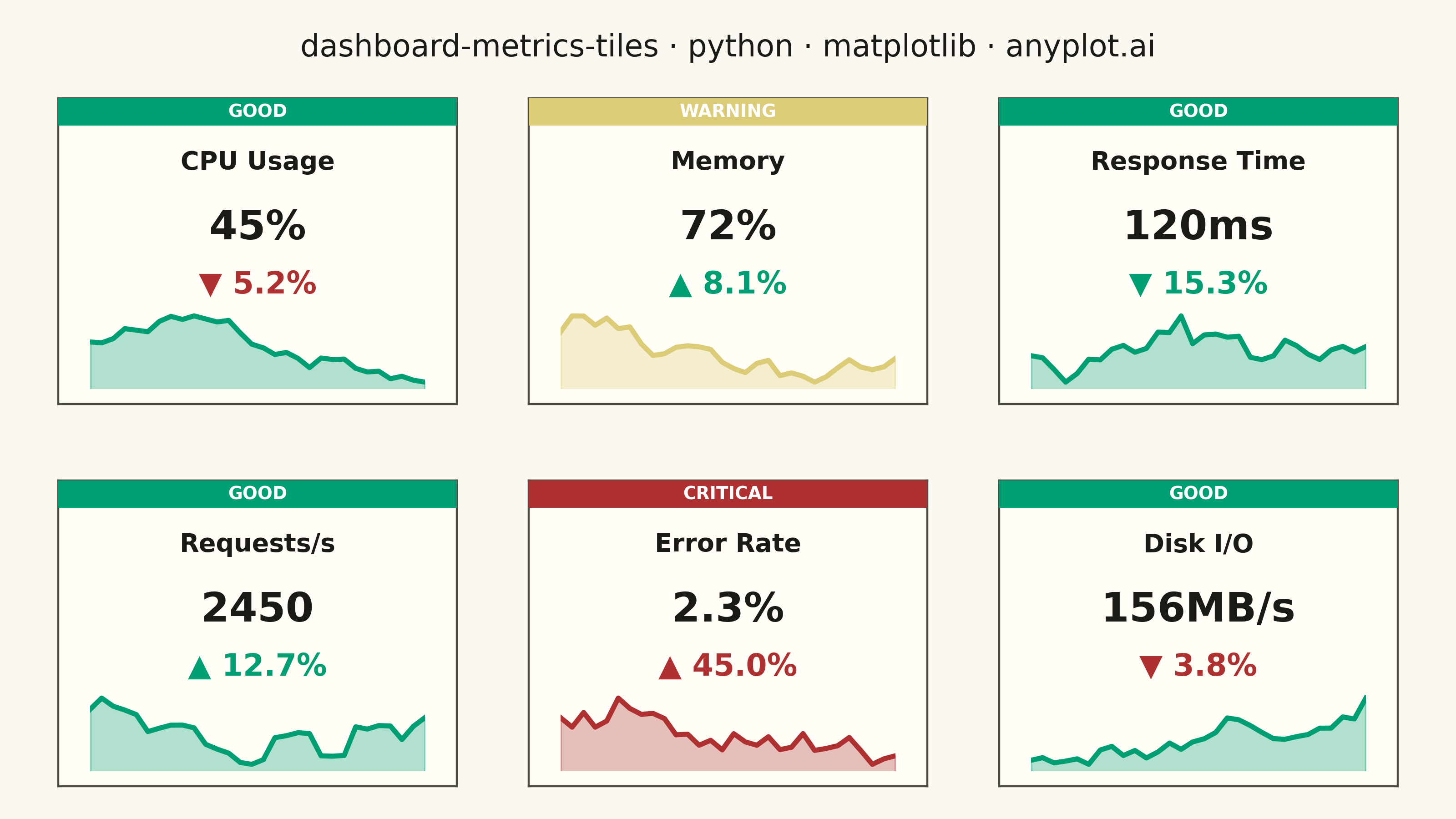
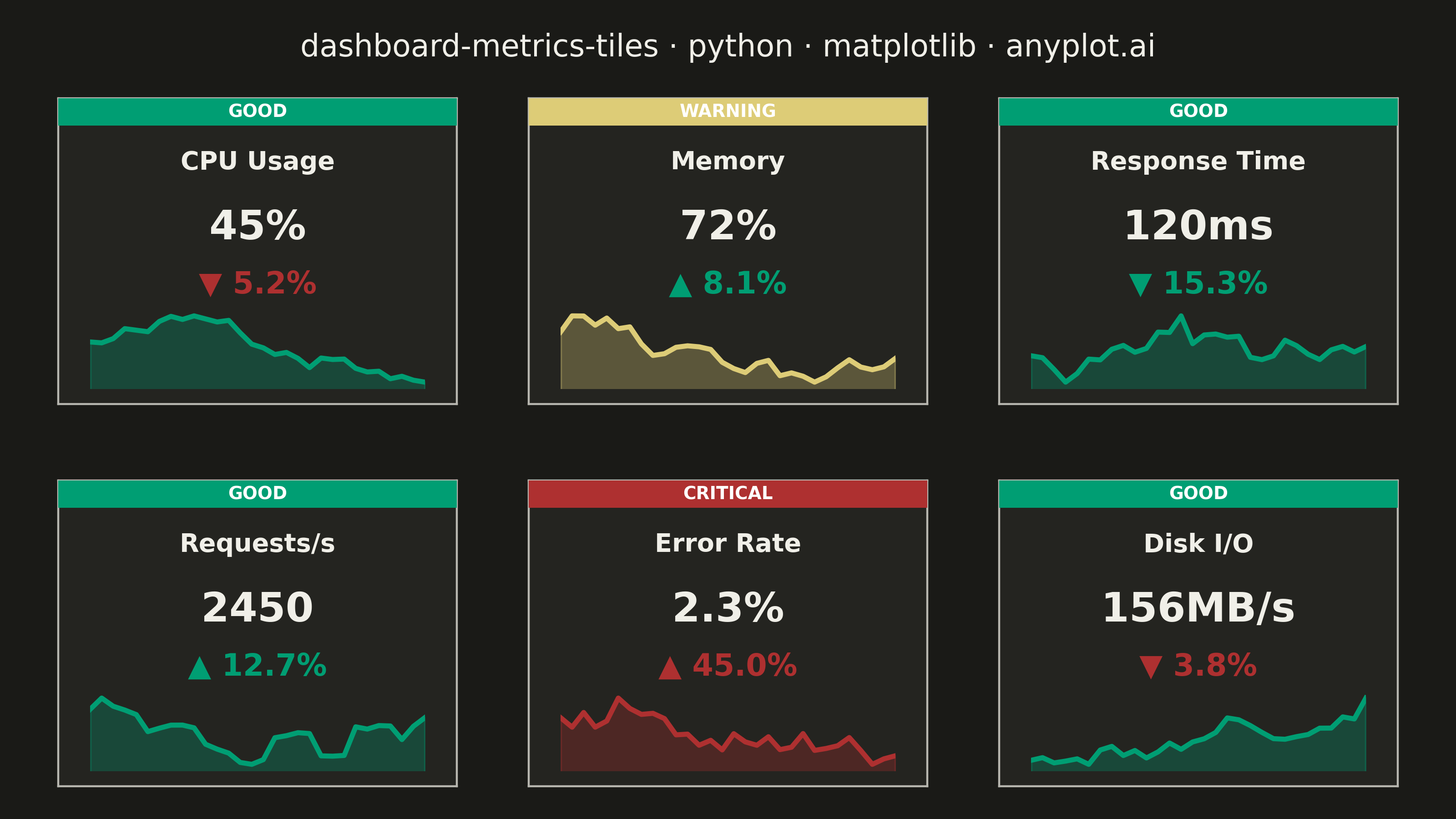
A dashboard layout displaying multiple metric tiles in a responsive grid, where each tile shows a KPI value with its label, an embedded sparkline showing recent trend, and a change indicator (up/down arrow with percentage). This visualization is essential for operations monitoring and business dashboards where multiple metrics need to be tracked simultaneously at a glance. The combination of current value, trend visualization, and change direction provides comprehensive metric context in a compact format.
""" anyplot.ai
dashboard-metrics-tiles: Real-Time Dashboard Tiles
Library: matplotlib 3.10.9 | Python 3.13.13
Quality: 90/100 | Updated: 2026-05-21
"""

import os

import matplotlib.pyplot as plt
import numpy as np


# Theme tokens
THEME = os.getenv("ANYPLOT_THEME", "light")
PAGE_BG = "#FAF8F1" if THEME == "light" else "#1A1A17"
ELEVATED_BG = "#FFFDF6" if THEME == "light" else "#242420"
INK = "#1A1A17" if THEME == "light" else "#F0EFE8"
INK_SOFT = "#4A4A44" if THEME == "light" else "#B8B7B0"

# Status colors — imprint semantic anchors (green / amber / red)
STATUS_COLORS = {"good": "#009E73", "warning": "#DDCC77", "critical": "#AE3030"}
STATUS_LABELS = {"good": "GOOD", "warning": "WARNING", "critical": "CRITICAL"}

# Data
np.random.seed(42)
metrics = [
    {
        "name": "CPU Usage",
        "value": 45,
        "unit": "%",
        "history": np.cumsum(np.random.randn(30) * 2) + 50,
        "change": -5.2,
        "status": "good",
    },
    {
        "name": "Memory",
        "value": 72,
        "unit": "%",
        "history": np.cumsum(np.random.randn(30) * 1.5) + 70,
        "change": 8.1,
        "status": "warning",
    },
    {
        "name": "Response Time",
        "value": 120,
        "unit": "ms",
        "history": np.cumsum(np.random.randn(30) * 10) + 130,
        "change": -15.3,
        "status": "good",
    },
    {
        "name": "Requests/s",
        "value": 2450,
        "unit": "",
        "history": np.cumsum(np.random.randn(30) * 50) + 2400,
        "change": 12.7,
        "status": "good",
    },
    {
        "name": "Error Rate",
        "value": 2.3,
        "unit": "%",
        "history": np.cumsum(np.random.randn(30) * 0.3) + 2,
        "change": 45.0,
        "status": "critical",
    },
    {
        "name": "Disk I/O",
        "value": 156,
        "unit": "MB/s",
        "history": np.cumsum(np.random.randn(30) * 8) + 150,
        "change": -3.8,
        "status": "good",
    },
]

# Plot — 3×2 grid of dashboard tiles
fig, axes = plt.subplots(2, 3, figsize=(8, 4.5), dpi=400, facecolor=PAGE_BG)
fig.subplots_adjust(left=0.04, right=0.96, top=0.88, bottom=0.04, wspace=0.18, hspace=0.25)

fig.suptitle(
    "dashboard-metrics-tiles · python · matplotlib · anyplot.ai", fontsize=12, fontweight="medium", color=INK, y=0.96
)

for ax, metric in zip(axes.flat, metrics, strict=True):
    ax.set_facecolor(ELEVATED_BG)
    for spine in ax.spines.values():
        spine.set_color(INK_SOFT)
        spine.set_linewidth(0.8)
    ax.set_xticks([])
    ax.set_yticks([])

    status_color = STATUS_COLORS[metric["status"]]

    # Status bar at top with accessibility text label
    status_ax = ax.inset_axes([0, 0.91, 1, 0.09])
    status_ax.set_facecolor(status_color)
    status_ax.set_xticks([])
    status_ax.set_yticks([])
    for spine in status_ax.spines.values():
        spine.set_visible(False)
    status_ax.text(
        0.5,
        0.5,
        STATUS_LABELS[metric["status"]],
        ha="center",
        va="center",
        fontsize=7,
        fontweight="bold",
        color="white",
        transform=status_ax.transAxes,
    )

    # Metric name
    ax.text(
        0.5,
        0.83,
        metric["name"],
        ha="center",
        va="top",
        fontsize=10,
        fontweight="bold",
        color=INK,
        transform=ax.transAxes,
    )

    # Main value — prominent display
    value_str = f"{metric['value']}{metric['unit']}"
    ax.text(
        0.5, 0.64, value_str, ha="center", va="top", fontsize=16, fontweight="bold", color=INK, transform=ax.transAxes
    )

    # Change indicator with arrow — enlarged for better at-a-glance visibility
    change = metric["change"]
    arrow = "▲" if change >= 0 else "▼"
    if metric["name"] in ["Error Rate", "Response Time"]:
        change_color = STATUS_COLORS["good"] if change < 0 else STATUS_COLORS["critical"]
    else:
        change_color = STATUS_COLORS["good"] if change >= 0 else STATUS_COLORS["critical"]
    ax.text(
        0.5,
        0.44,
        f"{arrow} {abs(change):.1f}%",
        ha="center",
        va="top",
        fontsize=12,
        fontweight="bold",
        color=change_color,
        transform=ax.transAxes,
    )

    # Sparkline
    sparkline_ax = ax.inset_axes([0.08, 0.05, 0.84, 0.26])
    sparkline_ax.set_facecolor("none")
    history = metric["history"]
    x_vals = range(len(history))
    sparkline_ax.fill_between(x_vals, history, alpha=0.3, color=status_color)
    sparkline_ax.plot(x_vals, history, linewidth=2.0, color=status_color)
    sparkline_ax.set_xlim(0, len(history) - 1)
    y_range = max(history) - min(history)
    sparkline_ax.set_ylim(min(history) - 0.1 * y_range, max(history) + 0.1 * y_range)
    sparkline_ax.axis("off")

# Save
plt.savefig(f"plot-{THEME}.png", dpi=400, facecolor=PAGE_BG)
Runnable source as JSON, for any HTTP client: https://api.anyplot.ai/specs/dashboard-metrics-tiles/matplotlib/code. Any spec id and library id listed in llms-full.txt fit the same URL shape; every URL below is complete and callable.
{
  "spec_id": "dashboard-metrics-tiles",
  "language": "python",
  "library": "matplotlib",
  "page": "https://anyplot.ai/dashboard-metrics-tiles/python/matplotlib",
  "hub": "https://anyplot.ai/dashboard-metrics-tiles",
  "code_json": "https://api.anyplot.ai/specs/dashboard-metrics-tiles/matplotlib/code",
  "spec_json": "https://api.anyplot.ai/specs/dashboard-metrics-tiles",
  "render_light_png": "https://storage.googleapis.com/anyplot-images/plots/dashboard-metrics-tiles/python/matplotlib/plot-light.png",
  "render_dark_png": "https://storage.googleapis.com/anyplot-images/plots/dashboard-metrics-tiles/python/matplotlib/plot-dark.png",
  "quality_score": 90.0,
  "license": "MIT",
  "guide": "https://anyplot.ai/llms.txt"
}
Part of Real-Time Dashboard Tiles on anyplot.ai.