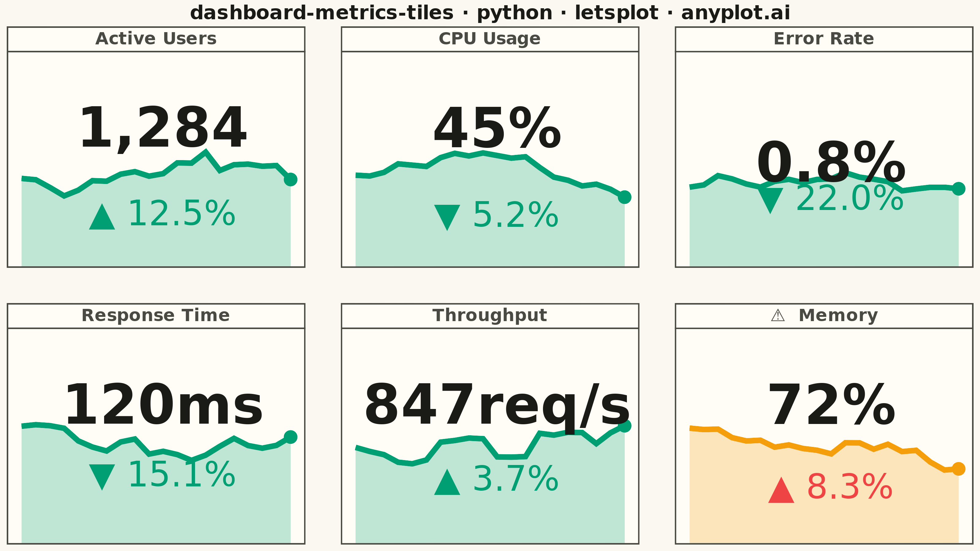
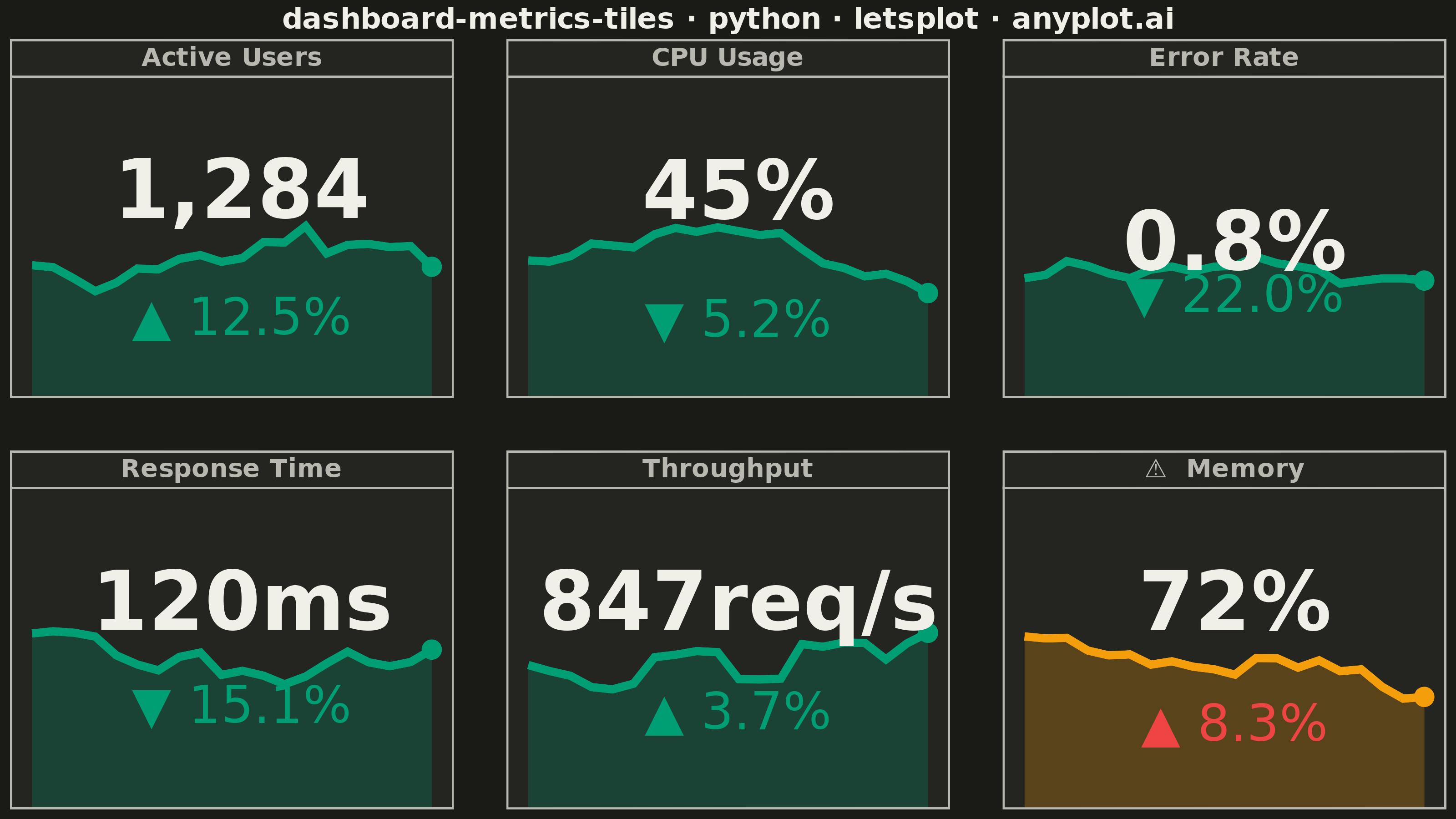
A dashboard layout displaying multiple metric tiles in a responsive grid, where each tile shows a KPI value with its label, an embedded sparkline showing recent trend, and a change indicator (up/down arrow with percentage). This visualization is essential for operations monitoring and business dashboards where multiple metrics need to be tracked simultaneously at a glance. The combination of current value, trend visualization, and change direction provides comprehensive metric context in a compact format.
""" anyplot.ai
dashboard-metrics-tiles: Real-Time Dashboard Tiles
Library: letsplot 4.10.1 | Python 3.13.13
Quality: 88/100 | Updated: 2026-05-21
"""

import os

import numpy as np
import pandas as pd
from lets_plot import (
    LetsPlot,
    aes,
    element_blank,
    element_rect,
    element_text,
    facet_wrap,
    geom_area,
    geom_line,
    geom_point,
    geom_text,
    ggplot,
    ggsize,
    labs,
    layer_tooltips,
    scale_color_manual,
    scale_fill_manual,
    scale_x_continuous,
    scale_y_continuous,
    theme,
)
from lets_plot.export import ggsave


LetsPlot.setup_html()

THEME = os.getenv("ANYPLOT_THEME", "light")
PAGE_BG = "#FAF8F1" if THEME == "light" else "#1A1A17"
ELEVATED_BG = "#FFFDF6" if THEME == "light" else "#242420"
INK = "#1A1A17" if THEME == "light" else "#F0EFE8"
INK_SOFT = "#4A4A44" if THEME == "light" else "#B8B7B0"

# Status colors: good uses brand green (Okabe-Ito #1), warning amber, critical red
STATUS_COLORS = {"good": "#009E73", "warning": "#F59E0B", "critical": "#EF4444", "bad": "#EF4444"}

np.random.seed(42)

# Data
metrics = [
    {"name": "CPU Usage", "value": 45, "unit": "%", "change": -5.2, "status": "good"},
    {"name": "Memory", "value": 72, "unit": "%", "change": 8.3, "status": "warning"},
    {"name": "Response Time", "value": 120, "unit": "ms", "change": -15.1, "status": "good"},
    {"name": "Active Users", "value": 1284, "unit": "", "change": 12.5, "status": "good"},
    {"name": "Error Rate", "value": 0.8, "unit": "%", "change": -22.0, "status": "good"},
    {"name": "Throughput", "value": 847, "unit": "req/s", "change": 3.7, "status": "good"},
]

all_data = []
for m in metrics:
    base = m["value"]
    trend = np.cumsum(np.random.randn(20) * (base * 0.08)) + base * 0.85
    trend = trend - trend[-1] + base

    value_str = f"{m['value']:,}" if m["value"] >= 1000 else str(m["value"])
    value_display = f"{value_str}{m['unit']}"

    change = m["change"]
    if change >= 0:
        arrow = "▲"
        change_color = "bad" if m["name"] in ["CPU Usage", "Memory", "Error Rate", "Response Time"] else "good"
    else:
        arrow = "▼"
        change_color = "good" if m["name"] in ["CPU Usage", "Memory", "Error Rate", "Response Time"] else "bad"

    change_str = f"{arrow} {abs(change):.1f}%"

    # Prepend warning badge to facet strip label for prominent visual distinction
    facet_label = f"⚠  {m['name']}" if m["status"] == "warning" else m["name"]

    for i, val in enumerate(trend):
        all_data.append(
            {
                "metric": facet_label,
                "x": i,
                "y": val,
                "status": m["status"],
                "value_label": value_display if i == 10 else "",
                "change_label": change_str if i == 10 else "",
                "change_color": change_color,
                "is_last": i == len(trend) - 1,
            }
        )

df = pd.DataFrame(all_data)
last_points = df[df["is_last"]].copy()
label_data = df[df["value_label"] != ""].copy()

y_stats = df.groupby("metric").agg({"y": ["min", "max"]}).reset_index()
y_stats.columns = ["metric", "y_min", "y_max"]

label_data = label_data.merge(y_stats, on="metric")
label_data["y_value"] = label_data["y_max"] + (label_data["y_max"] - label_data["y_min"]) * 0.55
label_data["y_change"] = label_data["y_min"] - (label_data["y_max"] - label_data["y_min"]) * 0.40

# Plot
plot = (
    ggplot(df, aes("x", "y"))
    + geom_area(aes(fill="status"), alpha=0.25, show_legend=False, tooltips="none")
    + geom_line(
        aes(color="status"), size=2, show_legend=False, tooltips=layer_tooltips().line("@metric").line("value|@y{.1f}")
    )
    + geom_point(
        data=last_points,
        mapping=aes(color="status"),
        size=5,
        show_legend=False,
        tooltips=layer_tooltips().line("@metric").line("current|@y{.1f}"),
    )
    + geom_text(
        data=label_data, mapping=aes(x="x", y="y_value", label="value_label"), size=22, fontface="bold", color=INK
    )
    + geom_text(
        data=label_data,
        mapping=aes(x="x", y="y_change", label="change_label", color="change_color"),
        size=14,
        show_legend=False,
    )
    + scale_fill_manual(values=STATUS_COLORS)
    + scale_color_manual(values=STATUS_COLORS)
    + scale_x_continuous(expand=[0.05, 0.05])
    + scale_y_continuous(expand=[0.55, 0.55])
    + facet_wrap("metric", ncol=3, scales="free_y")
    + labs(title="dashboard-metrics-tiles · python · letsplot · anyplot.ai")
    + theme(
        plot_title=element_text(size=16, face="bold", color=INK, hjust=0.5),
        strip_text=element_text(size=14, face="bold", color=INK_SOFT),
        strip_background=element_rect(fill=ELEVATED_BG, color=INK_SOFT),
        axis_text=element_blank(),
        axis_ticks=element_blank(),
        axis_title=element_blank(),
        axis_line=element_blank(),
        panel_grid=element_blank(),
        panel_background=element_rect(fill=ELEVATED_BG, color=INK_SOFT, size=1),
        plot_background=element_rect(fill=PAGE_BG, color=PAGE_BG),
        legend_background=element_rect(fill=ELEVATED_BG, color=INK_SOFT),
        panel_spacing_x=30,
        panel_spacing_y=30,
    )
    + ggsize(800, 450)
)

# Save
ggsave(plot, f"plot-{THEME}.png", path=".", scale=4)
ggsave(plot, f"plot-{THEME}.html", path=".")
Runnable source as JSON, for any HTTP client: https://api.anyplot.ai/specs/dashboard-metrics-tiles/letsplot/code. Any spec id and library id listed in llms-full.txt fit the same URL shape; every URL below is complete and callable.
{
  "spec_id": "dashboard-metrics-tiles",
  "language": "python",
  "library": "letsplot",
  "page": "https://anyplot.ai/dashboard-metrics-tiles/python/letsplot",
  "hub": "https://anyplot.ai/dashboard-metrics-tiles",
  "code_json": "https://api.anyplot.ai/specs/dashboard-metrics-tiles/letsplot/code",
  "spec_json": "https://api.anyplot.ai/specs/dashboard-metrics-tiles",
  "render_light_png": "https://storage.googleapis.com/anyplot-images/plots/dashboard-metrics-tiles/python/letsplot/plot-light.png",
  "render_dark_png": "https://storage.googleapis.com/anyplot-images/plots/dashboard-metrics-tiles/python/letsplot/plot-dark.png",
  "interactive_light_html": "https://storage.googleapis.com/anyplot-images/plots/dashboard-metrics-tiles/python/letsplot/plot-light.html",
  "interactive_dark_html": "https://storage.googleapis.com/anyplot-images/plots/dashboard-metrics-tiles/python/letsplot/plot-dark.html",
  "quality_score": 88.0,
  "license": "MIT",
  "guide": "https://anyplot.ai/llms.txt"
}
Part of Real-Time Dashboard Tiles on anyplot.ai.