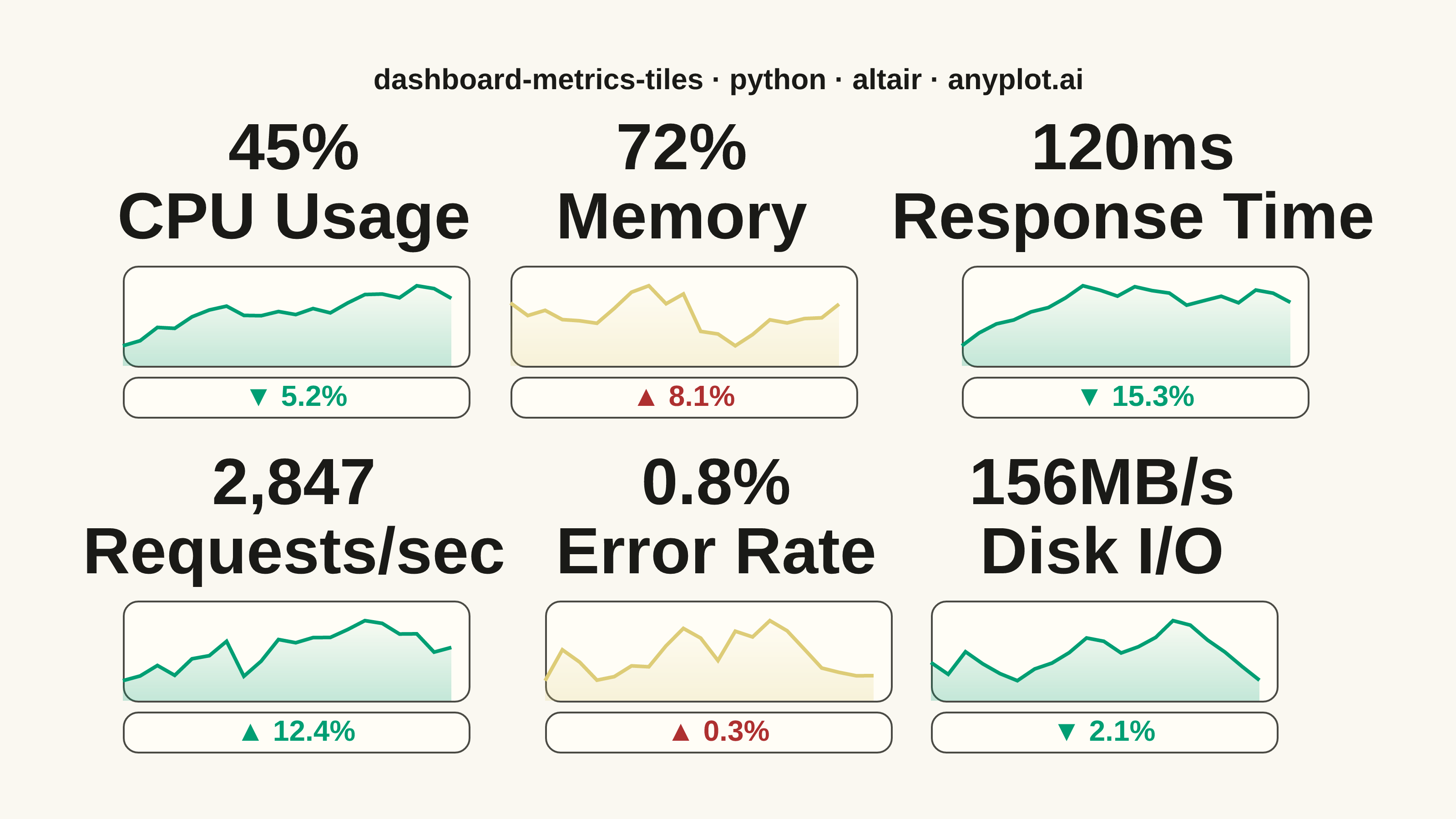
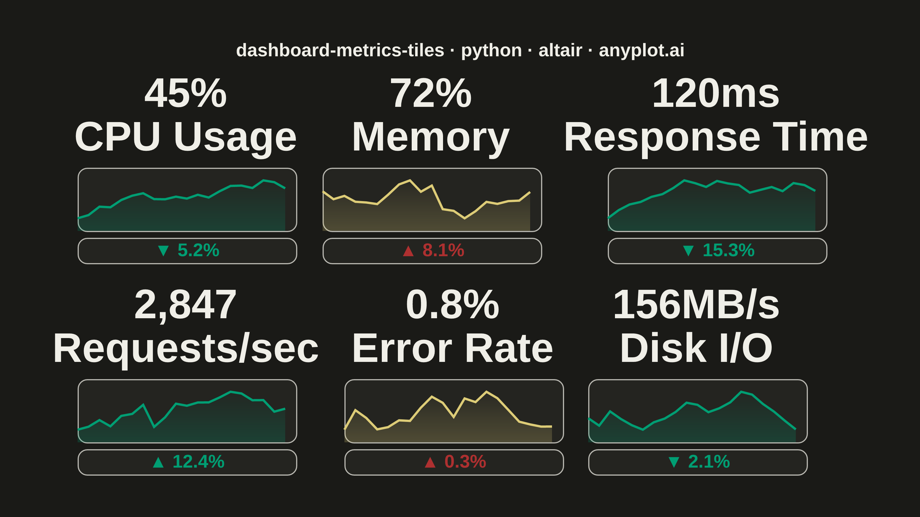
A dashboard layout displaying multiple metric tiles in a responsive grid, where each tile shows a KPI value with its label, an embedded sparkline showing recent trend, and a change indicator (up/down arrow with percentage). This visualization is essential for operations monitoring and business dashboards where multiple metrics need to be tracked simultaneously at a glance. The combination of current value, trend visualization, and change direction provides comprehensive metric context in a compact format.
""" anyplot.ai
dashboard-metrics-tiles: Real-Time Dashboard Tiles
Library: altair 6.1.0 | Python 3.13.13
Quality: 91/100 | Updated: 2026-05-21
"""

import os

import altair as alt
import numpy as np
import pandas as pd
from PIL import Image


THEME = os.getenv("ANYPLOT_THEME", "light")
PAGE_BG = "#FAF8F1" if THEME == "light" else "#1A1A17"
ELEVATED_BG = "#FFFDF6" if THEME == "light" else "#242420"
INK = "#1A1A17" if THEME == "light" else "#F0EFE8"
INK_SOFT = "#4A4A44" if THEME == "light" else "#B8B7B0"

# Okabe-Ito colours mapped to status roles
GOOD_COLOR = "#009E73"
WARN_COLOR = "#DDCC77"  # imprint amber — semantic warning
CRIT_COLOR = "#AE3030"  # imprint red — semantic critical
STATUS_COLORS = {"good": GOOD_COLOR, "warning": WARN_COLOR, "critical": CRIT_COLOR}

# Data - KPI metrics with sparkline history
np.random.seed(42)

metrics = [
    {"name": "CPU Usage", "value": 45, "unit": "%", "change": -5.2, "status": "good"},
    {"name": "Memory", "value": 72, "unit": "%", "change": 8.1, "status": "warning"},
    {"name": "Response Time", "value": 120, "unit": "ms", "change": -15.3, "status": "good"},
    {"name": "Requests/sec", "value": 2847, "unit": "", "change": 12.4, "status": "good"},
    {"name": "Error Rate", "value": 0.8, "unit": "%", "change": 0.3, "status": "warning"},
    {"name": "Disk I/O", "value": 156, "unit": "MB/s", "change": -2.1, "status": "good"},
]

# Build tiles inline (no helper function)
tiles = []
for idx, m in enumerate(metrics):
    # Sparkline history
    np.random.seed(100 + idx * 17)
    n = 20
    noise = np.cumsum(np.random.randn(n) * 5)
    trend_dir = -1 if m["change"] < 0 else 1
    trend = np.linspace(trend_dir * 15, 0, n)
    values = 50 + noise + trend
    v_min, v_max = values.min(), values.max()
    values = 20 + 60 * (values - v_min) / (v_max - v_min + 0.001)
    spark_df = pd.DataFrame({"t": range(n), "v": values})

    # Format headline value
    if m["value"] >= 1000:
        val_str = f"{m['value']:,.0f}"
    elif m["value"] < 1:
        val_str = f"{m['value']:.1f}"
    else:
        val_str = f"{m['value']:.0f}"
    display_val = f"{val_str}{m['unit']}"

    # Change indicator
    arrow = "▲" if m["change"] > 0 else "▼"
    change_text = f"{arrow} {abs(m['change']):.1f}%"
    favorable = m["change"] < 0 if m["name"] != "Requests/sec" else m["change"] > 0
    change_color = GOOD_COLOR if favorable else CRIT_COLOR
    tile_color = STATUS_COLORS[m["status"]]

    # Sparkline area chart
    sparkline = (
        alt.Chart(spark_df)
        .mark_area(
            line={"color": tile_color, "strokeWidth": 2},
            color=alt.Gradient(
                gradient="linear",
                stops=[
                    alt.GradientStop(color=f"{tile_color}55", offset=0),
                    alt.GradientStop(color=f"{tile_color}0a", offset=1),
                ],
                x1=1,
                x2=1,
                y1=1,
                y2=0,
            ),
        )
        .encode(x=alt.X("t:Q", axis=None), y=alt.Y("v:Q", axis=None, scale=alt.Scale(domain=[0, 100])))
        .properties(width=190, height=55)
    )

    # Change indicator text row
    cdf = pd.DataFrame([{"x": 0.5, "label": change_text}])
    change_row = (
        alt.Chart(cdf)
        .mark_text(fontSize=16, fontWeight="bold", color=change_color)
        .encode(x=alt.X("x:Q", axis=None, scale=alt.Scale(domain=[0, 1])), text="label:N")
        .properties(width=190, height=22)
    )

    tile = alt.vconcat(sparkline, change_row, spacing=4).properties(
        title=alt.Title(
            text=[display_val, m["name"]],
            fontSize=36,
            subtitleFontSize=16,
            subtitleColor=INK_SOFT,
            color=INK,
            anchor="middle",
            offset=6,
        )
    )
    tiles.append(tile)

# Arrange in 3×2 grid
row1 = alt.hconcat(tiles[0], tiles[1], tiles[2], spacing=18)
row2 = alt.hconcat(tiles[3], tiles[4], tiles[5], spacing=18)

chart = (
    alt.vconcat(row1, row2, spacing=18)
    .properties(
        background=PAGE_BG,
        title=alt.Title(
            text="dashboard-metrics-tiles · python · altair · anyplot.ai",
            fontSize=16,
            color=INK,
            anchor="middle",
            offset=12,
        ),
    )
    .configure_view(stroke=INK_SOFT, strokeWidth=1, cornerRadius=8, fill=ELEVATED_BG)
    .configure_concat(spacing=18)
)

# Save PNG then pad to exact 3200×1800
chart.save(f"plot-{THEME}.png", scale_factor=4.0)

TW, TH = 3200, 1800
_img = Image.open(f"plot-{THEME}.png").convert("RGB")
_w, _h = _img.size
if _w > TW or _h > TH:
    raise SystemExit(
        f"altair vl-convert produced {_w}×{_h}, exceeds target {TW}×{TH}. "
        f"Shrink chart .properties(width=, height=) values and re-render."
    )
if _w < TW or _h < TH:
    _canvas = Image.new("RGB", (TW, TH), PAGE_BG)
    _canvas.paste(_img, ((TW - _w) // 2, (TH - _h) // 2))
    _canvas.save(f"plot-{THEME}.png")

chart.save(f"plot-{THEME}.html")
Runnable source as JSON, for any HTTP client: https://api.anyplot.ai/specs/dashboard-metrics-tiles/altair/code. Any spec id and library id listed in llms-full.txt fit the same URL shape; every URL below is complete and callable.
{
  "spec_id": "dashboard-metrics-tiles",
  "language": "python",
  "library": "altair",
  "page": "https://anyplot.ai/dashboard-metrics-tiles/python/altair",
  "hub": "https://anyplot.ai/dashboard-metrics-tiles",
  "code_json": "https://api.anyplot.ai/specs/dashboard-metrics-tiles/altair/code",
  "spec_json": "https://api.anyplot.ai/specs/dashboard-metrics-tiles",
  "render_light_png": "https://storage.googleapis.com/anyplot-images/plots/dashboard-metrics-tiles/python/altair/plot-light.png",
  "render_dark_png": "https://storage.googleapis.com/anyplot-images/plots/dashboard-metrics-tiles/python/altair/plot-dark.png",
  "interactive_light_html": "https://storage.googleapis.com/anyplot-images/plots/dashboard-metrics-tiles/python/altair/plot-light.html",
  "interactive_dark_html": "https://storage.googleapis.com/anyplot-images/plots/dashboard-metrics-tiles/python/altair/plot-dark.html",
  "quality_score": 91.0,
  "license": "MIT",
  "guide": "https://anyplot.ai/llms.txt"
}
Part of Real-Time Dashboard Tiles on anyplot.ai.