The same plot in 14 other libraries — Python: Altair, Bokeh, lets-plot, Matplotlib, Plotly, plotnine, Pygal, Seaborn; Julia: Makie.jl; JavaScript: Chart.js, D3.js, Apache ECharts, Highcharts, MUI X Charts. Compare all 15 side by side: Real-Time Dashboard Tiles in Python, R, Julia and JavaScript.
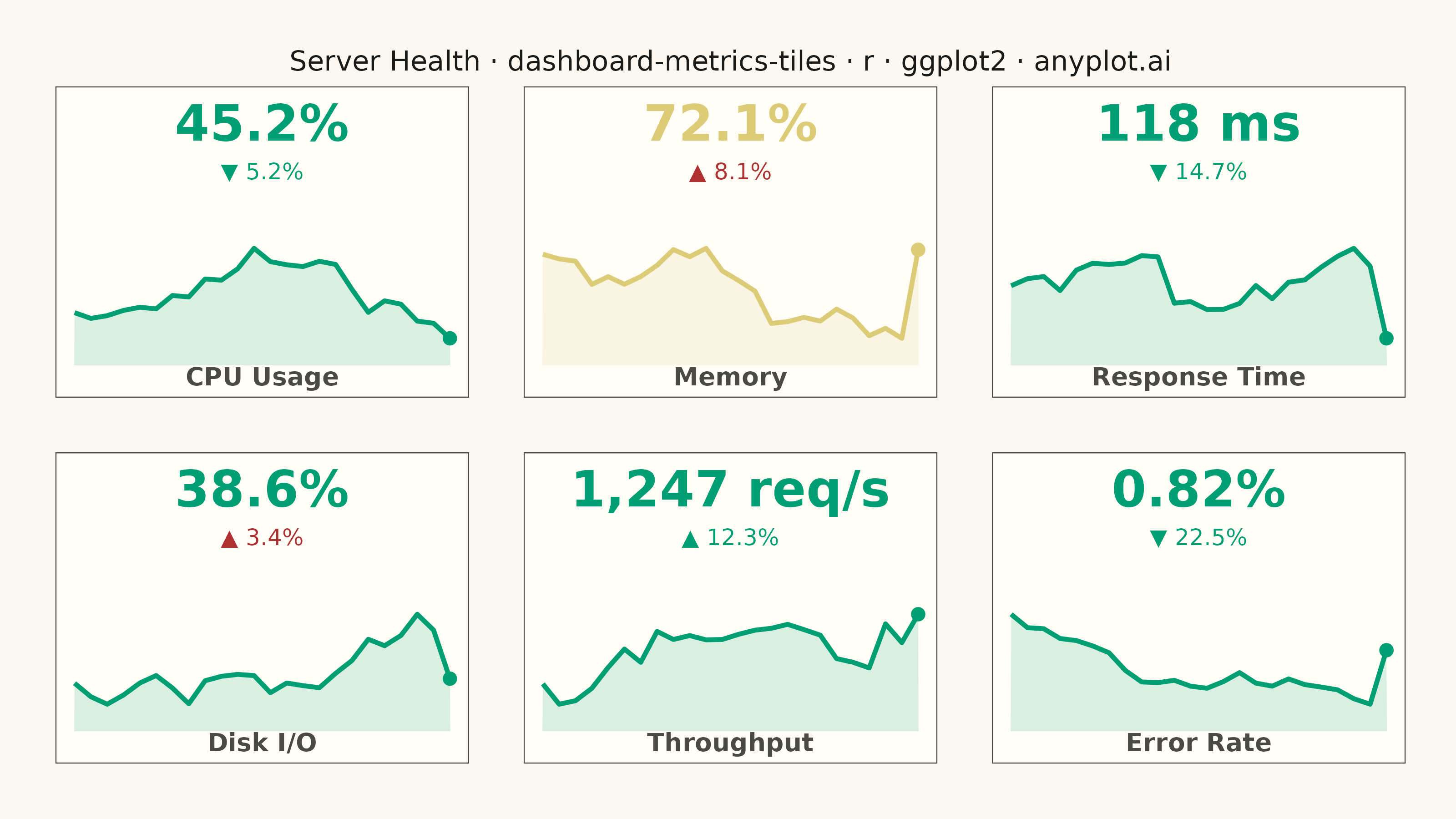
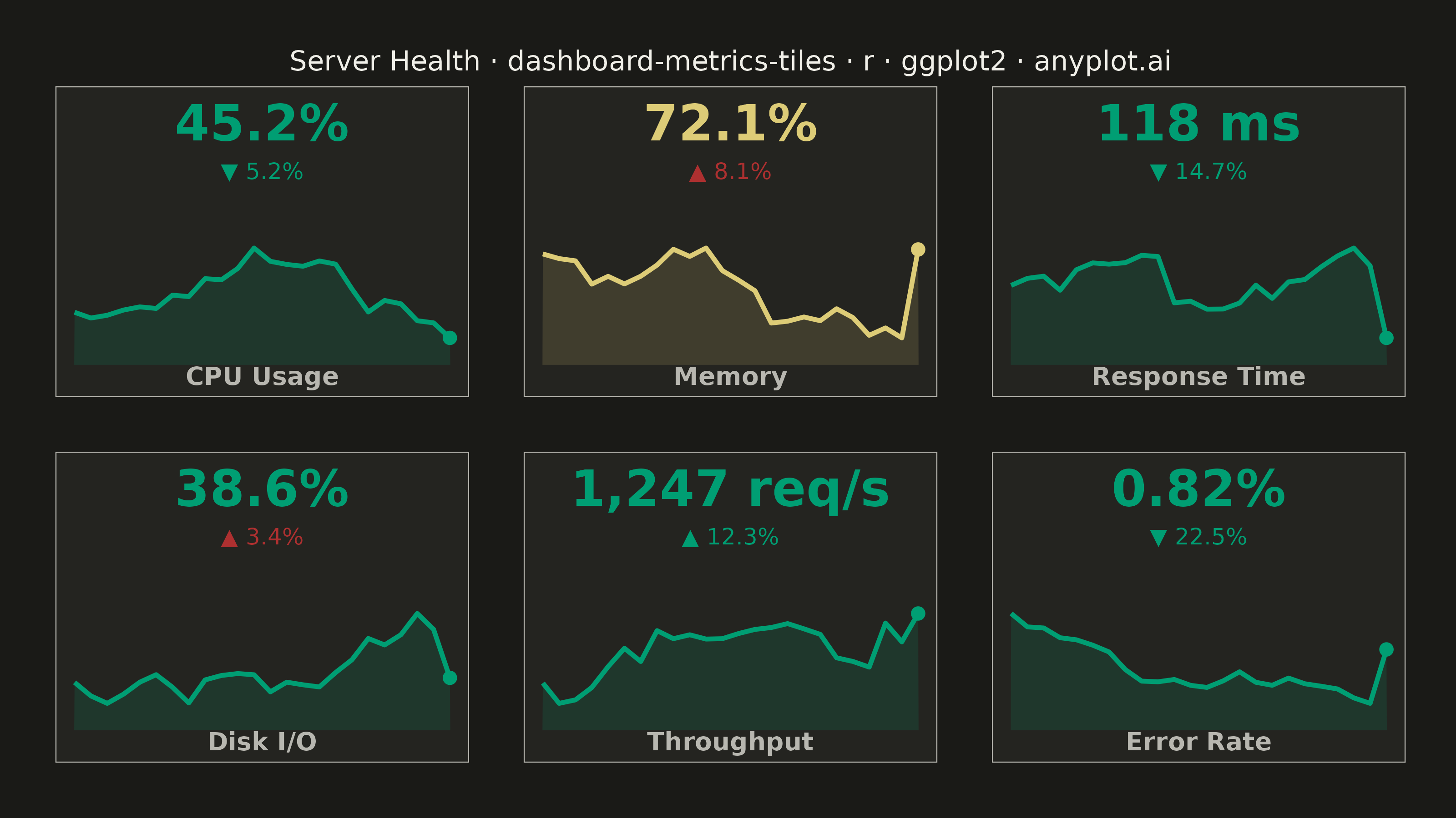
A dashboard layout displaying multiple metric tiles in a responsive grid, where each tile shows a KPI value with its label, an embedded sparkline showing recent trend, and a change indicator (up/down arrow with percentage). This visualization is essential for operations monitoring and business dashboards where multiple metrics need to be tracked simultaneously at a glance. The combination of current value, trend visualization, and change direction provides comprehensive metric context in a compact format.
#' anyplot.ai
#' dashboard-metrics-tiles: Real-Time Dashboard Tiles
#' Library: ggplot2 3.5.1 | R 4.4.1
#' Quality: 92/100 | Created: 2026-05-21

library(ggplot2)
library(dplyr)
library(scales)
library(ragg)

set.seed(42)

# --- Theme tokens -----------------------------------------------------------
THEME       <- Sys.getenv("ANYPLOT_THEME", "light")
PAGE_BG     <- if (THEME == "light") "#FAF8F1" else "#1A1A17"
ELEVATED_BG <- if (THEME == "light") "#FFFDF6" else "#242420"
INK         <- if (THEME == "light") "#1A1A17" else "#F0EFE8"
INK_SOFT    <- if (THEME == "light") "#4A4A44" else "#B8B7B0"

COL_GOOD     <- "#009E73"  # Okabe-Ito 1 — good / brand
COL_WARNING  <- "#DDCC77"  # imprint amber — warning
COL_CRITICAL <- "#AE3030"  # imprint red — critical / bad

# --- Data -------------------------------------------------------------------
# Server health metrics snapshot (6 tiles in 3x2 grid)
metric_names  <- c("CPU Usage", "Memory", "Response Time", "Disk I/O", "Throughput", "Error Rate")
value_nums    <- c(45.2,  72.1,  118,   38.6,  1247,  0.82)
value_labels  <- c("45.2%", "72.1%", "118 ms", "38.6%", "1,247 req/s", "0.82%")
changes       <- c(-5.2,   8.1,  -14.7,   3.4,  12.3, -22.5)
statuses      <- c("good", "warning", "good", "good", "good", "good")
up_is_good    <- c(FALSE,  FALSE,  FALSE,  FALSE,  TRUE,  FALSE)

n_metrics <- length(metric_names)
n_pts     <- 24

status_colors <- ifelse(
  statuses == "critical", COL_CRITICAL,
  ifelse(statuses == "warning", COL_WARNING, COL_GOOD)
)

change_colors <- ifelse(
  (changes > 0 & !up_is_good) | (changes < 0 & up_is_good),
  COL_CRITICAL, COL_GOOD
)

arrows        <- ifelse(changes > 0, "▲", "▼")
change_labels <- paste0(arrows, " ", sprintf("%.1f", abs(changes)), "%")

metrics_df <- data.frame(
  metric        = factor(metric_names, levels = metric_names),
  value_label   = value_labels,
  change_label  = change_labels,
  status_color  = status_colors,
  change_color  = change_colors,
  stringsAsFactors = FALSE
)

# Generate sparkline histories (end pinned to current value, with slight trend)
spark_list <- lapply(seq_len(n_metrics), function(i) {
  base <- value_nums[i]
  chg  <- changes[i] / 100 * base
  steps <- rnorm(n_pts, mean = chg / n_pts, sd = base * 0.035)
  vals  <- base - chg + cumsum(steps)
  vals[n_pts] <- base
  data.frame(
    metric       = metric_names[i],
    t            = seq_len(n_pts),
    val          = vals,
    status_color = status_colors[i],
    stringsAsFactors = FALSE
  )
})
spark_df <- do.call(rbind, spark_list)
spark_df$metric <- factor(spark_df$metric, levels = metric_names)

# Normalise each sparkline to [0.15, 0.65] within the panel's y space
spark_df <- spark_df |>
  group_by(metric) |>
  mutate(val_norm = rescale(val, to = c(0.15, 0.65))) |>
  ungroup()

spark_end <- spark_df[spark_df$t == n_pts, ]

# Annotation positions within the normalised [−0.18, 1.55] y range
label_df <- data.frame(
  metric       = metrics_df$metric,
  x_mid        = (n_pts + 1) / 2,
  y_value      = 1.35,
  y_change     = 1.08,
  y_name       = -0.06,
  value_label  = metrics_df$value_label,
  change_label = metrics_df$change_label,
  status_color = metrics_df$status_color,
  change_color = metrics_df$change_color,
  name_color   = INK_SOFT,
  stringsAsFactors = FALSE
)

# --- Plot -------------------------------------------------------------------
p <- ggplot() +
  # Shaded area under sparkline
  geom_area(
    data = spark_df,
    aes(x = t, y = val_norm, fill = status_color, group = metric),
    alpha = 0.15,
    show.legend = FALSE
  ) +
  # Sparkline
  geom_line(
    data = spark_df,
    aes(x = t, y = val_norm, color = status_color, group = metric),
    linewidth = 0.9,
    show.legend = FALSE
  ) +
  # Terminal dot
  geom_point(
    data = spark_end,
    aes(x = t, y = val_norm, color = status_color),
    size = 2.0,
    show.legend = FALSE
  ) +
  # KPI value — large, status-coloured
  geom_text(
    data = label_df,
    aes(x = x_mid, y = y_value, label = value_label, color = status_color),
    size = 7,
    fontface = "bold",
    show.legend = FALSE
  ) +
  # Change indicator with directional arrow
  geom_text(
    data = label_df,
    aes(x = x_mid, y = y_change, label = change_label, color = change_color),
    size = 3.2,
    show.legend = FALSE
  ) +
  # Metric name label at bottom of tile
  geom_text(
    data = label_df,
    aes(x = x_mid, y = y_name, label = metric, color = name_color),
    size = 3.5,
    fontface = "bold",
    show.legend = FALSE
  ) +
  scale_color_identity() +
  scale_fill_identity() +
  facet_wrap(~metric, nrow = 2, ncol = 3) +
  scale_y_continuous(limits = c(-0.18, 1.55), expand = c(0, 0)) +
  scale_x_continuous(expand = expansion(mult = 0.05)) +
  labs(
    title = "Server Health · dashboard-metrics-tiles · r · ggplot2 · anyplot.ai"
  ) +
  theme_minimal(base_size = 8) +
  theme(
    plot.background  = element_rect(fill = PAGE_BG, color = PAGE_BG),
    panel.background = element_rect(fill = ELEVATED_BG, color = INK_SOFT, linewidth = 0.4),
    panel.grid       = element_blank(),
    axis.text        = element_blank(),
    axis.title       = element_blank(),
    axis.ticks       = element_blank(),
    strip.text       = element_blank(),
    plot.title       = element_text(color = INK, size = 11, hjust = 0.5),
    plot.margin      = margin(t = 20, r = 20, b = 20, l = 20),
    panel.spacing.x  = unit(1.5, "lines"),
    panel.spacing.y  = unit(1.5, "lines")
  )

# --- Save -------------------------------------------------------------------
ggsave(
  filename = sprintf("plot-%s.png", THEME),
  plot     = p,
  device   = ragg::agg_png,
  width    = 8,
  height   = 4.5,
  units    = "in",
  dpi      = 400
)
Runnable source as JSON, for any HTTP client: https://api.anyplot.ai/specs/dashboard-metrics-tiles/ggplot2/code. Any spec id and library id listed in llms-full.txt fit the same URL shape; every URL below is complete and callable.
{
  "spec_id": "dashboard-metrics-tiles",
  "language": "r",
  "library": "ggplot2",
  "page": "https://anyplot.ai/dashboard-metrics-tiles/r/ggplot2",
  "hub": "https://anyplot.ai/dashboard-metrics-tiles",
  "code_json": "https://api.anyplot.ai/specs/dashboard-metrics-tiles/ggplot2/code",
  "spec_json": "https://api.anyplot.ai/specs/dashboard-metrics-tiles",
  "render_light_png": "https://storage.googleapis.com/anyplot-images/plots/dashboard-metrics-tiles/r/ggplot2/plot-light.png",
  "render_dark_png": "https://storage.googleapis.com/anyplot-images/plots/dashboard-metrics-tiles/r/ggplot2/plot-dark.png",
  "quality_score": 92.0,
  "license": "MIT",
  "guide": "https://anyplot.ai/llms.txt"
}
Part of Real-Time Dashboard Tiles on anyplot.ai.