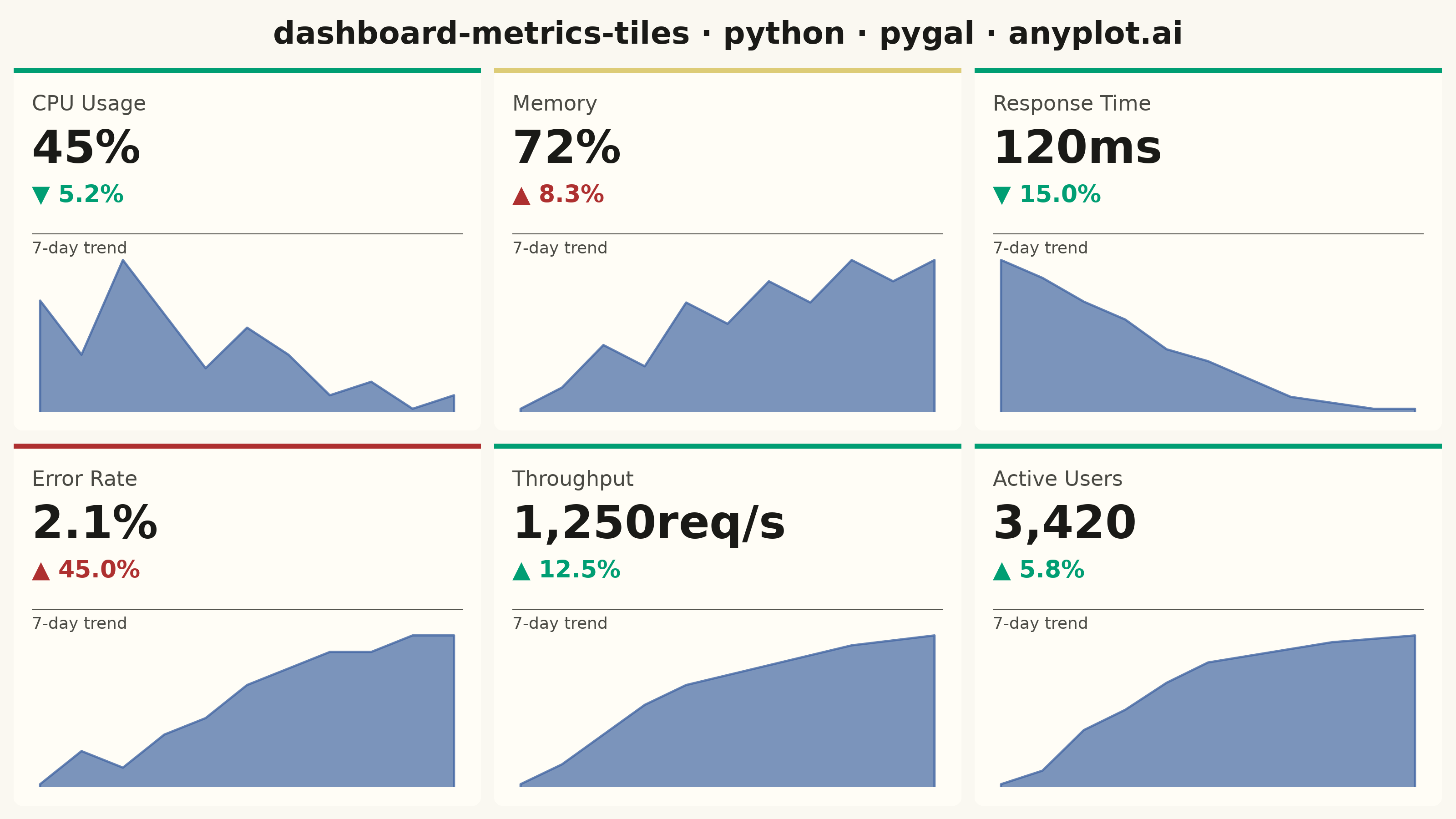
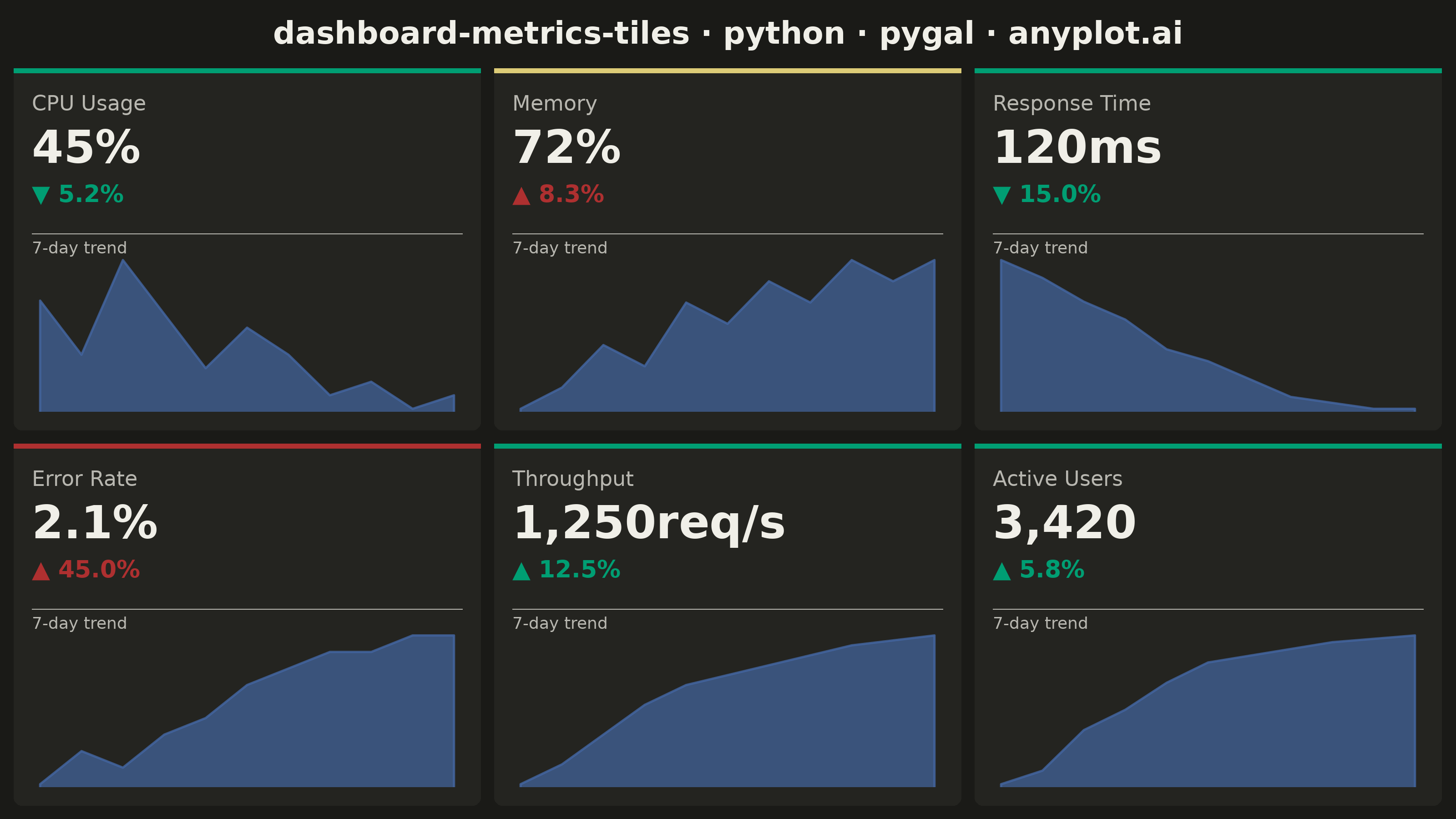
A dashboard layout displaying multiple metric tiles in a responsive grid, where each tile shows a KPI value with its label, an embedded sparkline showing recent trend, and a change indicator (up/down arrow with percentage). This visualization is essential for operations monitoring and business dashboards where multiple metrics need to be tracked simultaneously at a glance. The combination of current value, trend visualization, and change direction provides comprehensive metric context in a compact format.
""" anyplot.ai
dashboard-metrics-tiles: Real-Time Dashboard Tiles
Library: pygal 3.1.0 | Python 3.13.13
Quality: 88/100 | Updated: 2026-05-21
"""

import os
import sys


# Remove the script's own directory from sys.path to prevent circular import
# (this file is named pygal.py, same as the installed package).
_script_dir = os.path.dirname(os.path.abspath(__file__))
sys.path = [p for p in sys.path if os.path.abspath(p or ".") != _script_dir]

from io import BytesIO

import cairosvg
import numpy as np
import pygal
from PIL import Image, ImageDraw, ImageFont
from pygal.style import Style


# Theme tokens
THEME = os.getenv("ANYPLOT_THEME", "light")
PAGE_BG = "#FAF8F1" if THEME == "light" else "#1A1A17"
ELEVATED_BG = "#FFFDF6" if THEME == "light" else "#242420"
INK = "#1A1A17" if THEME == "light" else "#F0EFE8"
INK_SOFT = "#4A4A44" if THEME == "light" else "#B8B7B0"

# Semantic status colors (Okabe-Ito positions)
STATUS_COLORS = {"good": "#009E73", "warning": "#DDCC77", "critical": "#AE3030"}  # imprint semantic anchors
CHANGE_POSITIVE = "#009E73"
CHANGE_NEGATIVE = "#AE3030"  # imprint red — negative change
SPARKLINE_COLOR = "#4467A3"  # Okabe-Ito position 3

# Data
np.random.seed(42)
metrics = [
    {
        "name": "CPU Usage",
        "value": 45,
        "unit": "%",
        "change": -5.2,
        "status": "good",
        "history": [52, 48, 55, 51, 47, 50, 48, 45, 46, 44, 45],
        "lower_is_better": True,
    },
    {
        "name": "Memory",
        "value": 72,
        "unit": "%",
        "change": 8.3,
        "status": "warning",
        "history": [65, 66, 68, 67, 70, 69, 71, 70, 72, 71, 72],
        "lower_is_better": True,
    },
    {
        "name": "Response Time",
        "value": 120,
        "unit": "ms",
        "change": -15.0,
        "status": "good",
        "history": [145, 142, 138, 135, 130, 128, 125, 122, 121, 120, 120],
        "lower_is_better": True,
    },
    {
        "name": "Error Rate",
        "value": 2.1,
        "unit": "%",
        "change": 45.0,
        "status": "critical",
        "history": [1.2, 1.4, 1.3, 1.5, 1.6, 1.8, 1.9, 2.0, 2.0, 2.1, 2.1],
        "lower_is_better": True,
    },
    {
        "name": "Throughput",
        "value": 1250,
        "unit": "req/s",
        "change": 12.5,
        "status": "good",
        "history": [1100, 1120, 1150, 1180, 1200, 1210, 1220, 1230, 1240, 1245, 1250],
        "lower_is_better": False,
    },
    {
        "name": "Active Users",
        "value": 3420,
        "unit": "",
        "change": 5.8,
        "status": "good",
        "history": [3200, 3220, 3280, 3310, 3350, 3380, 3390, 3400, 3410, 3415, 3420],
        "lower_is_better": False,
    },
]

# Canvas layout (3200x1800 landscape — hard contract)
CANVAS_WIDTH = 3200
CANVAS_HEIGHT = 1800
TITLE_HEIGHT = 120
MARGIN = 30
GAP = 30
GRID_COLS = 3
GRID_ROWS = 2

grid_width = CANVAS_WIDTH - 2 * MARGIN
grid_height = CANVAS_HEIGHT - TITLE_HEIGHT - 2 * MARGIN
tile_width = (grid_width - (GRID_COLS - 1) * GAP) // GRID_COLS
tile_height = (grid_height - (GRID_ROWS - 1) * GAP) // GRID_ROWS

TILE_PADDING = 40
STATUS_BAR_H = 10
SPARKLINE_W = tile_width - 2 * TILE_PADDING
SPARKLINE_H = 340

# Pygal sparkline style (transparent background)
sparkline_style = Style(
    background="transparent",
    plot_background="transparent",
    foreground="transparent",
    foreground_strong="transparent",
    foreground_subtle="transparent",
    colors=(SPARKLINE_COLOR,),
    stroke_width=5,
)

# Load fonts
try:
    title_font = ImageFont.truetype("/usr/share/fonts/truetype/dejavu/DejaVuSans-Bold.ttf", 68)
    value_font = ImageFont.truetype("/usr/share/fonts/truetype/dejavu/DejaVuSans-Bold.ttf", 100)
    name_font = ImageFont.truetype("/usr/share/fonts/truetype/dejavu/DejaVuSans.ttf", 46)
    change_font = ImageFont.truetype("/usr/share/fonts/truetype/dejavu/DejaVuSans-Bold.ttf", 52)
    trend_font = ImageFont.truetype("/usr/share/fonts/truetype/dejavu/DejaVuSans.ttf", 36)
except OSError:
    title_font = ImageFont.load_default()
    value_font = ImageFont.load_default()
    name_font = ImageFont.load_default()
    change_font = ImageFont.load_default()
    trend_font = ImageFont.load_default()

# Create canvas
canvas = Image.new("RGB", (CANVAS_WIDTH, CANVAS_HEIGHT), PAGE_BG)
draw = ImageDraw.Draw(canvas)

# Title
title_text = "dashboard-metrics-tiles · python · pygal · anyplot.ai"
bbox = draw.textbbox((0, 0), title_text, font=title_font)
title_w = bbox[2] - bbox[0]
draw.text(((CANVAS_WIDTH - title_w) // 2, 32), title_text, fill=INK, font=title_font)

# Metric tiles — 3x2 grid
for idx, metric in enumerate(metrics):
    row = idx // GRID_COLS
    col = idx % GRID_COLS
    tx = MARGIN + col * (tile_width + GAP)
    ty = TITLE_HEIGHT + MARGIN + row * (tile_height + GAP)

    # Tile background
    draw.rounded_rectangle([tx, ty, tx + tile_width, ty + tile_height], radius=18, fill=ELEVATED_BG)

    # Coloured status bar at top of tile
    draw.rectangle([tx, ty, tx + tile_width, ty + STATUS_BAR_H], fill=STATUS_COLORS[metric["status"]])

    # Metric name
    cy = ty + STATUS_BAR_H + TILE_PADDING
    draw.text((tx + TILE_PADDING, cy), metric["name"], fill=INK_SOFT, font=name_font)
    cy += 65

    # Current value with unit
    value_text = f"{metric['value']:,}{metric['unit']}"
    draw.text((tx + TILE_PADDING, cy), value_text, fill=INK, font=value_font)
    cy += 130

    # Change indicator (arrow + percentage)
    change = metric["change"]
    favorable = (change < 0) if metric["lower_is_better"] else (change > 0)
    change_color = CHANGE_POSITIVE if favorable else CHANGE_NEGATIVE
    arrow = "▲" if change > 0 else "▼"
    draw.text((tx + TILE_PADDING, cy), f"{arrow} {abs(change):.1f}%", fill=change_color, font=change_font)

    # Separator + trend label above sparkline to fill the vertical gap
    sp_y = ty + tile_height - SPARKLINE_H - TILE_PADDING
    rule_y = sp_y - 52
    draw.line([(tx + TILE_PADDING, rule_y), (tx + tile_width - TILE_PADDING, rule_y)], fill=INK_SOFT, width=2)
    draw.text((tx + TILE_PADDING, rule_y + 10), "7-day trend", fill=INK_SOFT, font=trend_font)

    # Sparkline (full tile width, anchored to bottom of tile)
    sp_chart = pygal.Line(
        width=SPARKLINE_W,
        height=SPARKLINE_H,
        style=sparkline_style,
        show_legend=False,
        show_dots=False,
        show_y_labels=False,
        show_x_labels=False,
        show_y_guides=False,
        show_x_guides=False,
        margin=0,
        spacing=0,
        fill=True,
        stroke_style={"width": 5, "linecap": "round", "linejoin": "round"},
    )
    sp_chart.add("", metric["history"])
    sp_svg = sp_chart.render()
    sp_png = cairosvg.svg2png(bytestring=sp_svg, output_width=SPARKLINE_W, output_height=SPARKLINE_H)
    sp_img = Image.open(BytesIO(sp_png)).convert("RGBA")
    canvas.paste(sp_img, (tx + TILE_PADDING, sp_y), sp_img)

# Save PNG
canvas.save(f"plot-{THEME}.png")

# Interactive HTML with pygal SVG sparklines
html_parts = [
    f"""<!DOCTYPE html>
<html>
<head>
    <meta charset="utf-8">
    <title>dashboard-metrics-tiles · python · pygal · anyplot.ai</title>
    <style>
        * {{ box-sizing: border-box; margin: 0; padding: 0; }}
        body {{ font-family: -apple-system, BlinkMacSystemFont, 'Segoe UI', Roboto, sans-serif;
               background: {PAGE_BG}; padding: 40px; }}
        h1 {{ text-align: center; color: {INK}; font-size: 26px; margin-bottom: 32px; }}
        .dashboard {{ display: grid; grid-template-columns: repeat(3, 1fr); gap: 20px;
                     max-width: 1400px; margin: 0 auto; }}
        .tile {{ background: {ELEVATED_BG}; border-radius: 12px; padding: 24px;
                position: relative; overflow: hidden; }}
        .status-bar {{ position: absolute; top: 0; left: 0; right: 0; height: 4px; }}
        .metric-name {{ color: {INK_SOFT}; font-size: 15px; margin-bottom: 8px; }}
        .metric-value {{ color: {INK}; font-size: 38px; font-weight: bold; margin-bottom: 8px; }}
        .metric-change {{ font-size: 16px; font-weight: 600; margin-bottom: 12px; }}
        .change-pos {{ color: #009E73; }}
        .change-neg {{ color: #C475FD; }}
        .trend-separator {{ border: none; border-top: 1px solid {INK_SOFT}; margin: 0 0 6px; }}
        .trend-label {{ font-size: 12px; color: {INK_SOFT}; margin-bottom: 6px; }}
        .sparkline {{ width: 100%; height: 70px; overflow: hidden; }}
        .sparkline svg {{ width: 100%; height: 100%; }}
        @media (max-width: 900px) {{ .dashboard {{ grid-template-columns: repeat(2, 1fr); }} }}
        @media (max-width: 600px) {{ .dashboard {{ grid-template-columns: 1fr; }} }}
    </style>
</head>
<body>
    <h1>dashboard-metrics-tiles · python · pygal · anyplot.ai</h1>
    <div class="dashboard">
"""
]

for metric in metrics:
    change = metric["change"]
    favorable = (change < 0) if metric["lower_is_better"] else (change > 0)
    change_class = "change-pos" if favorable else "change-neg"
    arrow = "▲" if change > 0 else "▼"

    mini = pygal.Line(
        width=300,
        height=80,
        style=sparkline_style,
        show_legend=False,
        show_dots=False,
        show_y_labels=False,
        show_x_labels=False,
        show_y_guides=False,
        show_x_guides=False,
        margin=2,
        fill=True,
    )
    mini.add("", metric["history"])
    sp_svg = mini.render(is_unicode=True).replace('<?xml version="1.0" encoding="utf-8"?>', "")

    html_parts.append(
        f"""        <div class="tile">
            <div class="status-bar" style="background:{STATUS_COLORS[metric["status"]]}"></div>
            <div class="metric-name">{metric["name"]}</div>
            <div class="metric-value">{metric["value"]:,}{metric["unit"]}</div>
            <div class="metric-change {change_class}">{arrow} {abs(change):.1f}%</div>
            <hr class="trend-separator">
            <div class="trend-label">7-day trend</div>
            <div class="sparkline">{sp_svg}</div>
        </div>
"""
    )

html_parts.append(
    """    </div>
</body>
</html>"""
)

with open(f"plot-{THEME}.html", "w") as f:
    f.write("".join(html_parts))
Runnable source as JSON, for any HTTP client: https://api.anyplot.ai/specs/dashboard-metrics-tiles/pygal/code. Any spec id and library id listed in llms-full.txt fit the same URL shape; every URL below is complete and callable.
{
  "spec_id": "dashboard-metrics-tiles",
  "language": "python",
  "library": "pygal",
  "page": "https://anyplot.ai/dashboard-metrics-tiles/python/pygal",
  "hub": "https://anyplot.ai/dashboard-metrics-tiles",
  "code_json": "https://api.anyplot.ai/specs/dashboard-metrics-tiles/pygal/code",
  "spec_json": "https://api.anyplot.ai/specs/dashboard-metrics-tiles",
  "render_light_png": "https://storage.googleapis.com/anyplot-images/plots/dashboard-metrics-tiles/python/pygal/plot-light.png",
  "render_dark_png": "https://storage.googleapis.com/anyplot-images/plots/dashboard-metrics-tiles/python/pygal/plot-dark.png",
  "interactive_light_html": "https://storage.googleapis.com/anyplot-images/plots/dashboard-metrics-tiles/python/pygal/plot-light.html",
  "interactive_dark_html": "https://storage.googleapis.com/anyplot-images/plots/dashboard-metrics-tiles/python/pygal/plot-dark.html",
  "quality_score": 88.0,
  "license": "MIT",
  "guide": "https://anyplot.ai/llms.txt"
}
Part of Real-Time Dashboard Tiles on anyplot.ai.