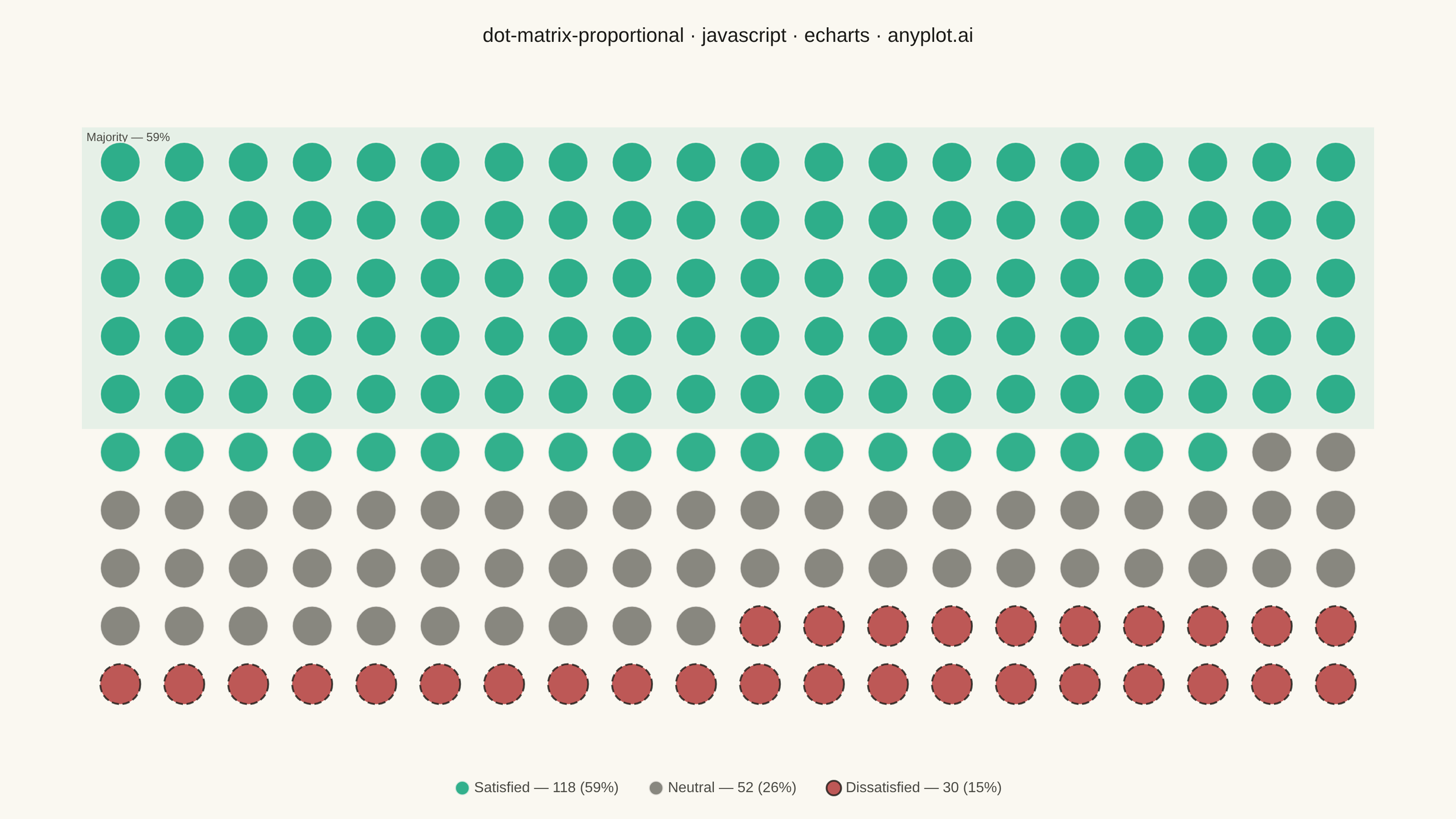
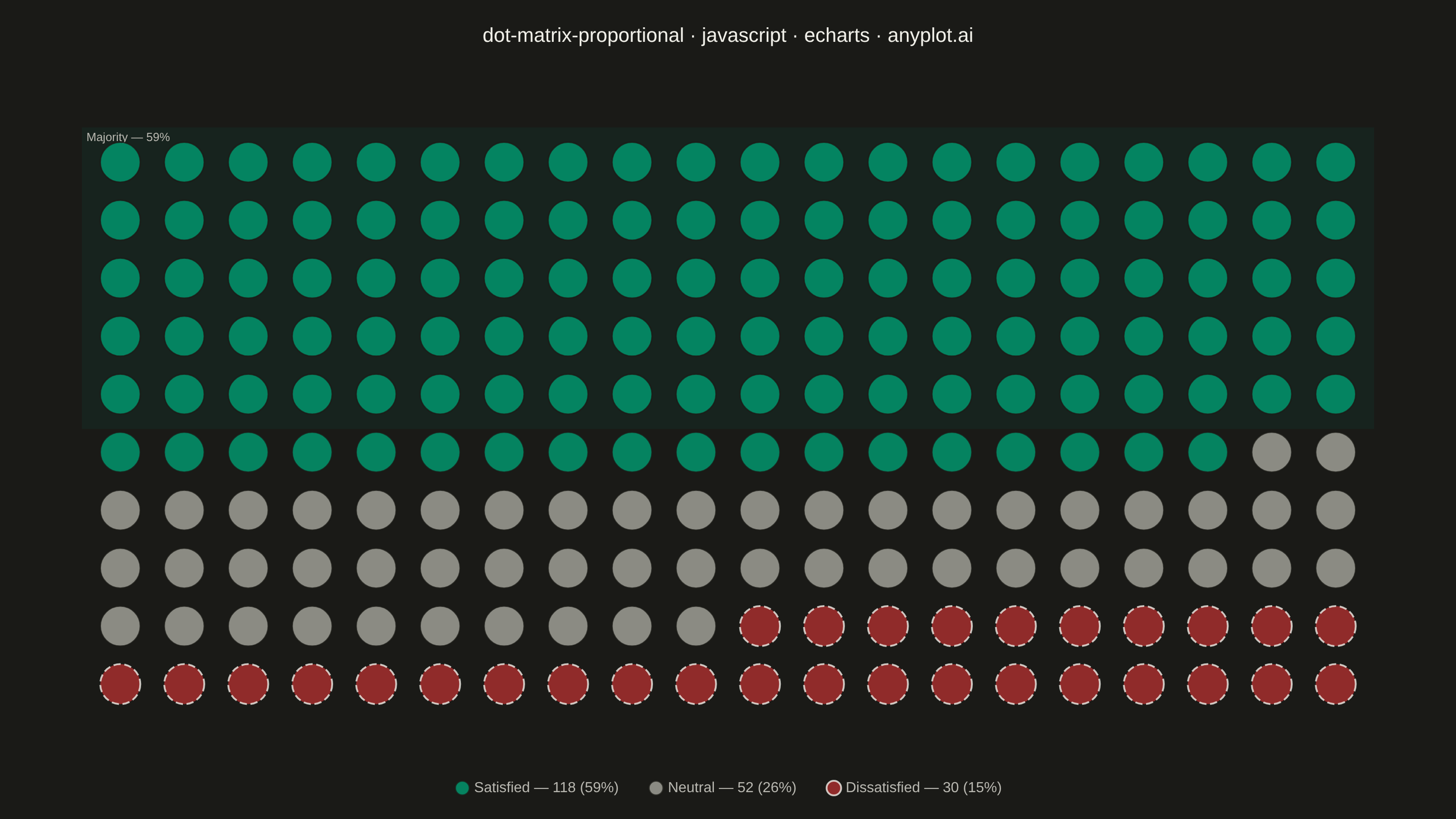
The same plot in 14 other libraries — JavaScript: Chart.js, D3.js, Highcharts, MUI X Charts; Python: Altair, Bokeh, lets-plot, Matplotlib, Plotly, plotnine, Pygal, Seaborn; R: ggplot2; Julia: Makie.jl. Compare all 15 side by side: Dot Matrix Chart for Proportional Counts in Python, R, Julia and JavaScript.
A dot matrix chart displays proportions using a grid of equally-sized dots where filled or colored dots represent counts out of a total. Each dot corresponds to one unit, making it intuitive to read "X out of N" statistics at a glance. Unlike waffle charts that use percentage-based squares, dot matrix charts emphasize absolute counts with variable grid sizes, excelling at risk communication and survey result visualization.
// anyplot.ai
// dot-matrix-proportional: Dot Matrix Chart for Proportional Counts
// Library: echarts 6.1.0 | JavaScript 22.23.2
// Quality: 89/100 | Created: 2026-09-05

//# anyplot-orientation: landscape
const t = window.ANYPLOT_TOKENS;
// "muted" semantic anchor (other/rest/neutral) isn't in ANYPLOT_TOKENS — derive it
// from the theme-adaptive hexes in default-style-guide.md "Semantic anchors".
const muted = t.theme === "dark" ? "#A8A79F" : "#6B6A63";

// --- Data (in-memory, deterministic) ----------------------------------------
// Customer satisfaction survey: 200 respondents, filled left-to-right, top-to-bottom.
const total = 200;
const cols = 20;
const rows = 10;
const categories = [
  { name: "Satisfied", count: 118, color: t.palette[0] }, // positive sentiment -> Imprint brand green
  { name: "Neutral", count: 52, color: muted }, // neutral sentiment -> Imprint neutral anchor
  // negative sentiment -> Imprint semantic red; dashed ink border is a non-color
  // secondary cue so the two sentiment extremes stay distinguishable under
  // red-green color-vision deficiency, not just by hue.
  { name: "Dissatisfied", count: 30, color: t.palette[4], accent: true },
];

let cursor = 0;
const series = categories.map((cat) => {
  const points = [];
  for (let i = 0; i < cat.count; i += 1) {
    const idx = cursor + i;
    points.push([idx % cols, Math.floor(idx / cols)]);
  }
  cursor += cat.count;
  const pct = Math.round((cat.count / total) * 100);
  return {
    name: `${cat.name} — ${cat.count} (${pct}%)`,
    type: "scatter",
    symbol: "circle",
    symbolSize: 44,
    data: points,
    itemStyle: cat.accent
      ? { color: cat.color, borderColor: t.ink, borderWidth: 2, borderType: "dashed" }
      : { color: cat.color, borderColor: t.pageBg, borderWidth: 1.5 },
  };
});

// Emphasize the majority category (ECharts markArea) to lift plain grid-of-
// circles into a small "at a glance" callout, and to showcase a native
// ECharts feature beyond a generic scatter port.
const majority = categories.reduce((best, cat) => (cat.count > best.count ? cat : best));
const majorityFullRows = majority === categories[0] ? Math.floor(majority.count / cols) : 0;
if (majorityFullRows > 0) {
  series[0].markArea = {
    silent: true,
    itemStyle: { color: majority.color, opacity: 0.08 },
    label: {
      show: true,
      position: "insideTopLeft",
      color: t.inkSoft,
      fontSize: 13,
      fontWeight: 500,
      formatter: `Majority — ${Math.round((majority.count / total) * 100)}%`,
    },
    data: [
      [
        { xAxis: -0.6, yAxis: -0.6 },
        { xAxis: cols - 0.4, yAxis: majorityFullRows - 0.4 },
      ],
    ],
  };
}

// --- Init --------------------------------------------------------------------
const chart = echarts.init(document.getElementById("container"));

// --- Option --------------------------------------------------------------------
chart.setOption({
  animation: false,
  color: t.palette,
  backgroundColor: "transparent",
  title: {
    text: "dot-matrix-proportional · javascript · echarts · anyplot.ai",
    left: "center",
    top: 24,
    textStyle: { color: t.ink, fontSize: 22, fontWeight: 500 },
  },
  legend: {
    bottom: 20,
    left: "center",
    itemGap: 32,
    itemWidth: 16,
    itemHeight: 16,
    icon: "circle",
    textStyle: { color: t.inkSoft, fontSize: 16 },
  },
  grid: { left: 90, right: 90, top: 140, bottom: 110 },
  xAxis: {
    type: "value",
    min: -0.6,
    max: cols - 0.4,
    show: false,
    splitLine: { show: false },
  },
  yAxis: {
    type: "value",
    min: -0.6,
    max: rows - 0.4,
    inverse: true,
    show: false,
    splitLine: { show: false },
  },
  tooltip: {
    trigger: "item",
    formatter: (p) => p.seriesName,
  },
  series,
});
Runnable source as JSON, for any HTTP client: https://api.anyplot.ai/specs/dot-matrix-proportional/echarts/code. Any spec id and library id listed in llms-full.txt fit the same URL shape; every URL below is complete and callable.
{
  "spec_id": "dot-matrix-proportional",
  "language": "javascript",
  "library": "echarts",
  "page": "https://anyplot.ai/dot-matrix-proportional/javascript/echarts",
  "hub": "https://anyplot.ai/dot-matrix-proportional",
  "code_json": "https://api.anyplot.ai/specs/dot-matrix-proportional/echarts/code",
  "spec_json": "https://api.anyplot.ai/specs/dot-matrix-proportional",
  "render_light_png": "https://storage.googleapis.com/anyplot-images/plots/dot-matrix-proportional/javascript/echarts/plot-light.png",
  "render_dark_png": "https://storage.googleapis.com/anyplot-images/plots/dot-matrix-proportional/javascript/echarts/plot-dark.png",
  "interactive_light_html": "https://storage.googleapis.com/anyplot-images/plots/dot-matrix-proportional/javascript/echarts/plot-light.html",
  "interactive_dark_html": "https://storage.googleapis.com/anyplot-images/plots/dot-matrix-proportional/javascript/echarts/plot-dark.html",
  "quality_score": 89.0,
  "license": "MIT",
  "guide": "https://anyplot.ai/llms.txt"
}
Part of Dot Matrix Chart for Proportional Counts on anyplot.ai.