The same plot in 14 other libraries — Python: Altair, Bokeh, lets-plot, Matplotlib, Plotly, plotnine, Pygal, Seaborn; Julia: Makie.jl; JavaScript: Chart.js, D3.js, Apache ECharts, Highcharts, MUI X Charts. Compare all 15 side by side: Dot Matrix Chart for Proportional Counts in Python, R, Julia and JavaScript.
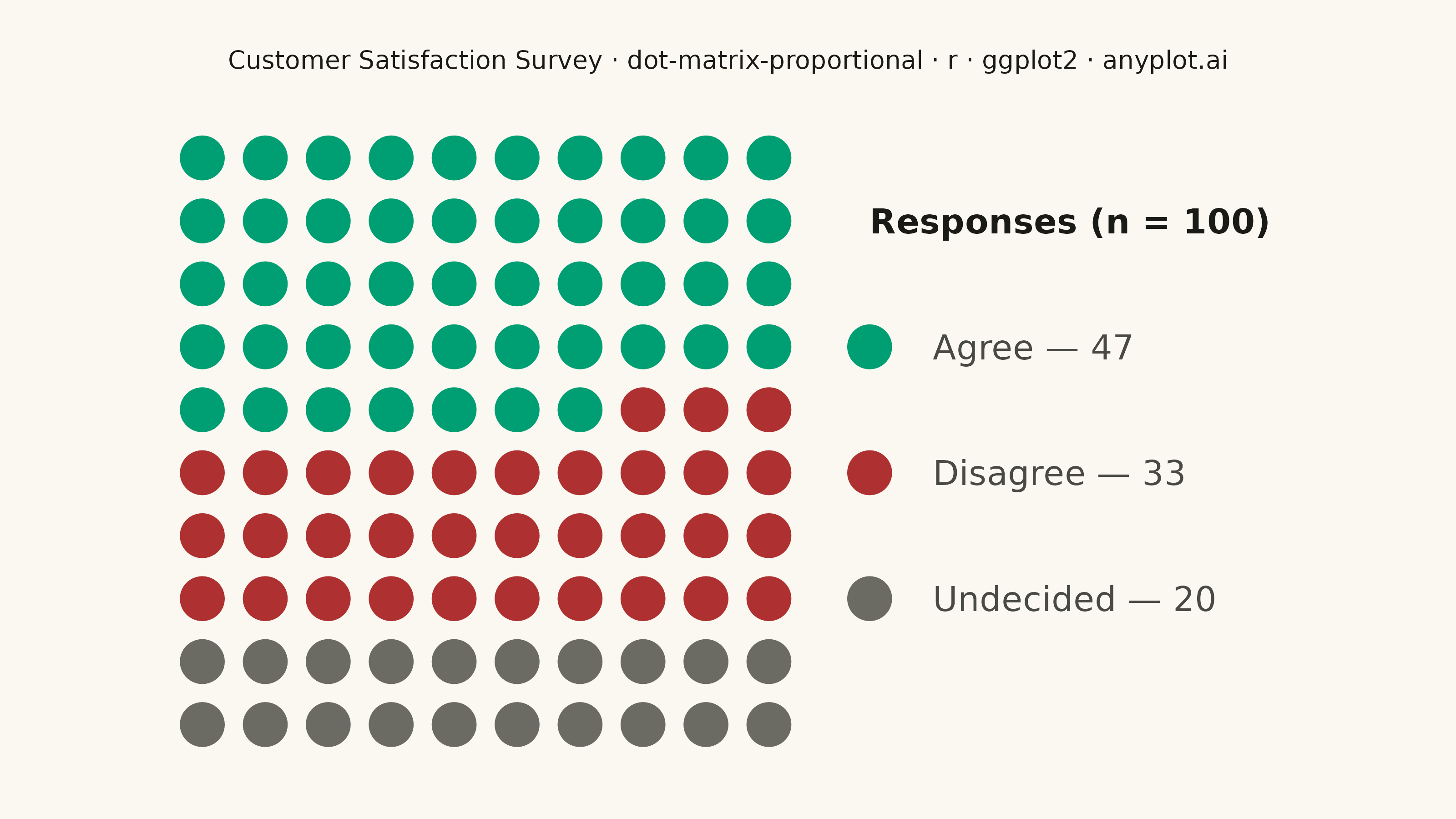
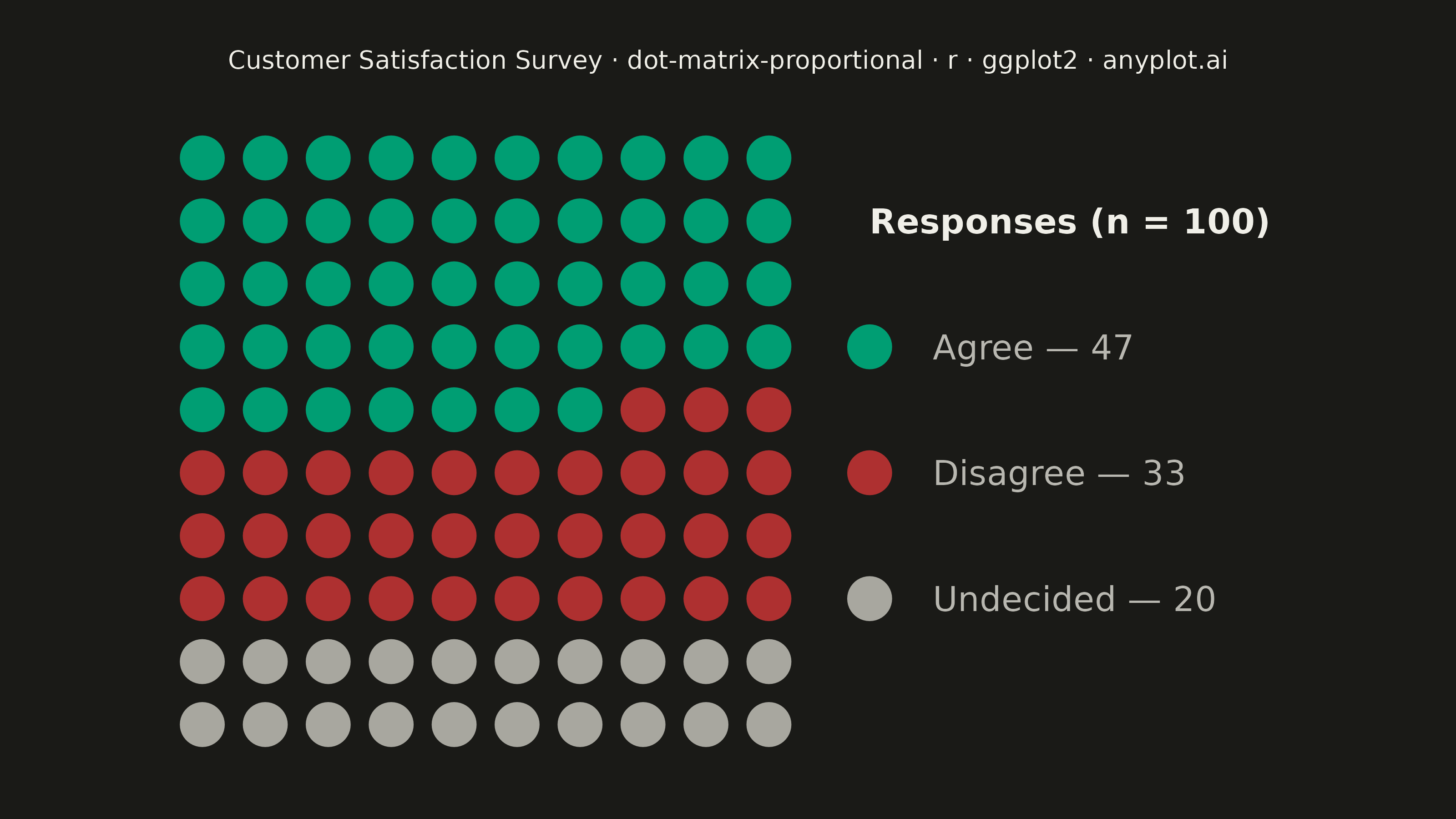
A dot matrix chart displays proportions using a grid of equally-sized dots where filled or colored dots represent counts out of a total. Each dot corresponds to one unit, making it intuitive to read "X out of N" statistics at a glance. Unlike waffle charts that use percentage-based squares, dot matrix charts emphasize absolute counts with variable grid sizes, excelling at risk communication and survey result visualization.
#' anyplot.ai
#' dot-matrix-proportional: Dot Matrix Chart for Proportional Counts
#' Library: ggplot2 3.5.1 | R 4.4.1
#' Quality: 90/100 | Created: 2026-09-05

library(ggplot2)
library(ragg)

set.seed(42)

# --- Theme tokens ------------------------------------------------------------
THEME     <- Sys.getenv("ANYPLOT_THEME", "light")
PAGE_BG   <- if (THEME == "light") "#FAF8F1" else "#1A1A17"
INK       <- if (THEME == "light") "#1A1A17" else "#F0EFE8"
INK_SOFT  <- if (THEME == "light") "#4A4A44" else "#B8B7B0"
INK_MUTED <- if (THEME == "light") "#6B6A63" else "#A8A79F"

# Imprint palette — semantic exception applied: sentiment maps to
# positive/negative/neutral rather than ordinal position (see
# default-style-guide.md "Semantic exception").
COLOR_AGREE     <- "#009E73" # Imprint position 1 — positive sentiment
COLOR_DISAGREE  <- "#AE3030" # Imprint semantic anchor — negative sentiment
COLOR_UNDECIDED <- INK_MUTED # muted anchor — neutral / other

# --- Data ---------------------------------------------------------------------
# "47 out of 100 respondents agreed" — a 10x10 dot matrix survey result.
n_cols <- 10
n_rows <- 10
total <- n_cols * n_rows

counts <- c(Agree = 47, Disagree = 33, Undecided = 20)
stopifnot(sum(counts) == total)

category <- factor(rep(names(counts), times = counts), levels = names(counts))

dots <- tibble::tibble(
  index        = seq_len(total),
  col          = ((index - 1) %% n_cols) + 1,
  row_from_top = ((index - 1) %/% n_cols) + 1,
  row          = n_rows - row_from_top + 1,
  category     = category
)

# Manual legend geometry — placed in the same coordinate space as the grid.
# Built by hand (rather than ggplot2's automatic legend) because the
# automatic legend competes with coord_fixed() for width and silently
# overflows the fixed canvas instead of reflowing.
legend_x_swatch <- n_cols + 1.6
legend_x_label <- legend_x_swatch + 1.0
legend_x_max <- legend_x_label + 5.8
legend_y <- c(7, 5, 3)

legend_df <- tibble::tibble(
  category = factor(names(counts), levels = names(counts)),
  y = legend_y,
  label = sprintf("%s — %d", names(counts), counts)
)

# --- Plot -----------------------------------------------------------------
title <- "Customer Satisfaction Survey · dot-matrix-proportional · r · ggplot2 · anyplot.ai"
title_fontsize <- max(round(12 * min(1, 67 / nchar(title))), 8)

p <- ggplot() +
  geom_point(
    data = dots, aes(x = col, y = row, color = category),
    size = 8, shape = 16
  ) +
  geom_point(
    data = legend_df, aes(x = legend_x_swatch, y = y, color = category),
    size = 8, shape = 16
  ) +
  geom_text(
    data = legend_df,
    aes(x = legend_x_label, y = y, label = label),
    hjust = 0, size = 4.8, color = INK_SOFT
  ) +
  annotate(
    "text",
    x = legend_x_swatch, y = 9, label = "Responses (n = 100)",
    hjust = 0, size = 4.8, color = INK, fontface = "bold"
  ) +
  scale_color_manual(
    values = c(
      Agree = COLOR_AGREE,
      Disagree = COLOR_DISAGREE,
      Undecided = COLOR_UNDECIDED
    ),
    guide = "none"
  ) +
  coord_fixed(
    ratio = 1,
    xlim = c(0.3, legend_x_max),
    ylim = c(0.3, n_rows + 0.7),
    expand = FALSE
  ) +
  labs(title = title) +
  theme_void(base_size = 8) +
  theme(
    plot.background = element_rect(fill = PAGE_BG, color = PAGE_BG),
    panel.background = element_rect(fill = PAGE_BG, color = NA),
    plot.title = element_text(
      color = INK,
      size = title_fontsize,
      hjust = 0.5,
      margin = margin(b = 16)
    ),
    plot.margin = margin(t = 20, r = 20, b = 20, l = 20)
  )

# --- Save -------------------------------------------------------------------
ggsave(
  filename = sprintf("plot-%s.png", THEME),
  plot = p,
  device = ragg::agg_png,
  width = 8,
  height = 4.5,
  units = "in",
  dpi = 400
)
Runnable source as JSON, for any HTTP client: https://api.anyplot.ai/specs/dot-matrix-proportional/ggplot2/code. Any spec id and library id listed in llms-full.txt fit the same URL shape; every URL below is complete and callable.
{
  "spec_id": "dot-matrix-proportional",
  "language": "r",
  "library": "ggplot2",
  "page": "https://anyplot.ai/dot-matrix-proportional/r/ggplot2",
  "hub": "https://anyplot.ai/dot-matrix-proportional",
  "code_json": "https://api.anyplot.ai/specs/dot-matrix-proportional/ggplot2/code",
  "spec_json": "https://api.anyplot.ai/specs/dot-matrix-proportional",
  "render_light_png": "https://storage.googleapis.com/anyplot-images/plots/dot-matrix-proportional/r/ggplot2/plot-light.png",
  "render_dark_png": "https://storage.googleapis.com/anyplot-images/plots/dot-matrix-proportional/r/ggplot2/plot-dark.png",
  "quality_score": 90.0,
  "license": "MIT",
  "guide": "https://anyplot.ai/llms.txt"
}
Part of Dot Matrix Chart for Proportional Counts on anyplot.ai.