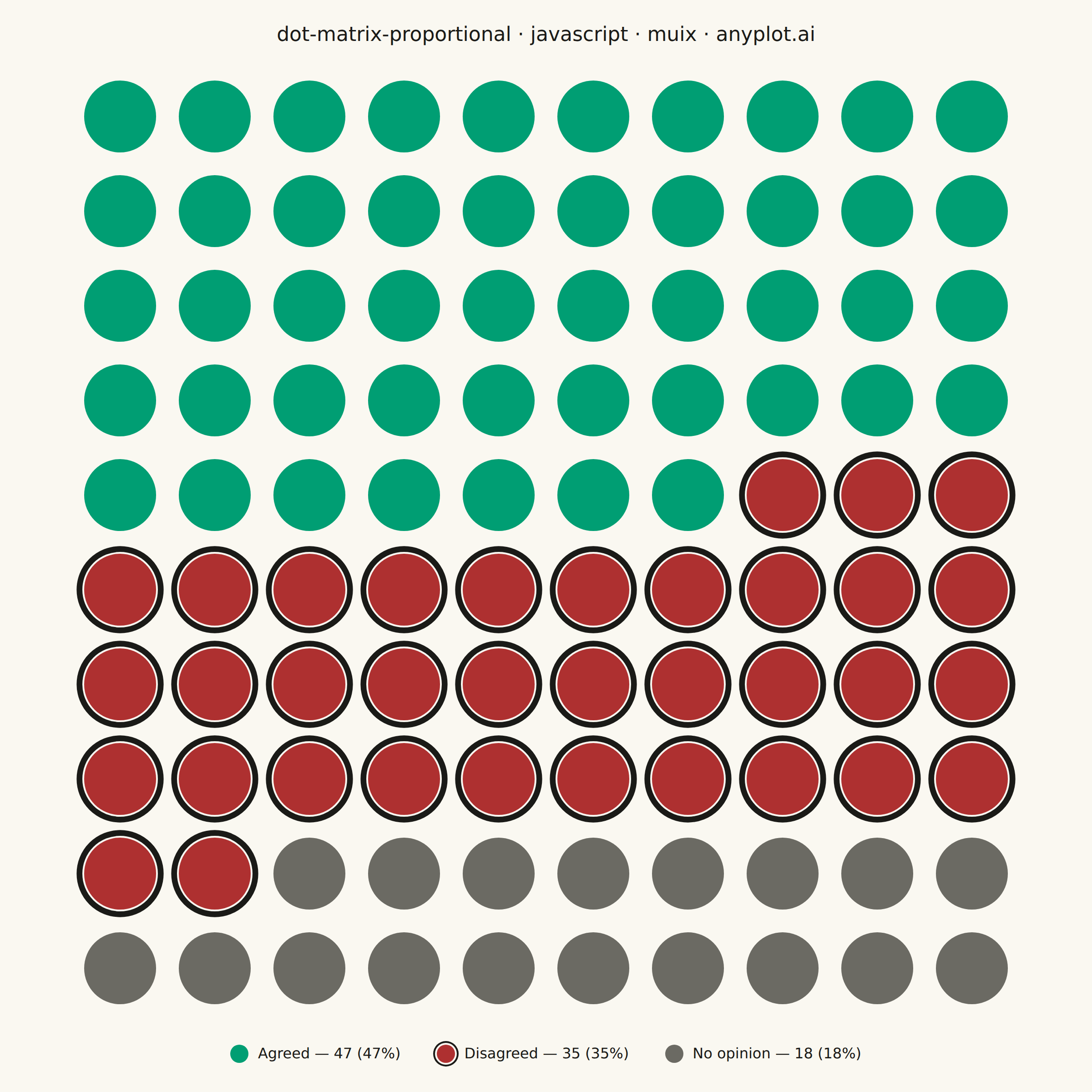
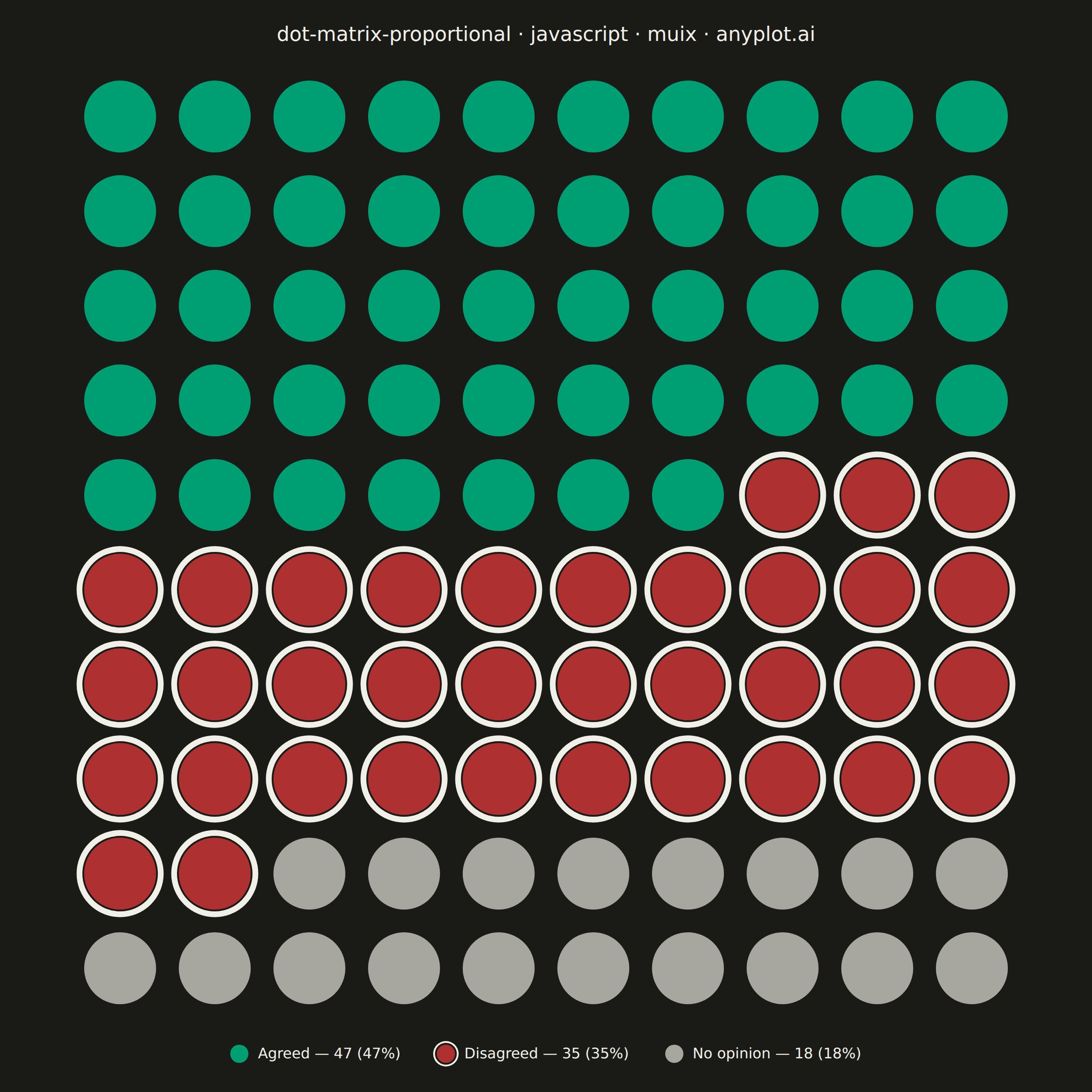
The same plot in 14 other libraries — JavaScript: Chart.js, D3.js, Apache ECharts, Highcharts; Python: Altair, Bokeh, lets-plot, Matplotlib, Plotly, plotnine, Pygal, Seaborn; R: ggplot2; Julia: Makie.jl. Compare all 15 side by side: Dot Matrix Chart for Proportional Counts in Python, R, Julia and JavaScript.
A dot matrix chart displays proportions using a grid of equally-sized dots where filled or colored dots represent counts out of a total. Each dot corresponds to one unit, making it intuitive to read "X out of N" statistics at a glance. Unlike waffle charts that use percentage-based squares, dot matrix charts emphasize absolute counts with variable grid sizes, excelling at risk communication and survey result visualization.
// anyplot.ai
// dot-matrix-proportional: Dot Matrix Chart for Proportional Counts
// Library: muix 7.29.1 | JavaScript 22.23.2
// Quality: 86/100 | Created: 2026-09-05
//# anyplot-orientation: square
// anyplot.ai
// dot-matrix-proportional: Dot Matrix Chart for Proportional Counts
// Library: MUI X Charts | React | Node 22
// License: @mui/x-charts — MIT (community). Pro/Premium are out of scope.
// Quality: pending | Created: 2026-09-05

import { ChartContainer } from "@mui/x-charts/ChartContainer";
import { ScatterPlot } from "@mui/x-charts/ScatterChart";
import { ChartsTooltip } from "@mui/x-charts/ChartsTooltip";
import { ChartsVoronoiHandler } from "@mui/x-charts/ChartsVoronoiHandler";
import Box from "@mui/material/Box";
import Typography from "@mui/material/Typography";

const t = window.ANYPLOT_TOKENS;
const FONT = "system-ui, -apple-system, sans-serif";
const TITLE = "dot-matrix-proportional · javascript · muix · anyplot.ai";

// Muted anchor (other/rest/neutral) — not part of the harness's ANYPLOT_TOKENS,
// so it's keyed off ANYPLOT_THEME directly using the documented Imprint hexes.
const MUTED = window.ANYPLOT_THEME === "dark" ? "#A8A79F" : "#6B6A63";

// Survey of 100 respondents on a new workplace policy — one dot per
// respondent, grid sized to match the total exactly (10x10 = 100).
const TOTAL = 100;
const GRID_COLS = 10;
const GRID_ROWS = 10;

// Sentiment semantic exception: positive -> brand green, negative -> matte
// red, neutral -> the muted anchor (all from the Imprint palette / anchors).
const CATEGORIES = [
  { label: "Agreed", count: 47, color: t.palette[0] },
  { label: "Disagreed", count: 35, color: t.palette[4] },
  { label: "No opinion", count: 18, color: MUTED },
];

// Fill the grid sequentially by category in reading order (left-to-right,
// top-to-bottom); row 0 is the top of the chart, so it maps to the highest y.
let dotIndex = 0;
const series = CATEGORIES.map((category) => {
  const data = [];
  for (let n = 0; n < category.count; n += 1) {
    const row = Math.floor(dotIndex / GRID_COLS);
    const col = dotIndex % GRID_COLS;
    data.push({ x: col, y: GRID_ROWS - 1 - row, id: dotIndex });
    dotIndex += 1;
  }
  return {
    type: "scatter",
    id: category.label,
    label: category.label,
    color: category.color,
    data,
  };
});

// CVD-safety: green ("Agreed") vs. red ("Disagreed") is otherwise a pure-hue
// distinction, so the "Disagreed" dots get a non-color ring cue (a shape/
// contrast difference, not just a different hex) that a red-green colorblind
// viewer can still pick up. It's a decorative overlay -- not a chart series --
// so it never touches MUI X's Voronoi hit-testing or the hover tooltip.
const disagreedData = series.find((s) => s.id === "Disagreed").data;

const TITLE_HEIGHT = 76;
const LEGEND_HEIGHT = 84;

export default function Chart() {
  const width = window.ANYPLOT_SIZE.width;
  const height = window.ANYPLOT_SIZE.height;

  // The grid is a true square: same pixel span on both axes for the same
  // 10-unit domain, so every dot renders as a perfect circle in a perfect
  // cell, never stretched.
  const gridArea = Math.min(width, height - TITLE_HEIGHT - LEGEND_HEIGHT);
  const cellSize = gridArea / GRID_COLS;
  const markerSize = cellSize * 0.38;

  // Ring sized to clear the fill dot with a visible gap, and its outer edge
  // (ringRadius + ringStrokeWidth / 2 = markerSize * 1.21) stays inside half a
  // cell (0.5 * cellSize) so rings on adjacent "Disagreed" dots never touch.
  const ringGap = markerSize * 0.05;
  const ringStrokeWidth = Math.max(1.5, markerSize * 0.16);
  const ringRadius = markerSize + ringGap + ringStrokeWidth / 2;

  return (
    <Box
      sx={{
        width,
        height,
        display: "flex",
        flexDirection: "column",
        alignItems: "center",
      }}
    >
      <Box
        sx={{
          height: TITLE_HEIGHT,
          display: "flex",
          alignItems: "center",
          justifyContent: "center",
          flexShrink: 0,
        }}
      >
        <Typography sx={{ color: t.ink, fontSize: 22, fontWeight: 500, fontFamily: FONT }}>
          {TITLE}
        </Typography>
      </Box>

      <Box sx={{ position: "relative", width: gridArea, height: gridArea, flexShrink: 0 }}>
        <ChartContainer
          width={gridArea}
          height={gridArea}
          margin={{ top: 0, right: 0, bottom: 0, left: 0 }}
          skipAnimation
          series={series.map((s) => ({ ...s, markerSize }))}
          xAxis={[
            {
              scaleType: "linear",
              min: -0.5,
              max: GRID_COLS - 0.5,
              domainLimit: "strict",
              disableLine: true,
              disableTicks: true,
              tickLabelInterval: () => false,
            },
          ]}
          yAxis={[
            {
              scaleType: "linear",
              min: -0.5,
              max: GRID_ROWS - 0.5,
              domainLimit: "strict",
              disableLine: true,
              disableTicks: true,
              tickLabelInterval: () => false,
            },
          ]}
        >
          <ScatterPlot />
          <ChartsVoronoiHandler />
          <ChartsTooltip trigger="item" />
        </ChartContainer>

        {/* Decorative CVD-safety ring, matches the grid's own domain-to-pixel
            mapping ((value + 0.5) * cellSize, y flipped since row 0 is top). */}
        <svg
          width={gridArea}
          height={gridArea}
          viewBox={`0 0 ${gridArea} ${gridArea}`}
          style={{ position: "absolute", top: 0, left: 0, pointerEvents: "none" }}
        >
          {disagreedData.map((point) => (
            <circle
              key={point.id}
              cx={(point.x + 0.5) * cellSize}
              cy={gridArea - (point.y + 0.5) * cellSize}
              r={ringRadius}
              fill="none"
              stroke={t.ink}
              strokeWidth={ringStrokeWidth}
            />
          ))}
        </svg>
      </Box>

      <Box
        sx={{
          height: LEGEND_HEIGHT,
          display: "flex",
          alignItems: "center",
          justifyContent: "center",
          gap: "40px",
          flexShrink: 0,
        }}
      >
        {CATEGORIES.map((category) => (
          <Box key={category.label} sx={{ display: "flex", alignItems: "center", gap: "10px" }}>
            <Box
              sx={{
                width: 20,
                height: 20,
                borderRadius: "50%",
                backgroundColor: category.color,
                flexShrink: 0,
                // Mirrors the grid's CVD-safety ring so the legend swatch
                // matches what's actually drawn for "Disagreed" dots.
                boxShadow: category.label === "Disagreed" ? `0 0 0 2px ${t.pageBg}, 0 0 0 4px ${t.ink}` : "none",
              }}
            />
            <Typography sx={{ color: t.ink, fontSize: 16, fontFamily: FONT }}>
              {category.label} — {category.count} ({Math.round((category.count / TOTAL) * 100)}%)
            </Typography>
          </Box>
        ))}
      </Box>
    </Box>
  );
}
Runnable source as JSON, for any HTTP client: https://api.anyplot.ai/specs/dot-matrix-proportional/muix/code. Any spec id and library id listed in llms-full.txt fit the same URL shape; every URL below is complete and callable.
{
  "spec_id": "dot-matrix-proportional",
  "language": "javascript",
  "library": "muix",
  "page": "https://anyplot.ai/dot-matrix-proportional/javascript/muix",
  "hub": "https://anyplot.ai/dot-matrix-proportional",
  "code_json": "https://api.anyplot.ai/specs/dot-matrix-proportional/muix/code",
  "spec_json": "https://api.anyplot.ai/specs/dot-matrix-proportional",
  "render_light_png": "https://storage.googleapis.com/anyplot-images/plots/dot-matrix-proportional/javascript/muix/plot-light.png",
  "render_dark_png": "https://storage.googleapis.com/anyplot-images/plots/dot-matrix-proportional/javascript/muix/plot-dark.png",
  "interactive_light_html": "https://storage.googleapis.com/anyplot-images/plots/dot-matrix-proportional/javascript/muix/plot-light.html",
  "interactive_dark_html": "https://storage.googleapis.com/anyplot-images/plots/dot-matrix-proportional/javascript/muix/plot-dark.html",
  "quality_score": 86.0,
  "license": "MIT",
  "guide": "https://anyplot.ai/llms.txt"
}
Part of Dot Matrix Chart for Proportional Counts on anyplot.ai.