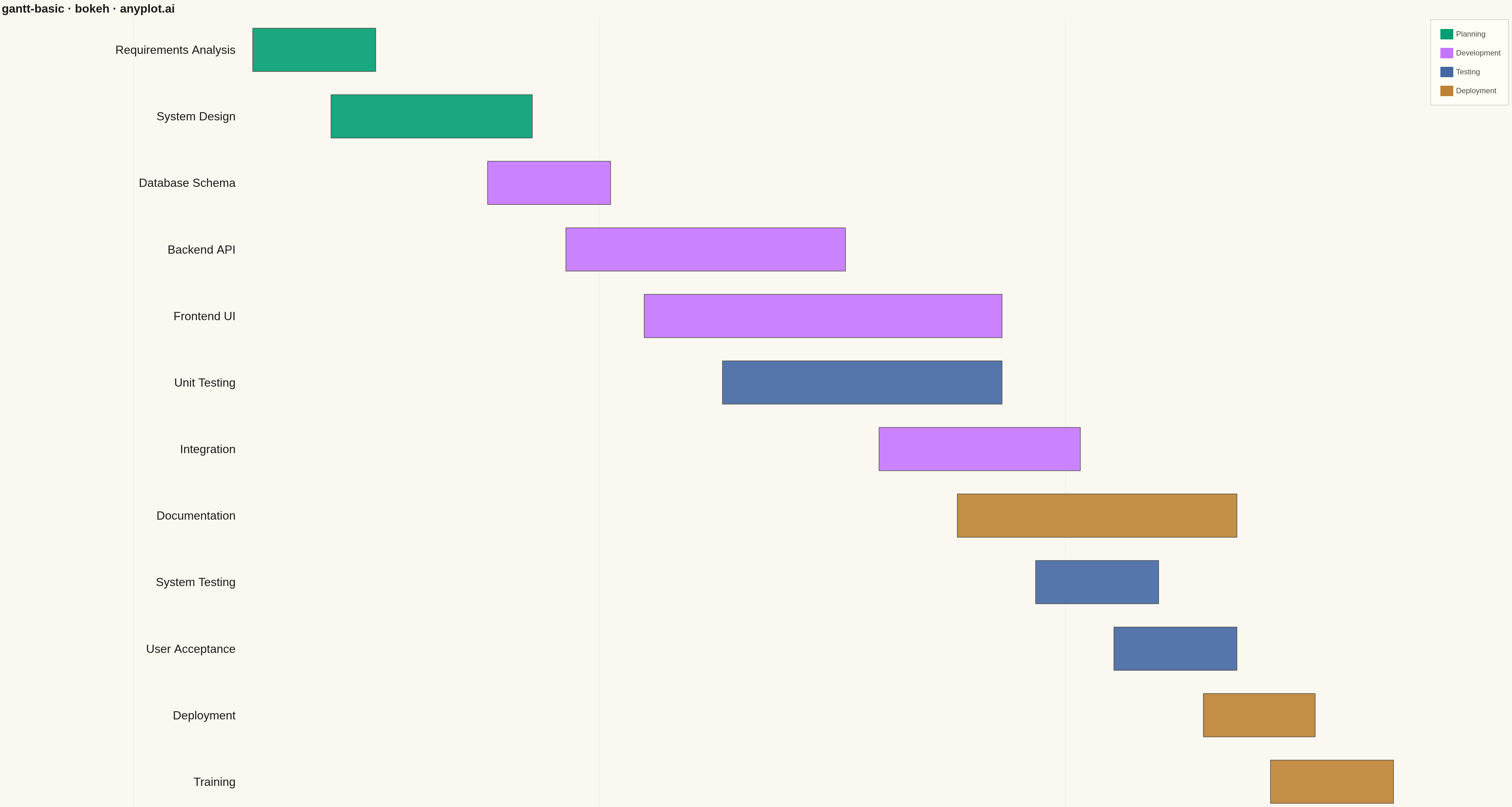
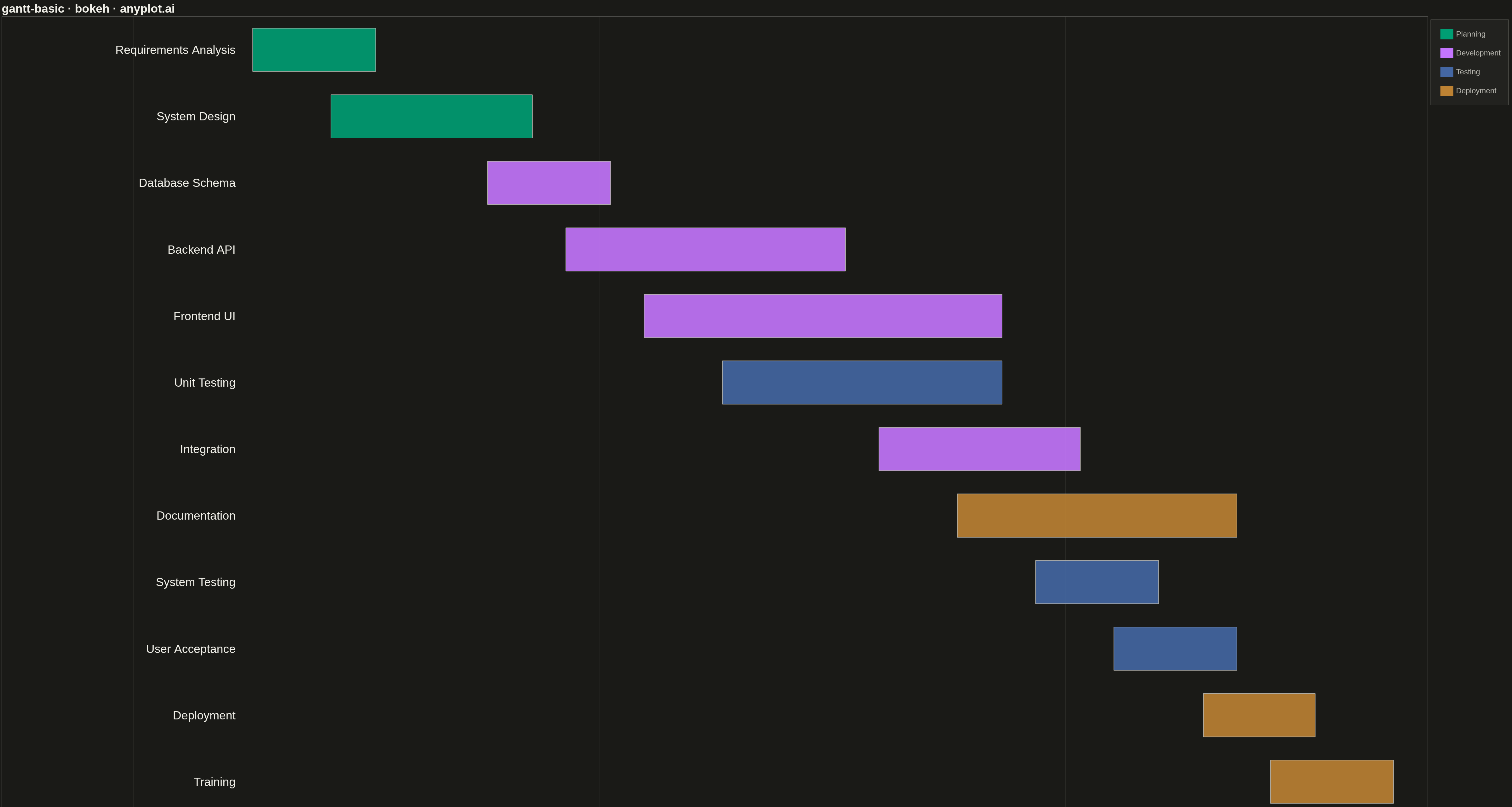
A Gantt chart is a horizontal bar chart that visualizes project schedules and timelines. Each task is represented as a horizontal bar spanning from its start date to end date, making it easy to see task durations, overlaps, and the overall project timeline at a glance. Gantt charts are essential for project management, helping teams understand task sequences and identify scheduling conflicts.
""" anyplot.ai
gantt-basic: Basic Gantt Chart
Library: bokeh 3.9.0 | Python 3.13.13
Quality: 92/100 | Updated: 2026-05-10
"""

import os
import time
from pathlib import Path

import pandas as pd
from bokeh.io import output_file, save
from bokeh.models import ColumnDataSource, Legend, LegendItem
from bokeh.plotting import figure
from selenium import webdriver
from selenium.webdriver.chrome.options import Options


# Theme tokens
THEME = os.getenv("ANYPLOT_THEME", "light")
PAGE_BG = "#FAF8F1" if THEME == "light" else "#1A1A17"
ELEVATED_BG = "#FFFDF6" if THEME == "light" else "#242420"
INK = "#1A1A17" if THEME == "light" else "#F0EFE8"
INK_SOFT = "#4A4A44" if THEME == "light" else "#B8B7B0"

# Data - Software Development Project
tasks = [
    {"task": "Requirements Analysis", "start": "2025-01-06", "end": "2025-01-17", "category": "Planning"},
    {"task": "System Design", "start": "2025-01-13", "end": "2025-01-31", "category": "Planning"},
    {"task": "Database Schema", "start": "2025-01-27", "end": "2025-02-07", "category": "Development"},
    {"task": "Backend API", "start": "2025-02-03", "end": "2025-02-28", "category": "Development"},
    {"task": "Frontend UI", "start": "2025-02-10", "end": "2025-03-14", "category": "Development"},
    {"task": "Integration", "start": "2025-03-03", "end": "2025-03-21", "category": "Development"},
    {"task": "Unit Testing", "start": "2025-02-17", "end": "2025-03-14", "category": "Testing"},
    {"task": "System Testing", "start": "2025-03-17", "end": "2025-03-28", "category": "Testing"},
    {"task": "User Acceptance", "start": "2025-03-24", "end": "2025-04-04", "category": "Testing"},
    {"task": "Documentation", "start": "2025-03-10", "end": "2025-04-04", "category": "Deployment"},
    {"task": "Deployment", "start": "2025-04-01", "end": "2025-04-11", "category": "Deployment"},
    {"task": "Training", "start": "2025-04-07", "end": "2025-04-18", "category": "Deployment"},
]

df = pd.DataFrame(tasks)
df["start"] = pd.to_datetime(df["start"])
df["end"] = pd.to_datetime(df["end"])

# Sort by start date for chronological order
df = df.sort_values(["start", "category"], ascending=[True, True]).reset_index(drop=True)

# Convert dates to numeric for plotting (milliseconds since epoch)
df["start_ms"] = df["start"].astype("int64") // 10**6
df["end_ms"] = df["end"].astype("int64") // 10**6

# Assign y positions (inverted so first task is at top)
df["y"] = list(range(len(df) - 1, -1, -1))

# Color mapping by category using Okabe-Ito palette
okabe_ito = ["#009E73", "#C475FD", "#4467A3", "#BD8233"]
categories = df["category"].unique().tolist()
color_map = {cat: okabe_ito[i % len(okabe_ito)] for i, cat in enumerate(categories)}
df["color"] = df["category"].map(color_map)

# Create ColumnDataSource
source = ColumnDataSource(
    data={
        "task": df["task"],
        "y": df["y"],
        "left": df["start_ms"],
        "right": df["end_ms"],
        "color": df["color"],
        "category": df["category"],
    }
)

# Create figure
p = figure(
    width=4800,
    height=2700,
    title="gantt-basic · bokeh · anyplot.ai",
    x_axis_type="datetime",
    y_range=(-0.5, len(df) - 0.5),
    tools="",
    toolbar_location=None,
)

# Bar height
bar_height = 0.65

# Draw Gantt bars
p.hbar(
    y="y",
    left="left",
    right="right",
    height=bar_height,
    color="color",
    alpha=0.9,
    source=source,
    line_color=INK_SOFT,
    line_width=2,
)

# Add task labels on the left side
x_range_span = df["end_ms"].max() - df["start_ms"].min()
for i, row in df.iterrows():
    y_pos = df.loc[i, "y"]
    task_name = row["task"]
    p.text(
        x=[df["start_ms"].min() - x_range_span * 0.015],
        y=[y_pos],
        text=[task_name],
        text_font_size="28pt",
        text_align="right",
        text_baseline="middle",
        text_color=INK,
    )

# Title styling
p.title.text_font_size = "28pt"
p.title.text_color = INK

# X-axis styling
p.xaxis.axis_label = "Timeline"
p.xaxis.axis_label_text_font_size = "22pt"
p.xaxis.major_label_text_font_size = "18pt"
p.xaxis.axis_label_text_color = INK
p.xaxis.major_label_text_color = INK_SOFT
p.xaxis.axis_line_color = INK_SOFT
p.xaxis.axis_line_width = 2
p.xaxis.major_tick_line_color = INK_SOFT
p.xaxis.major_tick_line_width = 2
p.xaxis.minor_tick_line_color = None

# Hide y-axis
p.yaxis.visible = False

# Grid styling
p.xgrid.grid_line_color = INK_SOFT
p.xgrid.grid_line_alpha = 0.10
p.xgrid.grid_line_width = 1
p.ygrid.grid_line_color = None

# Background
p.background_fill_color = PAGE_BG
p.border_fill_color = PAGE_BG
p.outline_line_color = None

# Extend x-range to accommodate task labels
x_min = df["start_ms"].min()
x_max = df["end_ms"].max()
x_padding = (x_max - x_min) * 0.22
p.x_range.start = x_min - x_padding
p.x_range.end = x_max + (x_max - x_min) * 0.03

# Add legend
legend_items = []
for cat in categories:
    dummy = p.hbar(y=[-100], left=[0], right=[1], height=0.1, color=color_map[cat], visible=False)
    legend_items.append(LegendItem(label=cat, renderers=[dummy]))

legend = Legend(items=legend_items, location="top_right")
legend.label_text_font_size = "18pt"
legend.label_text_color = INK_SOFT
legend.glyph_height = 40
legend.glyph_width = 50
legend.spacing = 20
legend.padding = 25
legend.background_fill_color = ELEVATED_BG
legend.background_fill_alpha = 0.9
legend.border_line_color = INK_SOFT
legend.border_line_width = 1
p.add_layout(legend, "right")

# Save as HTML
output_file(f"plot-{THEME}.html")
save(p)

# Screenshot with Selenium
W, H = 4800, 2700
opts = Options()
for arg in (
    "--headless=new",
    "--no-sandbox",
    "--disable-dev-shm-usage",
    "--disable-gpu",
    f"--window-size={W},{H}",
    "--hide-scrollbars",
):
    opts.add_argument(arg)
driver = webdriver.Chrome(options=opts)
driver.set_window_size(W, H)
driver.get(f"file://{Path(f'plot-{THEME}.html').resolve()}")
time.sleep(3)
driver.save_screenshot(f"plot-{THEME}.png")
driver.quit()
Runnable source as JSON, for any HTTP client: https://api.anyplot.ai/specs/gantt-basic/bokeh/code. Any spec id and library id listed in llms-full.txt fit the same URL shape; every URL below is complete and callable.
{
  "spec_id": "gantt-basic",
  "language": "python",
  "library": "bokeh",
  "page": "https://anyplot.ai/gantt-basic/python/bokeh",
  "hub": "https://anyplot.ai/gantt-basic",
  "code_json": "https://api.anyplot.ai/specs/gantt-basic/bokeh/code",
  "spec_json": "https://api.anyplot.ai/specs/gantt-basic",
  "render_light_png": "https://storage.googleapis.com/anyplot-images/plots/gantt-basic/python/bokeh/plot-light.png",
  "render_dark_png": "https://storage.googleapis.com/anyplot-images/plots/gantt-basic/python/bokeh/plot-dark.png",
  "interactive_light_html": "https://storage.googleapis.com/anyplot-images/plots/gantt-basic/python/bokeh/plot-light.html",
  "interactive_dark_html": "https://storage.googleapis.com/anyplot-images/plots/gantt-basic/python/bokeh/plot-dark.html",
  "quality_score": 92.0,
  "license": "MIT",
  "guide": "https://anyplot.ai/llms.txt"
}
Part of Basic Gantt Chart on anyplot.ai.