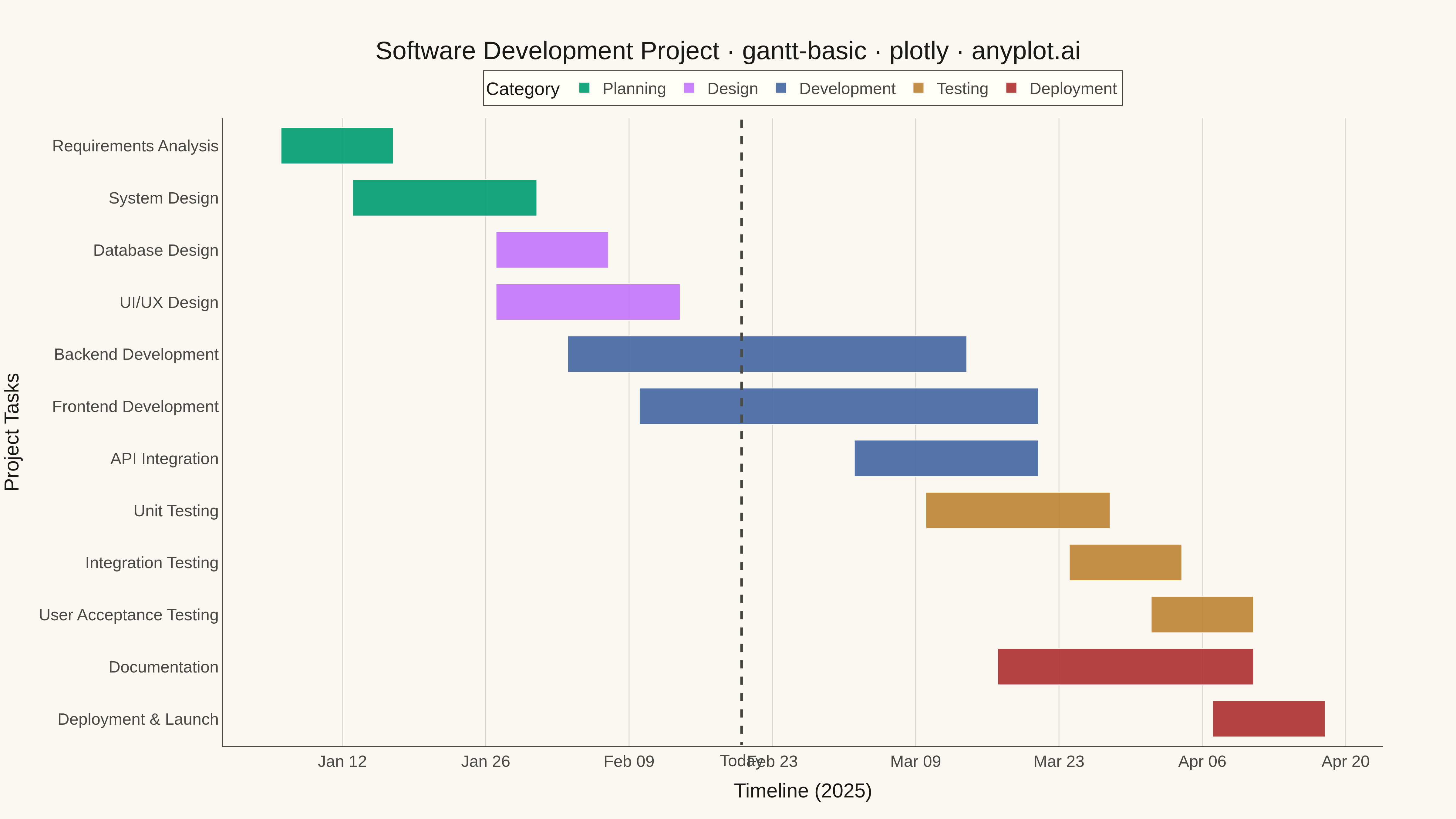
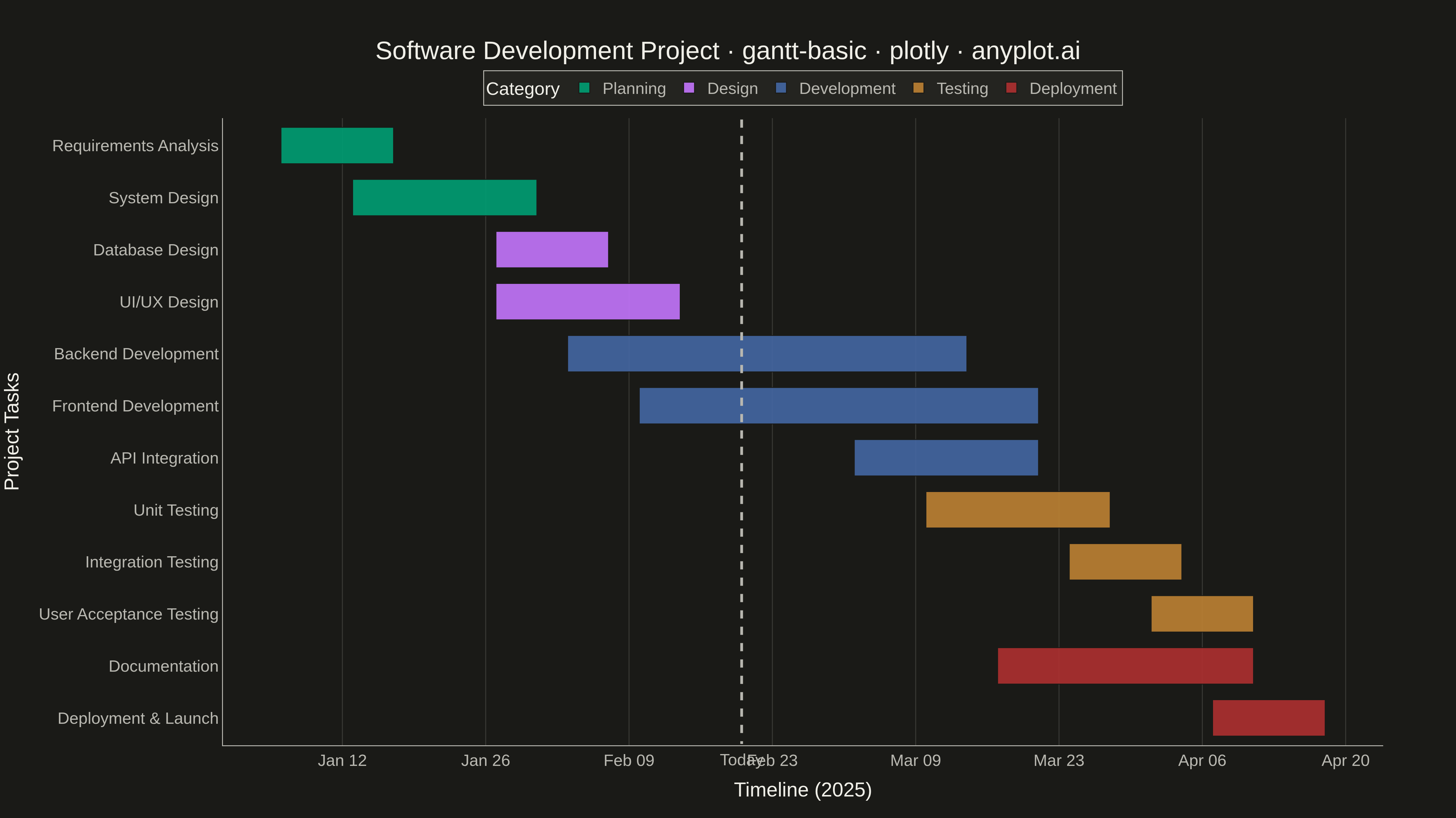
A Gantt chart is a horizontal bar chart that visualizes project schedules and timelines. Each task is represented as a horizontal bar spanning from its start date to end date, making it easy to see task durations, overlaps, and the overall project timeline at a glance. Gantt charts are essential for project management, helping teams understand task sequences and identify scheduling conflicts.
""" anyplot.ai
gantt-basic: Basic Gantt Chart
Library: plotly 6.7.0 | Python 3.13.13
Quality: 92/100 | Updated: 2026-05-10
"""

import os
from datetime import datetime

import pandas as pd
import plotly.express as px


# Theme tokens
THEME = os.getenv("ANYPLOT_THEME", "light")
PAGE_BG = "#FAF8F1" if THEME == "light" else "#1A1A17"
ELEVATED_BG = "#FFFDF6" if THEME == "light" else "#242420"
INK = "#1A1A17" if THEME == "light" else "#F0EFE8"
INK_SOFT = "#4A4A44" if THEME == "light" else "#B8B7B0"
GRID = "rgba(26,26,23,0.15)" if THEME == "light" else "rgba(240,239,232,0.15)"

# Okabe-Ito palette
IMPRINT = ["#009E73", "#C475FD", "#4467A3", "#BD8233", "#AE3030"]

# Data - Software Development Project Timeline
tasks = [
    {"task": "Requirements Analysis", "start": "2025-01-06", "end": "2025-01-17", "category": "Planning"},
    {"task": "System Design", "start": "2025-01-13", "end": "2025-01-31", "category": "Planning"},
    {"task": "Database Design", "start": "2025-01-27", "end": "2025-02-07", "category": "Design"},
    {"task": "UI/UX Design", "start": "2025-01-27", "end": "2025-02-14", "category": "Design"},
    {"task": "Backend Development", "start": "2025-02-03", "end": "2025-03-14", "category": "Development"},
    {"task": "Frontend Development", "start": "2025-02-10", "end": "2025-03-21", "category": "Development"},
    {"task": "API Integration", "start": "2025-03-03", "end": "2025-03-21", "category": "Development"},
    {"task": "Unit Testing", "start": "2025-03-10", "end": "2025-03-28", "category": "Testing"},
    {"task": "Integration Testing", "start": "2025-03-24", "end": "2025-04-04", "category": "Testing"},
    {"task": "User Acceptance Testing", "start": "2025-04-01", "end": "2025-04-11", "category": "Testing"},
    {"task": "Documentation", "start": "2025-03-17", "end": "2025-04-11", "category": "Deployment"},
    {"task": "Deployment & Launch", "start": "2025-04-07", "end": "2025-04-18", "category": "Deployment"},
]

df = pd.DataFrame(tasks)
df["start"] = pd.to_datetime(df["start"])
df["end"] = pd.to_datetime(df["end"])

# Sort by start date for logical ordering
df = df.sort_values("start").reset_index(drop=True)

# Color map using Okabe-Ito palette
color_map = {
    "Planning": IMPRINT[0],
    "Design": IMPRINT[1],
    "Development": IMPRINT[2],
    "Testing": IMPRINT[3],
    "Deployment": IMPRINT[4],
}

# Create Gantt chart using timeline
fig = px.timeline(df, x_start="start", x_end="end", y="task", color="category", color_discrete_map=color_map)

# Reverse y-axis so earliest tasks are at top
fig.update_yaxes(autorange="reversed")

# Add current date line (vertical marker)
today = datetime(2025, 2, 20)
fig.add_shape(
    type="line",
    x0=today,
    x1=today,
    y0=-0.5,
    y1=len(df) - 0.5,
    line={"color": INK_SOFT, "width": 3, "dash": "dash"},
    layer="above",
)
fig.add_annotation(
    x=today,
    y=len(df) - 0.5,
    text="Today",
    showarrow=False,
    font={"size": 18, "color": INK_SOFT, "family": "Arial"},
    yanchor="top",
    yshift=-5,
)

# Update layout for 4800x2700 px
fig.update_layout(
    title={
        "text": "Software Development Project · gantt-basic · plotly · anyplot.ai",
        "font": {"size": 28, "color": INK},
        "x": 0.5,
        "xanchor": "center",
    },
    xaxis={
        "title": {"text": "Timeline (2025)", "font": {"size": 22, "color": INK}},
        "tickfont": {"size": 18, "color": INK_SOFT},
        "tickformat": "%b %d",
        "showgrid": True,
        "gridwidth": 1,
        "gridcolor": GRID,
        "linecolor": INK_SOFT,
        "zerolinecolor": INK_SOFT,
    },
    yaxis={
        "title": {"text": "Project Tasks", "font": {"size": 22, "color": INK}},
        "tickfont": {"size": 18, "color": INK_SOFT},
        "showgrid": False,
        "linecolor": INK_SOFT,
    },
    paper_bgcolor=PAGE_BG,
    plot_bgcolor=PAGE_BG,
    font={"color": INK},
    legend={
        "title": {"text": "Category", "font": {"size": 20, "color": INK}},
        "font": {"size": 18, "color": INK_SOFT},
        "bgcolor": ELEVATED_BG,
        "bordercolor": INK_SOFT,
        "borderwidth": 1,
        "orientation": "h",
        "yanchor": "bottom",
        "y": 1.02,
        "xanchor": "center",
        "x": 0.5,
    },
    margin={"l": 220, "r": 80, "t": 130, "b": 80},
    bargap=0.3,
)

# Update bar appearance
fig.update_traces(marker={"line": {"color": PAGE_BG, "width": 1}}, opacity=0.9)

# Save as PNG
fig.write_image(f"plot-{THEME}.png", width=1600, height=900, scale=3)

# Save interactive HTML
fig.write_html(f"plot-{THEME}.html", include_plotlyjs="cdn")
Runnable source as JSON, for any HTTP client: https://api.anyplot.ai/specs/gantt-basic/plotly/code. Any spec id and library id listed in llms-full.txt fit the same URL shape; every URL below is complete and callable.
{
  "spec_id": "gantt-basic",
  "language": "python",
  "library": "plotly",
  "page": "https://anyplot.ai/gantt-basic/python/plotly",
  "hub": "https://anyplot.ai/gantt-basic",
  "code_json": "https://api.anyplot.ai/specs/gantt-basic/plotly/code",
  "spec_json": "https://api.anyplot.ai/specs/gantt-basic",
  "render_light_png": "https://storage.googleapis.com/anyplot-images/plots/gantt-basic/python/plotly/plot-light.png",
  "render_dark_png": "https://storage.googleapis.com/anyplot-images/plots/gantt-basic/python/plotly/plot-dark.png",
  "interactive_light_html": "https://storage.googleapis.com/anyplot-images/plots/gantt-basic/python/plotly/plot-light.html",
  "interactive_dark_html": "https://storage.googleapis.com/anyplot-images/plots/gantt-basic/python/plotly/plot-dark.html",
  "quality_score": 92.0,
  "license": "MIT",
  "guide": "https://anyplot.ai/llms.txt"
}
Part of Basic Gantt Chart on anyplot.ai.