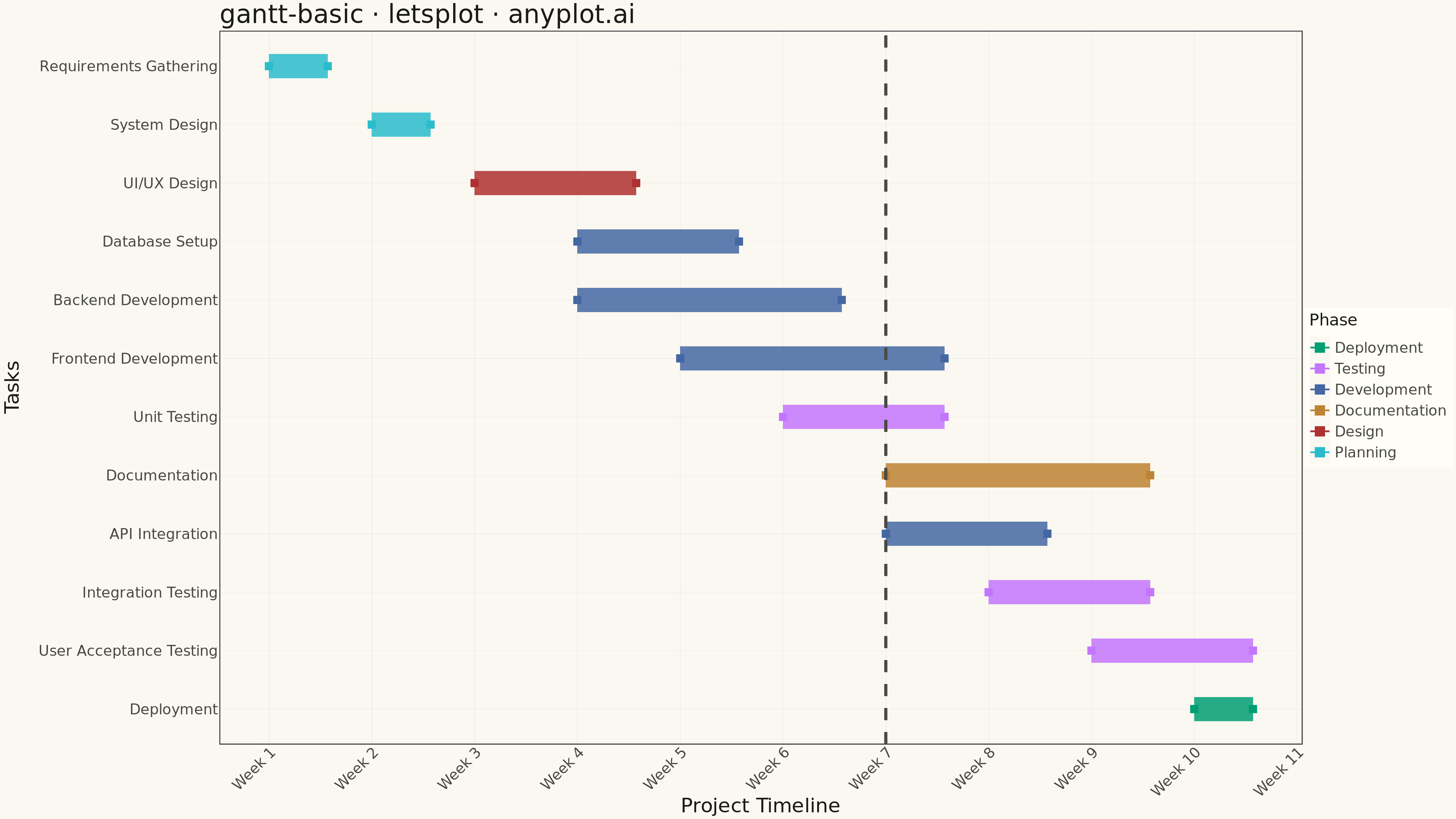
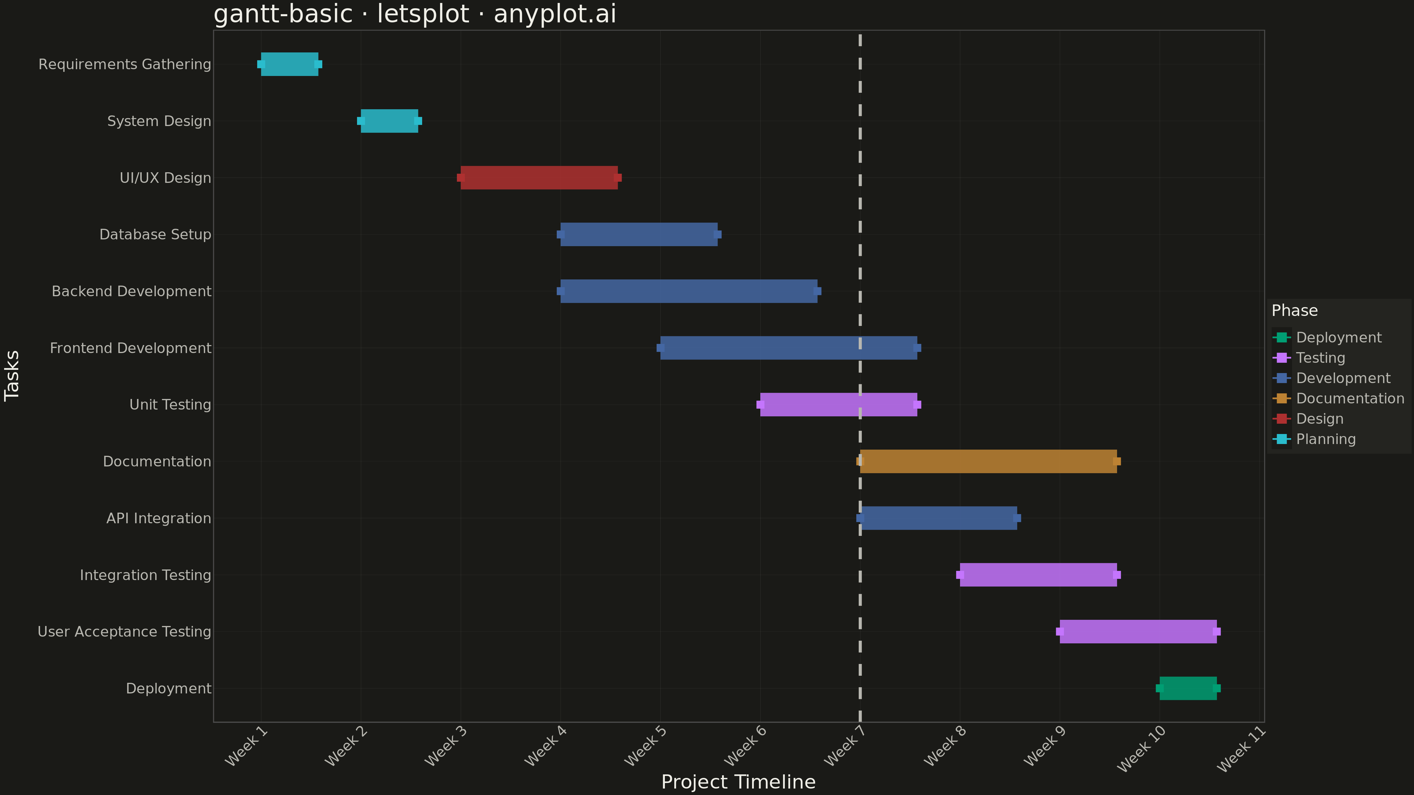
A Gantt chart is a horizontal bar chart that visualizes project schedules and timelines. Each task is represented as a horizontal bar spanning from its start date to end date, making it easy to see task durations, overlaps, and the overall project timeline at a glance. Gantt charts are essential for project management, helping teams understand task sequences and identify scheduling conflicts.
""" anyplot.ai
gantt-basic: Basic Gantt Chart
Library: letsplot 4.9.0 | Python 3.13.13
Quality: 90/100 | Updated: 2026-05-10
"""

import os
from datetime import datetime

import pandas as pd
from lets_plot import *


LetsPlot.setup_html()

THEME = os.getenv("ANYPLOT_THEME", "light")
PAGE_BG = "#FAF8F1" if THEME == "light" else "#1A1A17"
ELEVATED_BG = "#FFFDF6" if THEME == "light" else "#242420"
INK = "#1A1A17" if THEME == "light" else "#F0EFE8"
INK_SOFT = "#4A4A44" if THEME == "light" else "#B8B7B0"
RULE = "rgba(26,26,23,0.10)" if THEME == "light" else "rgba(240,239,232,0.10)"

IMPRINT = ["#009E73", "#C475FD", "#4467A3", "#BD8233", "#AE3030", "#2ABCCD"]

# Data - Software Development Project
tasks_data = {
    "task": [
        "Requirements Gathering",
        "System Design",
        "UI/UX Design",
        "Backend Development",
        "Frontend Development",
        "Database Setup",
        "API Integration",
        "Unit Testing",
        "Integration Testing",
        "User Acceptance Testing",
        "Documentation",
        "Deployment",
    ],
    "category": [
        "Planning",
        "Planning",
        "Design",
        "Development",
        "Development",
        "Development",
        "Development",
        "Testing",
        "Testing",
        "Testing",
        "Documentation",
        "Deployment",
    ],
    "start": [
        datetime(2025, 1, 6),
        datetime(2025, 1, 13),
        datetime(2025, 1, 20),
        datetime(2025, 1, 27),
        datetime(2025, 2, 3),
        datetime(2025, 1, 27),
        datetime(2025, 2, 17),
        datetime(2025, 2, 10),
        datetime(2025, 2, 24),
        datetime(2025, 3, 3),
        datetime(2025, 2, 17),
        datetime(2025, 3, 10),
    ],
    "end": [
        datetime(2025, 1, 10),
        datetime(2025, 1, 17),
        datetime(2025, 1, 31),
        datetime(2025, 2, 14),
        datetime(2025, 2, 21),
        datetime(2025, 2, 7),
        datetime(2025, 2, 28),
        datetime(2025, 2, 21),
        datetime(2025, 3, 7),
        datetime(2025, 3, 14),
        datetime(2025, 3, 7),
        datetime(2025, 3, 14),
    ],
}

df = pd.DataFrame(tasks_data)

# Convert dates to numeric for plotting (days since project start)
project_start = datetime(2025, 1, 6)
project_today = datetime(2025, 2, 17)

df["start_days"] = [(d - project_start).days for d in df["start"]]
df["end_days"] = [(d - project_start).days for d in df["end"]]
df["duration"] = df["end_days"] - df["start_days"]

# Map categories to colors (Okabe-Ito palette)
category_colors = {
    "Planning": IMPRINT[0],
    "Design": IMPRINT[1],
    "Development": IMPRINT[2],
    "Testing": IMPRINT[3],
    "Documentation": IMPRINT[4],
    "Deployment": IMPRINT[5],
}
df["color"] = df["category"].map(category_colors)

# Order tasks by start date and assign y positions
df = df.sort_values("start_days", ascending=False).reset_index(drop=True)
df["y_pos"] = range(len(df))

# Create the Gantt chart using horizontal bars (geom_segment)
plot = (
    ggplot(df, aes(x="start_days", y="y_pos"))
    + geom_segment(aes(xend="end_days", yend="y_pos", color="category"), size=12, alpha=0.85)
    + geom_point(aes(color="category"), size=4, shape=15)  # Start markers
    + geom_point(aes(x="end_days", color="category"), size=4, shape=15)  # End markers
    + geom_vline(xintercept=(project_today - project_start).days, color=INK_SOFT, size=1.5, linetype="dashed")
    + scale_y_continuous(breaks=list(df["y_pos"]), labels=list(df["task"]), expand=[0.05, 0.05])
    + scale_x_continuous(
        name="Project Timeline (Days from Start)",
        breaks=[0, 7, 14, 21, 28, 35, 42, 49, 56, 63, 70],
        labels=[
            "Week 1",
            "Week 2",
            "Week 3",
            "Week 4",
            "Week 5",
            "Week 6",
            "Week 7",
            "Week 8",
            "Week 9",
            "Week 10",
            "Week 11",
        ],
    )
    + scale_color_manual(values=IMPRINT, name="Phase")
    + labs(title="gantt-basic · letsplot · anyplot.ai", x="Project Timeline", y="Tasks")
    + theme_minimal()
    + theme(
        plot_background=element_rect(fill=PAGE_BG, color=PAGE_BG),
        panel_background=element_rect(fill=PAGE_BG),
        plot_title=element_text(size=28, color=INK),
        axis_title_x=element_text(size=22, color=INK),
        axis_title_y=element_text(size=22, color=INK),
        axis_text_x=element_text(size=16, color=INK_SOFT, angle=45),
        axis_text_y=element_text(size=16, color=INK_SOFT),
        axis_line=element_line(color=INK_SOFT),
        legend_background=element_rect(fill=ELEVATED_BG, color=INK_SOFT),
        legend_title=element_text(size=18, color=INK),
        legend_text=element_text(size=16, color=INK_SOFT),
        legend_position="right",
        panel_grid_major_x=element_line(color=RULE, size=0.3),
        panel_grid_major_y=element_line(color=RULE, size=0.2),
        panel_grid_minor=element_blank(),
    )
    + ggsize(1600, 900)
)

# Save as PNG (scale 3x for 4800 × 2700 px)
ggsave(plot, f"plot-{THEME}.png", scale=3, path=".")

# Save interactive HTML version
ggsave(plot, f"plot-{THEME}.html", path=".")
Runnable source as JSON, for any HTTP client: https://api.anyplot.ai/specs/gantt-basic/letsplot/code. Any spec id and library id listed in llms-full.txt fit the same URL shape; every URL below is complete and callable.
{
  "spec_id": "gantt-basic",
  "language": "python",
  "library": "letsplot",
  "page": "https://anyplot.ai/gantt-basic/python/letsplot",
  "hub": "https://anyplot.ai/gantt-basic",
  "code_json": "https://api.anyplot.ai/specs/gantt-basic/letsplot/code",
  "spec_json": "https://api.anyplot.ai/specs/gantt-basic",
  "render_light_png": "https://storage.googleapis.com/anyplot-images/plots/gantt-basic/python/letsplot/plot-light.png",
  "render_dark_png": "https://storage.googleapis.com/anyplot-images/plots/gantt-basic/python/letsplot/plot-dark.png",
  "interactive_light_html": "https://storage.googleapis.com/anyplot-images/plots/gantt-basic/python/letsplot/plot-light.html",
  "interactive_dark_html": "https://storage.googleapis.com/anyplot-images/plots/gantt-basic/python/letsplot/plot-dark.html",
  "quality_score": 90.0,
  "license": "MIT",
  "guide": "https://anyplot.ai/llms.txt"
}
Part of Basic Gantt Chart on anyplot.ai.