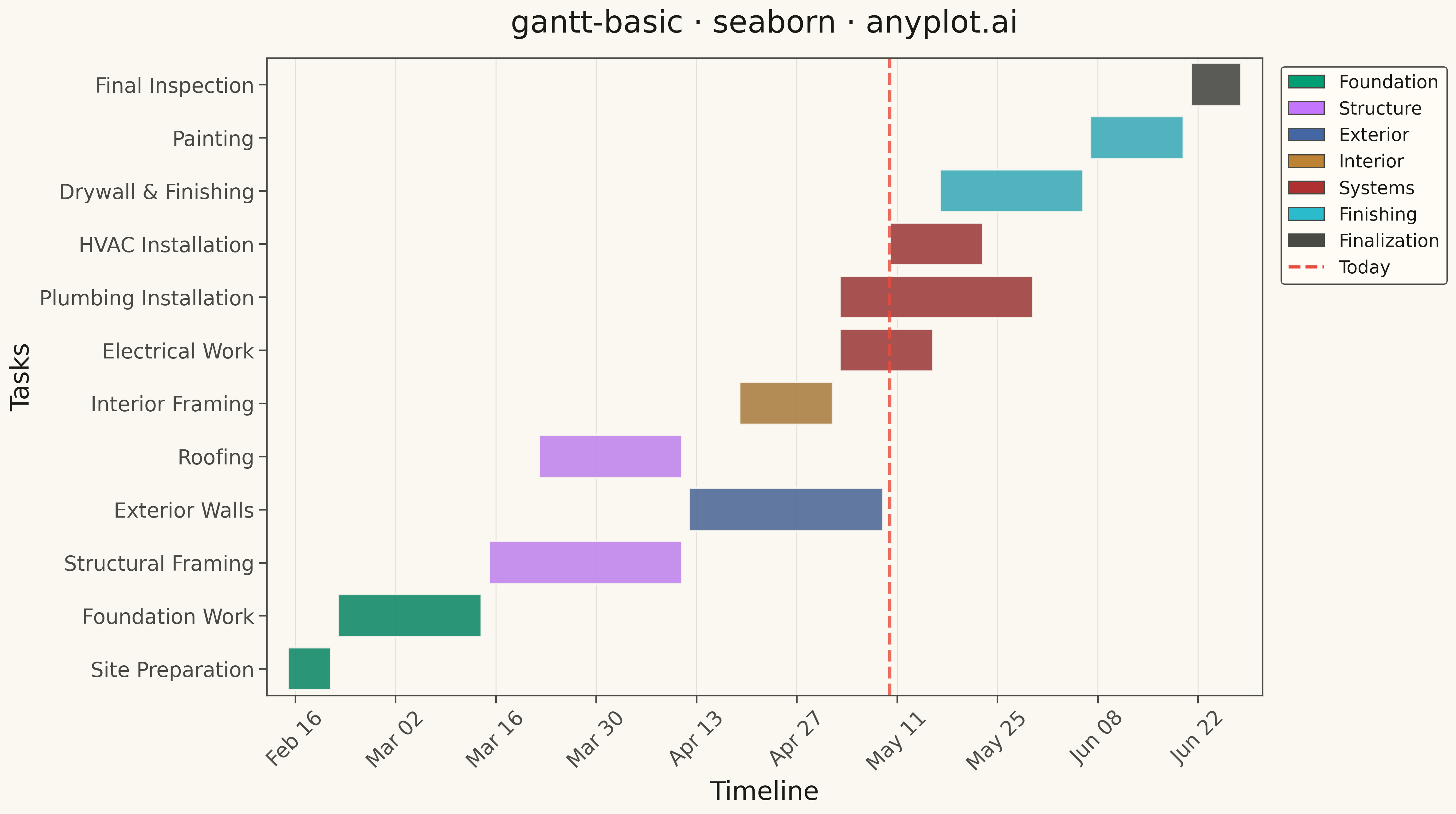
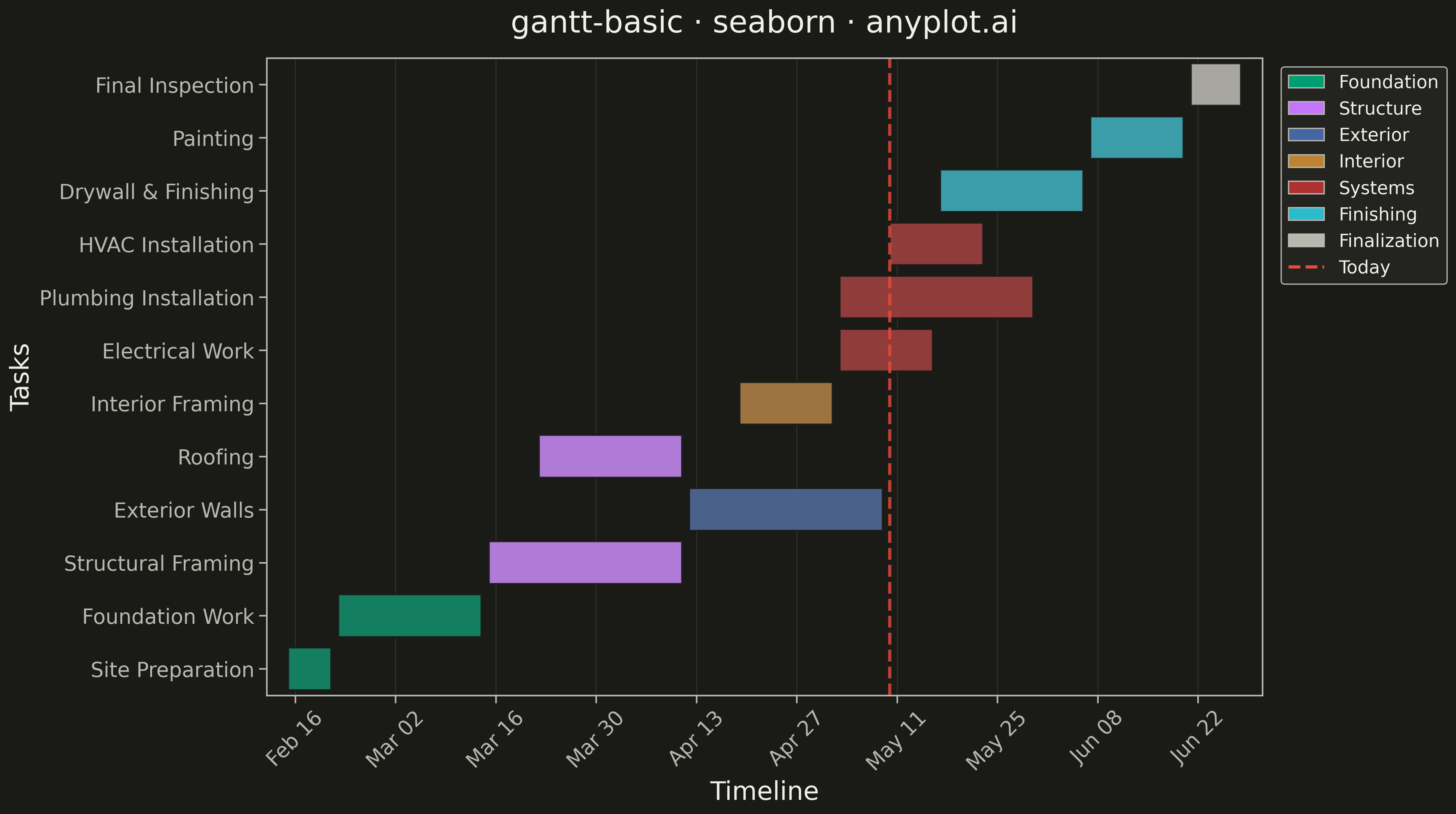
A Gantt chart is a horizontal bar chart that visualizes project schedules and timelines. Each task is represented as a horizontal bar spanning from its start date to end date, making it easy to see task durations, overlaps, and the overall project timeline at a glance. Gantt charts are essential for project management, helping teams understand task sequences and identify scheduling conflicts.
""" anyplot.ai
gantt-basic: Basic Gantt Chart
Library: seaborn 0.13.2 | Python 3.13.13
Quality: 91/100 | Updated: 2026-05-10
"""

import os
from datetime import datetime

import matplotlib.dates as mdates
import matplotlib.pyplot as plt
import pandas as pd
import seaborn as sns


THEME = os.getenv("ANYPLOT_THEME", "light")
PAGE_BG = "#FAF8F1" if THEME == "light" else "#1A1A17"
ELEVATED_BG = "#FFFDF6" if THEME == "light" else "#242420"
INK = "#1A1A17" if THEME == "light" else "#F0EFE8"
INK_SOFT = "#4A4A44" if THEME == "light" else "#B8B7B0"

IMPRINT = ["#009E73", "#C475FD", "#4467A3", "#BD8233", "#AE3030", "#2ABCCD"]

# Data - Construction Project Timeline starting mid-February
tasks_data = {
    "task": [
        "Site Preparation",
        "Foundation Work",
        "Structural Framing",
        "Roofing",
        "Exterior Walls",
        "Interior Framing",
        "Electrical Work",
        "Plumbing Installation",
        "HVAC Installation",
        "Drywall & Finishing",
        "Painting",
        "Final Inspection",
    ],
    "start": [
        "2026-02-15",
        "2026-02-22",
        "2026-03-15",
        "2026-04-12",
        "2026-03-22",
        "2026-04-19",
        "2026-05-03",
        "2026-05-03",
        "2026-05-10",
        "2026-05-17",
        "2026-06-07",
        "2026-06-21",
    ],
    "end": [
        "2026-02-21",
        "2026-03-14",
        "2026-04-11",
        "2026-05-02",
        "2026-04-18",
        "2026-05-02",
        "2026-05-16",
        "2026-05-30",
        "2026-05-23",
        "2026-06-06",
        "2026-06-20",
        "2026-06-28",
    ],
    "category": [
        "Foundation",
        "Foundation",
        "Structure",
        "Structure",
        "Exterior",
        "Interior",
        "Systems",
        "Systems",
        "Systems",
        "Finishing",
        "Finishing",
        "Finalization",
    ],
}

df = pd.DataFrame(tasks_data)
df["start"] = pd.to_datetime(df["start"])
df["end"] = pd.to_datetime(df["end"])
df["duration"] = (df["end"] - df["start"]).dt.days

df = df.sort_values("start").reset_index(drop=True)
df["start_num"] = mdates.date2num(df["start"])

# Set seaborn style with theme-adaptive colors
sns.set_theme(
    style="ticks",
    rc={
        "figure.facecolor": PAGE_BG,
        "axes.facecolor": PAGE_BG,
        "axes.edgecolor": INK_SOFT,
        "axes.labelcolor": INK,
        "text.color": INK,
        "xtick.color": INK_SOFT,
        "ytick.color": INK_SOFT,
        "grid.color": INK,
        "grid.alpha": 0.10,
        "legend.facecolor": ELEVATED_BG,
        "legend.edgecolor": INK_SOFT,
    },
)

# Category palette using Okabe-Ito
category_order = ["Foundation", "Structure", "Exterior", "Interior", "Systems", "Finishing", "Finalization"]
category_palette = {
    "Foundation": IMPRINT[0],
    "Structure": IMPRINT[1],
    "Exterior": IMPRINT[2],
    "Interior": IMPRINT[3],
    "Systems": IMPRINT[4],
    "Finishing": IMPRINT[5],
    "Finalization": INK_SOFT,
}

# Create plot
fig, ax = plt.subplots(figsize=(16, 9), facecolor=PAGE_BG)

# Use seaborn barplot with hue for category coloring
sns.barplot(
    data=df,
    y="task",
    x="duration",
    hue="category",
    hue_order=category_order,
    palette=category_palette,
    orient="h",
    dodge=False,
    ax=ax,
    edgecolor=PAGE_BG,
    linewidth=1.5,
    alpha=0.9,
    legend=False,
)

# Shift bars to start date positions
for bar, start_num in zip(ax.patches, df["start_num"], strict=True):
    bar.set_x(start_num)

# Format x-axis as dates
ax.xaxis_date()
ax.xaxis.set_major_formatter(mdates.DateFormatter("%b %d"))
ax.xaxis.set_major_locator(mdates.WeekdayLocator(byweekday=0, interval=2))

# Add current date indicator
today = datetime(2026, 5, 10)
ax.axvline(x=mdates.date2num(today), color="#E74C3C", linestyle="--", linewidth=2.5, label="Today", alpha=0.8)

# Styling
ax.set_xlabel("Timeline", fontsize=20, color=INK)
ax.set_ylabel("Tasks", fontsize=20, color=INK)
ax.set_title("gantt-basic · seaborn · anyplot.ai", fontsize=24, fontweight="medium", color=INK, pad=20)
ax.tick_params(axis="x", labelsize=16, colors=INK_SOFT, rotation=45)
ax.tick_params(axis="y", labelsize=16, colors=INK_SOFT)

# Remove y-axis grid, keep x-axis grid subtle
ax.grid(axis="x", alpha=0.10, linestyle="-", linewidth=0.8)

# Create legend positioned outside plot area
legend_elements = [
    plt.Rectangle((0, 0), 1, 1, facecolor=color, edgecolor=INK_SOFT, linewidth=1, label=cat)
    for cat, color in category_palette.items()
    if cat in df["category"].values
]
legend_elements.append(plt.Line2D([0], [0], color="#E74C3C", linestyle="--", linewidth=2.5, label="Today"))

ax.legend(handles=legend_elements, loc="upper left", bbox_to_anchor=(1.01, 1), fontsize=14, framealpha=0.95)

# Invert y-axis to have first task at top
ax.invert_yaxis()

# Set x-axis limits with padding
date_min = df["start"].min() - pd.Timedelta(days=3)
date_max = df["end"].max() + pd.Timedelta(days=3)
ax.set_xlim(mdates.date2num(date_min), mdates.date2num(date_max))

plt.tight_layout()
plt.savefig(f"plot-{THEME}.png", dpi=300, bbox_inches="tight", facecolor=PAGE_BG)
Runnable source as JSON, for any HTTP client: https://api.anyplot.ai/specs/gantt-basic/seaborn/code. Any spec id and library id listed in llms-full.txt fit the same URL shape; every URL below is complete and callable.
{
  "spec_id": "gantt-basic",
  "language": "python",
  "library": "seaborn",
  "page": "https://anyplot.ai/gantt-basic/python/seaborn",
  "hub": "https://anyplot.ai/gantt-basic",
  "code_json": "https://api.anyplot.ai/specs/gantt-basic/seaborn/code",
  "spec_json": "https://api.anyplot.ai/specs/gantt-basic",
  "render_light_png": "https://storage.googleapis.com/anyplot-images/plots/gantt-basic/python/seaborn/plot-light.png",
  "render_dark_png": "https://storage.googleapis.com/anyplot-images/plots/gantt-basic/python/seaborn/plot-dark.png",
  "quality_score": 91.0,
  "license": "MIT",
  "guide": "https://anyplot.ai/llms.txt"
}
Part of Basic Gantt Chart on anyplot.ai.