The same plot in 14 other libraries — JavaScript: Chart.js, D3.js, Highcharts, MUI X Charts; Python: Altair, Bokeh, lets-plot, Matplotlib, Plotly, plotnine, Pygal, Seaborn; R: ggplot2; Julia: Makie.jl. Compare all 15 side by side: Basic Gauge Chart in Python, R, Julia and JavaScript.
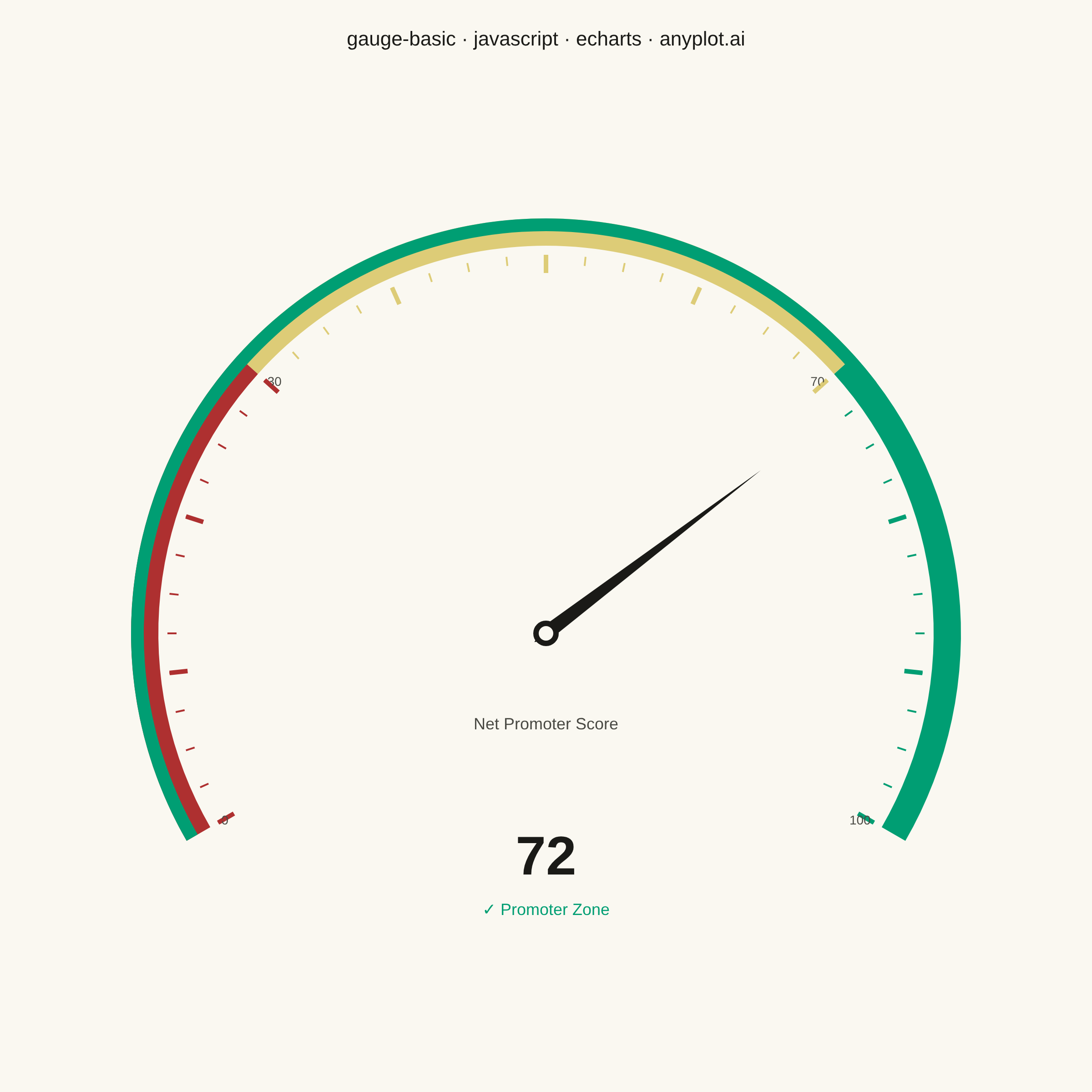
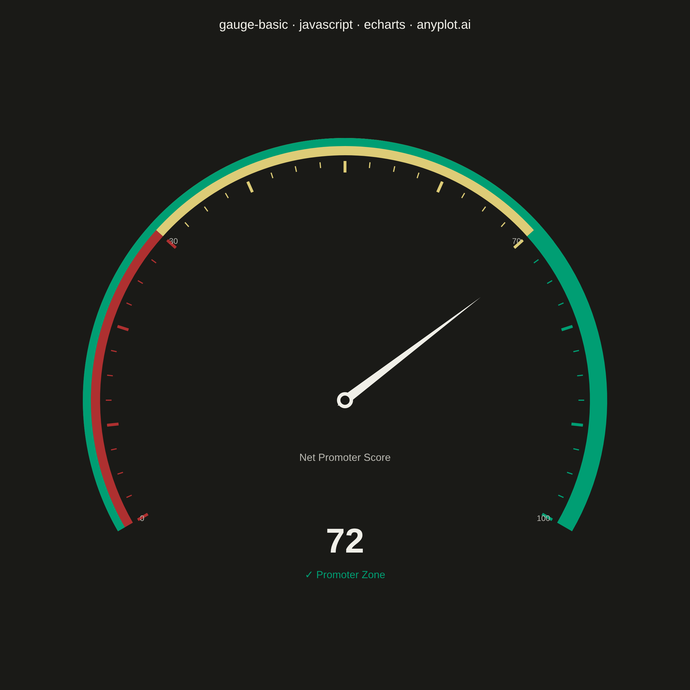
A gauge chart (also known as a speedometer chart) displays a single value within a defined range using a semi-circular or circular dial. It is ideal for showing progress toward a goal, performance metrics, or any KPI that needs to be evaluated against minimum and maximum bounds. The visual metaphor of a speedometer makes it intuitive to quickly assess whether a value is in an acceptable range.
// anyplot.ai
// gauge-basic: Basic Gauge Chart
// Library: echarts 5.5.1 | JavaScript 22.23.0
// Quality: 91/100 | Created: 2026-06-30

//# anyplot-orientation: square

const t = window.ANYPLOT_TOKENS;

// Net Promoter Score — Q2 2026 customer satisfaction survey (scale 0–100)
const score = 72;
const zoneLabel = score >= 70 ? "✓ Promoter Zone"
               : score >= 30 ? "◎ Passive Zone"
               : "✗ Detractor Zone";
const zoneColor = score >= 70 ? "#009E73"
               : score >= 30 ? "#DDCC77"
               : "#AE3030";

const chart = echarts.init(document.getElementById("container"));

chart.setOption({
  animation: false,
  backgroundColor: "transparent",
  title: {
    text: "gauge-basic · javascript · echarts · anyplot.ai",
    left: "center",
    top: 28,
    textStyle: { color: t.ink, fontSize: 22, fontWeight: "normal" },
  },
  series: [
    {
      type: "gauge",
      center: ["50%", "58%"],
      radius: "76%",
      min: 0,
      max: 100,
      startAngle: 210,
      endAngle: -30,
      splitNumber: 10,
      axisLine: {
        lineStyle: {
          width: 30,
          color: [
            [0.3, "#AE3030"],  // 0–30: poor (matte red)
            [0.7, "#DDCC77"],  // 30–70: fair (amber)
            [1.0, "#009E73"],  // 70–100: good (brand green)
          ],
        },
      },
      progress: {
        show: true,
        width: 14,
        itemStyle: { color: t.palette[0] },
      },
      pointer: {
        length: "65%",
        width: 8,
        itemStyle: { color: t.ink },
      },
      axisTick: {
        splitNumber: 4,
        length: 10,
        lineStyle: { color: "auto", width: 2 },
      },
      splitLine: {
        length: 20,
        lineStyle: { color: "auto", width: 5 },
      },
      axisLabel: {
        color: t.inkSoft,
        fontSize: 14,
        distance: 14,
        formatter: function (value) {
          const zones = [0, 30, 70, 100];
          return zones.includes(Number(value)) ? value : "";
        },
      },
      anchor: {
        show: true,
        showAbove: true,
        size: 22,
        itemStyle: {
          borderWidth: 6,
          borderColor: t.ink,
          color: t.pageBg,
        },
      },
      title: {
        offsetCenter: [0, "22%"],
        fontSize: 18,
        color: t.inkSoft,
        fontWeight: "normal",
      },
      detail: {
        valueAnimation: false,
        offsetCenter: [0, "58%"],
        formatter: function (value) {
          return `{val|${value}}\n{lbl|${zoneLabel}}`;
        },
        rich: {
          val: { fontSize: 60, fontWeight: "bold", color: t.ink, lineHeight: 80 },
          lbl: { fontSize: 18, color: zoneColor, lineHeight: 32 },
        },
        color: t.ink,
      },
      data: [{ value: score, name: "Net Promoter Score" }],
    },
  ],
});
Runnable source as JSON, for any HTTP client: https://api.anyplot.ai/specs/gauge-basic/echarts/code. Any spec id and library id listed in llms-full.txt fit the same URL shape; every URL below is complete and callable.
{
  "spec_id": "gauge-basic",
  "language": "javascript",
  "library": "echarts",
  "page": "https://anyplot.ai/gauge-basic/javascript/echarts",
  "hub": "https://anyplot.ai/gauge-basic",
  "code_json": "https://api.anyplot.ai/specs/gauge-basic/echarts/code",
  "spec_json": "https://api.anyplot.ai/specs/gauge-basic",
  "render_light_png": "https://storage.googleapis.com/anyplot-images/plots/gauge-basic/javascript/echarts/plot-light.png",
  "render_dark_png": "https://storage.googleapis.com/anyplot-images/plots/gauge-basic/javascript/echarts/plot-dark.png",
  "interactive_light_html": "https://storage.googleapis.com/anyplot-images/plots/gauge-basic/javascript/echarts/plot-light.html",
  "interactive_dark_html": "https://storage.googleapis.com/anyplot-images/plots/gauge-basic/javascript/echarts/plot-dark.html",
  "quality_score": 91.0,
  "license": "MIT",
  "guide": "https://anyplot.ai/llms.txt"
}
Part of Basic Gauge Chart on anyplot.ai.