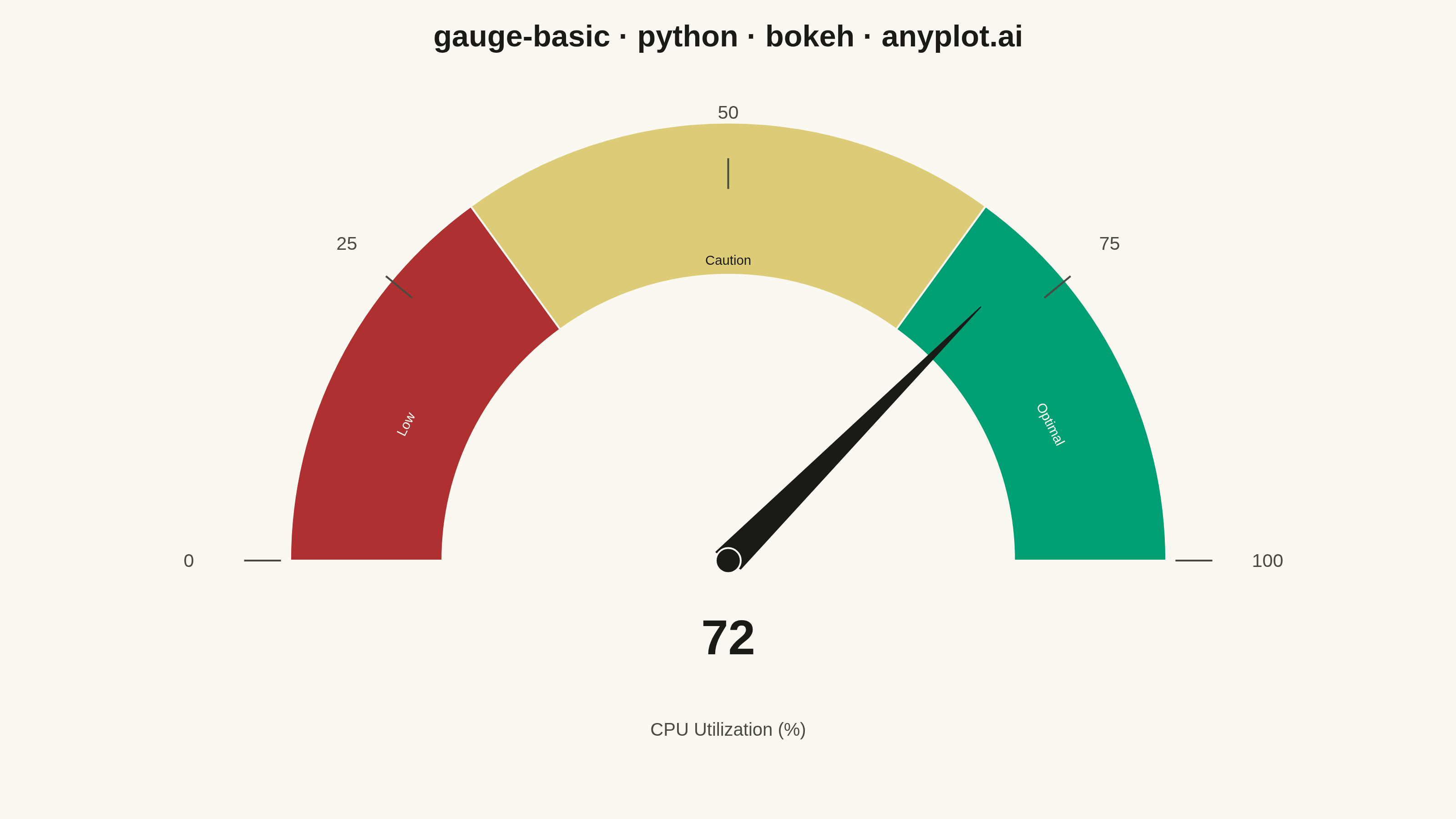
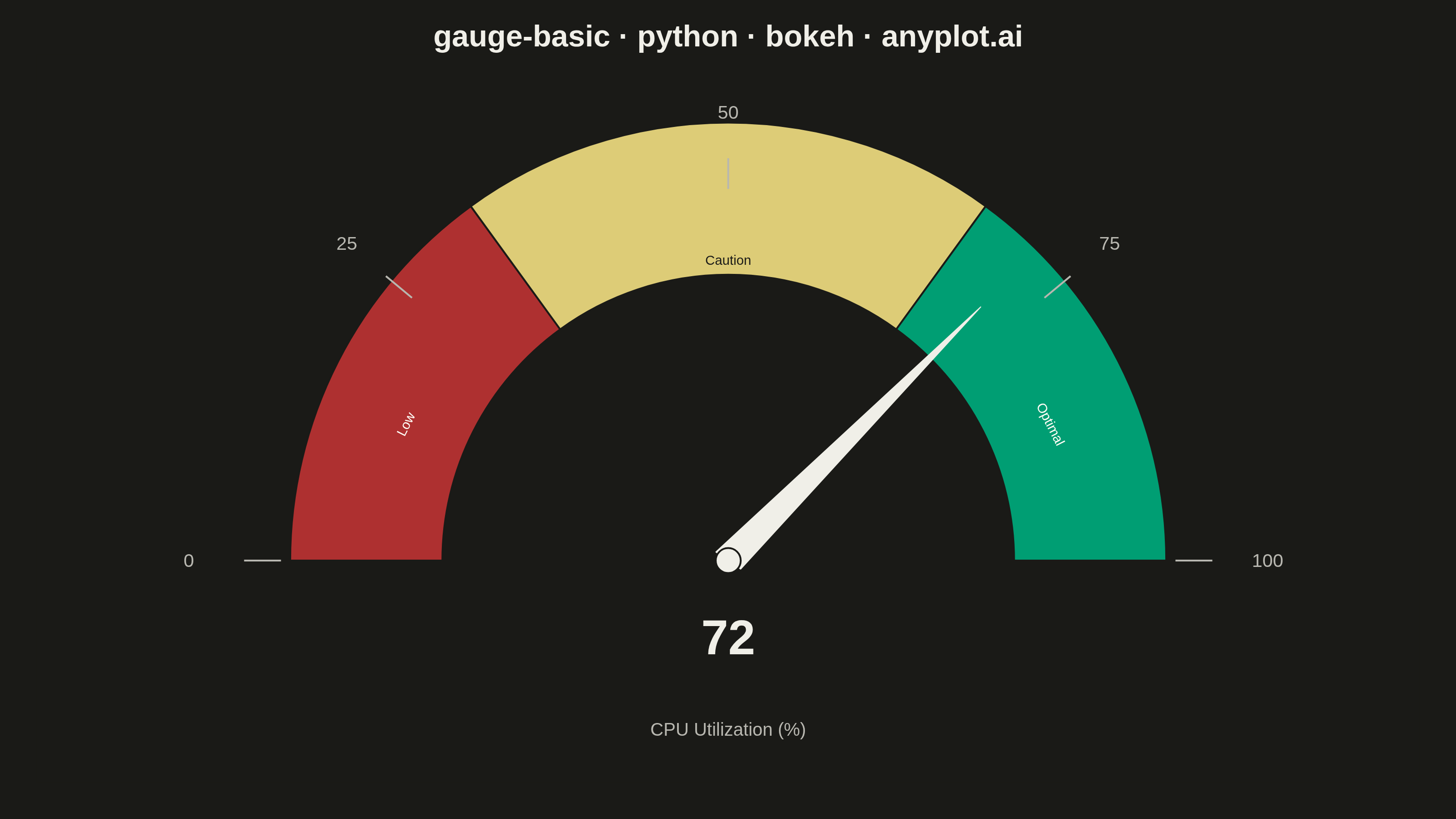
A gauge chart (also known as a speedometer chart) displays a single value within a defined range using a semi-circular or circular dial. It is ideal for showing progress toward a goal, performance metrics, or any KPI that needs to be evaluated against minimum and maximum bounds. The visual metaphor of a speedometer makes it intuitive to quickly assess whether a value is in an acceptable range.
""" anyplot.ai
gauge-basic: Basic Gauge Chart
Library: bokeh 3.9.1 | Python 3.13.14
Quality: 89/100 | Updated: 2026-06-30
"""

import os
import sys
import time
from pathlib import Path


# Remove script's own directory from sys.path to prevent self-shadowing
# (this file is named bokeh.py; without this, `import bokeh` would find itself)
_here = os.path.dirname(os.path.abspath(__file__))
sys.path = [p for p in sys.path if os.path.abspath(p or ".") != _here]

import numpy as np
from bokeh.io import output_file, save
from bokeh.models import ColumnDataSource, HoverTool, Label
from bokeh.plotting import figure
from selenium import webdriver
from selenium.webdriver.chrome.options import Options


# Theme tokens
THEME = os.getenv("ANYPLOT_THEME", "light")
PAGE_BG = "#FAF8F1" if THEME == "light" else "#1A1A17"
ELEVATED_BG = "#FFFDF6" if THEME == "light" else "#242420"
INK = "#1A1A17" if THEME == "light" else "#F0EFE8"
INK_SOFT = "#4A4A44" if THEME == "light" else "#B8B7B0"

# Imprint zone colors — semantic convention: red=bad, amber=caution, green=good
ZONE_LOW = "#AE3030"  # Imprint matte red
ZONE_MID = "#DDCC77"  # Imprint amber
ZONE_HIGH = "#009E73"  # Imprint brand green

# Data — CPU utilization
value = 72
min_value = 0
max_value = 100
thresholds = [30, 70]

# Gauge geometry
center_x, center_y = 0.0, 0.0
outer_radius = 0.95
inner_radius = 0.62
arc_mid_radius = (inner_radius + outer_radius) / 2  # label midpoint inside arc
needle_length = 0.86
start_angle = np.pi  # leftmost position (180°)

# Map data values onto the semi-circle (pi → 0 radians)
zone_bounds = np.array([min_value] + thresholds + [max_value])
zone_angles = start_angle - (zone_bounds - min_value) / (max_value - min_value) * np.pi

tick_values = np.array([0, 25, 50, 75, 100])
tick_angles = start_angle - (tick_values - min_value) / (max_value - min_value) * np.pi

needle_angle = start_angle - (value - min_value) / (max_value - min_value) * np.pi

# Figure — landscape canvas; toolbar_location=None prevents height bloat in screenshot
W, H = 3200, 1800
p = figure(
    width=W,
    height=H,
    title="gauge-basic · python · bokeh · anyplot.ai",
    x_range=(-1.5, 1.5),
    y_range=(-0.58, 1.32),
    tools="",
    toolbar_location=None,
    background_fill_color=PAGE_BG,
    border_fill_color=PAGE_BG,
    outline_line_color=None,
    min_border_bottom=80,
    min_border_left=80,
    min_border_top=120,
    min_border_right=80,
)
p.axis.visible = False
p.grid.visible = False
p.outline_line_color = None

p.title.text_font_size = "50pt"
p.title.text_color = INK
p.title.align = "center"

# Zone arcs via annular_wedge — ColumnDataSource enables HoverTool
zone_colors = [ZONE_LOW, ZONE_MID, ZONE_HIGH]
zone_names = ["Low", "Caution", "Optimal"]
zone_ranges = ["0–30", "30–70", "70–100"]

zone_source = ColumnDataSource(
    data={
        "x": [center_x, center_x, center_x],
        "y": [center_y, center_y, center_y],
        "inner_radius": [inner_radius, inner_radius, inner_radius],
        "outer_radius": [outer_radius, outer_radius, outer_radius],
        "start_angle": [float(zone_angles[1]), float(zone_angles[2]), float(zone_angles[3])],
        "end_angle": [float(zone_angles[0]), float(zone_angles[1]), float(zone_angles[2])],
        "fill_color": zone_colors,
        "zone": zone_names,
        "range": zone_ranges,
    }
)

zone_renderer = p.annular_wedge(
    x="x",
    y="y",
    inner_radius="inner_radius",
    outer_radius="outer_radius",
    start_angle="start_angle",
    end_angle="end_angle",
    fill_color="fill_color",
    line_color=PAGE_BG,
    line_width=4,
    source=zone_source,
)

p.add_tools(HoverTool(renderers=[zone_renderer], tooltips=[("Zone", "@zone"), ("Range", "@range")]))

# Zone labels inside each arc segment — contrasting fixed colors (zones are theme-invariant)
# red/green zones get light text; amber zone gets dark text for contrast
zone_mid_values = [15.0, 50.0, 85.0]
zone_label_colors = ["#FFFDF6", "#1A1A17", "#FFFDF6"]

for mid_val, label_text, label_color in zip(zone_mid_values, zone_names, zone_label_colors, strict=True):
    a = start_angle - (mid_val / max_value) * np.pi
    lx = arc_mid_radius * np.cos(a)
    ly = arc_mid_radius * np.sin(a)
    p.add_layout(
        Label(
            x=lx,
            y=ly,
            text=label_text,
            text_font_size="22pt",
            text_color=label_color,
            text_align="center",
            text_baseline="middle",
            angle=float(a - np.pi / 2),  # tangent along arc for natural text flow
        )
    )

# Tick marks and labels
for tick_val, a in zip(tick_values, tick_angles, strict=True):
    cos_a, sin_a = np.cos(a), np.sin(a)

    p.line(
        [center_x + (outer_radius + 0.02) * cos_a, center_x + (outer_radius + 0.10) * cos_a],
        [center_y + (outer_radius + 0.02) * sin_a, center_y + (outer_radius + 0.10) * sin_a],
        line_color=INK_SOFT,
        line_width=4,
    )

    p.add_layout(
        Label(
            x=center_x + (outer_radius + 0.22) * cos_a,
            y=center_y + (outer_radius + 0.22) * sin_a,
            text=str(tick_val),
            text_font_size="31pt",
            text_color=INK_SOFT,
            text_align="center",
            text_baseline="middle",
        )
    )

# Needle (triangle pointing to current value)
needle_tip_x = center_x + needle_length * np.cos(needle_angle)
needle_tip_y = center_y + needle_length * np.sin(needle_angle)
half_base = 0.035
perp = needle_angle + np.pi / 2
base1_x = center_x + half_base * np.cos(perp)
base1_y = center_y + half_base * np.sin(perp)
base2_x = center_x - half_base * np.cos(perp)
base2_y = center_y - half_base * np.sin(perp)

p.patch(
    [base1_x, needle_tip_x, base2_x], [base1_y, needle_tip_y, base2_y], fill_color=INK, line_color=INK, line_width=2
)

# Center hub
p.scatter(x=[center_x], y=[center_y], size=55, marker="circle", fill_color=INK, line_color=PAGE_BG, line_width=4)

# Value display
p.add_layout(
    Label(
        x=center_x,
        y=-0.20,
        text=str(value),
        text_font_size="80pt",
        text_color=INK,
        text_align="center",
        text_baseline="middle",
        text_font_style="bold",
    )
)

# Metric label
p.add_layout(
    Label(
        x=center_x,
        y=-0.44,
        text="CPU Utilization (%)",
        text_font_size="30pt",
        text_color=INK_SOFT,
        text_align="center",
        text_baseline="middle",
    )
)

# Save interactive HTML
html_path = Path(f"plot-{THEME}.html")
output_file(str(html_path))
save(p)

# Inject body background CSS to prevent thin border artifact in headless-Chrome screenshot
html_content = html_path.read_text()
body_style = f"<style>body{{margin:0;padding:0;background:{PAGE_BG};}}</style>"
html_content = html_content.replace("</head>", f"{body_style}\n</head>", 1)
html_path.write_text(html_content)

# Screenshot via headless Chrome — use CDP to set exact viewport to match figure dimensions
opts = Options()
for arg in (
    "--headless=new",
    "--no-sandbox",
    "--disable-dev-shm-usage",
    "--disable-gpu",
    f"--window-size={W},{H}",
    "--hide-scrollbars",
):
    opts.add_argument(arg)
driver = webdriver.Chrome(options=opts)
driver.execute_cdp_cmd(
    "Emulation.setDeviceMetricsOverride", {"width": W, "height": H, "deviceScaleFactor": 1, "mobile": False}
)
driver.get(f"file://{html_path.resolve()}")
time.sleep(3)
driver.save_screenshot(f"plot-{THEME}.png")
driver.quit()
Runnable source as JSON, for any HTTP client: https://api.anyplot.ai/specs/gauge-basic/bokeh/code. Any spec id and library id listed in llms-full.txt fit the same URL shape; every URL below is complete and callable.
{
  "spec_id": "gauge-basic",
  "language": "python",
  "library": "bokeh",
  "page": "https://anyplot.ai/gauge-basic/python/bokeh",
  "hub": "https://anyplot.ai/gauge-basic",
  "code_json": "https://api.anyplot.ai/specs/gauge-basic/bokeh/code",
  "spec_json": "https://api.anyplot.ai/specs/gauge-basic",
  "render_light_png": "https://storage.googleapis.com/anyplot-images/plots/gauge-basic/python/bokeh/plot-light.png",
  "render_dark_png": "https://storage.googleapis.com/anyplot-images/plots/gauge-basic/python/bokeh/plot-dark.png",
  "interactive_light_html": "https://storage.googleapis.com/anyplot-images/plots/gauge-basic/python/bokeh/plot-light.html",
  "interactive_dark_html": "https://storage.googleapis.com/anyplot-images/plots/gauge-basic/python/bokeh/plot-dark.html",
  "quality_score": 89.0,
  "license": "MIT",
  "guide": "https://anyplot.ai/llms.txt"
}
Part of Basic Gauge Chart on anyplot.ai.