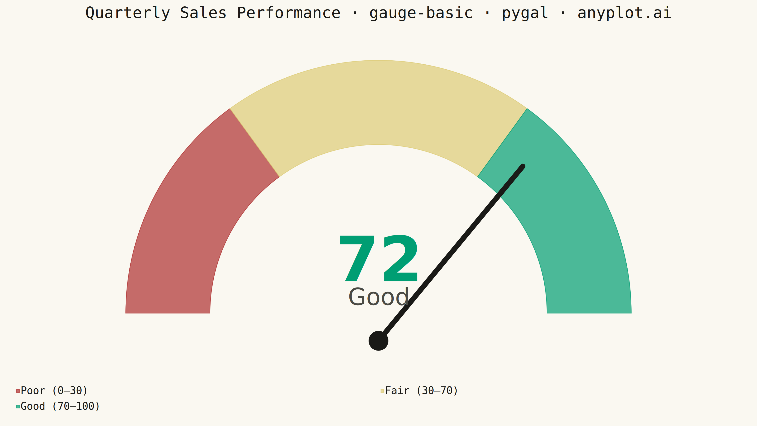
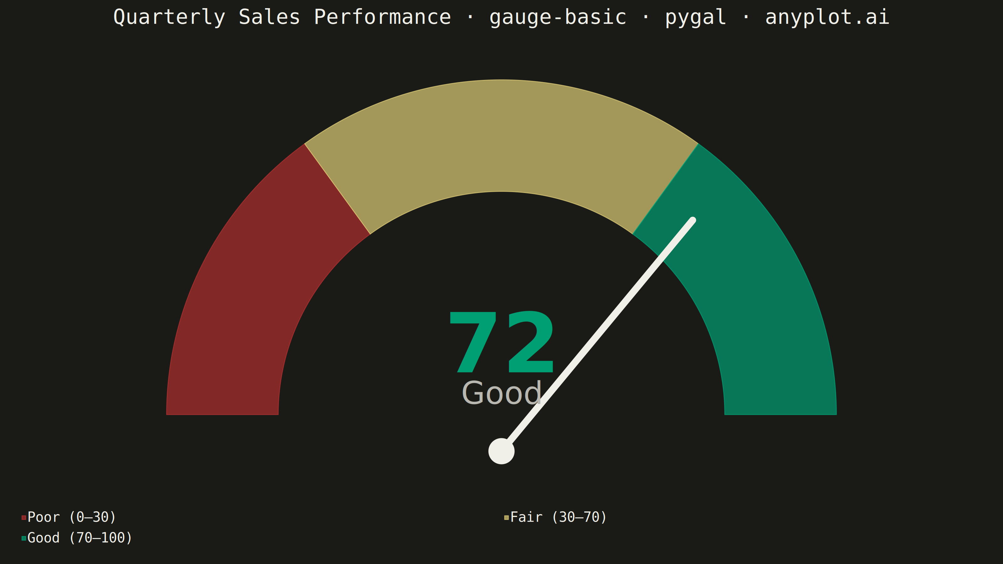
A gauge chart (also known as a speedometer chart) displays a single value within a defined range using a semi-circular or circular dial. It is ideal for showing progress toward a goal, performance metrics, or any KPI that needs to be evaluated against minimum and maximum bounds. The visual metaphor of a speedometer makes it intuitive to quickly assess whether a value is in an acceptable range.
""" anyplot.ai
gauge-basic: Basic Gauge Chart
Library: pygal 3.1.3 | Python 3.13.14
Quality: 90/100 | Updated: 2026-06-30
"""

import math
import os
import re
import sys
from pathlib import Path


# Remove script directory from path to avoid name collision with the pygal package
_script_dir = str(Path(__file__).parent)
sys.path = [p for p in sys.path if p != _script_dir]

import pygal
from pygal.style import Style


# Theme tokens
THEME = os.getenv("ANYPLOT_THEME", "light")
PAGE_BG = "#FAF8F1" if THEME == "light" else "#1A1A17"
INK = "#1A1A17" if THEME == "light" else "#F0EFE8"
INK_SOFT = "#4A4A44" if THEME == "light" else "#B8B7B0"
INK_MUTED = "#6B6A63" if THEME == "light" else "#A8A79F"

# Data — quarterly sales performance against an annual target (Q3 2024)
value = 72
min_value = 0
max_value = 100
thresholds = [30, 70]

# Semantic zone colors: bad → warn → good (Imprint traffic-light anchors)
ZONE_COLORS = ("#AE3030", "#DDCC77", "#009E73")

zone_label = "Poor" if value < thresholds[0] else "Fair" if value < thresholds[1] else "Good"
zone_color = "#AE3030" if value < thresholds[0] else "#DDCC77" if value < thresholds[1] else "#009E73"

# Stable descriptive title (does not embed runtime zone/value strings)
_title = "Quarterly Sales Performance · gauge-basic · pygal · anyplot.ai"
# Scale font size down only when title exceeds the 67-char reference length
_title_fs = max(44, round(66 * 67 / max(len(_title), 67)))

# Zone widths for the half-pie arcs (sum = max_value)
_poor_w = thresholds[0] - min_value  # 30
_fair_w = thresholds[1] - thresholds[0]  # 40
_good_w = max_value - thresholds[1]  # 30

custom_style = Style(
    background=PAGE_BG,
    plot_background=PAGE_BG,
    foreground=INK,
    foreground_strong=INK,
    foreground_subtle=INK_MUTED,
    colors=ZONE_COLORS,
    title_font_size=_title_fs,
    label_font_size=56,
    major_label_font_size=44,
    legend_font_size=44,
    value_font_size=36,
    stroke_width=2.5,
)

chart = pygal.Pie(
    width=3200,
    height=1800,
    title=_title,
    style=custom_style,
    half_pie=True,
    inner_radius=0.60,
    show_legend=True,
    legend_at_bottom=True,
    print_values=False,
    margin=60,
    # Rich tooltip labels for the interactive HTML export (LM-02)
    value_formatter=lambda x: f"Span: {int(x)} pts of {max_value}",
)

chart.add(f"Poor  (0–{thresholds[0]})", _poor_w)
chart.add(f"Fair  ({thresholds[0]}–{thresholds[1]})", _fair_w)
chart.add(f"Good  ({thresholds[1]}–{max_value})", _good_w)

# Render to SVG, then inject needle + prominent value label (fixes SC-01, SC-02)
svg_str = chart.render().decode("utf-8")

# Extract the half-pie center (CX, CY) and outer radius from the SVG path data.
# pygal pie slices start from the center: d="M cx cy L ..."
# The arc command carries the radius: A rx ry ...
_path_match = re.search(r'd="M\s+([\d.]+)\s+([\d.]+)\s+L[\s\d.,\-]+A\s+([\d.]+)\s+\3', svg_str)
if _path_match:
    CX = float(_path_match.group(1))
    CY = float(_path_match.group(2))
    R_OUTER = float(_path_match.group(3))
else:
    # Fallback geometry for 3200×1800, margin=60, legend_at_bottom
    CX, CY, R_OUTER = 1600.0, 1440.0, 1100.0

R_INNER = R_OUTER * 0.60  # matches inner_radius=0.60

# Needle: value 0 → left (180°), value 100 → right (0°)
angle_rad = math.radians(180.0 - (value / max_value) * 180.0)
tip_x = CX + R_OUTER * 0.87 * math.cos(angle_rad)
tip_y = CY - R_OUTER * 0.87 * math.sin(angle_rad)

# Prominent value label centered in the inner donut area
val_y = CY - R_INNER * 0.52
lbl_y = val_y + 0.24 * R_INNER

overlay = (
    f'<g id="value-overlay">'
    f'<line x1="{CX:.1f}" y1="{CY:.1f}" x2="{tip_x:.1f}" y2="{tip_y:.1f}"'
    f' stroke="{INK}" stroke-width="22" stroke-linecap="round"/>'
    f'<circle cx="{CX:.1f}" cy="{CY:.1f}" r="{R_OUTER * 0.038:.1f}" fill="{INK}"/>'
    f'<text x="{CX:.1f}" y="{val_y:.1f}" text-anchor="middle"'
    f' dominant-baseline="middle" font-size="{R_INNER * 0.40:.0f}"'
    f' font-weight="bold" fill="{zone_color}" font-family="sans-serif">{value}</text>'
    f'<text x="{CX:.1f}" y="{lbl_y:.1f}" text-anchor="middle"'
    f' dominant-baseline="middle" font-size="{R_INNER * 0.15:.0f}"'
    f' fill="{INK_SOFT}" font-family="sans-serif">{zone_label}</text>'
    f"</g>"
)

close_idx = svg_str.rfind("</svg>")
modified_svg = svg_str[:close_idx] + overlay + svg_str[close_idx:]

import cairosvg


cairosvg.svg2png(bytestring=modified_svg.encode("utf-8"), write_to=f"plot-{THEME}.png")

# HTML: modified SVG preserves both JS interactivity and the value overlay
with open(f"plot-{THEME}.html", "w", encoding="utf-8") as f:
    f.write(modified_svg)
Runnable source as JSON, for any HTTP client: https://api.anyplot.ai/specs/gauge-basic/pygal/code. Any spec id and library id listed in llms-full.txt fit the same URL shape; every URL below is complete and callable.
{
  "spec_id": "gauge-basic",
  "language": "python",
  "library": "pygal",
  "page": "https://anyplot.ai/gauge-basic/python/pygal",
  "hub": "https://anyplot.ai/gauge-basic",
  "code_json": "https://api.anyplot.ai/specs/gauge-basic/pygal/code",
  "spec_json": "https://api.anyplot.ai/specs/gauge-basic",
  "render_light_png": "https://storage.googleapis.com/anyplot-images/plots/gauge-basic/python/pygal/plot-light.png",
  "render_dark_png": "https://storage.googleapis.com/anyplot-images/plots/gauge-basic/python/pygal/plot-dark.png",
  "interactive_light_html": "https://storage.googleapis.com/anyplot-images/plots/gauge-basic/python/pygal/plot-light.html",
  "interactive_dark_html": "https://storage.googleapis.com/anyplot-images/plots/gauge-basic/python/pygal/plot-dark.html",
  "quality_score": 90.0,
  "license": "MIT",
  "guide": "https://anyplot.ai/llms.txt"
}
Part of Basic Gauge Chart on anyplot.ai.