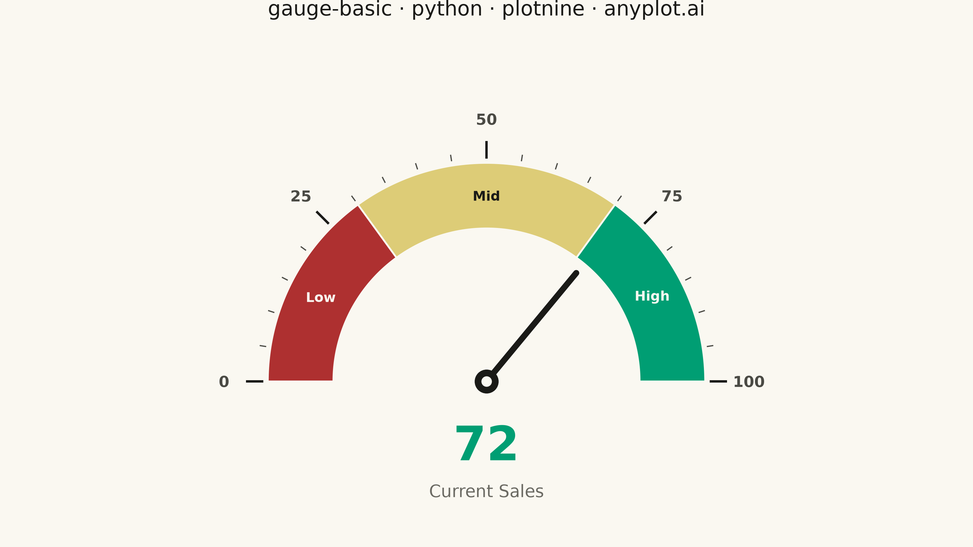
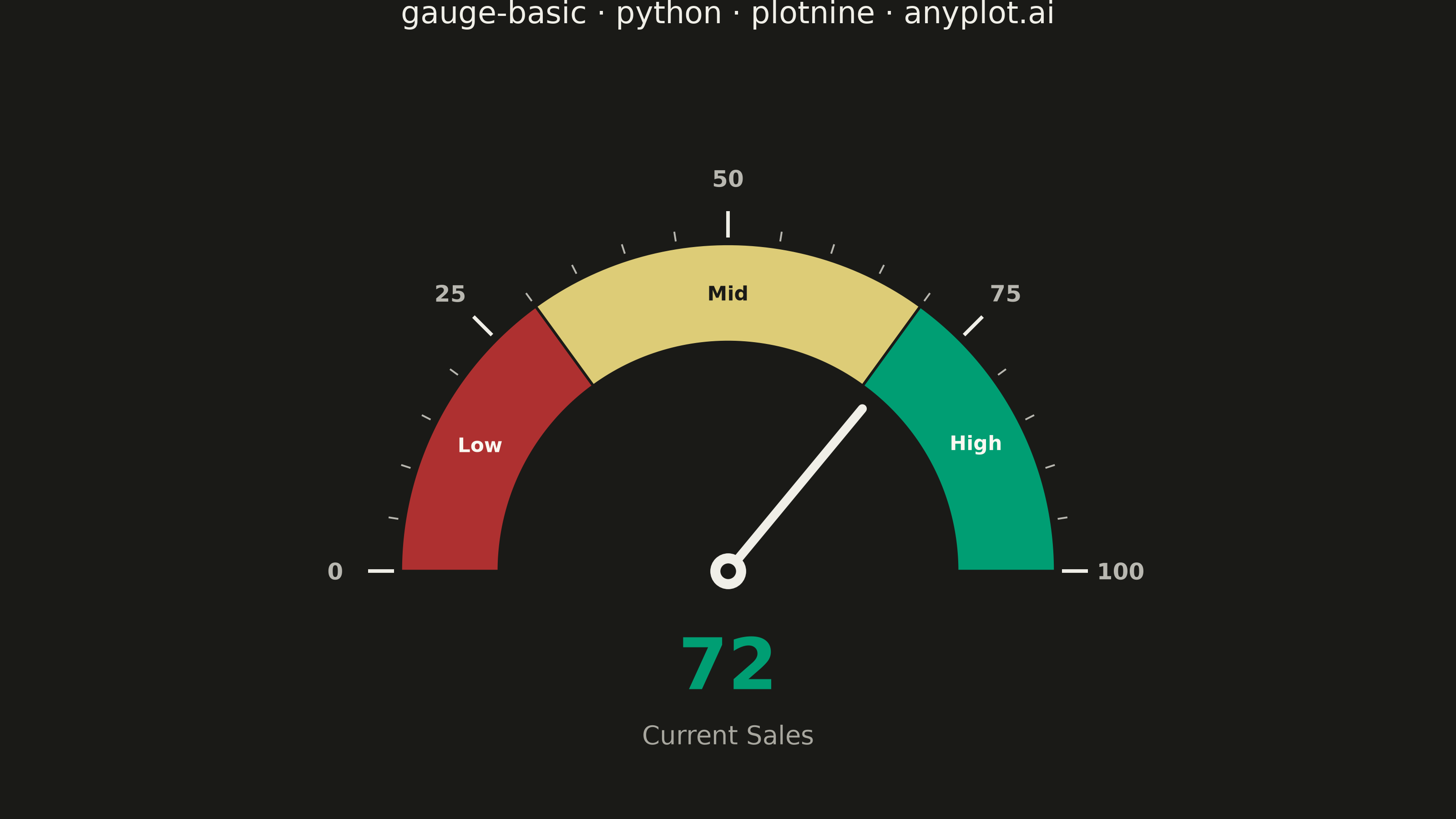
A gauge chart (also known as a speedometer chart) displays a single value within a defined range using a semi-circular or circular dial. It is ideal for showing progress toward a goal, performance metrics, or any KPI that needs to be evaluated against minimum and maximum bounds. The visual metaphor of a speedometer makes it intuitive to quickly assess whether a value is in an acceptable range.
""" anyplot.ai
gauge-basic: Basic Gauge Chart
Library: plotnine 0.15.7 | Python 3.13.14
Quality: 88/100 | Created: 2026-06-30
"""

import os
import sys


# Avoid name collision: drop this script's directory from sys.path
# so `from plotnine import ...` resolves to the installed package.
_HERE = os.path.dirname(os.path.abspath(__file__))
sys.path = [p for p in sys.path if os.path.abspath(p) != _HERE]

import numpy as np
import pandas as pd
from plotnine import (
    aes,
    coord_fixed,
    element_blank,
    element_rect,
    element_text,
    geom_point,
    geom_polygon,
    geom_segment,
    geom_text,
    ggplot,
    labs,
    scale_color_identity,
    scale_fill_manual,
    theme,
    theme_void,
)


# Theme tokens
THEME = os.getenv("ANYPLOT_THEME", "light")
PAGE_BG = "#FAF8F1" if THEME == "light" else "#1A1A17"
INK = "#1A1A17" if THEME == "light" else "#F0EFE8"
INK_SOFT = "#4A4A44" if THEME == "light" else "#B8B7B0"
INK_MUTED = "#6B6A63" if THEME == "light" else "#A8A79F"

# Imprint palette semantic anchors for traffic-light zones
ZONE_BAD = "#AE3030"  # Imprint position 5 — matte red (semantic bad/loss)
ZONE_WARN = "#DDCC77"  # Imprint amber warning anchor
ZONE_GOOD = "#009E73"  # Imprint position 1 — brand green
ZONE_COLORS = [ZONE_BAD, ZONE_WARN, ZONE_GOOD]

# Zone label text colors that contrast against each zone fill
# Data colors are theme-stable, so these text colors are static too
ZONE_LABEL_COLORS = ["#FAF8F1", "#1A1A17", "#FAF8F1"]
ZONE_NAMES = ["Low", "Mid", "High"]

# Data
value = 72
min_value = 0
max_value = 100
thresholds = [30, 70]

# Geometry parameters
inner_radius = 0.70
outer_radius = 1.00
start_angle = np.pi
end_angle = 0.0

# Zone arc polygons
zone_bounds = [min_value, *thresholds, max_value]
zone_records = []
for i in range(len(ZONE_COLORS)):
    start_pct = (zone_bounds[i] - min_value) / (max_value - min_value)
    end_pct = (zone_bounds[i + 1] - min_value) / (max_value - min_value)
    start_ang = start_angle - start_pct * (start_angle - end_angle)
    end_ang = start_angle - end_pct * (start_angle - end_angle)
    n_pts = 60
    angles_outer = np.linspace(start_ang, end_ang, n_pts)
    angles_inner = np.linspace(end_ang, start_ang, n_pts)
    xs = np.concatenate([outer_radius * np.cos(angles_outer), inner_radius * np.cos(angles_inner)])
    ys = np.concatenate([outer_radius * np.sin(angles_outer), inner_radius * np.sin(angles_inner)])
    for j in range(len(xs)):
        zone_records.append({"x": xs[j], "y": ys[j], "zone": str(i)})

df_zones = pd.DataFrame(zone_records)

# Zone labels at arc midpoints — plotnine geom_text + scale_color_identity
arc_mid_radius = (inner_radius + outer_radius) / 2  # 0.85
zone_label_rows = []
for i in range(len(ZONE_COLORS)):
    mid_pct = (zone_bounds[i] + zone_bounds[i + 1]) / 2 / (max_value - min_value)
    ang = start_angle - mid_pct * (start_angle - end_angle)
    zone_label_rows.append(
        {
            "x": arc_mid_radius * np.cos(ang),
            "y": arc_mid_radius * np.sin(ang),
            "label": ZONE_NAMES[i],
            "text_color": ZONE_LABEL_COLORS[i],
        }
    )
df_zone_labels = pd.DataFrame(zone_label_rows)

# Needle pointing to current value
value_pct = (value - min_value) / (max_value - min_value)
needle_angle = start_angle - value_pct * (start_angle - end_angle)
needle_length = inner_radius * 0.92
df_needle = pd.DataFrame(
    {"x": [0], "y": [0], "xend": [needle_length * np.cos(needle_angle)], "yend": [needle_length * np.sin(needle_angle)]}
)

# Tick marks and labels
major_ticks = [0, 25, 50, 75, 100]
minor_ticks = [t for t in range(0, 101, 5) if t not in major_ticks]

minor_tick_records = []
for tv in minor_ticks:
    pct = (tv - min_value) / (max_value - min_value)
    ang = start_angle - pct * (start_angle - end_angle)
    minor_tick_records.append(
        {
            "x": (outer_radius * 1.02) * np.cos(ang),
            "y": (outer_radius * 1.02) * np.sin(ang),
            "xend": (outer_radius * 1.05) * np.cos(ang),
            "yend": (outer_radius * 1.05) * np.sin(ang),
        }
    )

major_tick_records = []
label_records = []
for tv in major_ticks:
    pct = (tv - min_value) / (max_value - min_value)
    ang = start_angle - pct * (start_angle - end_angle)
    major_tick_records.append(
        {
            "x": (outer_radius * 1.02) * np.cos(ang),
            "y": (outer_radius * 1.02) * np.sin(ang),
            "xend": (outer_radius * 1.10) * np.cos(ang),
            "yend": (outer_radius * 1.10) * np.sin(ang),
        }
    )
    label_records.append(
        {"x": (outer_radius * 1.20) * np.cos(ang), "y": (outer_radius * 1.20) * np.sin(ang), "label": str(tv)}
    )

df_minor_ticks = pd.DataFrame(minor_tick_records)
df_major_ticks = pd.DataFrame(major_tick_records)
df_labels = pd.DataFrame(label_records)

# Center cap (two-layer for visual definition)
df_cap_outer = pd.DataFrame({"x": [0], "y": [0]})
df_cap_inner = pd.DataFrame({"x": [0], "y": [0]})

# Value display and context label
df_value = pd.DataFrame({"x": [0], "y": [-0.28], "label": [str(value)]})
df_context = pd.DataFrame({"x": [0], "y": [-0.50], "label": ["Current Sales"]})

# Build plot — idiomatic plotnine: grammar-of-graphics layers + labs() title
# scale_color_identity maps zone label hex colors directly from data column
plot = (
    ggplot()
    + geom_polygon(aes(x="x", y="y", fill="zone", group="zone"), data=df_zones, color=PAGE_BG, size=0.6)
    + geom_text(aes(x="x", y="y", label="label", color="text_color"), data=df_zone_labels, size=8, fontweight="bold")
    + scale_color_identity()
    + geom_segment(aes(x="x", y="y", xend="xend", yend="yend"), data=df_minor_ticks, color=INK_SOFT, size=0.4)
    + geom_segment(aes(x="x", y="y", xend="xend", yend="yend"), data=df_major_ticks, color=INK, size=0.8)
    + geom_text(aes(x="x", y="y", label="label"), data=df_labels, color=INK_SOFT, size=9, fontweight="bold")
    + geom_segment(aes(x="x", y="y", xend="xend", yend="yend"), data=df_needle, color=INK, size=2.0, lineend="round")
    + geom_point(aes(x="x", y="y"), data=df_cap_outer, color=INK, size=7)
    + geom_point(aes(x="x", y="y"), data=df_cap_inner, color=PAGE_BG, size=2.5)
    + geom_text(aes(x="x", y="y", label="label"), data=df_value, color=ZONE_GOOD, size=28, fontweight="bold")
    + geom_text(aes(x="x", y="y", label="label"), data=df_context, color=INK_MUTED, size=10)
    + scale_fill_manual(values=ZONE_COLORS, guide=None)
    + coord_fixed(ratio=1, xlim=(-1.40, 1.40), ylim=(-0.65, 1.50))
    + labs(title="gauge-basic · python · plotnine · anyplot.ai")
    + theme_void()
    + theme(
        figure_size=(8, 4.5),
        plot_background=element_rect(fill=PAGE_BG, color=PAGE_BG),
        panel_background=element_rect(fill=PAGE_BG, color=PAGE_BG),
        plot_title=element_text(color=INK, size=12, ha="center"),
        legend_position="none",
        axis_text=element_blank(),
        axis_title=element_blank(),
    )
)

plot.save(f"plot-{THEME}.png", dpi=400, width=8, height=4.5, units="in", verbose=False)
Runnable source as JSON, for any HTTP client: https://api.anyplot.ai/specs/gauge-basic/plotnine/code. Any spec id and library id listed in llms-full.txt fit the same URL shape; every URL below is complete and callable.
{
  "spec_id": "gauge-basic",
  "language": "python",
  "library": "plotnine",
  "page": "https://anyplot.ai/gauge-basic/python/plotnine",
  "hub": "https://anyplot.ai/gauge-basic",
  "code_json": "https://api.anyplot.ai/specs/gauge-basic/plotnine/code",
  "spec_json": "https://api.anyplot.ai/specs/gauge-basic",
  "render_light_png": "https://storage.googleapis.com/anyplot-images/plots/gauge-basic/python/plotnine/plot-light.png",
  "render_dark_png": "https://storage.googleapis.com/anyplot-images/plots/gauge-basic/python/plotnine/plot-dark.png",
  "quality_score": 88.0,
  "license": "MIT",
  "guide": "https://anyplot.ai/llms.txt"
}
Part of Basic Gauge Chart on anyplot.ai.