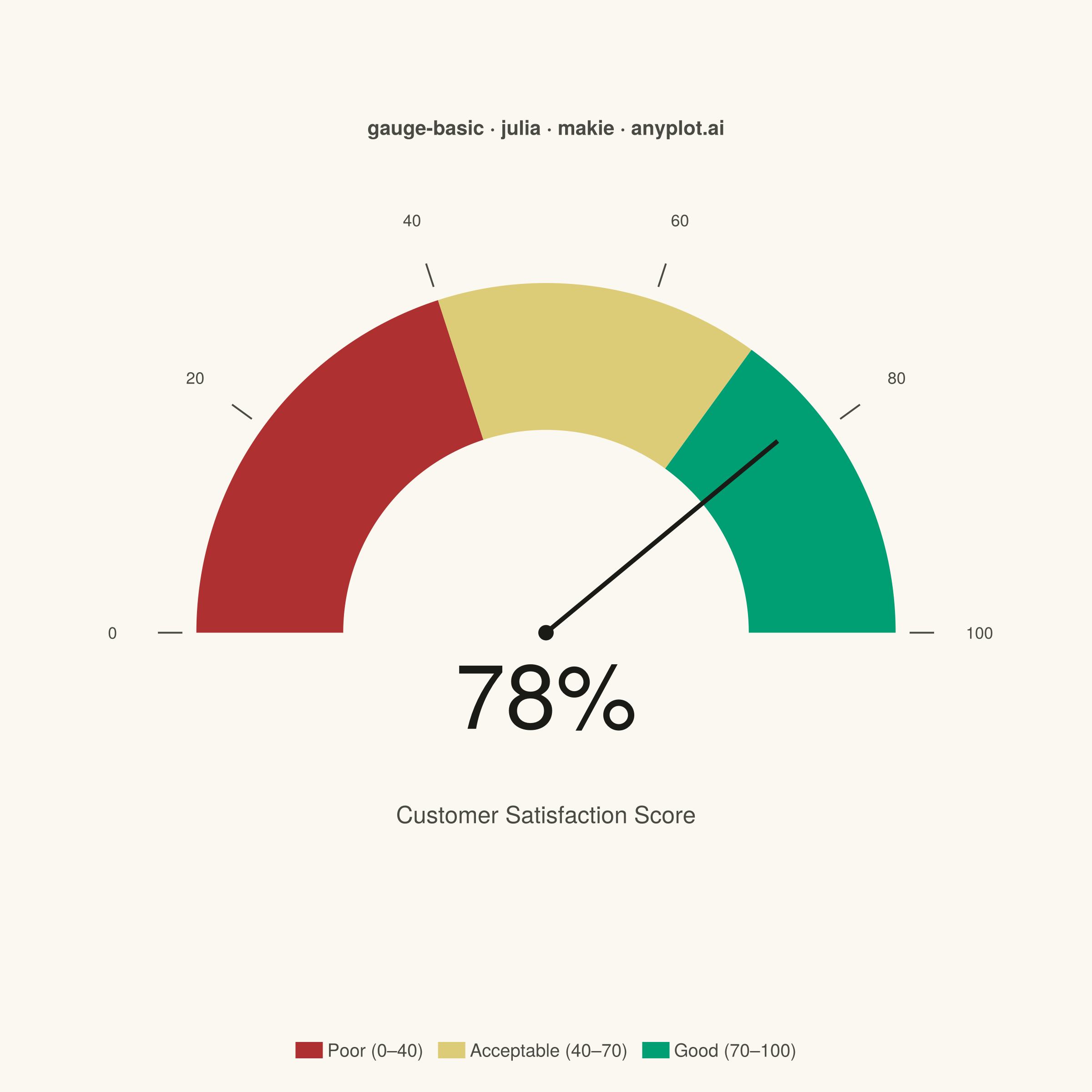
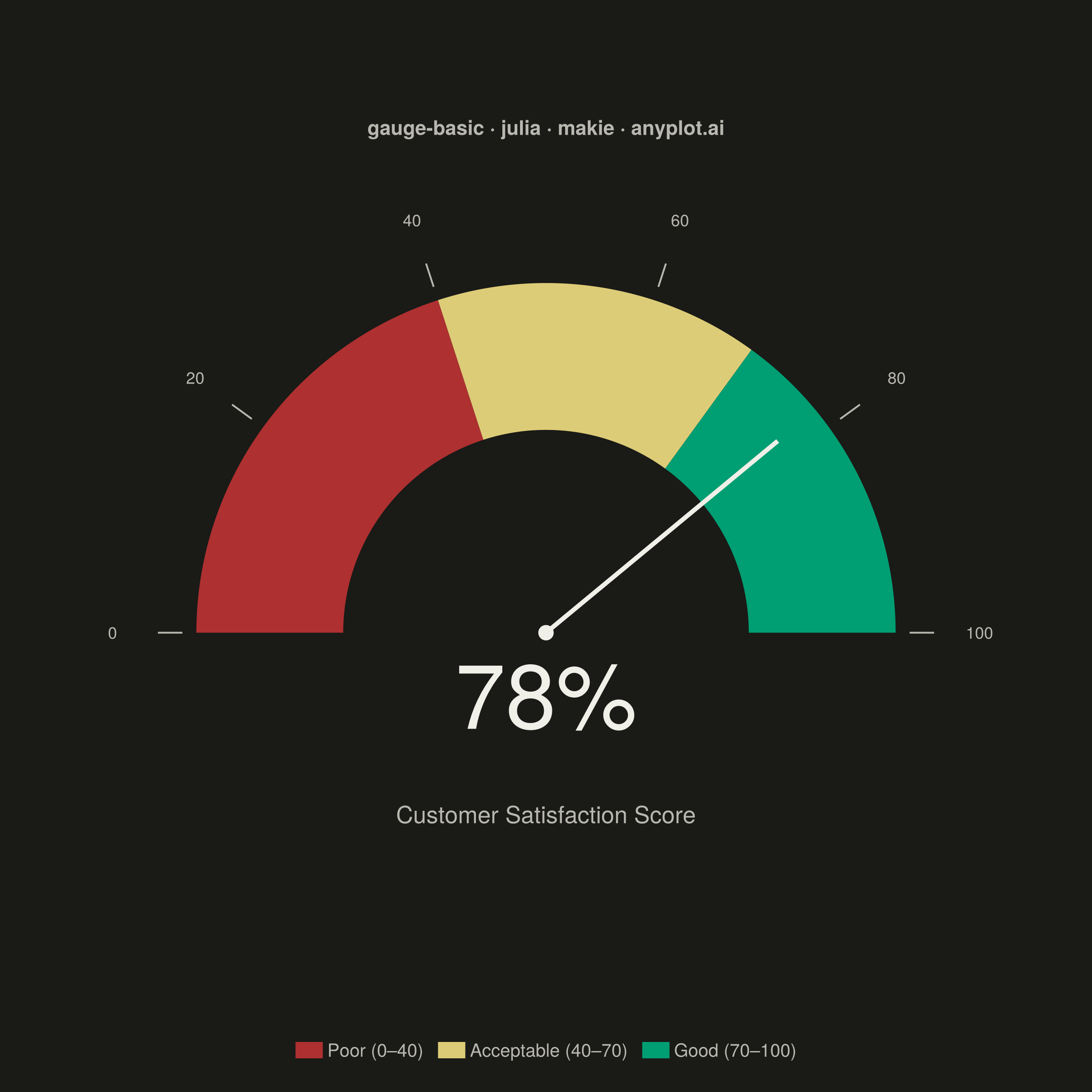
The same plot in 14 other libraries — Python: Altair, Bokeh, lets-plot, Matplotlib, Plotly, plotnine, Pygal, Seaborn; R: ggplot2; JavaScript: Chart.js, D3.js, Apache ECharts, Highcharts, MUI X Charts. Compare all 15 side by side: Basic Gauge Chart in Python, R, Julia and JavaScript.
A gauge chart (also known as a speedometer chart) displays a single value within a defined range using a semi-circular or circular dial. It is ideal for showing progress toward a goal, performance metrics, or any KPI that needs to be evaluated against minimum and maximum bounds. The visual metaphor of a speedometer makes it intuitive to quickly assess whether a value is in an acceptable range.
# anyplot.ai
# gauge-basic: Basic Gauge Chart
# Library: makie 0.21.9 | Julia 1.11.9
# Quality: 90/100 | Created: 2026-06-30

using CairoMakie
using Colors

# Theme tokens
const THEME       = get(ENV, "ANYPLOT_THEME", "light")
const PAGE_BG     = THEME == "light" ? colorant"#FAF8F1" : colorant"#1A1A17"
const ELEVATED_BG = THEME == "light" ? colorant"#FFFDF6" : colorant"#242420"
const INK         = THEME == "light" ? colorant"#1A1A17" : colorant"#F0EFE8"
const INK_SOFT    = THEME == "light" ? colorant"#4A4A44" : colorant"#B8B7B0"
const INK_MUTED   = THEME == "light" ? colorant"#6B6A63" : colorant"#A8A79F"

# Imprint palette colors for zone semantics
const ZONE_RED   = colorant"#AE3030"   # matte red   — poor
const ZONE_AMBER = colorant"#DDCC77"   # amber       — acceptable
const ZONE_GREEN = colorant"#009E73"   # brand green — good

# Gauge data — Customer Satisfaction Score (CSAT)
csat_score = 78.0
gauge_min  = 0.0
gauge_max  = 100.0
thresh_lo  = 40.0   # poor / acceptable boundary
thresh_hi  = 70.0   # acceptable / good boundary

# Angle mapping: value → arc angle (π at left/min, 0 at right/max)
θ_min = π
θ_lo  = π * (1.0 - (thresh_lo - gauge_min) / (gauge_max - gauge_min))
θ_hi  = π * (1.0 - (thresh_hi - gauge_min) / (gauge_max - gauge_min))
θ_max = 0.0
θ_val = π * (1.0 - (csat_score - gauge_min) / (gauge_max - gauge_min))

# Arc geometry
r_in  = 0.58
r_out = 1.00
n_pts = 150

# Red zone sector: π down to θ_lo
θ_red = range(θ_min, θ_lo, n_pts)
red_sector = vcat(
    [Point2f(r_out * cos(θ), r_out * sin(θ)) for θ in θ_red],
    [Point2f(r_in  * cos(θ), r_in  * sin(θ)) for θ in reverse(θ_red)],
)

# Amber zone sector: θ_lo down to θ_hi
θ_amb = range(θ_lo, θ_hi, n_pts)
amb_sector = vcat(
    [Point2f(r_out * cos(θ), r_out * sin(θ)) for θ in θ_amb],
    [Point2f(r_in  * cos(θ), r_in  * sin(θ)) for θ in reverse(θ_amb)],
)

# Green zone sector: θ_hi down to 0
θ_grn = range(θ_hi, θ_max, n_pts)
grn_sector = vcat(
    [Point2f(r_out * cos(θ), r_out * sin(θ)) for θ in θ_grn],
    [Point2f(r_in  * cos(θ), r_in  * sin(θ)) for θ in reverse(θ_grn)],
)

# Figure — square canvas
fig = Figure(
    size            = (1200, 1200),
    backgroundcolor = PAGE_BG,
)

ax = Axis(
    fig[1, 1];
    aspect             = DataAspect(),
    backgroundcolor    = PAGE_BG,
    title              = "gauge-basic · julia · makie · anyplot.ai",
    titlesize          = 22,
    titlecolor         = INK_SOFT,
    titlegap           = 12,
    topspinevisible    = false,
    rightspinevisible  = false,
    leftspinevisible   = false,
    bottomspinevisible = false,
    xgridvisible       = false,
    ygridvisible       = false,
    xticksvisible      = false,
    yticksvisible      = false,
    xticklabelsvisible = false,
    yticklabelsvisible = false,
)

# Draw three color zones
poly!(ax, red_sector; color = ZONE_RED,   strokewidth = 0)
poly!(ax, amb_sector; color = ZONE_AMBER, strokewidth = 0)
poly!(ax, grn_sector; color = ZONE_GREEN, strokewidth = 0)

# Scale ticks and value labels outside the arc
for tv in [0, 20, 40, 60, 80, 100]
    θt = π * (1.0 - tv / 100.0)
    lines!(ax,
        [( r_out + 0.04) * cos(θt), (r_out + 0.11) * cos(θt)],
        [( r_out + 0.04) * sin(θt), (r_out + 0.11) * sin(θt)];
        color = INK_SOFT, linewidth = 2,
    )
    text!(ax,
        (r_out + 0.24) * cos(θt),
        (r_out + 0.24) * sin(θt);
        text = string(tv),
        fontsize = 18,
        align = (:center, :center),
        color = INK_SOFT,
    )
end

# Needle pointing to current value
r_needle = 0.86
lines!(ax,
    [0.0, r_needle * cos(θ_val)],
    [0.0, r_needle * sin(θ_val)];
    color = INK, linewidth = 5,
)

# Center pivot dot
scatter!(ax, [0.0], [0.0]; color = INK, markersize = 24, strokewidth = 0)

# Value label — prominent display below needle pivot
text!(ax, 0.0, -0.18;
    text = "$(round(Int, csat_score))%",
    fontsize = 100,
    align = (:center, :center),
    color = INK,
)

# Metric name
text!(ax, 0.0, -0.52;
    text = "Customer Satisfaction Score",
    fontsize = 26,
    align = (:center, :center),
    color = INK_SOFT,
)

# Zone legend
Legend(
    fig[2, 1],
    [PolyElement(color = ZONE_RED),
     PolyElement(color = ZONE_AMBER),
     PolyElement(color = ZONE_GREEN)],
    ["Poor (0–40)", "Acceptable (40–70)", "Good (70–100)"];
    orientation      = :horizontal,
    framevisible     = false,
    labelcolor       = INK_SOFT,
    labelsize        = 20,
    patchsize        = (30, 18),
    padding          = (8, 8, 8, 8),
    backgroundcolor  = PAGE_BG,
    tellwidth        = false,
)

rowsize!(fig.layout, 2, Fixed(60))
limits!(ax, -1.52, 1.52, -0.78, 1.38)

save("plot-$(THEME).png", fig; px_per_unit = 2)
Runnable source as JSON, for any HTTP client: https://api.anyplot.ai/specs/gauge-basic/makie/code. Any spec id and library id listed in llms-full.txt fit the same URL shape; every URL below is complete and callable.
{
  "spec_id": "gauge-basic",
  "language": "julia",
  "library": "makie",
  "page": "https://anyplot.ai/gauge-basic/julia/makie",
  "hub": "https://anyplot.ai/gauge-basic",
  "code_json": "https://api.anyplot.ai/specs/gauge-basic/makie/code",
  "spec_json": "https://api.anyplot.ai/specs/gauge-basic",
  "render_light_png": "https://storage.googleapis.com/anyplot-images/plots/gauge-basic/julia/makie/plot-light.png",
  "render_dark_png": "https://storage.googleapis.com/anyplot-images/plots/gauge-basic/julia/makie/plot-dark.png",
  "quality_score": 90.0,
  "license": "MIT",
  "guide": "https://anyplot.ai/llms.txt"
}
Part of Basic Gauge Chart on anyplot.ai.