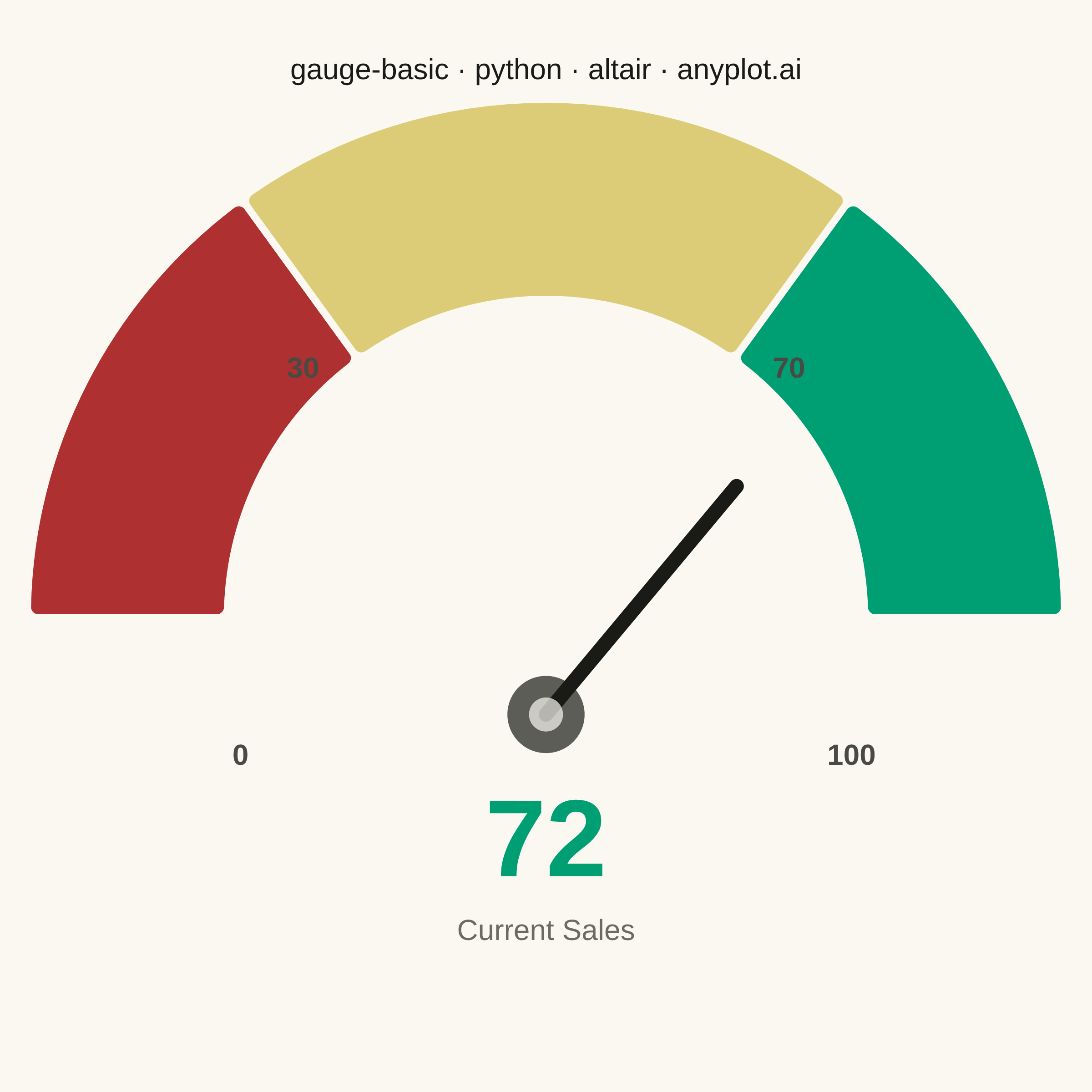
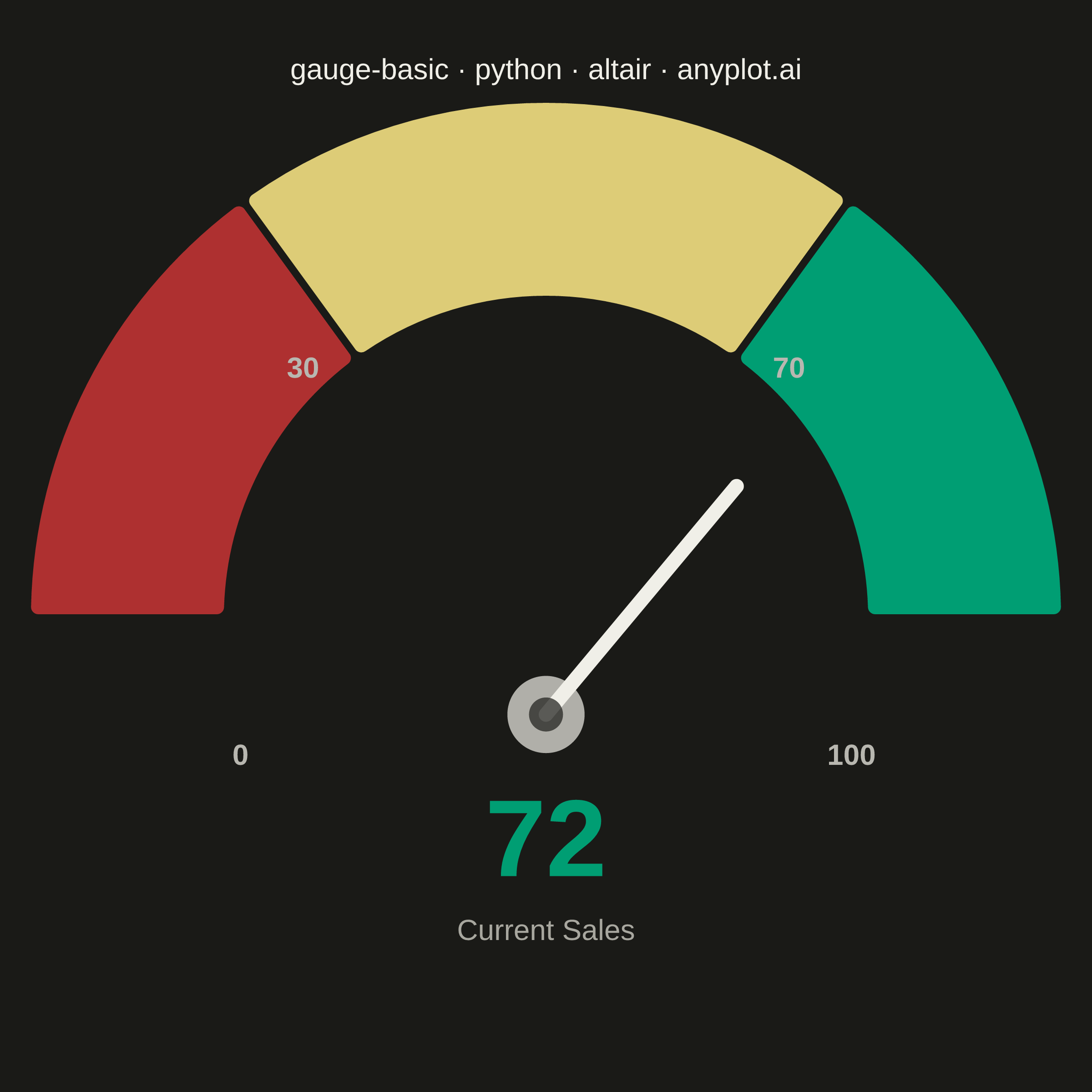
A gauge chart (also known as a speedometer chart) displays a single value within a defined range using a semi-circular or circular dial. It is ideal for showing progress toward a goal, performance metrics, or any KPI that needs to be evaluated against minimum and maximum bounds. The visual metaphor of a speedometer makes it intuitive to quickly assess whether a value is in an acceptable range.
""" anyplot.ai
gauge-basic: Basic Gauge Chart
Library: altair 6.2.2 | Python 3.13.14
Quality: 87/100 | Updated: 2026-06-30
"""

import os

import altair as alt
import numpy as np
import pandas as pd
from PIL import Image


# Theme tokens
THEME = os.getenv("ANYPLOT_THEME", "light")
PAGE_BG = "#FAF8F1" if THEME == "light" else "#1A1A17"
ELEVATED_BG = "#FFFDF6" if THEME == "light" else "#242420"
INK = "#1A1A17" if THEME == "light" else "#F0EFE8"
INK_SOFT = "#4A4A44" if THEME == "light" else "#B8B7B0"
INK_MUTED = "#6B6A63" if THEME == "light" else "#A8A79F"

# Imprint palette zone colors (semantic: bad → warning → good)
ZONE_BAD = "#AE3030"  # Imprint matte red — bad / below threshold
ZONE_WARN = "#DDCC77"  # Imprint amber — caution
ZONE_GOOD = "#009E73"  # Imprint brand green — target achieved

# Data — Sales performance gauge
value = 72
min_value = 0
max_value = 100
thresholds = [30, 70]

# Geometry: semi-circle from left (-π/2) to right (+π/2)
boundaries = np.array([min_value] + thresholds + [max_value], dtype=float)
boundary_angles = -np.pi / 2 + (boundaries - min_value) / (max_value - min_value) * np.pi
needle_angle = -np.pi / 2 + (value - min_value) / (max_value - min_value) * np.pi

# Zone arcs — tooltip makes the HTML export genuinely informative
zones_df = pd.DataFrame(
    {
        "startAngle": boundary_angles[:-1],
        "endAngle": boundary_angles[1:],
        "color": [ZONE_BAD, ZONE_WARN, ZONE_GOOD],
        "zone": ["Low (0–30)", "Medium (30–70)", "High (70–100)"],
    }
)

gauge_arcs = (
    alt.Chart(zones_df)
    .mark_arc(innerRadius=175, outerRadius=285, cornerRadius=6, stroke=PAGE_BG, strokeWidth=4)
    .encode(
        theta=alt.Theta("startAngle:Q", scale=None),
        theta2="endAngle:Q",
        color=alt.Color("color:N", scale=None, legend=None),
        tooltip=[alt.Tooltip("zone:N", title="Zone")],
    )
)

# Needle
needle_length = 230
needle_df = pd.DataFrame(
    [{"x": 0.0, "y": 0.0, "x2": needle_length * np.sin(needle_angle), "y2": needle_length * np.cos(needle_angle)}]
)
needle = (
    alt.Chart(needle_df)
    .mark_rule(color=INK, strokeWidth=8, strokeCap="round")
    .encode(
        x=alt.X("x:Q", scale=alt.Scale(domain=[-340, 340]), axis=None),
        y=alt.Y("y:Q", scale=alt.Scale(domain=[-220, 370]), axis=None),
        x2="x2:Q",
        y2="y2:Q",
    )
)

# Center hub (two-tone for definition)
hub_df = pd.DataFrame([{"x": 0, "y": 0}])
hub_outer = alt.Chart(hub_df).mark_circle(size=1800, color=INK).encode(x="x:Q", y="y:Q")
hub_inner = alt.Chart(hub_df).mark_circle(size=350, color=PAGE_BG).encode(x="x:Q", y="y:Q")

# Prominent value label — colored to match the zone it falls in
value_label_df = pd.DataFrame([{"x": 0, "y": -100, "text": f"{value}"}])
value_label = (
    alt.Chart(value_label_df)
    .mark_text(fontSize=60, fontWeight="bold", color=ZONE_GOOD, baseline="middle")
    .encode(x="x:Q", y="y:Q", text="text:N")
)

# Context label
context_label_df = pd.DataFrame([{"x": 0, "y": -168, "text": "Current Sales"}])
context_label = (
    alt.Chart(context_label_df)
    .mark_text(fontSize=16, color=INK_MUTED, baseline="middle")
    .encode(x="x:Q", y="y:Q", text="text:N")
)

# Min/max range labels at arc ends
range_label_radius = 235
range_labels_df = pd.DataFrame(
    [
        {"x": range_label_radius * np.sin(boundary_angles[0]), "y": -32, "text": str(min_value)},
        {"x": range_label_radius * np.sin(boundary_angles[-1]), "y": -32, "text": str(max_value)},
    ]
)
range_labels = (
    alt.Chart(range_labels_df)
    .mark_text(fontSize=16, color=INK_SOFT, fontWeight="bold")
    .encode(x="x:Q", y="y:Q", text="text:N")
)

# Threshold labels just above the arc boundary edges
threshold_angles = -np.pi / 2 + (np.array(thresholds, dtype=float) - min_value) / (max_value - min_value) * np.pi
threshold_label_radius = 318
threshold_labels_df = pd.DataFrame(
    {
        "x": threshold_label_radius * np.sin(threshold_angles),
        "y": threshold_label_radius * np.cos(threshold_angles),
        "text": [str(t) for t in thresholds],
    }
)
threshold_labels = (
    alt.Chart(threshold_labels_df)
    .mark_text(fontSize=16, color=INK_SOFT, fontWeight="bold", dy=-8)
    .encode(x="x:Q", y="y:Q", text="text:N")
)

# Compose all layers — square canvas suits a semi-circular gauge
chart = (
    alt.layer(gauge_arcs, needle, hub_outer, hub_inner, threshold_labels, range_labels, value_label, context_label)
    .properties(
        width=500,
        height=460,
        background=PAGE_BG,
        title=alt.Title(
            "gauge-basic · python · altair · anyplot.ai", fontSize=16, anchor="middle", color=INK, fontWeight="normal"
        ),
    )
    .configure_view(strokeWidth=0, fill=PAGE_BG)
)

# Save PNG, then pad to exact 2400×2400 target
chart.save(f"plot-{THEME}.png", scale_factor=4.0)

TW, TH = 2400, 2400
_img = Image.open(f"plot-{THEME}.png").convert("RGB")
_w, _h = _img.size
if _w > TW or _h > TH:
    raise SystemExit(
        f"altair vl-convert produced {_w}×{_h}, exceeds target {TW}×{TH}. "
        f"Shrink chart .properties(width=, height=) values and re-render."
    )
if _w < TW or _h < TH:
    _canvas = Image.new("RGB", (TW, TH), PAGE_BG)
    _canvas.paste(_img, ((TW - _w) // 2, (TH - _h) // 2))
    _canvas.save(f"plot-{THEME}.png")

chart.save(f"plot-{THEME}.html")
Runnable source as JSON, for any HTTP client: https://api.anyplot.ai/specs/gauge-basic/altair/code. Any spec id and library id listed in llms-full.txt fit the same URL shape; every URL below is complete and callable.
{
  "spec_id": "gauge-basic",
  "language": "python",
  "library": "altair",
  "page": "https://anyplot.ai/gauge-basic/python/altair",
  "hub": "https://anyplot.ai/gauge-basic",
  "code_json": "https://api.anyplot.ai/specs/gauge-basic/altair/code",
  "spec_json": "https://api.anyplot.ai/specs/gauge-basic",
  "render_light_png": "https://storage.googleapis.com/anyplot-images/plots/gauge-basic/python/altair/plot-light.png",
  "render_dark_png": "https://storage.googleapis.com/anyplot-images/plots/gauge-basic/python/altair/plot-dark.png",
  "interactive_light_html": "https://storage.googleapis.com/anyplot-images/plots/gauge-basic/python/altair/plot-light.html",
  "interactive_dark_html": "https://storage.googleapis.com/anyplot-images/plots/gauge-basic/python/altair/plot-dark.html",
  "quality_score": 87.0,
  "license": "MIT",
  "guide": "https://anyplot.ai/llms.txt"
}
Part of Basic Gauge Chart on anyplot.ai.