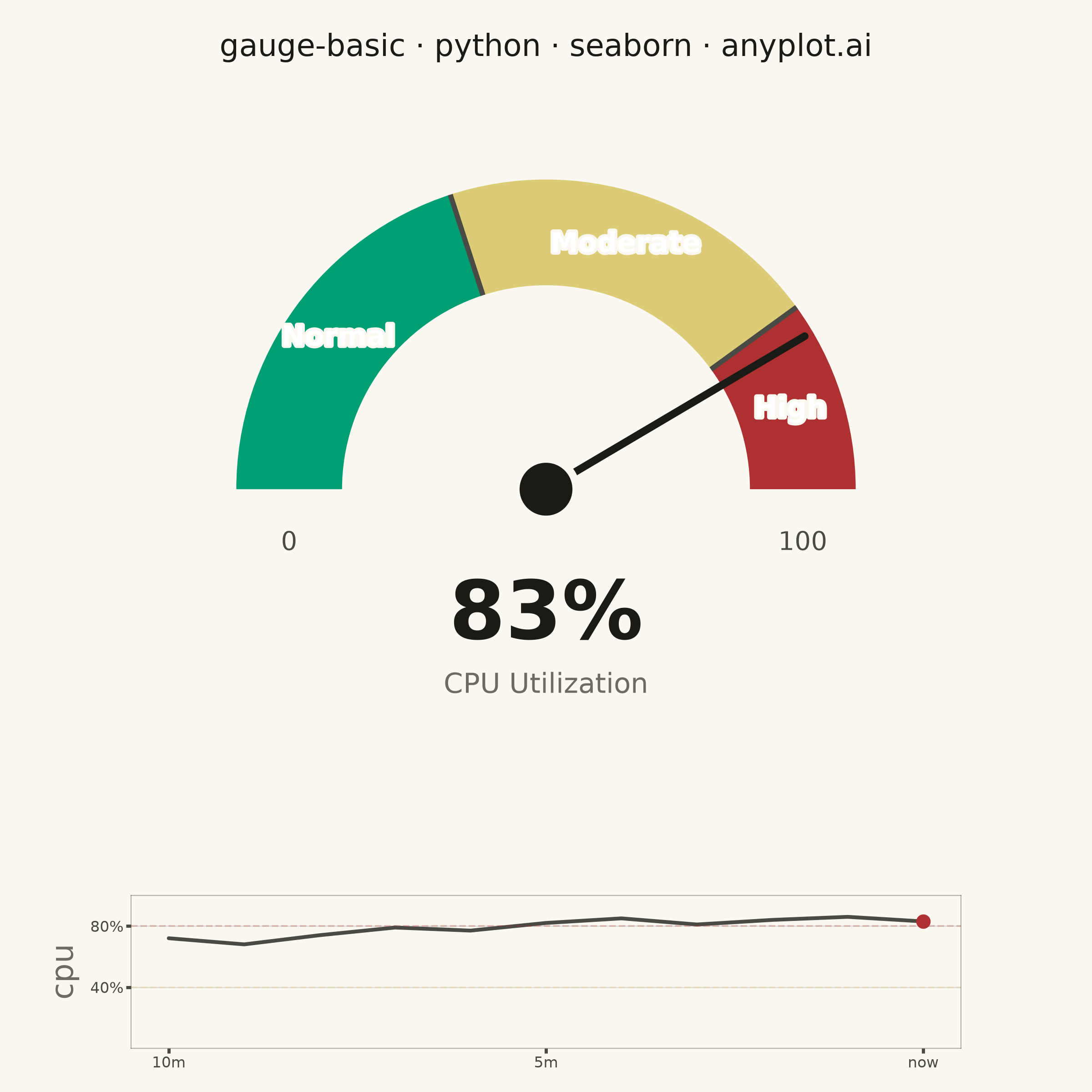
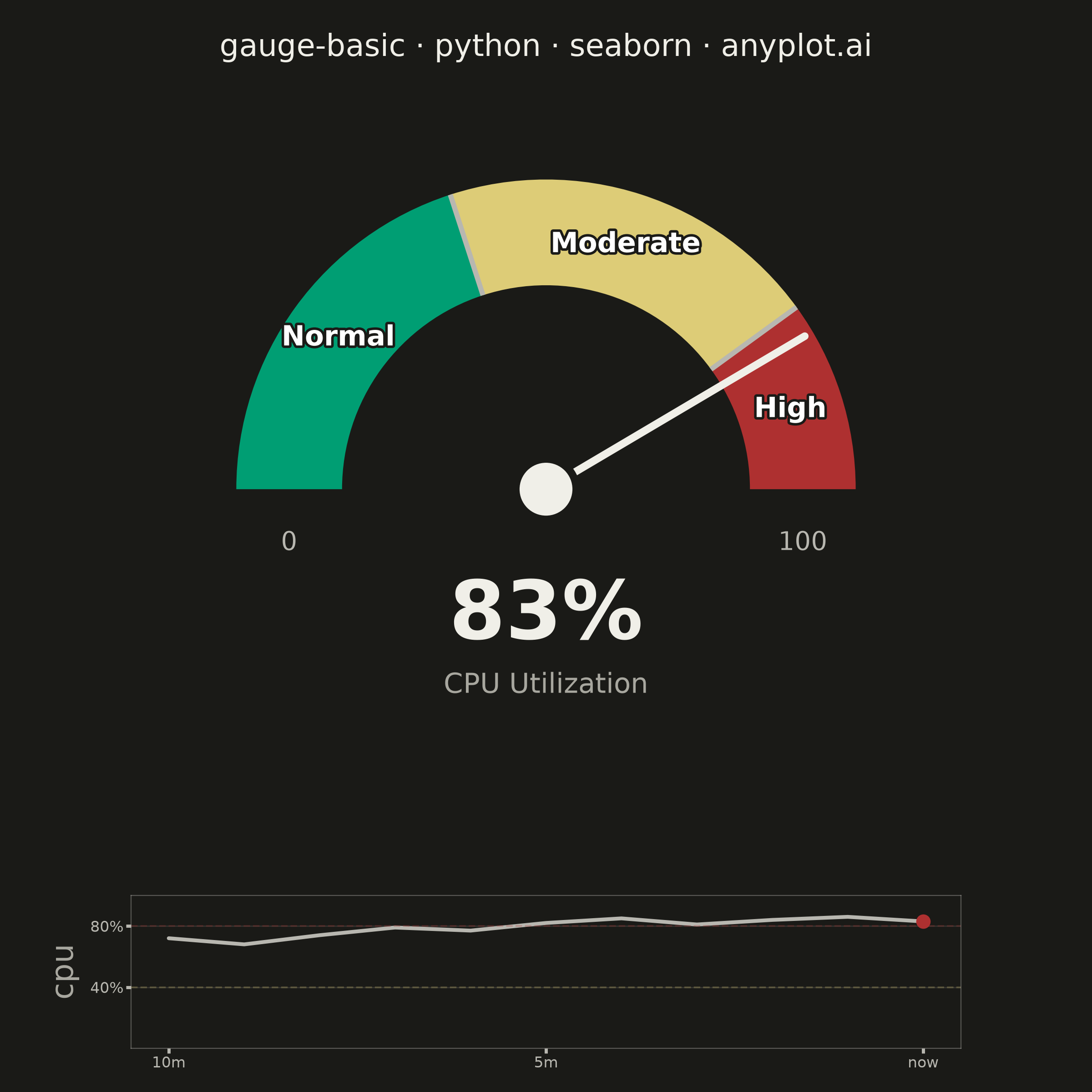
A gauge chart (also known as a speedometer chart) displays a single value within a defined range using a semi-circular or circular dial. It is ideal for showing progress toward a goal, performance metrics, or any KPI that needs to be evaluated against minimum and maximum bounds. The visual metaphor of a speedometer makes it intuitive to quickly assess whether a value is in an acceptable range.
""" anyplot.ai
gauge-basic: Basic Gauge Chart
Library: seaborn 0.13.2 | Python 3.13.14
Quality: 89/100 | Updated: 2026-06-30
"""

import os
import sys


# matplotlib.py in this directory is a sibling implementation — remove own dir from sys.path
# so it does not shadow the installed matplotlib package
_own_dir = os.path.dirname(os.path.abspath(__file__))
sys.path = [p for p in sys.path if not p or os.path.abspath(p) != _own_dir]

import matplotlib.patheffects as pe
import matplotlib.pyplot as plt
import numpy as np
import pandas as pd
import seaborn as sns
from matplotlib.patches import Circle, Wedge


# Imprint palette chrome — theme-adaptive
THEME = os.getenv("ANYPLOT_THEME", "light")
PAGE_BG = "#FAF8F1" if THEME == "light" else "#1A1A17"
ELEVATED_BG = "#FFFDF6" if THEME == "light" else "#242420"
INK = "#1A1A17" if THEME == "light" else "#F0EFE8"
INK_SOFT = "#4A4A44" if THEME == "light" else "#B8B7B0"
INK_MUTED = "#6B6A63" if THEME == "light" else "#A8A79F"

# Imprint semantic anchors for CPU health zones (low usage = good, high = danger)
ZONE_NORMAL = "#009E73"  # Imprint green — healthy CPU load
ZONE_MODERATE = "#DDCC77"  # Imprint amber — elevated load, caution
ZONE_HIGH = "#AE3030"  # Imprint red — high CPU, intervention needed

# Data — production server CPU utilization
value = 83
min_value = 0
max_value = 100
thresholds = [40, 80]  # 0–40: Normal, 40–80: Moderate, 80–100: High

# Historical readings for seaborn sparkline (minutes_ago=0 is current reading)
history_minutes = list(range(10, -1, -1))
history_cpu = [72, 68, 74, 79, 77, 82, 85, 81, 84, 86, 83]
spark_df = pd.DataFrame({"minutes_ago": history_minutes, "cpu": history_cpu})

# Gauge geometry (unit-square axis coordinates)
center = (0.5, 0.48)
radius = 0.34  # reduced from 0.38 for better breathing room
width = 0.14
start_angle = 180
end_angle = 0
angle_range = start_angle - end_angle
value_range = max_value - min_value

zone_boundaries = [min_value] + thresholds + [max_value]
zone_names = ["Normal", "Moderate", "High"]
zone_colors = [ZONE_NORMAL, ZONE_MODERATE, ZONE_HIGH]

# Seaborn theme with Imprint chrome — applies globally to all axes
sns.set_theme(
    style="ticks",
    rc={
        "figure.facecolor": PAGE_BG,
        "axes.facecolor": PAGE_BG,
        "axes.edgecolor": INK_SOFT,
        "axes.labelcolor": INK_MUTED,
        "text.color": INK,
        "xtick.color": INK_SOFT,
        "ytick.color": INK_SOFT,
        "grid.color": INK,
        "grid.alpha": 0.15,
        "legend.facecolor": ELEVATED_BG,
        "legend.edgecolor": INK_SOFT,
    },
)

fig, ax = plt.subplots(figsize=(6, 6), dpi=400, facecolor=PAGE_BG)
ax.set_facecolor(PAGE_BG)

# Arc zones — Wedge patches for each CPU health band
for i in range(len(zone_boundaries) - 1):
    z_start = start_angle - (zone_boundaries[i] - min_value) / value_range * angle_range
    z_end = start_angle - (zone_boundaries[i + 1] - min_value) / value_range * angle_range
    ax.add_patch(
        Wedge(
            center=center,
            r=radius + width / 2,
            theta1=z_end,
            theta2=z_start,
            width=width,
            facecolor=zone_colors[i],
            edgecolor="none",
            linewidth=0,
            zorder=2,
        )
    )

# Zone boundary dividers — thin radial cuts in INK_SOFT
for threshold in thresholds:
    angle = start_angle - (threshold - min_value) / value_range * angle_range
    rad = np.radians(angle)
    rs = (radius - width / 2, radius + width / 2)
    ax.plot(
        [center[0] + r * np.cos(rad) for r in rs],
        [center[1] + r * np.sin(rad) for r in rs],
        color=INK_SOFT,
        linewidth=2,
        zorder=3,
        solid_capstyle="butt",
    )

# Needle — points to current CPU utilization
needle_angle = start_angle - (value - min_value) / value_range * angle_range
needle_rad = np.radians(needle_angle)
needle_length = radius + width / 2 - 0.012
needle_tip_x = center[0] + needle_length * np.cos(needle_rad)
needle_tip_y = center[1] + needle_length * np.sin(needle_rad)
ax.plot([center[0], needle_tip_x], [center[1], needle_tip_y], color=INK, linewidth=3, zorder=12, solid_capstyle="round")

# Hub — page-bg ring + ink disc for crisp look in both themes
ax.add_patch(Circle(center, radius=0.045, facecolor=PAGE_BG, edgecolor="none", zorder=13))
ax.add_patch(Circle(center, radius=0.035, facecolor=INK, edgecolor="none", zorder=14))

# Value display — bold reading centered below gauge
ax.text(center[0], center[1] - 0.17, f"{value}%", ha="center", va="center", fontsize=32, fontweight="bold", color=INK)

# Context label — fontsize=11 for mobile legibility
ax.text(center[0], center[1] - 0.26, "CPU Utilization", ha="center", va="center", fontsize=11, color=INK_MUTED)

# Min / max scale endpoints
for vlabel, x_off in [(min_value, -1), (max_value, 1)]:
    ax.text(
        center[0] + x_off * radius, center[1] - 0.055, f"{vlabel}", ha="center", va="top", fontsize=10, color=INK_SOFT
    )

# Zone labels on arc — white text with PAGE_BG stroke (theme-adaptive halo)
zone_label_centers = [
    (thresholds[0] - min_value) / 2 + min_value,
    (thresholds[0] + thresholds[1]) / 2,
    (thresholds[1] + max_value) / 2,
]
for v_center, label in zip(zone_label_centers, zone_names, strict=True):
    angle = start_angle - (v_center - min_value) / value_range * angle_range
    rad = np.radians(angle)
    lx = center[0] + radius * np.cos(rad)
    ly = center[1] + radius * np.sin(rad)
    txt = ax.text(lx, ly, label, ha="center", va="center", fontsize=11, color="white", fontweight="bold", zorder=5)
    txt.set_path_effects([pe.withStroke(linewidth=2, foreground=PAGE_BG)])

# Title
ax.set_title("gauge-basic · python · seaborn · anyplot.ai", fontsize=12, fontweight="medium", pad=16, color=INK)

# Canvas — pure coordinate space, no axes chrome
ax.set_xlim(0, 1)
ax.set_ylim(0, 1)
ax.set_aspect("equal")
ax.axis("off")

# Reserve bottom 22% of figure for seaborn sparkline, then adjust
plt.tight_layout()
plt.subplots_adjust(bottom=0.22)

# Seaborn lineplot sparkline — 10-minute CPU history (genuine sns.lineplot usage)
ax_spark = fig.add_axes([0.12, 0.04, 0.76, 0.14], facecolor=PAGE_BG)
sns.lineplot(data=spark_df, x="minutes_ago", y="cpu", ax=ax_spark, color=INK_SOFT, linewidth=1.5)
# Highlight current reading with a red dot
ax_spark.scatter([0], [value], color=ZONE_HIGH, s=22, zorder=5)
# Zone threshold reference lines
ax_spark.axhline(80, color=ZONE_HIGH, alpha=0.25, linewidth=0.7, linestyle="--")
ax_spark.axhline(40, color=ZONE_MODERATE, alpha=0.25, linewidth=0.7, linestyle="--")
# Reversed x-axis: oldest (10 min ago) on left, newest ("now") on right
ax_spark.set_xlim(10.5, -0.5)
ax_spark.set_ylim(0, 100)
ax_spark.set_xticks([10, 5, 0])
ax_spark.set_xticklabels(["10m", "5m", "now"], fontsize=6, color=INK_SOFT)
ax_spark.set_yticks([40, 80])
ax_spark.set_yticklabels(["40%", "80%"], fontsize=6, color=INK_SOFT)
ax_spark.tick_params(axis="both", length=2, pad=1, colors=INK_SOFT)
ax_spark.set_xlabel("")
ax_spark.set_facecolor(PAGE_BG)
ax_spark.yaxis.grid(True, alpha=0.12, linewidth=0.5, color=INK)
for spine in ax_spark.spines.values():
    spine.set_edgecolor(INK_SOFT)
    spine.set_linewidth(0.4)
    spine.set_alpha(0.4)

plt.savefig(f"plot-{THEME}.png", dpi=400, facecolor=PAGE_BG)
Runnable source as JSON, for any HTTP client: https://api.anyplot.ai/specs/gauge-basic/seaborn/code. Any spec id and library id listed in llms-full.txt fit the same URL shape; every URL below is complete and callable.
{
  "spec_id": "gauge-basic",
  "language": "python",
  "library": "seaborn",
  "page": "https://anyplot.ai/gauge-basic/python/seaborn",
  "hub": "https://anyplot.ai/gauge-basic",
  "code_json": "https://api.anyplot.ai/specs/gauge-basic/seaborn/code",
  "spec_json": "https://api.anyplot.ai/specs/gauge-basic",
  "render_light_png": "https://storage.googleapis.com/anyplot-images/plots/gauge-basic/python/seaborn/plot-light.png",
  "render_dark_png": "https://storage.googleapis.com/anyplot-images/plots/gauge-basic/python/seaborn/plot-dark.png",
  "quality_score": 89.0,
  "license": "MIT",
  "guide": "https://anyplot.ai/llms.txt"
}
Part of Basic Gauge Chart on anyplot.ai.