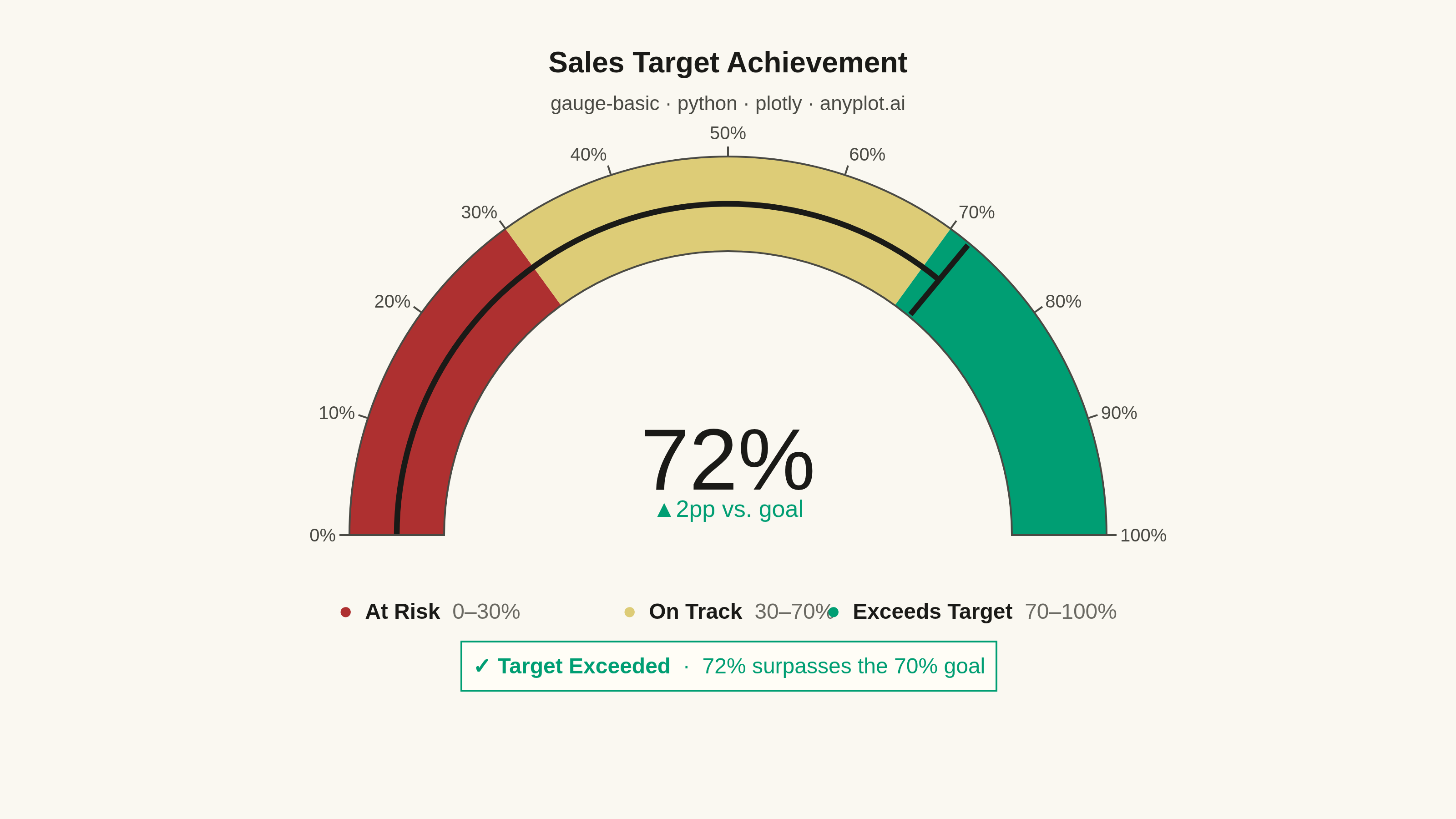
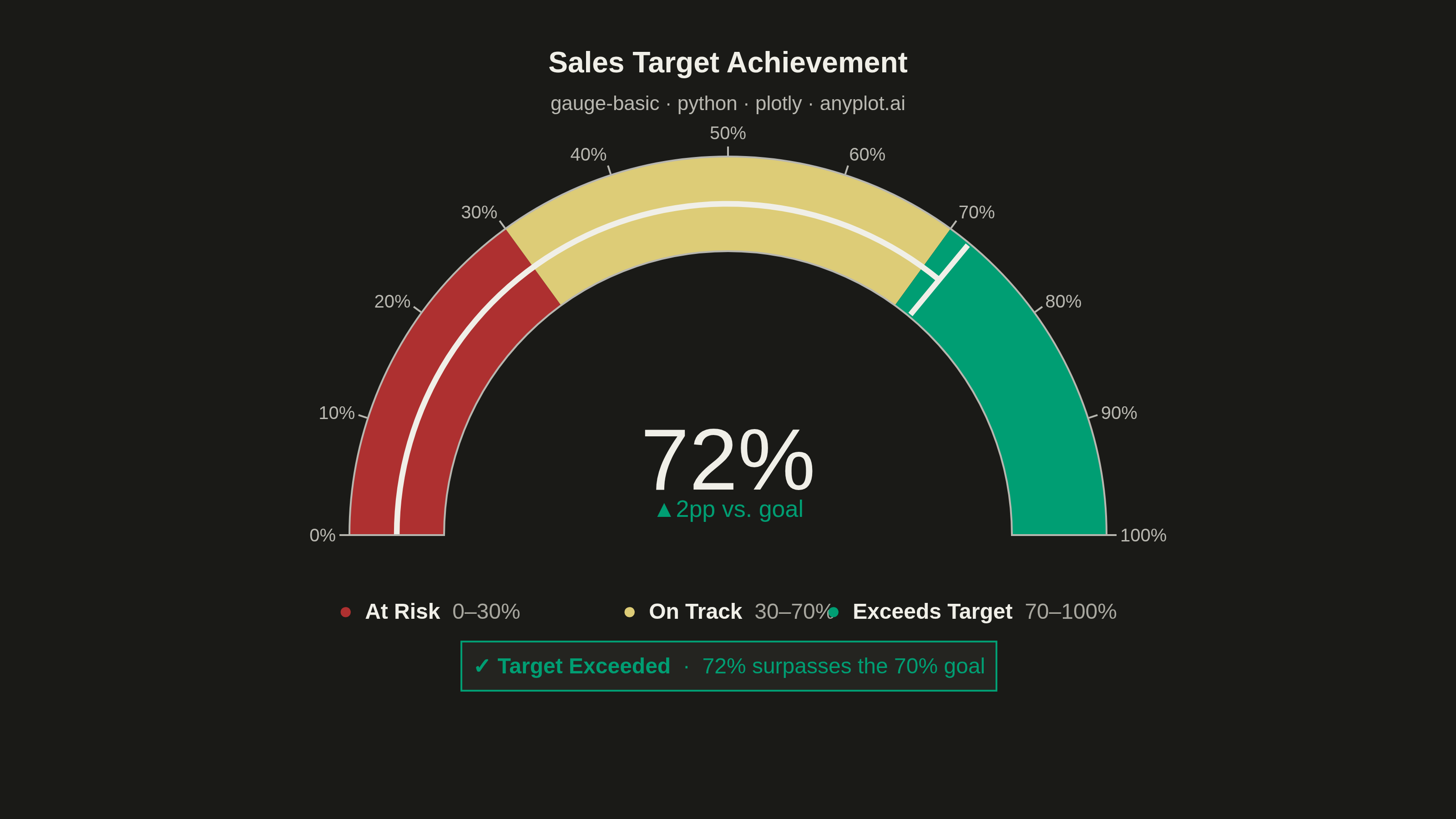
A gauge chart (also known as a speedometer chart) displays a single value within a defined range using a semi-circular or circular dial. It is ideal for showing progress toward a goal, performance metrics, or any KPI that needs to be evaluated against minimum and maximum bounds. The visual metaphor of a speedometer makes it intuitive to quickly assess whether a value is in an acceptable range.
""" anyplot.ai
gauge-basic: Basic Gauge Chart
Library: plotly 6.8.0 | Python 3.13.14
Quality: 94/100 | Updated: 2026-06-30
"""

import os

import plotly.graph_objects as go


# Theme tokens
THEME = os.getenv("ANYPLOT_THEME", "light")
PAGE_BG = "#FAF8F1" if THEME == "light" else "#1A1A17"
ELEVATED_BG = "#FFFDF6" if THEME == "light" else "#242420"
INK = "#1A1A17" if THEME == "light" else "#F0EFE8"
INK_SOFT = "#4A4A44" if THEME == "light" else "#B8B7B0"
INK_MUTED = "#6B6A63" if THEME == "light" else "#A8A79F"

# Imprint palette zone colors: red=bad, amber=caution, green=good
ZONE_LOW = "#AE3030"  # Imprint matte red — At Risk
ZONE_MID = "#DDCC77"  # Imprint amber — On Track
ZONE_HIGH = "#009E73"  # Imprint brand green — Exceeds Target

# Data — Sales target achievement for the quarter
value = 72
min_value = 0
max_value = 100
thresholds = [30, 70]

goal = thresholds[1]

# Plot
fig = go.Figure(
    go.Indicator(
        mode="gauge+number+delta",
        value=value,
        number={"font": {"size": 48, "color": INK, "family": "Arial"}, "suffix": "%"},
        delta={
            "reference": goal,
            "relative": False,
            "valueformat": "+.0f",
            "suffix": "pp vs. goal",
            "font": {"size": 13, "color": INK, "family": "Arial"},
            "increasing": {"color": ZONE_HIGH},
            "decreasing": {"color": ZONE_LOW},
        },
        title={
            "text": (
                "<b>Sales Target Achievement</b>"
                f"<br><span style='font-size:11px;color:{INK_SOFT}'>"
                "gauge-basic · python · plotly · anyplot.ai</span>"
            ),
            "font": {"size": 16, "color": INK, "family": "Arial"},
        },
        gauge={
            "shape": "angular",
            "axis": {
                "range": [min_value, max_value],
                "tickwidth": 1,
                "tickcolor": INK_SOFT,
                "tickfont": {"size": 10, "color": INK_SOFT, "family": "Arial"},
                "ticksuffix": "%",
                "dtick": 10,
            },
            # Slim needle keeps zone colors fully visible
            "bar": {"color": INK, "thickness": 0.06, "line": {"color": INK, "width": 0}},
            "bgcolor": ELEVATED_BG,
            "borderwidth": 1,
            "bordercolor": INK_SOFT,
            "steps": [
                {"range": [min_value, thresholds[0]], "color": ZONE_LOW},
                {"range": [thresholds[0], thresholds[1]], "color": ZONE_MID},
                {"range": [thresholds[1], max_value], "color": ZONE_HIGH},
            ],
            "threshold": {"line": {"color": INK, "width": 3}, "thickness": 0.95, "value": value},
        },
        domain={"x": [0.05, 0.95], "y": [0.30, 0.95]},
    )
)

# Layout — page surface + zone legend + callout
fig.update_layout(
    paper_bgcolor=PAGE_BG,
    plot_bgcolor=PAGE_BG,
    font={"family": "Arial", "color": INK},
    autosize=False,
    margin={"l": 40, "r": 40, "t": 70, "b": 60},
    annotations=[
        # Zone legend row — three color-coded chips below the gauge
        {
            "x": 0.20,
            "y": 0.14,
            "xref": "paper",
            "yref": "paper",
            "text": (
                f"<span style='color:{ZONE_LOW};font-size:13px'>●</span>  "
                f"<b>At Risk</b>  "
                f"<span style='color:{INK_MUTED}'>0–30%</span>"
            ),
            "showarrow": False,
            "font": {"size": 12, "color": INK, "family": "Arial"},
        },
        {
            "x": 0.50,
            "y": 0.14,
            "xref": "paper",
            "yref": "paper",
            "text": (
                f"<span style='color:{ZONE_MID};font-size:13px'>●</span>  "
                f"<b>On Track</b>  "
                f"<span style='color:{INK_MUTED}'>30–70%</span>"
            ),
            "showarrow": False,
            "font": {"size": 12, "color": INK, "family": "Arial"},
        },
        {
            "x": 0.80,
            "y": 0.14,
            "xref": "paper",
            "yref": "paper",
            "text": (
                f"<span style='color:{ZONE_HIGH};font-size:13px'>●</span>  "
                f"<b>Exceeds Target</b>  "
                f"<span style='color:{INK_MUTED}'>70–100%</span>"
            ),
            "showarrow": False,
            "font": {"size": 12, "color": INK, "family": "Arial"},
        },
        # Target-exceeded callout — immediate data story
        {
            "x": 0.5,
            "y": 0.03,
            "xref": "paper",
            "yref": "paper",
            "text": "<b>✓ Target Exceeded</b>  ·  72% surpasses the 70% goal",
            "showarrow": False,
            "font": {"size": 12, "color": ZONE_HIGH, "family": "Arial"},
            "bgcolor": ELEVATED_BG,
            "bordercolor": ZONE_HIGH,
            "borderwidth": 1,
            "borderpad": 6,
        },
    ],
)

# Save
fig.write_image(f"plot-{THEME}.png", width=800, height=450, scale=4)
fig.write_html(f"plot-{THEME}.html", include_plotlyjs="cdn")
Runnable source as JSON, for any HTTP client: https://api.anyplot.ai/specs/gauge-basic/plotly/code. Any spec id and library id listed in llms-full.txt fit the same URL shape; every URL below is complete and callable.
{
  "spec_id": "gauge-basic",
  "language": "python",
  "library": "plotly",
  "page": "https://anyplot.ai/gauge-basic/python/plotly",
  "hub": "https://anyplot.ai/gauge-basic",
  "code_json": "https://api.anyplot.ai/specs/gauge-basic/plotly/code",
  "spec_json": "https://api.anyplot.ai/specs/gauge-basic",
  "render_light_png": "https://storage.googleapis.com/anyplot-images/plots/gauge-basic/python/plotly/plot-light.png",
  "render_dark_png": "https://storage.googleapis.com/anyplot-images/plots/gauge-basic/python/plotly/plot-dark.png",
  "interactive_light_html": "https://storage.googleapis.com/anyplot-images/plots/gauge-basic/python/plotly/plot-light.html",
  "interactive_dark_html": "https://storage.googleapis.com/anyplot-images/plots/gauge-basic/python/plotly/plot-dark.html",
  "quality_score": 94.0,
  "license": "MIT",
  "guide": "https://anyplot.ai/llms.txt"
}
Part of Basic Gauge Chart on anyplot.ai.