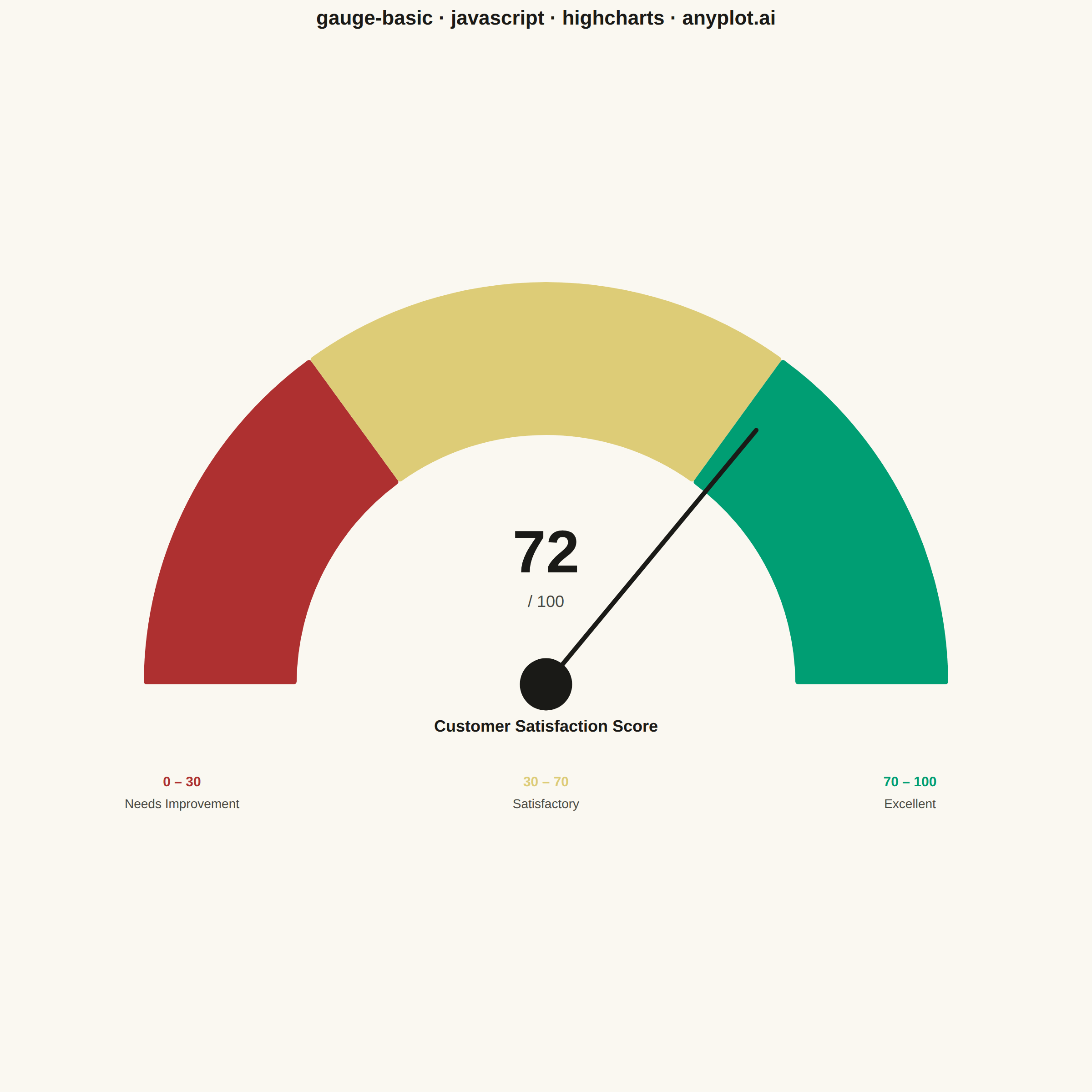
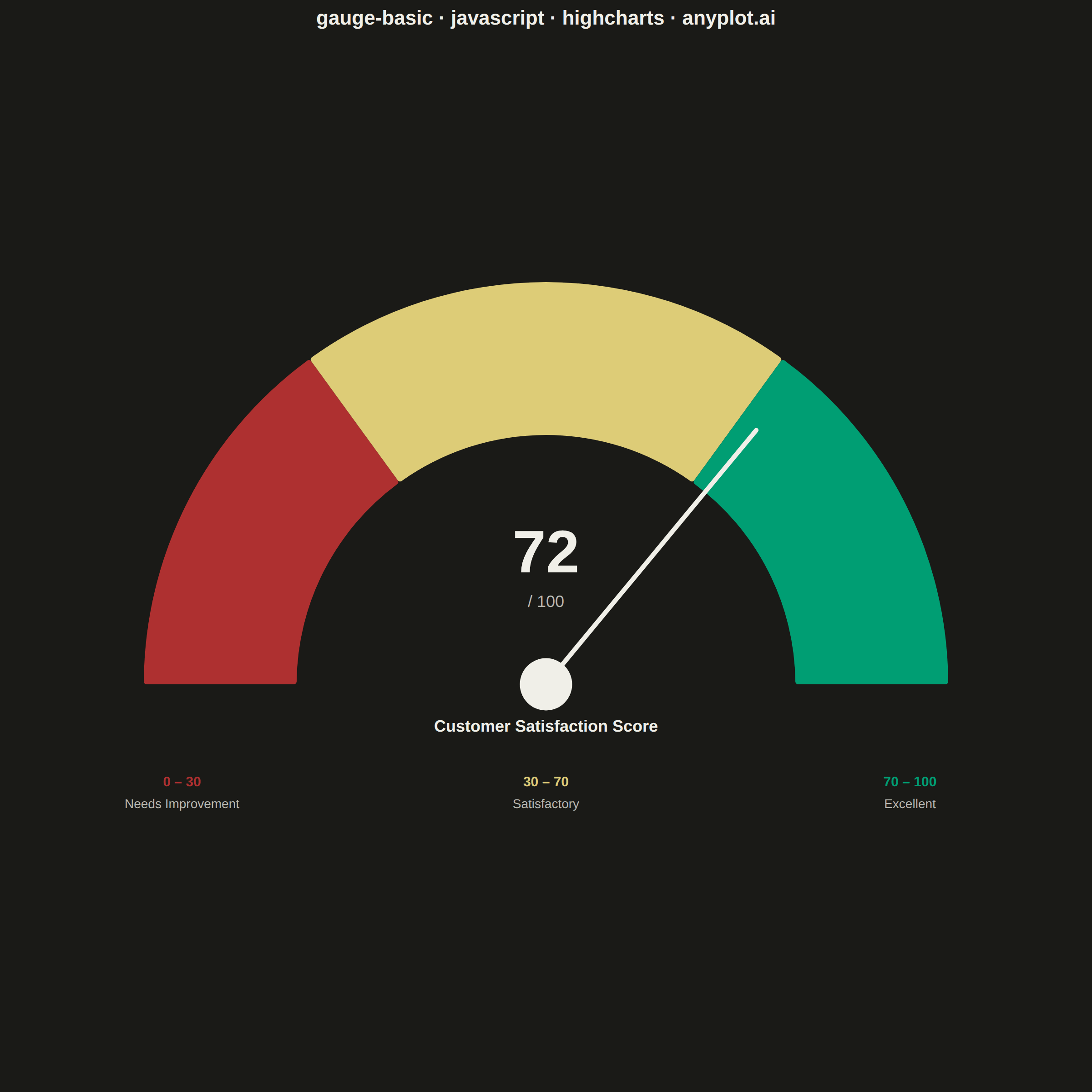
The same plot in 14 other libraries — JavaScript: Chart.js, D3.js, Apache ECharts, MUI X Charts; Python: Altair, Bokeh, lets-plot, Matplotlib, Plotly, plotnine, Pygal, Seaborn; R: ggplot2; Julia: Makie.jl. Compare all 15 side by side: Basic Gauge Chart in Python, R, Julia and JavaScript.
A gauge chart (also known as a speedometer chart) displays a single value within a defined range using a semi-circular or circular dial. It is ideal for showing progress toward a goal, performance metrics, or any KPI that needs to be evaluated against minimum and maximum bounds. The visual metaphor of a speedometer makes it intuitive to quickly assess whether a value is in an acceptable range.
// anyplot.ai
// gauge-basic: Basic Gauge Chart
// Library: highcharts 12.6.0 | JavaScript 22.23.0
// Quality: 91/100 | Created: 2026-06-30
//# anyplot-orientation: square
// anyplot.ai
// gauge-basic: Basic Gauge Chart
// Library: Highcharts 12.6.0 | Node 22
// License: Highcharts — commercial license, free for non-commercial use (highcharts.com/license)
// Quality: pending | Created: 2026-06-30

const t = window.ANYPLOT_TOKENS;

// --- Data (Customer Satisfaction Score) ------------------------------------
const MIN_VAL   = 0;
const MAX_VAL   = 100;
const CUR_VAL   = 72;
const THRESH_LO = 30;
const THRESH_HI = 70;

const arcRed   = THRESH_LO - MIN_VAL;         // 30
const arcAmber = THRESH_HI - THRESH_LO;       // 40
const arcGreen = MAX_VAL   - THRESH_HI;       // 30

const TITLE   = "gauge-basic · javascript · highcharts · anyplot.ai";
const titleFs = Math.max(15, Math.round(22 * Math.min(1, 67 / TITLE.length))) + "px";

// --- Chart -----------------------------------------------------------------
const chart = Highcharts.chart("container", {
  chart: {
    backgroundColor: "transparent",
    animation: false,
    style: { fontFamily: "inherit" },
    margin: [60, 40, 140, 40]
  },
  credits: { enabled: false },
  colors: t.palette,
  title: {
    text: TITLE,
    style: { color: t.ink, fontSize: titleFs, fontWeight: "600" }
  },
  plotOptions: {
    pie: {
      animation: false,
      startAngle: -90,
      endAngle: 90,
      center: ["50%", "70%"],
      dataLabels: { enabled: false },
      borderWidth: 0
    },
    series: { animation: false }
  },
  tooltip: { enabled: false },
  legend: { enabled: false },
  series: [{
    type: "pie",
    name: "CSAT Zones",
    innerSize: "62%",
    size: "90%",
    data: [
      { y: arcRed,   color: "#AE3030" },
      { y: arcAmber, color: "#DDCC77" },
      { y: arcGreen, color: "#009E73" }
    ]
  }]
});

// --- SVG overlays (needle, value, legend) ----------------------------------
const ps     = chart.series[0];
const cx     = chart.plotLeft + ps.center[0];
const cy     = chart.plotTop  + ps.center[1];
const outerR = ps.center[2] / 2;
const innerR = ps.center[3] / 2;

// Needle angle: -90° (left/MIN) to +90° (right/MAX), clockwise from 12 o'clock
const pct      = (CUR_VAL - MIN_VAL) / (MAX_VAL - MIN_VAL);
const angleDeg = -90 + pct * 180;
const angleRad = angleDeg * Math.PI / 180;

// SVG coords: x = cx + r·sin(θ), y = cy - r·cos(θ)
const needleLen = outerR * 0.82;
const tipX      = cx + needleLen * Math.sin(angleRad);
const tipY      = cy - needleLen * Math.cos(angleRad);

// Needle line
chart.renderer.path(["M", cx, cy, "L", tipX, tipY])
  .attr({ stroke: t.ink, "stroke-width": 5, "stroke-linecap": "round", zIndex: 5 })
  .add();

// Hub dot at pivot
chart.renderer.circle(cx, cy, outerR * 0.065)
  .attr({ fill: t.ink, zIndex: 6 })
  .add();

// Large value inside donut hole
const valY = cy - innerR * 0.45;
chart.renderer.text(CUR_VAL.toString(), cx, valY)
  .attr({ align: "center", zIndex: 5 })
  .css({ fontSize: "66px", fontWeight: "700", color: t.ink, fontFamily: "inherit" })
  .add();

chart.renderer.text("/ 100", cx, valY + 38)
  .attr({ align: "center", zIndex: 5 })
  .css({ fontSize: "18px", color: t.inkSoft, fontFamily: "inherit" })
  .add();

// Metric name below gauge
chart.renderer.text("Customer Satisfaction Score", cx, cy + 52)
  .attr({ align: "center", zIndex: 5 })
  .css({ fontSize: "18px", fontWeight: "600", color: t.ink, fontFamily: "inherit" })
  .add();

// Zone legend (3 columns)
const zoneBaseY = cy + 112;
const colW      = chart.chartWidth / 3;
[
  { range: "0 – 30",   label: "Needs Improvement", color: "#AE3030" },
  { range: "30 – 70",  label: "Satisfactory",       color: "#DDCC77" },
  { range: "70 – 100", label: "Excellent",           color: "#009E73" }
].forEach((z, i) => {
  const zx = colW * i + colW / 2;
  chart.renderer.text(z.range, zx, zoneBaseY)
    .attr({ align: "center", zIndex: 5 })
    .css({ fontSize: "15px", fontWeight: "700", color: z.color, fontFamily: "inherit" })
    .add();
  chart.renderer.text(z.label, zx, zoneBaseY + 24)
    .attr({ align: "center", zIndex: 5 })
    .css({ fontSize: "14px", color: t.inkSoft, fontFamily: "inherit" })
    .add();
});
Runnable source as JSON, for any HTTP client: https://api.anyplot.ai/specs/gauge-basic/highcharts/code. Any spec id and library id listed in llms-full.txt fit the same URL shape; every URL below is complete and callable.
{
  "spec_id": "gauge-basic",
  "language": "javascript",
  "library": "highcharts",
  "page": "https://anyplot.ai/gauge-basic/javascript/highcharts",
  "hub": "https://anyplot.ai/gauge-basic",
  "code_json": "https://api.anyplot.ai/specs/gauge-basic/highcharts/code",
  "spec_json": "https://api.anyplot.ai/specs/gauge-basic",
  "render_light_png": "https://storage.googleapis.com/anyplot-images/plots/gauge-basic/javascript/highcharts/plot-light.png",
  "render_dark_png": "https://storage.googleapis.com/anyplot-images/plots/gauge-basic/javascript/highcharts/plot-dark.png",
  "interactive_light_html": "https://storage.googleapis.com/anyplot-images/plots/gauge-basic/javascript/highcharts/plot-light.html",
  "interactive_dark_html": "https://storage.googleapis.com/anyplot-images/plots/gauge-basic/javascript/highcharts/plot-dark.html",
  "quality_score": 91.0,
  "license": "MIT",
  "guide": "https://anyplot.ai/llms.txt"
}
Part of Basic Gauge Chart on anyplot.ai.