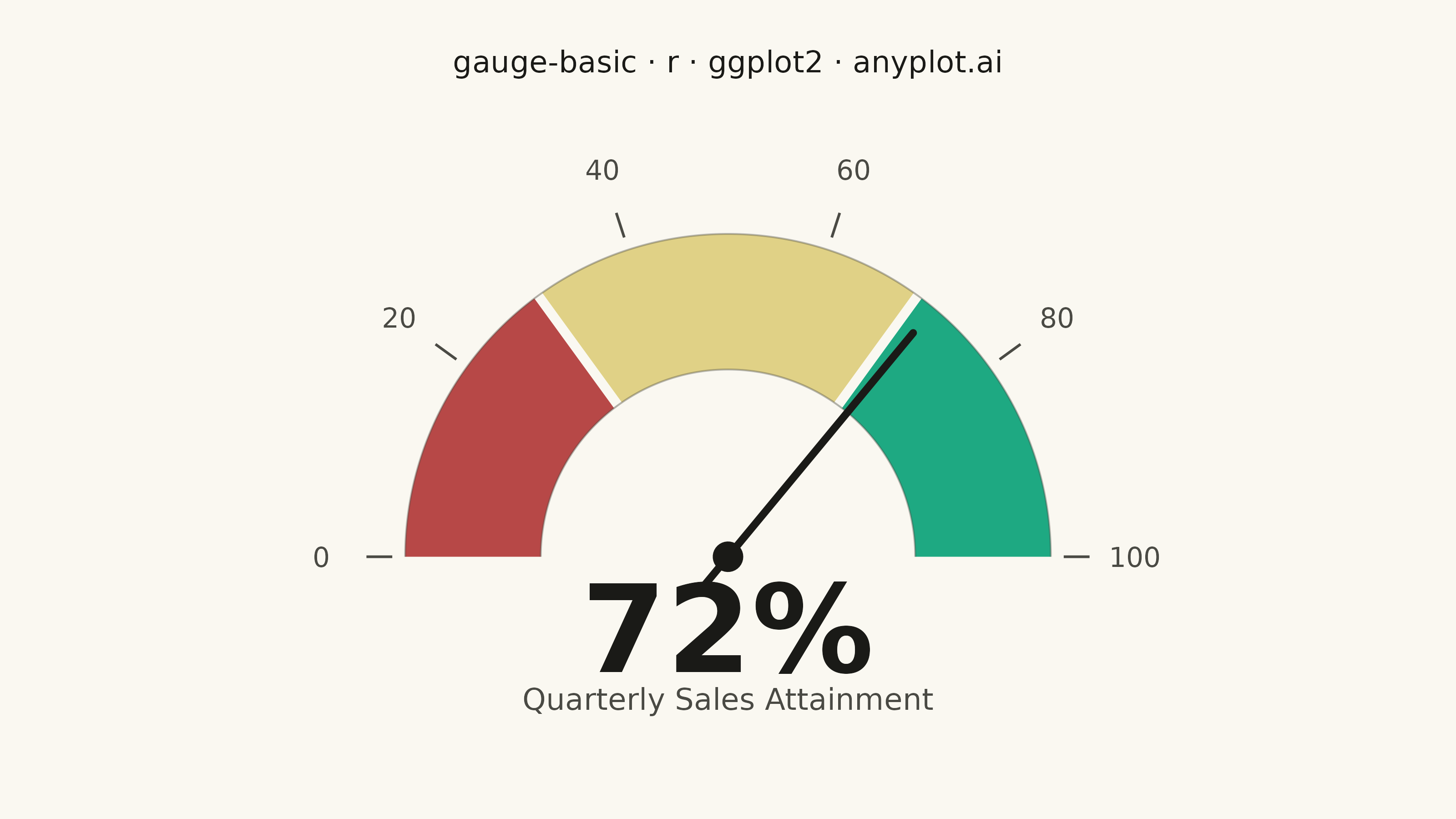
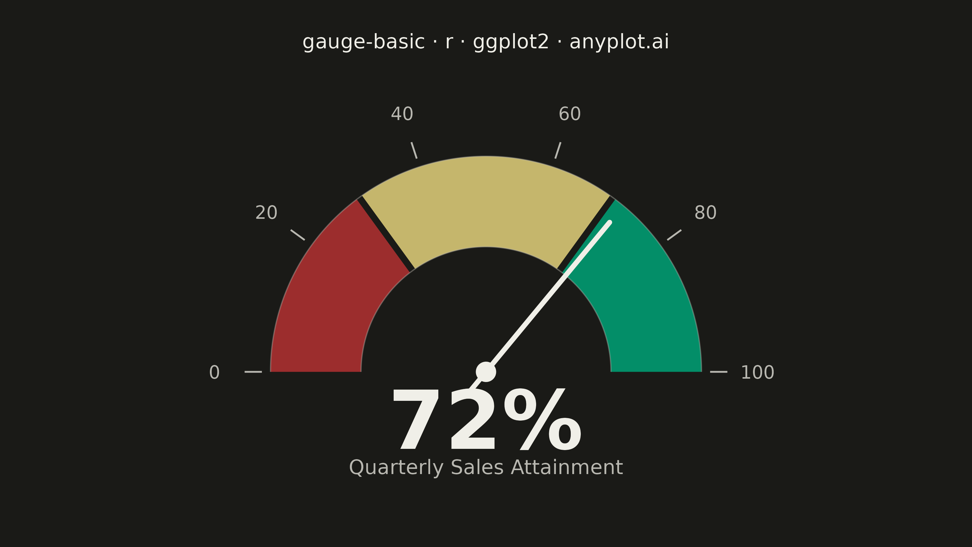
The same plot in 14 other libraries — Python: Altair, Bokeh, lets-plot, Matplotlib, Plotly, plotnine, Pygal, Seaborn; Julia: Makie.jl; JavaScript: Chart.js, D3.js, Apache ECharts, Highcharts, MUI X Charts. Compare all 15 side by side: Basic Gauge Chart in Python, R, Julia and JavaScript.
A gauge chart (also known as a speedometer chart) displays a single value within a defined range using a semi-circular or circular dial. It is ideal for showing progress toward a goal, performance metrics, or any KPI that needs to be evaluated against minimum and maximum bounds. The visual metaphor of a speedometer makes it intuitive to quickly assess whether a value is in an acceptable range.
#' anyplot.ai
#' gauge-basic: Basic Gauge Chart
#' Library: ggplot2 3.5.1 | R 4.4.1
#' Quality: 88/100 | Created: 2026-06-30

library(ggplot2)
library(ragg)

# Theme tokens
THEME       <- Sys.getenv("ANYPLOT_THEME", "light")
PAGE_BG     <- if (THEME == "light") "#FAF8F1" else "#1A1A17"
ELEVATED_BG <- if (THEME == "light") "#FFFDF6" else "#242420"
INK         <- if (THEME == "light") "#1A1A17" else "#F0EFE8"
INK_SOFT    <- if (THEME == "light") "#4A4A44" else "#B8B7B0"
INK_MUTED   <- if (THEME == "light") "#6B6A63" else "#A8A79F"

# Zone colors — semantic exception applies: red=bad, amber=caution, green=good
# per the Imprint palette's semantic anchors and matte-red role
ZONE_COLORS <- c(bad = "#AE3030", caution = "#DDCC77", good = "#009E73")

# Data: quarterly sales attainment (%)
current_value  <- 72
min_value      <- 0
max_value      <- 100
threshold_low  <- 30
threshold_high <- 70

# Map a value to an angle on the semi-circle (pi = left/min, 0 = right/max)
val_to_angle <- function(v) {
  pi * (1 - (v - min_value) / (max_value - min_value))
}

# Build a filled annular sector polygon (for zone arcs)
annular_sector <- function(a_start, a_end, r_inner, r_outer, n = 200) {
  angles_out <- seq(a_start, a_end, length.out = n)
  angles_in  <- rev(angles_out)
  data.frame(
    x = c(r_outer * cos(angles_out), r_inner * cos(angles_in)),
    y = c(r_outer * sin(angles_out), r_inner * sin(angles_in))
  )
}

# Gauge radii
r_outer <- 1.00
r_inner <- 0.58

# Zone boundary angles
a_min  <- val_to_angle(min_value)
a_low  <- val_to_angle(threshold_low)
a_high <- val_to_angle(threshold_high)
a_max  <- val_to_angle(max_value)

# Combined zones data frame — zone factor enables fill aesthetic mapping
# and scale_fill_manual(), leveraging ggplot2's grammar of graphics
zones_df <- rbind(
  cbind(annular_sector(a_min,  a_low,  r_inner, r_outer), zone = "bad"),
  cbind(annular_sector(a_low,  a_high, r_inner, r_outer), zone = "caution"),
  cbind(annular_sector(a_high, a_max,  r_inner, r_outer), zone = "good")
)
zones_df$zone <- factor(zones_df$zone, levels = c("bad", "caution", "good"))

# Thin separator lines at zone boundaries
sep_angles <- c(a_low, a_high)
sep_df <- data.frame(
  x    = r_inner * cos(sep_angles),
  y    = r_inner * sin(sep_angles),
  xend = r_outer * cos(sep_angles),
  yend = r_outer * sin(sep_angles)
)

# Decorative boundary arcs (inner + outer rings) — grouped for single geom_path call
arc_angles <- seq(a_min, a_max, length.out = 300)
arcs_df <- data.frame(
  x    = c(r_outer * cos(arc_angles), r_inner * cos(arc_angles)),
  y    = c(r_outer * sin(arc_angles), r_inner * sin(arc_angles)),
  ring = factor(rep(c("outer", "inner"), each = 300))
)

# Needle
needle_angle  <- val_to_angle(current_value)
r_tip         <- 0.90
r_tail        <- 0.14
needle_df <- data.frame(
  x    = -r_tail * cos(needle_angle),
  y    = -r_tail * sin(needle_angle),
  xend =  r_tip  * cos(needle_angle),
  yend =  r_tip  * sin(needle_angle)
)

# Tick marks at every 20 units
tick_values    <- c(0, 20, 40, 60, 80, 100)
tick_angles    <- val_to_angle(tick_values)
tick_lines_df <- data.frame(
  x    = 1.04 * cos(tick_angles),
  y    = 1.04 * sin(tick_angles),
  xend = 1.12 * cos(tick_angles),
  yend = 1.12 * sin(tick_angles)
)
tick_labels_df <- data.frame(
  x     = 1.26 * cos(tick_angles),
  y     = 1.26 * sin(tick_angles),
  label = as.character(tick_values)
)

plot_title <- "gauge-basic · r · ggplot2 · anyplot.ai"

# Build plot — zones mapped via fill aesthetic + scale_fill_manual (ggplot2 grammar)
p <- ggplot() +
  # Colored zone arcs — fill mapped to zone factor, colors via scale
  geom_polygon(
    data = zones_df,
    aes(x = x, y = y, fill = zone, group = zone),
    alpha = 0.88
  ) +
  scale_fill_manual(values = ZONE_COLORS, guide = "none") +
  # Zone boundary separators (PAGE_BG camouflage for seamless look)
  geom_segment(
    data = sep_df, aes(x = x, y = y, xend = xend, yend = yend),
    color = PAGE_BG, linewidth = 1.8
  ) +
  # Decorative inner/outer boundary arcs — both rings in one geom_path call
  geom_path(
    data = arcs_df, aes(x = x, y = y, group = ring),
    color = INK_SOFT, linewidth = 0.35, alpha = 0.4
  ) +
  # Tick marks
  geom_segment(
    data = tick_lines_df, aes(x = x, y = y, xend = xend, yend = yend),
    color = INK_SOFT, linewidth = 0.5
  ) +
  # Tick labels (size=3.8mm for better mobile legibility)
  geom_text(
    data = tick_labels_df, aes(x = x, y = y, label = label),
    color = INK_SOFT, size = 3.8
  ) +
  # Needle
  geom_segment(
    data = needle_df, aes(x = x, y = y, xend = xend, yend = yend),
    color = INK, linewidth = 1.4, lineend = "round"
  ) +
  # Center pivot dot
  annotate("point", x = 0, y = 0, size = 5, color = INK) +
  # Current value (large, prominent)
  annotate(
    "text", x = 0, y = -0.22,
    label = paste0(current_value, "%"),
    color = INK, size = 17, fontface = "bold"
  ) +
  # Subtitle below the value
  annotate(
    "text", x = 0, y = -0.44,
    label = "Quarterly Sales Attainment",
    color = INK_SOFT, size = 4.2
  ) +
  labs(title = plot_title) +
  coord_fixed(xlim = c(-1.7, 1.7), ylim = c(-0.65, 1.35)) +
  theme_void() +
  theme(
    plot.background  = element_rect(fill = PAGE_BG, color = PAGE_BG),
    panel.background = element_rect(fill = PAGE_BG, color = NA),
    plot.title       = element_text(
      color  = INK, size = 12, hjust = 0.5,
      margin = margin(t = 12, b = 4)
    ),
    plot.margin = margin(8, 16, 8, 16)
  )

# Save
ggsave(
  filename = sprintf("plot-%s.png", THEME),
  plot     = p,
  device   = ragg::agg_png,
  width    = 8,
  height   = 4.5,
  units    = "in",
  dpi      = 400
)
Runnable source as JSON, for any HTTP client: https://api.anyplot.ai/specs/gauge-basic/ggplot2/code. Any spec id and library id listed in llms-full.txt fit the same URL shape; every URL below is complete and callable.
{
  "spec_id": "gauge-basic",
  "language": "r",
  "library": "ggplot2",
  "page": "https://anyplot.ai/gauge-basic/r/ggplot2",
  "hub": "https://anyplot.ai/gauge-basic",
  "code_json": "https://api.anyplot.ai/specs/gauge-basic/ggplot2/code",
  "spec_json": "https://api.anyplot.ai/specs/gauge-basic",
  "render_light_png": "https://storage.googleapis.com/anyplot-images/plots/gauge-basic/r/ggplot2/plot-light.png",
  "render_dark_png": "https://storage.googleapis.com/anyplot-images/plots/gauge-basic/r/ggplot2/plot-dark.png",
  "quality_score": 88.0,
  "license": "MIT",
  "guide": "https://anyplot.ai/llms.txt"
}
Part of Basic Gauge Chart on anyplot.ai.