The same plot in 14 other libraries — JavaScript: Chart.js, D3.js, Highcharts, MUI X Charts; Python: Altair, Bokeh, lets-plot, Matplotlib, Plotly, plotnine, Pygal, Seaborn; R: ggplot2; Julia: Makie.jl. Compare all 15 side by side: Annotated Heatmap in Python, R, Julia and JavaScript.
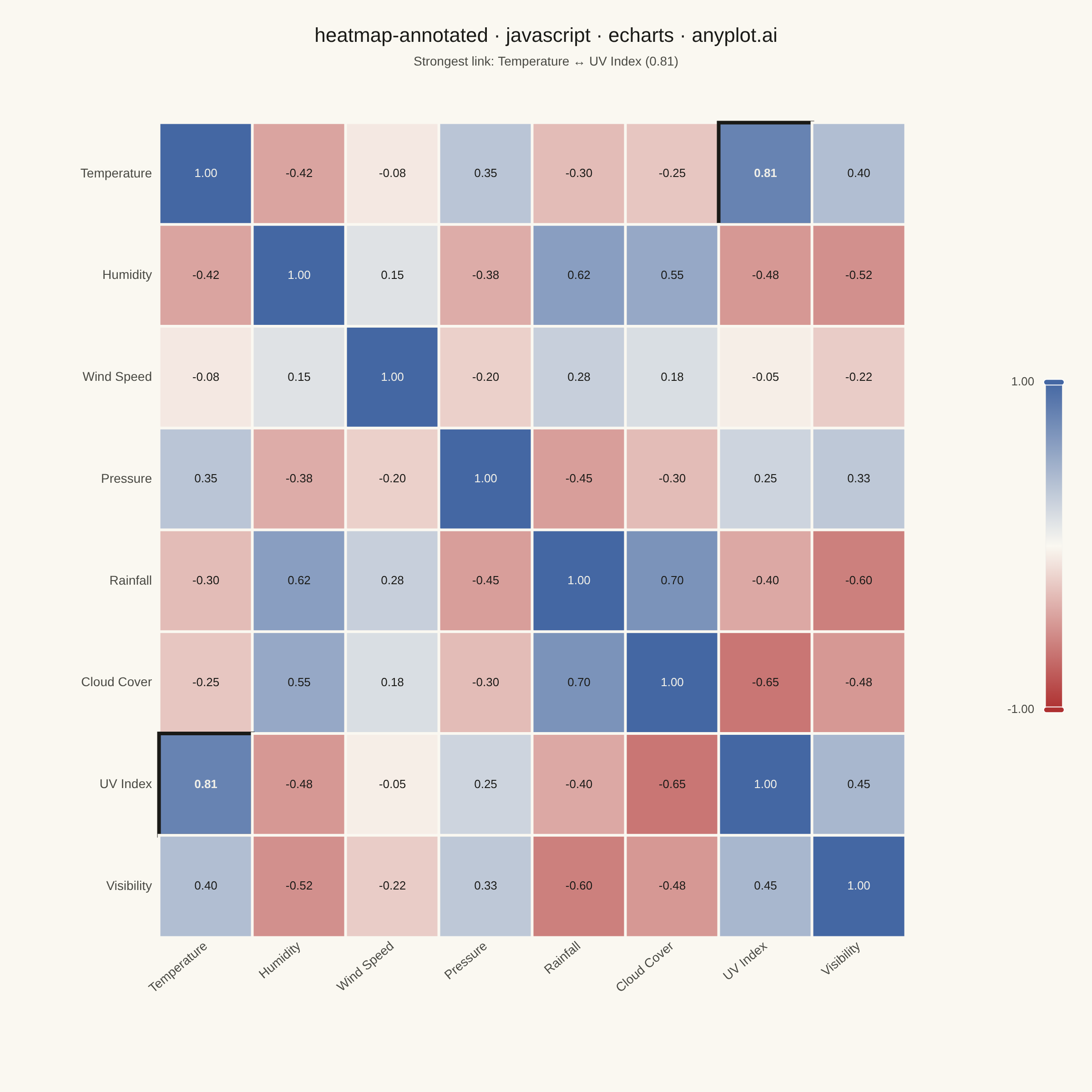
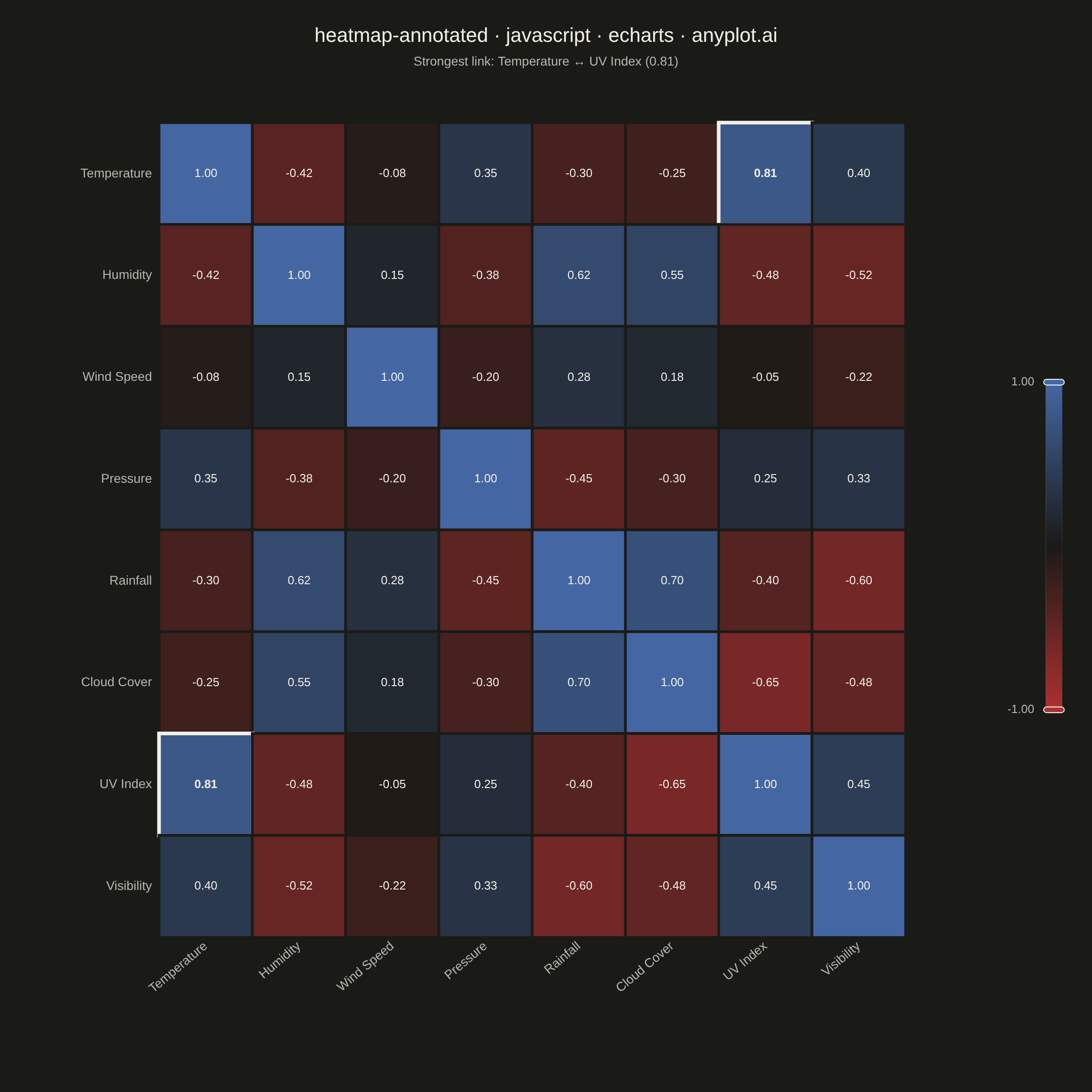
A heatmap with numeric values displayed inside each cell, combining color intensity with exact value labels. Essential for correlation matrices, confusion matrices, and any matrix visualization where both pattern recognition and precise values matter. Text color automatically contrasts with background for readability.
// anyplot.ai
// heatmap-annotated: Annotated Heatmap
// Library: echarts 6.1.0 | JavaScript 22.23.1
// Quality: 90/100 | Created: 2026-08-05
//# anyplot-orientation: square

const t = window.ANYPLOT_TOKENS;

// --- Data: correlation matrix of weather metrics (symmetric, diagonal = 1) -
const metrics = [
  "Temperature", "Humidity", "Wind Speed", "Pressure",
  "Rainfall", "Cloud Cover", "UV Index", "Visibility",
];

const corr = [
  [1.00, -0.42, -0.08, 0.35, -0.30, -0.25, 0.81, 0.40],
  [-0.42, 1.00, 0.15, -0.38, 0.62, 0.55, -0.48, -0.52],
  [-0.08, 0.15, 1.00, -0.20, 0.28, 0.18, -0.05, -0.22],
  [0.35, -0.38, -0.20, 1.00, -0.45, -0.30, 0.25, 0.33],
  [-0.30, 0.62, 0.28, -0.45, 1.00, 0.70, -0.40, -0.60],
  [-0.25, 0.55, 0.18, -0.30, 0.70, 1.00, -0.65, -0.48],
  [0.81, -0.48, -0.05, 0.25, -0.40, -0.65, 1.00, 0.45],
  [0.40, -0.52, -0.22, 0.33, -0.60, -0.48, 0.45, 1.00],
];

// --- Cell-background-aware annotation contrast --------------------------
// Interpolates the same imprint_div gradient the visualMap uses, so each
// cell's label color is derived from that exact cell's rendered background.
const hexToRgb = (hex) => [
  parseInt(hex.slice(1, 3), 16),
  parseInt(hex.slice(3, 5), 16),
  parseInt(hex.slice(5, 7), 16),
];
const lerpRgb = (hexA, hexB, ratio) => {
  const [a, b] = [hexToRgb(hexA), hexToRgb(hexB)];
  return a.map((channel, i) => Math.round(channel + (b[i] - channel) * ratio));
};
const divergingRgb = (value) => {
  const ratio = (value + 1) / 2; // value in [-1, 1] -> [0, 1]
  return ratio <= 0.5 ? lerpRgb(t.div[0], t.div[1], ratio / 0.5) : lerpRgb(t.div[1], t.div[2], (ratio - 0.5) / 0.5);
};
const luma = ([r, g, b]) => (r * 299 + g * 587 + b * 114) / 1000;
const contrastColor = (value) => (luma(divergingRgb(value)) > 140 ? "#1A1A17" : "#F0EFE8");

// --- Data storytelling: surface the strongest off-diagonal relationship ----
// so the reader isn't left to hunt the matrix for the standout pair.
let strongest = { row: 0, col: 1, value: corr[0][1] };
for (let row = 0; row < metrics.length; row += 1) {
  for (let col = row + 1; col < metrics.length; col += 1) {
    if (Math.abs(corr[row][col]) > Math.abs(strongest.value)) {
      strongest = { row, col, value: corr[row][col] };
    }
  }
}
const isStrongestPair = (row, col) =>
  row !== col && ((row === strongest.row && col === strongest.col) || (row === strongest.col && col === strongest.row));

const cells = [];
for (let row = 0; row < metrics.length; row += 1) {
  for (let col = 0; col < metrics.length; col += 1) {
    const value = corr[row][col];
    const highlight = isStrongestPair(row, col);
    cells.push({
      value: [col, row, value],
      label: { color: contrastColor(value), fontWeight: highlight ? 700 : 400 },
      ...(highlight ? { itemStyle: { borderColor: t.ink, borderWidth: 4 } } : {}),
    });
  }
}

// --- Init -------------------------------------------------------------------
const chart = echarts.init(document.getElementById("container"));

// --- Option -----------------------------------------------------------------
chart.setOption({
  animation: false,
  backgroundColor: "transparent",
  title: {
    text: "heatmap-annotated · javascript · echarts · anyplot.ai",
    subtext: `Strongest link: ${metrics[strongest.row]} ↔ ${metrics[strongest.col]} (${strongest.value.toFixed(2)})`,
    left: "center",
    top: 24,
    textStyle: { color: t.ink, fontSize: 22, fontWeight: 500 },
    subtextStyle: { color: t.inkSoft, fontSize: 14 },
  },
  grid: { left: 175, right: 205, top: 135, bottom: 170 },
  xAxis: {
    type: "category",
    data: metrics,
    axisLine: { show: false },
    axisTick: { show: false },
    splitLine: { show: false },
    axisLabel: { color: t.inkSoft, fontSize: 14, rotate: 40 },
  },
  yAxis: {
    type: "category",
    data: metrics,
    inverse: true,
    axisLine: { show: false },
    axisTick: { show: false },
    splitLine: { show: false },
    axisLabel: { color: t.inkSoft, fontSize: 14 },
  },
  visualMap: {
    type: "continuous",
    min: -1,
    max: 1,
    calculable: true,
    orient: "vertical",
    right: 15,
    top: "middle",
    itemHeight: 360,
    itemWidth: 18,
    precision: 2,
    inRange: { color: t.div },
    textStyle: { color: t.inkSoft, fontSize: 13 },
  },
  series: [
    {
      type: "heatmap",
      data: cells,
      itemStyle: { borderColor: t.pageBg, borderWidth: 3 },
      label: {
        show: true,
        formatter: (params) => params.value[2].toFixed(2),
        fontSize: 13,
      },
      emphasis: {
        itemStyle: { shadowBlur: 0, borderColor: t.ink, borderWidth: 2 },
      },
    },
  ],
});
Runnable source as JSON, for any HTTP client: https://api.anyplot.ai/specs/heatmap-annotated/echarts/code. Any spec id and library id listed in llms-full.txt fit the same URL shape; every URL below is complete and callable.
{
  "spec_id": "heatmap-annotated",
  "language": "javascript",
  "library": "echarts",
  "page": "https://anyplot.ai/heatmap-annotated/javascript/echarts",
  "hub": "https://anyplot.ai/heatmap-annotated",
  "code_json": "https://api.anyplot.ai/specs/heatmap-annotated/echarts/code",
  "spec_json": "https://api.anyplot.ai/specs/heatmap-annotated",
  "render_light_png": "https://storage.googleapis.com/anyplot-images/plots/heatmap-annotated/javascript/echarts/plot-light.png",
  "render_dark_png": "https://storage.googleapis.com/anyplot-images/plots/heatmap-annotated/javascript/echarts/plot-dark.png",
  "interactive_light_html": "https://storage.googleapis.com/anyplot-images/plots/heatmap-annotated/javascript/echarts/plot-light.html",
  "interactive_dark_html": "https://storage.googleapis.com/anyplot-images/plots/heatmap-annotated/javascript/echarts/plot-dark.html",
  "quality_score": 90.0,
  "license": "MIT",
  "guide": "https://anyplot.ai/llms.txt"
}
Part of Annotated Heatmap on anyplot.ai.