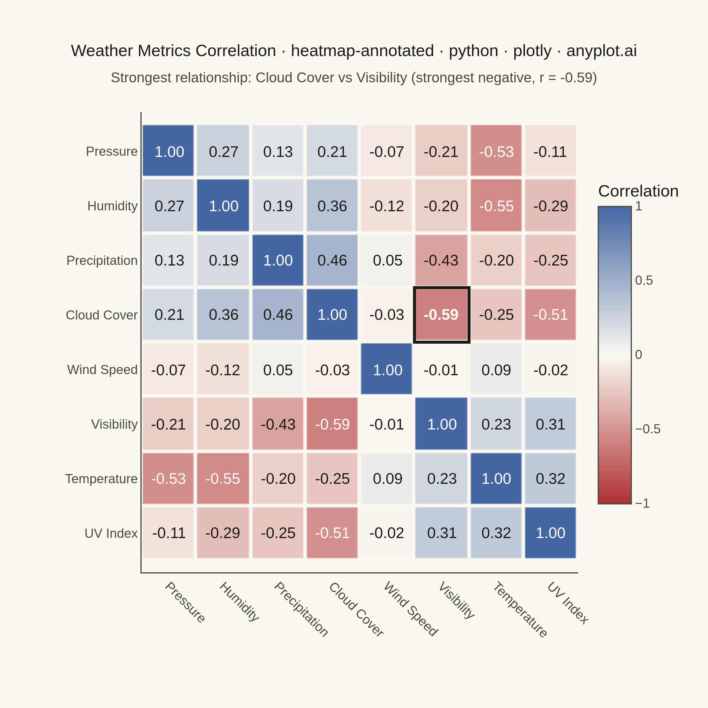
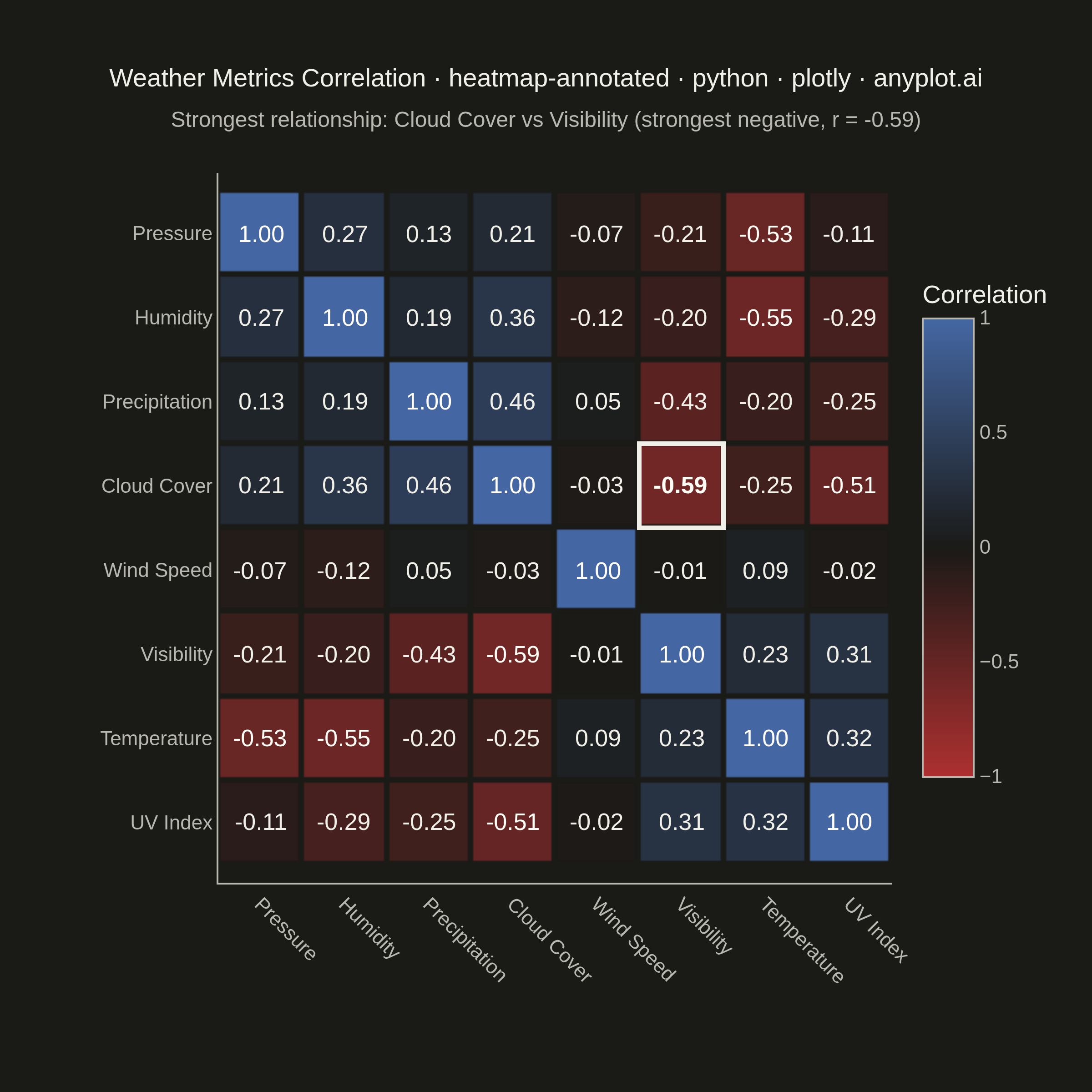
A heatmap with numeric values displayed inside each cell, combining color intensity with exact value labels. Essential for correlation matrices, confusion matrices, and any matrix visualization where both pattern recognition and precise values matter. Text color automatically contrasts with background for readability.
""" anyplot.ai
heatmap-annotated: Annotated Heatmap
Library: plotly 6.9.0 | Python 3.13.14
Quality: 94/100 | Updated: 2026-08-05
"""

import os

import numpy as np
import plotly.graph_objects as go
from scipy.cluster.hierarchy import leaves_list, linkage
from scipy.spatial.distance import squareform


THEME = os.getenv("ANYPLOT_THEME", "light")

# Theme-adaptive chrome tokens (Imprint palette)
PAGE_BG = "#FAF8F1" if THEME == "light" else "#1A1A17"
INK = "#1A1A17" if THEME == "light" else "#F0EFE8"
INK_SOFT = "#4A4A44" if THEME == "light" else "#B8B7B0"
LIGHT_TEXT = "#FFFDF6"  # near-white text for saturated diverging-cmap extremes

# Imprint diverging colormap for signed correlation data (midpoint = page bg)
IMPRINT_DIV = [[0.0, "#AE3030"], [0.5, PAGE_BG], [1.0, "#4467A3"]]

# Data: correlation matrix between daily weather-station metrics
np.random.seed(42)

metrics = [
    "Temperature",
    "Humidity",
    "Wind Speed",
    "Precipitation",
    "Pressure",
    "UV Index",
    "Cloud Cover",
    "Visibility",
]
n_metrics = len(metrics)
n_days = 200

# Simulate a seasonal cycle, then derive each metric from physically
# plausible relationships (not a generic block-correlated matrix), so the
# correlation structure reflects real weather dependencies.
t = np.linspace(0, 4 * np.pi, n_days)
temperature = 20 + 10 * np.sin(t) + np.random.normal(0, 2, n_days)
humidity = 70 - 0.8 * temperature + np.random.normal(0, 8, n_days)
pressure = 1015 - 0.3 * temperature + np.random.normal(0, 4, n_days)
cloud_cover = np.clip(50 + 0.6 * humidity + np.random.normal(0, 12, n_days), 0, 100)
precipitation = np.clip(0.4 * cloud_cover + 0.3 * humidity - 20 + np.random.normal(0, 15, n_days), 0, None)
wind_speed = np.clip(50 - 0.05 * pressure + np.random.normal(0, 5, n_days), 0, None)
uv_index = np.clip(9 - 0.07 * cloud_cover + 0.05 * temperature + np.random.normal(0, 1.5, n_days), 0, 11)
visibility = np.clip(20 - 0.1 * cloud_cover - 0.05 * precipitation + np.random.normal(0, 2, n_days), 0, 20)

data = np.column_stack([temperature, humidity, wind_speed, precipitation, pressure, uv_index, cloud_cover, visibility])
correlation_matrix = np.round(np.corrcoef(data.T), 2)

# Hierarchical-clustering reorder: group metrics with similar correlation
# profiles adjacently (average-linkage on 1 - correlation as distance), so
# the block structure of related weather metrics reads visually instead of
# requiring the eye to scan the whole matrix for it.
distance = squareform(1 - correlation_matrix, checks=False)
order = leaves_list(linkage(distance, method="average"))
metrics = [metrics[i] for i in order]
correlation_matrix = correlation_matrix[np.ix_(order, order)]
n_metrics = len(metrics)

# Locate the strongest off-diagonal relationship to give the plot an
# explicit focal point (outlined cell + subtitle) beyond raw color scanning.
off_diag = correlation_matrix.copy()
np.fill_diagonal(off_diag, 0)
peak_row, peak_col = np.unravel_index(np.argmax(np.abs(off_diag)), off_diag.shape)
peak_val = correlation_matrix[peak_row, peak_col]
peak_relation = "strongest positive" if peak_val > 0 else "strongest negative"

# Numeric cell coordinates (rather than category strings) give exact 0.5-cell
# padding for the focal-point outline below; tick labels are remapped to the
# metric names via tickvals/ticktext.
positions = list(range(n_metrics))

# Build the heatmap trace directly (rather than figure_factory) for full
# control over the colorbar, hover template, and per-cell text contrast.
fig = go.Figure(
    data=go.Heatmap(
        z=correlation_matrix,
        x=positions,
        y=positions,
        colorscale=IMPRINT_DIV,
        zmid=0,
        zmin=-1,
        zmax=1,
        xgap=3,
        ygap=3,
        customdata=[[(metrics[col], metrics[row]) for col in range(n_metrics)] for row in range(n_metrics)],
        hovertemplate="%{customdata[0]} vs %{customdata[1]}<br>Correlation: %{z:.2f}<extra></extra>",
        colorbar=dict(
            title=dict(text="Correlation", font=dict(size=14, color=INK)),
            tickfont=dict(size=11, color=INK_SOFT),
            outlinewidth=1,
            outlinecolor=INK_SOFT,
            thickness=28,
            len=0.75,
        ),
    )
)

# Per-cell annotations with contrast-aware text color: saturated cells
# (|corr| > 0.5, close to the diverging cmap's red/blue extremes) get a
# near-white label; cells close to the theme-matched midpoint get the
# theme's own ink color. The focal-point cell is additionally bolded.
for row in range(n_metrics):
    for col in range(n_metrics):
        val = correlation_matrix[row, col]
        text_color = LIGHT_TEXT if abs(val) > 0.5 else INK
        is_peak = (row, col) == (peak_row, peak_col)
        label = f"<b>{val:.2f}</b>" if is_peak else f"{val:.2f}"
        fig.add_annotation(
            x=positions[col], y=positions[row], text=label, showarrow=False, font=dict(size=13, color=text_color)
        )

# Outline the strongest off-diagonal correlation cell so the plot has an
# explicit focal point instead of relying on scanning color saturation alone.
fig.add_shape(
    type="rect",
    x0=peak_col - 0.5,
    x1=peak_col + 0.5,
    y0=peak_row - 0.5,
    y1=peak_row + 0.5,
    line=dict(color=INK, width=2.5),
    fillcolor="rgba(0,0,0,0)",
)

title = "Weather Metrics Correlation · heatmap-annotated · python · plotly · anyplot.ai"
title_fontsize = round(16 * min(1.0, 67 / len(title)))
subtitle = f"Strongest relationship: {metrics[peak_row]} vs {metrics[peak_col]} ({peak_relation}, r = {peak_val:.2f})"

fig.update_layout(
    autosize=False,
    width=600,
    height=600,
    margin=dict(l=120, r=110, t=95, b=115),
    title=dict(
        text=title,
        subtitle=dict(text=subtitle, font=dict(size=12, color=INK_SOFT)),
        font=dict(size=title_fontsize, color=INK),
        x=0.5,
        xanchor="center",
    ),
    paper_bgcolor=PAGE_BG,
    plot_bgcolor=PAGE_BG,
    font=dict(color=INK, family="Arial, sans-serif"),
    xaxis=dict(
        tickmode="array",
        tickvals=positions,
        ticktext=metrics,
        tickfont=dict(size=11, color=INK_SOFT),
        tickangle=45,
        side="bottom",
        showgrid=False,
        zeroline=False,
        linecolor=INK_SOFT,
        scaleanchor="y",
        constrain="domain",
    ),
    yaxis=dict(
        tickmode="array",
        tickvals=positions,
        ticktext=metrics,
        tickfont=dict(size=11, color=INK_SOFT),
        autorange="reversed",
        showgrid=False,
        zeroline=False,
        linecolor=INK_SOFT,
    ),
)

# Save PNG (square 2400x2400) and interactive HTML
fig.write_image(f"plot-{THEME}.png", width=600, height=600, scale=4)
fig.write_html(f"plot-{THEME}.html", include_plotlyjs="cdn")
Runnable source as JSON, for any HTTP client: https://api.anyplot.ai/specs/heatmap-annotated/plotly/code. Any spec id and library id listed in llms-full.txt fit the same URL shape; every URL below is complete and callable.
{
  "spec_id": "heatmap-annotated",
  "language": "python",
  "library": "plotly",
  "page": "https://anyplot.ai/heatmap-annotated/python/plotly",
  "hub": "https://anyplot.ai/heatmap-annotated",
  "code_json": "https://api.anyplot.ai/specs/heatmap-annotated/plotly/code",
  "spec_json": "https://api.anyplot.ai/specs/heatmap-annotated",
  "render_light_png": "https://storage.googleapis.com/anyplot-images/plots/heatmap-annotated/python/plotly/plot-light.png",
  "render_dark_png": "https://storage.googleapis.com/anyplot-images/plots/heatmap-annotated/python/plotly/plot-dark.png",
  "interactive_light_html": "https://storage.googleapis.com/anyplot-images/plots/heatmap-annotated/python/plotly/plot-light.html",
  "interactive_dark_html": "https://storage.googleapis.com/anyplot-images/plots/heatmap-annotated/python/plotly/plot-dark.html",
  "quality_score": 94.0,
  "license": "MIT",
  "guide": "https://anyplot.ai/llms.txt"
}
Part of Annotated Heatmap on anyplot.ai.