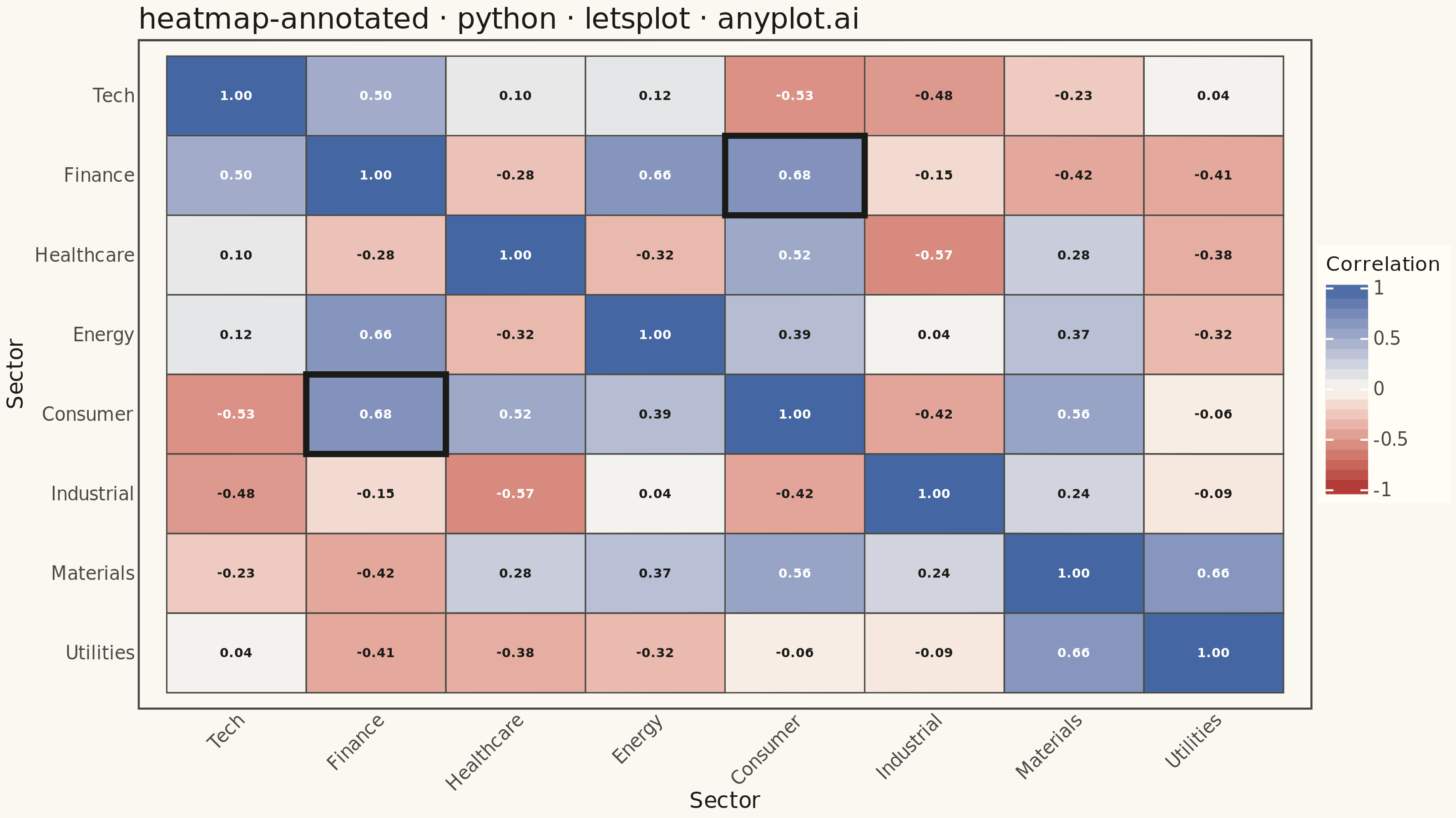
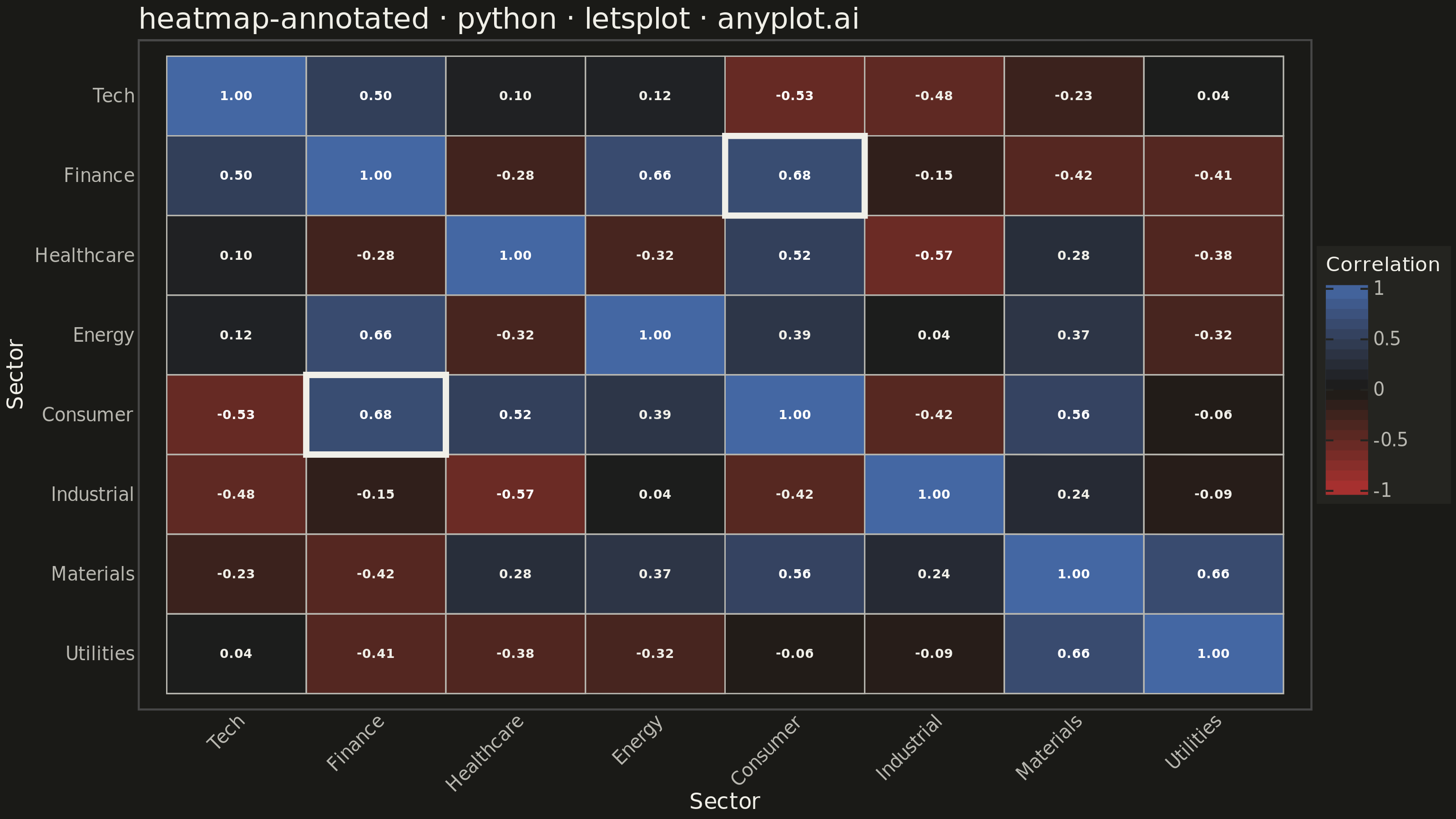
A heatmap with numeric values displayed inside each cell, combining color intensity with exact value labels. Essential for correlation matrices, confusion matrices, and any matrix visualization where both pattern recognition and precise values matter. Text color automatically contrasts with background for readability.
""" anyplot.ai
heatmap-annotated: Annotated Heatmap
Library: letsplot 4.11.0 | Python 3.13.14
Quality: 89/100 | Updated: 2026-08-05
"""

import os

import numpy as np
import pandas as pd
from lets_plot import *


LetsPlot.setup_html()

# Theme tokens
THEME = os.getenv("ANYPLOT_THEME", "light")
PAGE_BG = "#FAF8F1" if THEME == "light" else "#1A1A17"
ELEVATED_BG = "#FFFDF6" if THEME == "light" else "#242420"
INK = "#1A1A17" if THEME == "light" else "#F0EFE8"
INK_SOFT = "#4A4A44" if THEME == "light" else "#B8B7B0"

# Data - Correlation matrix for stock sectors
np.random.seed(42)
sectors = ["Tech", "Finance", "Healthcare", "Energy", "Consumer", "Industrial", "Materials", "Utilities"]
n = len(sectors)

# Generate a realistic correlation matrix
base_corr = np.random.uniform(-0.7, 0.85, (n, n))
corr_matrix = (base_corr + base_corr.T) / 2
np.fill_diagonal(corr_matrix, 1.0)
corr_matrix = np.clip(corr_matrix, -1, 1)

# Create dataframe in long format for lets-plot
rows = []
for i, row_sector in enumerate(sectors):
    for j, col_sector in enumerate(sectors):
        rows.append({"x": col_sector, "y": row_sector, "value": corr_matrix[i, j]})

df = pd.DataFrame(rows)

# Reverse y-axis order for proper matrix display
df["y"] = pd.Categorical(df["y"], categories=sectors[::-1], ordered=True)
df["x"] = pd.Categorical(df["x"], categories=sectors, ordered=True)

# Format values for annotation
df["label"] = df["value"].apply(lambda v: f"{v:.2f}")

# Contrast text: white on saturated cells, theme ink near the (background-colored) midpoint
df["text_color"] = df["value"].apply(lambda v: "white" if abs(v) > 0.5 else INK)

# Highlight the strongest off-diagonal relationship to guide the eye to the key pattern
off_diag = df[df["x"].astype(str) != df["y"].astype(str)]
top_pair = off_diag.loc[off_diag["value"].abs().idxmax()]
top_x, top_y = str(top_pair["x"]), str(top_pair["y"])
highlight = df[
    ((df["x"].astype(str) == top_x) & (df["y"].astype(str) == top_y))
    | ((df["x"].astype(str) == top_y) & (df["y"].astype(str) == top_x))
]

# Create heatmap with annotations
plot = (
    ggplot(df, aes(x="x", y="y", fill="value"))
    + geom_tile(color=INK_SOFT, size=0.3)
    + geom_tile(data=highlight, color=INK, size=1.5)
    + geom_text(aes(label="label", color="text_color"), size=3.5, fontface="bold")
    + scale_color_identity()
    + scale_fill_gradient2(low="#AE3030", mid=PAGE_BG, high="#4467A3", midpoint=0, name="Correlation", limits=[-1, 1])
    + labs(x="Sector", y="Sector", title="heatmap-annotated · python · letsplot · anyplot.ai")
    + theme_minimal()
    + theme(
        plot_background=element_rect(fill=PAGE_BG, color=PAGE_BG),
        panel_background=element_rect(fill=PAGE_BG),
        plot_title=element_text(size=16, color=INK),
        axis_title=element_text(size=12, color=INK),
        axis_text=element_text(size=10, color=INK_SOFT),
        axis_text_x=element_text(angle=45, hjust=1),
        legend_background=element_rect(fill=ELEVATED_BG, color=INK_SOFT),
        legend_title=element_text(size=11, color=INK),
        legend_text=element_text(size=10, color=INK_SOFT),
        panel_grid=element_blank(),
    )
    + ggsize(800, 450)
)

# Save PNG and HTML (scale 4x for 3200x1800)
ggsave(plot, f"plot-{THEME}.png", path=".", scale=4)
ggsave(plot, f"plot-{THEME}.html", path=".")
Runnable source as JSON, for any HTTP client: https://api.anyplot.ai/specs/heatmap-annotated/letsplot/code. Any spec id and library id listed in llms-full.txt fit the same URL shape; every URL below is complete and callable.
{
  "spec_id": "heatmap-annotated",
  "language": "python",
  "library": "letsplot",
  "page": "https://anyplot.ai/heatmap-annotated/python/letsplot",
  "hub": "https://anyplot.ai/heatmap-annotated",
  "code_json": "https://api.anyplot.ai/specs/heatmap-annotated/letsplot/code",
  "spec_json": "https://api.anyplot.ai/specs/heatmap-annotated",
  "render_light_png": "https://storage.googleapis.com/anyplot-images/plots/heatmap-annotated/python/letsplot/plot-light.png",
  "render_dark_png": "https://storage.googleapis.com/anyplot-images/plots/heatmap-annotated/python/letsplot/plot-dark.png",
  "interactive_light_html": "https://storage.googleapis.com/anyplot-images/plots/heatmap-annotated/python/letsplot/plot-light.html",
  "interactive_dark_html": "https://storage.googleapis.com/anyplot-images/plots/heatmap-annotated/python/letsplot/plot-dark.html",
  "quality_score": 89.0,
  "license": "MIT",
  "guide": "https://anyplot.ai/llms.txt"
}
Part of Annotated Heatmap on anyplot.ai.