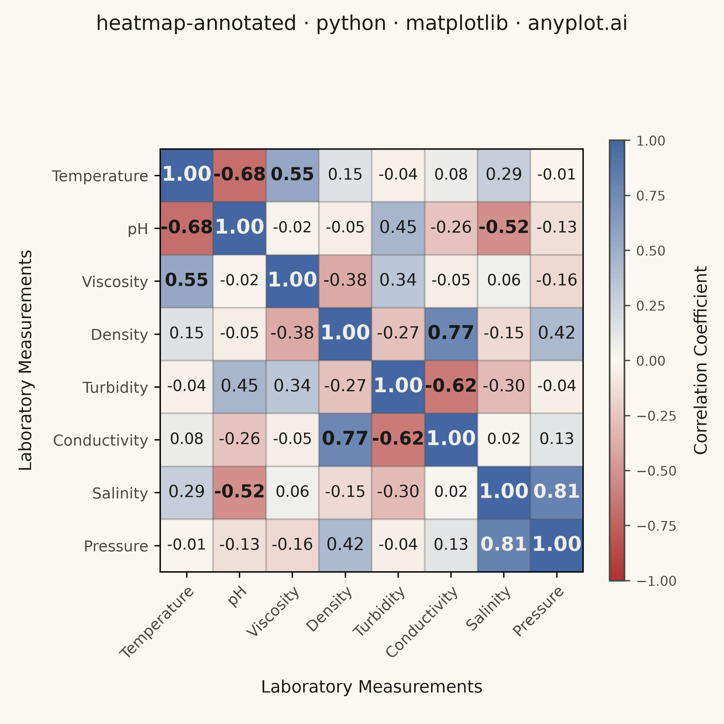
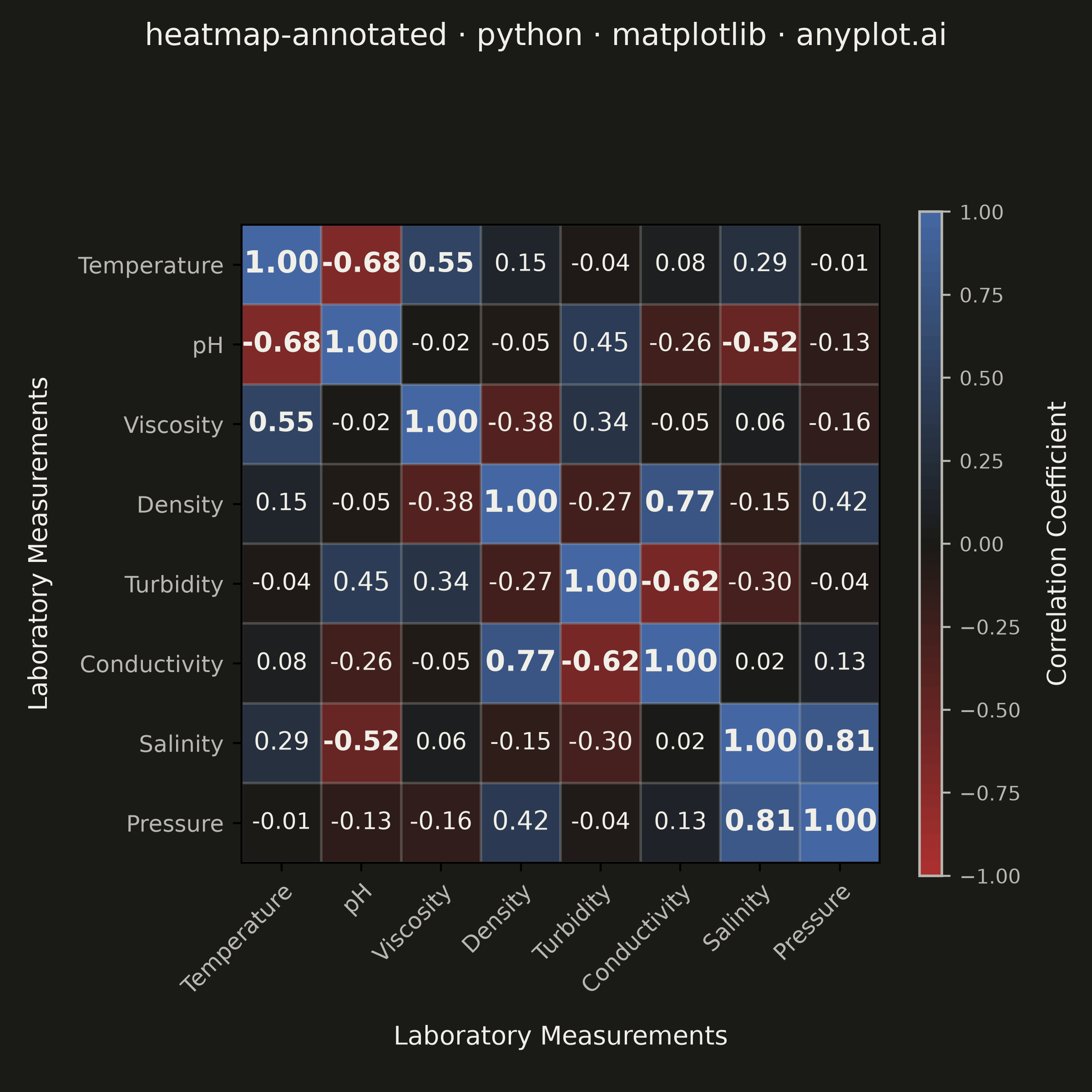
A heatmap with numeric values displayed inside each cell, combining color intensity with exact value labels. Essential for correlation matrices, confusion matrices, and any matrix visualization where both pattern recognition and precise values matter. Text color automatically contrasts with background for readability.
""" anyplot.ai
heatmap-annotated: Annotated Heatmap
Library: matplotlib 3.11.1 | Python 3.13.14
Quality: 95/100 | Updated: 2026-08-05
"""

import os

import matplotlib.pyplot as plt
import numpy as np
from matplotlib.colors import LinearSegmentedColormap


# Theme tokens (see prompts/default-style-guide.md "Theme-adaptive Chrome")
THEME = os.getenv("ANYPLOT_THEME", "light")
PAGE_BG = "#FAF8F1" if THEME == "light" else "#1A1A17"
INK = "#1A1A17" if THEME == "light" else "#F0EFE8"
INK_SOFT = "#4A4A44" if THEME == "light" else "#B8B7B0"
CELL_LIGHT_TEXT = "#F0EFE8"  # fixed light-ink chrome value, for contrast on dark cell fills in either theme

# Imprint diverging colormap — correlations have a meaningful zero midpoint
midpoint = PAGE_BG
imprint_div = LinearSegmentedColormap.from_list("imprint_div", ["#AE3030", midpoint, "#4467A3"])

# Data: laboratory measurement correlations
np.random.seed(42)
measurements = ["Temperature", "pH", "Viscosity", "Density", "Turbidity", "Conductivity", "Salinity", "Pressure"]
n = len(measurements)

# Generate a realistic correlation matrix (symmetric, diagonal = 1)
base = np.random.randn(n, n) * 0.3
correlation = (base + base.T) / 2
np.fill_diagonal(correlation, 1.0)
correlation = np.clip(correlation, -1, 1)

# Add realistic scientific correlations
correlation[0, 1] = correlation[1, 0] = -0.68  # Temperature-pH: negative
correlation[0, 2] = correlation[2, 0] = 0.55  # Temperature-Viscosity: positive
correlation[3, 5] = correlation[5, 3] = 0.77  # Density-Conductivity: strong positive
correlation[4, 5] = correlation[5, 4] = -0.62  # Turbidity-Conductivity: negative
correlation[6, 7] = correlation[7, 6] = 0.81  # Salinity-Pressure: strong positive
correlation[1, 4] = correlation[4, 1] = 0.45  # pH-Turbidity: positive

# Plot — square format for a symmetric matrix (see default-style-guide.md "Visual Sizing Defaults")
fig, ax = plt.subplots(figsize=(6, 6), dpi=400, facecolor=PAGE_BG)
ax.set_facecolor(PAGE_BG)

im = ax.imshow(correlation, cmap=imprint_div, vmin=-1, vmax=1, aspect="equal")

# Colorbar
cbar = ax.figure.colorbar(im, ax=ax, shrink=0.8, aspect=30)
cbar.ax.tick_params(labelsize=8, colors=INK_SOFT)
cbar.set_label("Correlation Coefficient", fontsize=10, labelpad=10, color=INK)
cbar.outline.set_edgecolor(INK_SOFT)
cbar.outline.set_linewidth(1)

# Ticks and category labels
ax.set_xticks(np.arange(n))
ax.set_yticks(np.arange(n))
ax.set_xticklabels(measurements, fontsize=9, color=INK_SOFT)
ax.set_yticklabels(measurements, fontsize=9, color=INK_SOFT)
plt.setp(ax.get_xticklabels(), rotation=45, ha="right", rotation_mode="anchor")

# Cell annotations — text color and weight computed from the cell's actual render
# luminance (not a fixed value threshold), so contrast stays correct across the
# full imprint_div range; magnitude scales size/weight to reinforce the strongest
# relationships visually, echoing the color-driven hierarchy.
for i in range(n):
    for j in range(n):
        value = correlation[i, j]
        r, g, b, _ = im.cmap(im.norm(value))
        luminance = 0.299 * r + 0.587 * g + 0.114 * b
        text_color = INK if luminance > 0.5 else CELL_LIGHT_TEXT
        weight = "bold" if abs(value) >= 0.5 else "normal"
        size = 9 + 3 * abs(value)
        ax.text(j, i, f"{value:.2f}", ha="center", va="center", color=text_color, fontsize=size, fontweight=weight)

# Styling — suptitle centers on the full figure (incl. colorbar), unlike ax.set_title
fig.suptitle("heatmap-annotated · python · matplotlib · anyplot.ai", fontsize=12, fontweight="medium", color=INK)
ax.set_xlabel("Laboratory Measurements", fontsize=10, labelpad=10, color=INK)
ax.set_ylabel("Laboratory Measurements", fontsize=10, labelpad=10, color=INK)

# Subtle grid between cells
ax.set_xticks(np.arange(n + 1) - 0.5, minor=True)
ax.set_yticks(np.arange(n + 1) - 0.5, minor=True)
ax.grid(which="minor", color=INK_SOFT, linestyle="-", linewidth=1, alpha=0.3)
ax.tick_params(which="minor", bottom=False, left=False)

plt.tight_layout(rect=(0, 0, 1, 0.96))
plt.savefig(f"plot-{THEME}.png", dpi=400, facecolor=PAGE_BG)  # bbox_inches MUST stay default (None)
Runnable source as JSON, for any HTTP client: https://api.anyplot.ai/specs/heatmap-annotated/matplotlib/code. Any spec id and library id listed in llms-full.txt fit the same URL shape; every URL below is complete and callable.
{
  "spec_id": "heatmap-annotated",
  "language": "python",
  "library": "matplotlib",
  "page": "https://anyplot.ai/heatmap-annotated/python/matplotlib",
  "hub": "https://anyplot.ai/heatmap-annotated",
  "code_json": "https://api.anyplot.ai/specs/heatmap-annotated/matplotlib/code",
  "spec_json": "https://api.anyplot.ai/specs/heatmap-annotated",
  "render_light_png": "https://storage.googleapis.com/anyplot-images/plots/heatmap-annotated/python/matplotlib/plot-light.png",
  "render_dark_png": "https://storage.googleapis.com/anyplot-images/plots/heatmap-annotated/python/matplotlib/plot-dark.png",
  "quality_score": 95.0,
  "license": "MIT",
  "guide": "https://anyplot.ai/llms.txt"
}
Part of Annotated Heatmap on anyplot.ai.