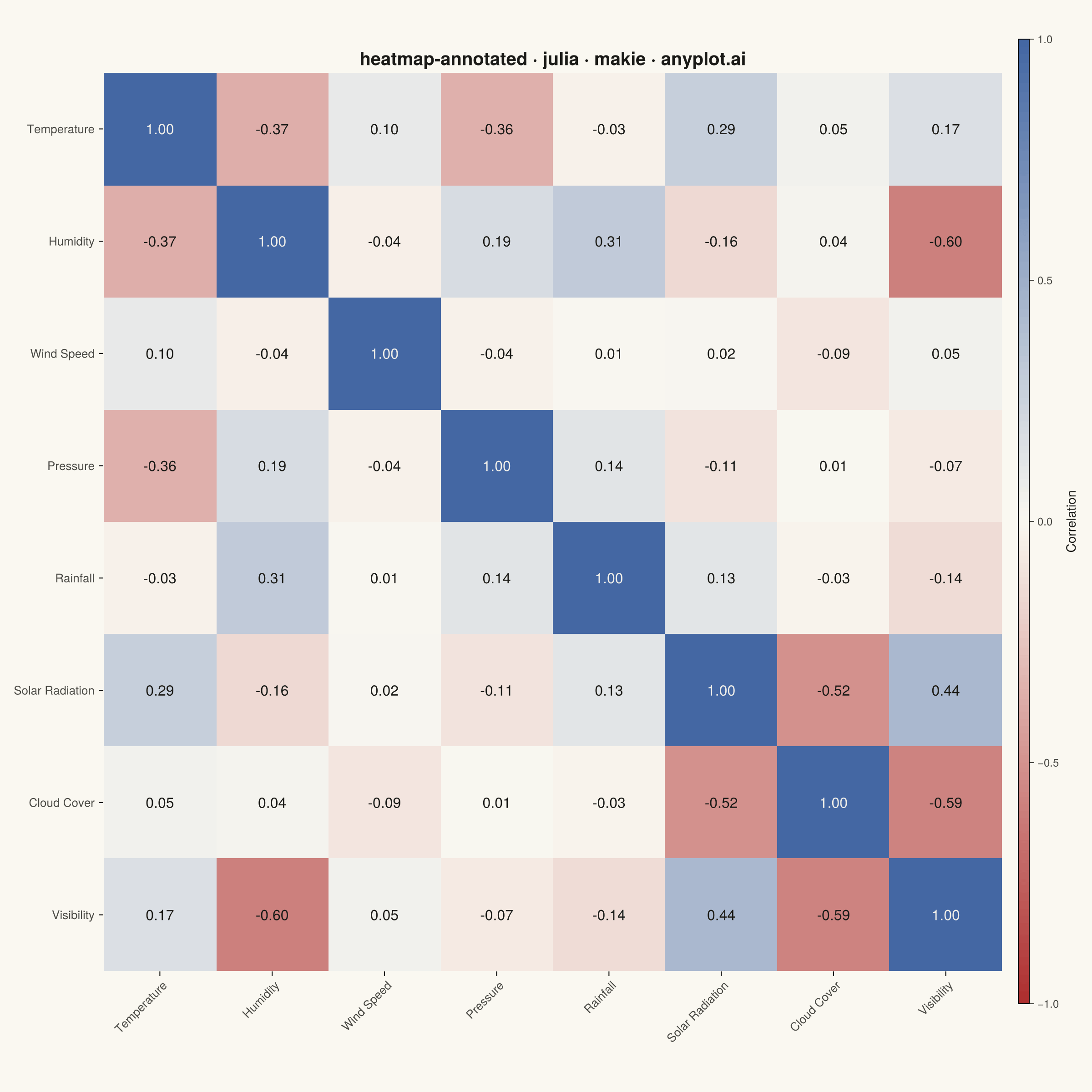
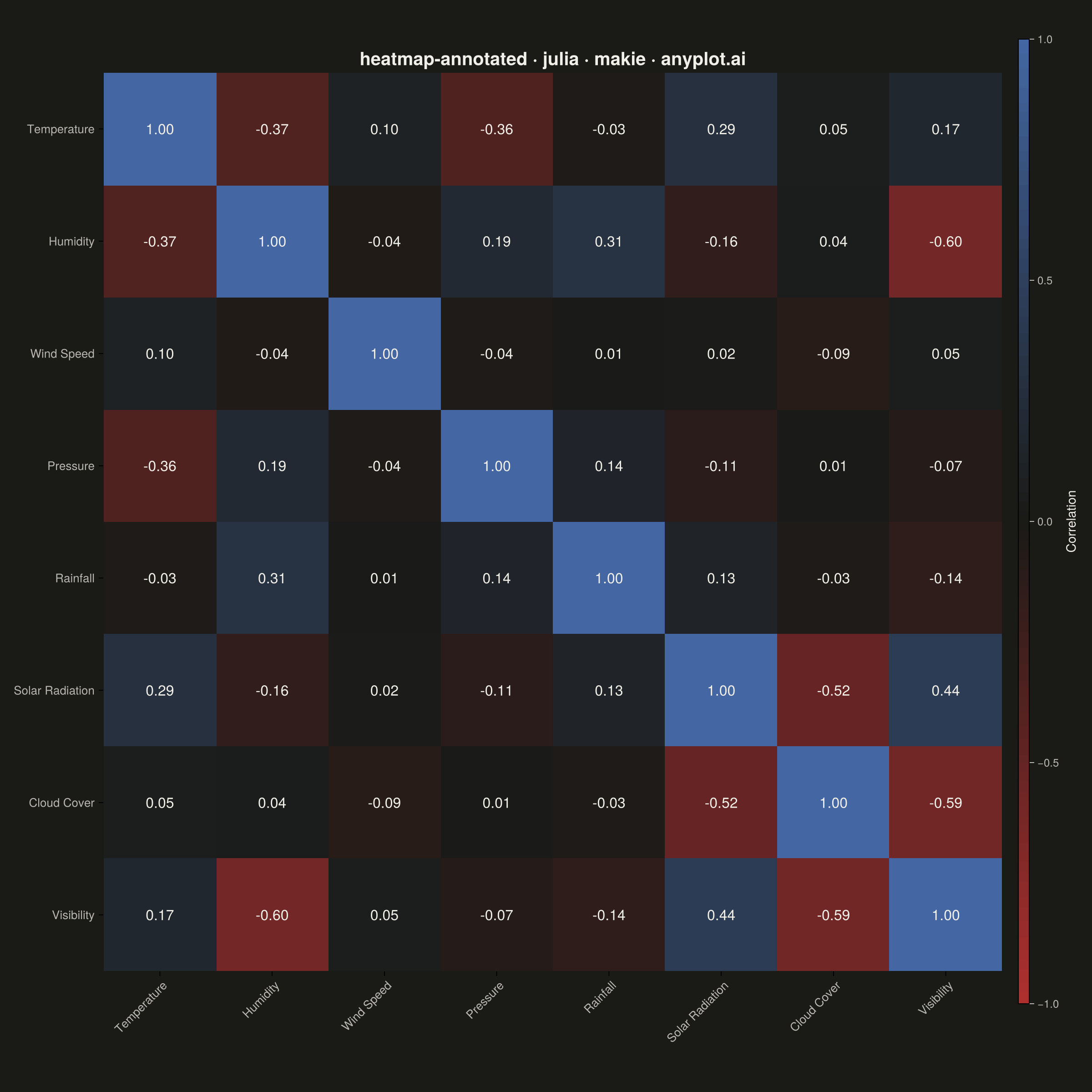
The same plot in 14 other libraries — Python: Altair, Bokeh, lets-plot, Matplotlib, Plotly, plotnine, Pygal, Seaborn; R: ggplot2; JavaScript: Chart.js, D3.js, Apache ECharts, Highcharts, MUI X Charts. Compare all 15 side by side: Annotated Heatmap in Python, R, Julia and JavaScript.
A heatmap with numeric values displayed inside each cell, combining color intensity with exact value labels. Essential for correlation matrices, confusion matrices, and any matrix visualization where both pattern recognition and precise values matter. Text color automatically contrasts with background for readability.
# anyplot.ai
# heatmap-annotated: Annotated Heatmap
# Library: makie 0.21.9 | Julia 1.11.9
# Quality: 83/100 | Created: 2026-08-05

using CairoMakie
using Colors
using Random
using Statistics
using Printf

Random.seed!(42)

# --- Theme tokens -----------------------------------------------------------
const THEME    = get(ENV, "ANYPLOT_THEME", "light")
const PAGE_BG  = THEME == "light" ? colorant"#FAF8F1" : colorant"#1A1A17"
const INK      = THEME == "light" ? colorant"#1A1A17" : colorant"#F0EFE8"
const INK_SOFT = THEME == "light" ? colorant"#4A4A44" : colorant"#B8B7B0"
const MIDPOINT = THEME == "light" ? colorant"#FAF8F1" : colorant"#1A1A17"

# Imprint diverging colormap — correlations have a meaningful zero midpoint
const ANYPLOT_DIV = cgrad([colorant"#AE3030", MIDPOINT, colorant"#4467A3"])

# Cell-annotation contrast colors — chosen per cell from the fill's own
# luminance, so text stays legible whether the cell lands on the saturated
# red/blue ends or the near-background midpoint of the diverging scale.
const DARK_TEXT  = colorant"#1A1A17"
const LIGHT_TEXT = colorant"#F0EFE8"

# --- Data ---------------------------------------------------------------
variables = [
    "Temperature", "Humidity", "Wind Speed", "Pressure",
    "Rainfall", "Solar Radiation", "Cloud Cover", "Visibility",
]
n_vars = length(variables)
n_samples = 200

cloud_cover = randn(n_samples) .* 15 .+ 50
temperature = randn(n_samples) .* 5 .+ 20
humidity = -0.6 .* temperature .+ randn(n_samples) .* 8 .+ 70
wind_speed = randn(n_samples) .* 3 .+ 15
pressure = -0.4 .* temperature .+ randn(n_samples) .* 5 .+ 1013
rainfall = 0.5 .* humidity .+ randn(n_samples) .* 10
solar_radiation = 0.7 .* temperature .- 0.4 .* cloud_cover .+ randn(n_samples) .* 10 .+ 200
visibility = -0.5 .* humidity .- 0.3 .* cloud_cover .+ randn(n_samples) .* 5 .+ 20

measurements = hcat(
    temperature, humidity, wind_speed, pressure,
    rainfall, solar_radiation, cloud_cover, visibility,
)
corr_matrix = cor(measurements)

# --- Plot -----------------------------------------------------------------
fig = Figure(
    resolution = (1200, 1200),
    fontsize = 14,
    backgroundcolor = PAGE_BG,
)

ax = Axis(
    fig[1, 1];
    title = "heatmap-annotated · julia · makie · anyplot.ai",
    titlesize = 20,
    titlecolor = INK,
    xticks = (1:n_vars, variables),
    yticks = (1:n_vars, variables),
    xticklabelrotation = pi / 4,
    xticklabelcolor = INK_SOFT,
    yticklabelcolor = INK_SOFT,
    xticklabelsize = 13,
    yticklabelsize = 13,
    backgroundcolor = PAGE_BG,
    topspinevisible = false,
    rightspinevisible = false,
    leftspinevisible = false,
    bottomspinevisible = false,
    xgridvisible = false,
    ygridvisible = false,
    aspect = DataAspect(),
    yreversed = true,
)

# Diagonal self-correlations (always 1.00) are redundant next to the
# off-diagonal relationships the matrix exists to reveal, so the fill mask
# swaps them for NaN and renders them in a muted neutral tone instead of
# solid colormap blue -- the value still prints, just visually quieted.
const NEUTRAL_FILL = RGBA(convert(RGB, INK_SOFT), 0.12)
display_matrix = copy(corr_matrix)
for i in 1:n_vars
    display_matrix[i, i] = NaN
end

hm = heatmap!(
    ax, 1:n_vars, 1:n_vars, display_matrix;
    colormap = ANYPLOT_DIV, colorrange = (-1, 1), nan_color = NEUTRAL_FILL,
)

# Subtle grid at cell boundaries keeps near-zero-correlation cells (whose
# fill sits close to the theme background by design) visually separated
# from the canvas without touching the data colors themselves.
for k in 0.5:(n_vars + 0.5)
    hlines!(ax, k; xmin = 0, xmax = 1, color = (INK_SOFT, 0.15), linewidth = 1)
    vlines!(ax, k; ymin = 0, ymax = 1, color = (INK_SOFT, 0.15), linewidth = 1)
end

const STRONG_THRESHOLD = 0.5
for i in 1:n_vars, j in 1:n_vars
    value = corr_matrix[i, j]
    is_diagonal = i == j
    is_strong = !is_diagonal && abs(value) >= STRONG_THRESHOLD

    if is_diagonal
        text_color = INK_SOFT
        label_fontsize = 13
    else
        fill_color = ANYPLOT_DIV[(value + 1) / 2]
        luminance = 0.299 * red(fill_color) + 0.587 * green(fill_color) + 0.114 * blue(fill_color)
        text_color = luminance > 0.5 ? DARK_TEXT : LIGHT_TEXT
        label_fontsize = 16
    end

    # A crisp outline calls out the strongest relationships (|r| >= 0.5) so
    # they read as the focal point instead of competing equally with weak
    # correlations for attention.
    if is_strong
        poly!(
            ax, Rect2f(i - 0.5, j - 0.5, 1, 1);
            color = :transparent, strokecolor = INK, strokewidth = 2.5,
        )
    end

    text!(
        ax, i, j;
        text = @sprintf("%.2f", value),
        align = (:center, :center),
        fontsize = label_fontsize,
        font = is_strong ? :bold : :regular,
        color = text_color,
    )
end

Colorbar(
    fig[1, 2], hm;
    label = "Correlation",
    labelsize = 14,
    labelcolor = INK,
    ticklabelsize = 12,
    ticklabelcolor = INK_SOFT,
    tickcolor = INK_SOFT,
)

# --- Save -------------------------------------------------------------------
save("plot-$(THEME).png", fig; px_per_unit = 2)
Runnable source as JSON, for any HTTP client: https://api.anyplot.ai/specs/heatmap-annotated/makie/code. Any spec id and library id listed in llms-full.txt fit the same URL shape; every URL below is complete and callable.
{
  "spec_id": "heatmap-annotated",
  "language": "julia",
  "library": "makie",
  "page": "https://anyplot.ai/heatmap-annotated/julia/makie",
  "hub": "https://anyplot.ai/heatmap-annotated",
  "code_json": "https://api.anyplot.ai/specs/heatmap-annotated/makie/code",
  "spec_json": "https://api.anyplot.ai/specs/heatmap-annotated",
  "render_light_png": "https://storage.googleapis.com/anyplot-images/plots/heatmap-annotated/julia/makie/plot-light.png",
  "render_dark_png": "https://storage.googleapis.com/anyplot-images/plots/heatmap-annotated/julia/makie/plot-dark.png",
  "quality_score": 83.0,
  "license": "MIT",
  "guide": "https://anyplot.ai/llms.txt"
}
Part of Annotated Heatmap on anyplot.ai.